My first conscious memory of thinking about “gradients” was in college biology. Gradients of chemicals make a difference in terms of cell differentiation, our professor explained.
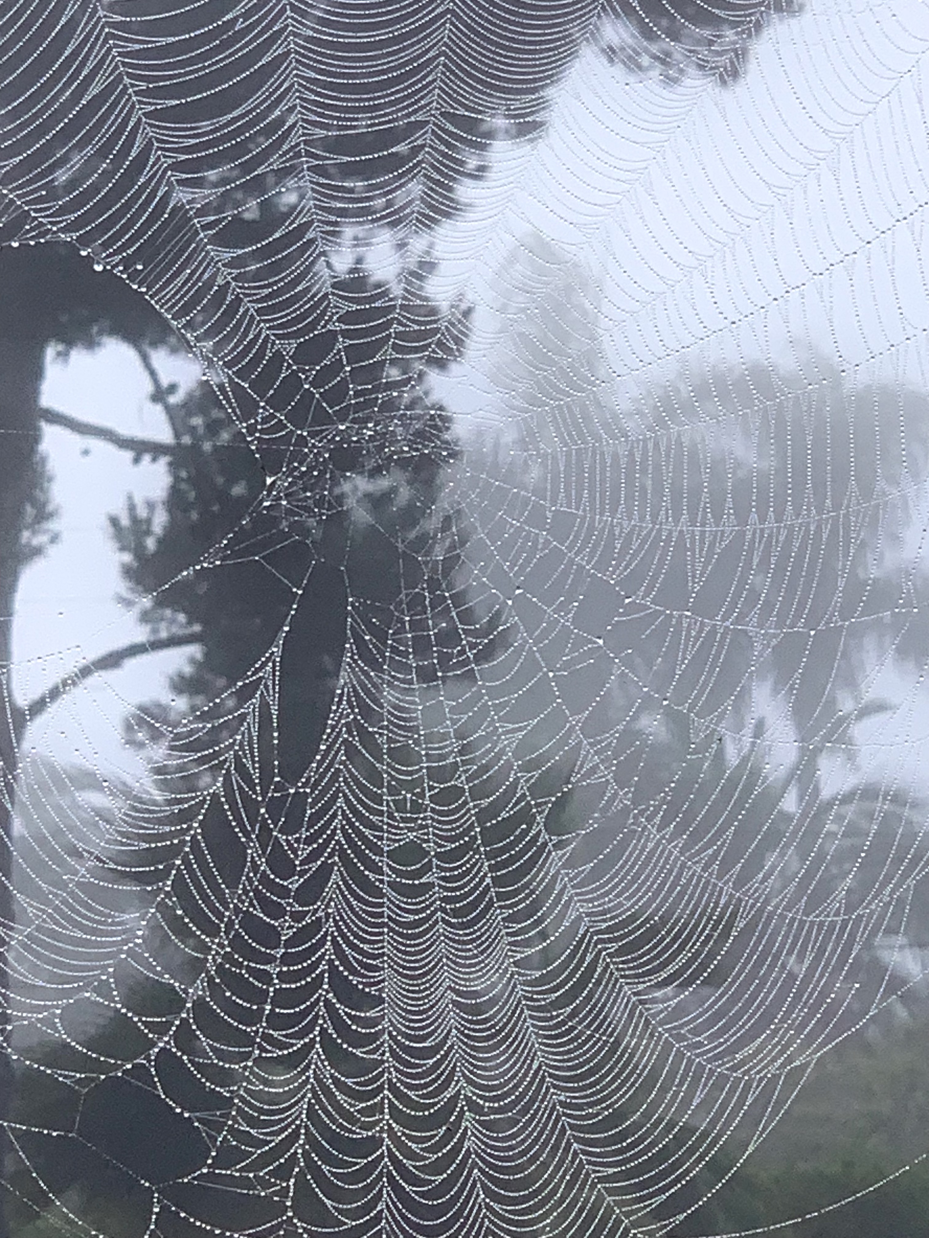
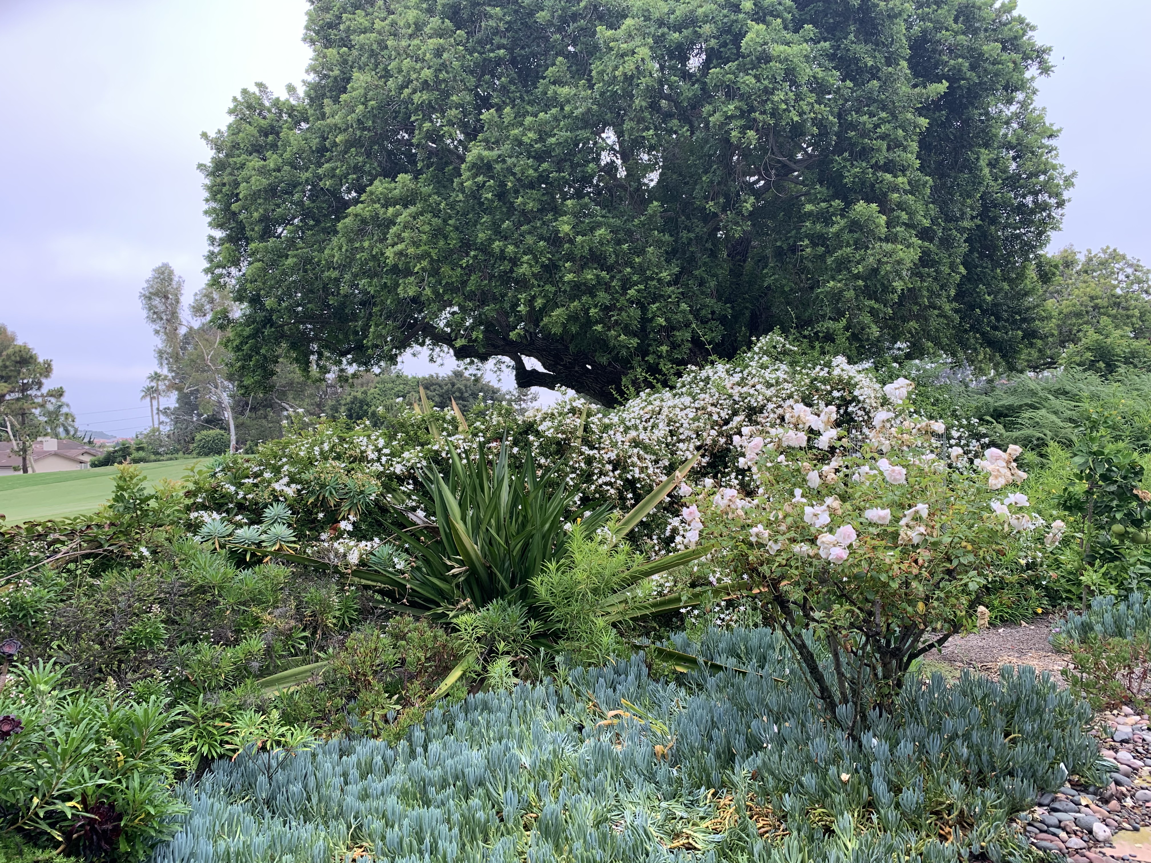
For the past few days, I’ve been walking the garden on the lookout for “gradients.” As an experiment, I’m going to break up the discussion of gradients into sub-categories.
Visually, all the various gradients look similar. I am categorizing them by the cause of the gradient.
So, first, we have “Perspective Gradient” … as we look at identical or nearly identical items at different distances, they will obviously appear to have different sizes and different distances between those items.
Second, we have “Light Gradient.” For example, a series of spheres or cylinders lit by a single source, the three-dimensional shape will result in a gradient of light and dark from most angles.
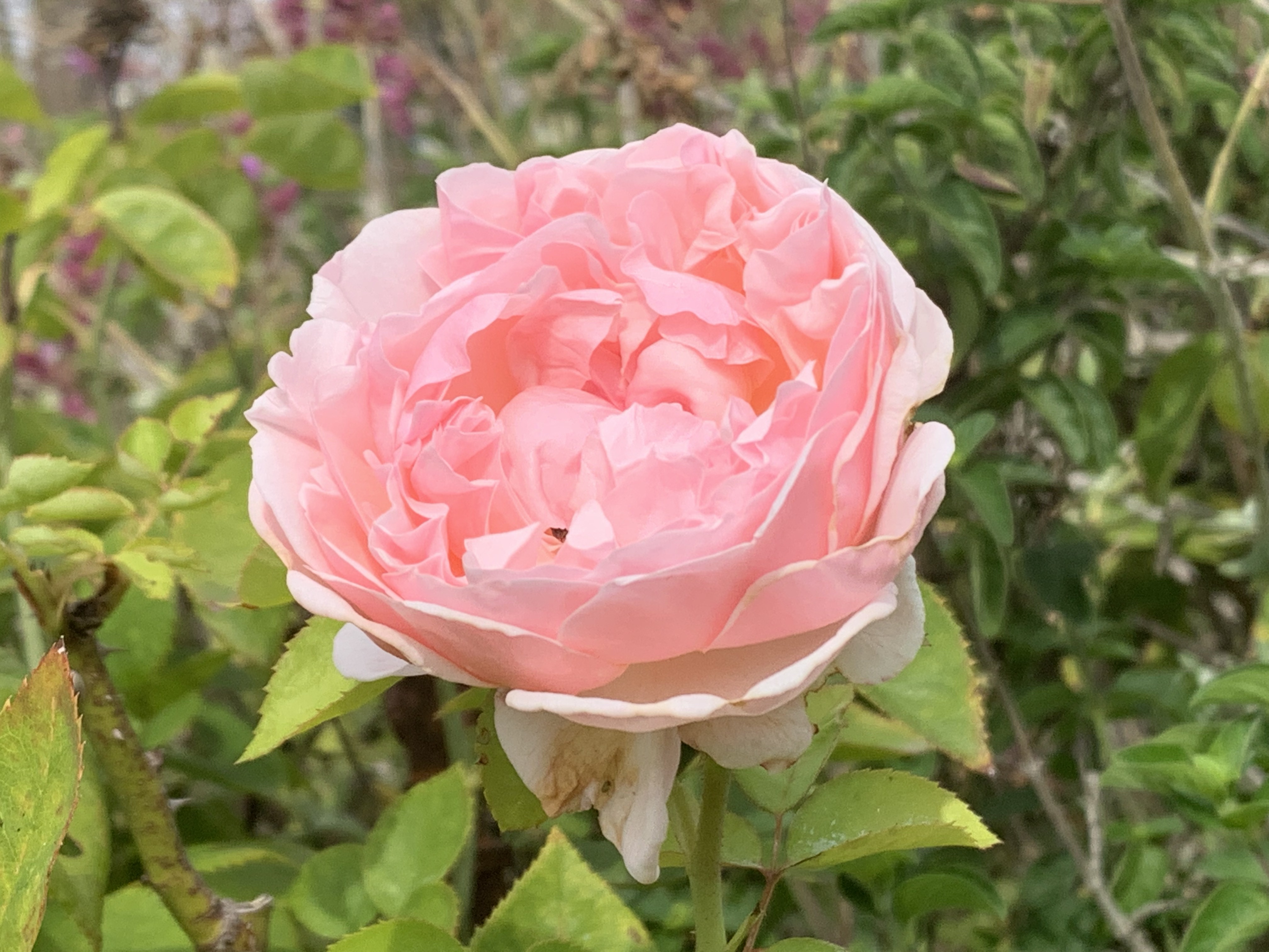
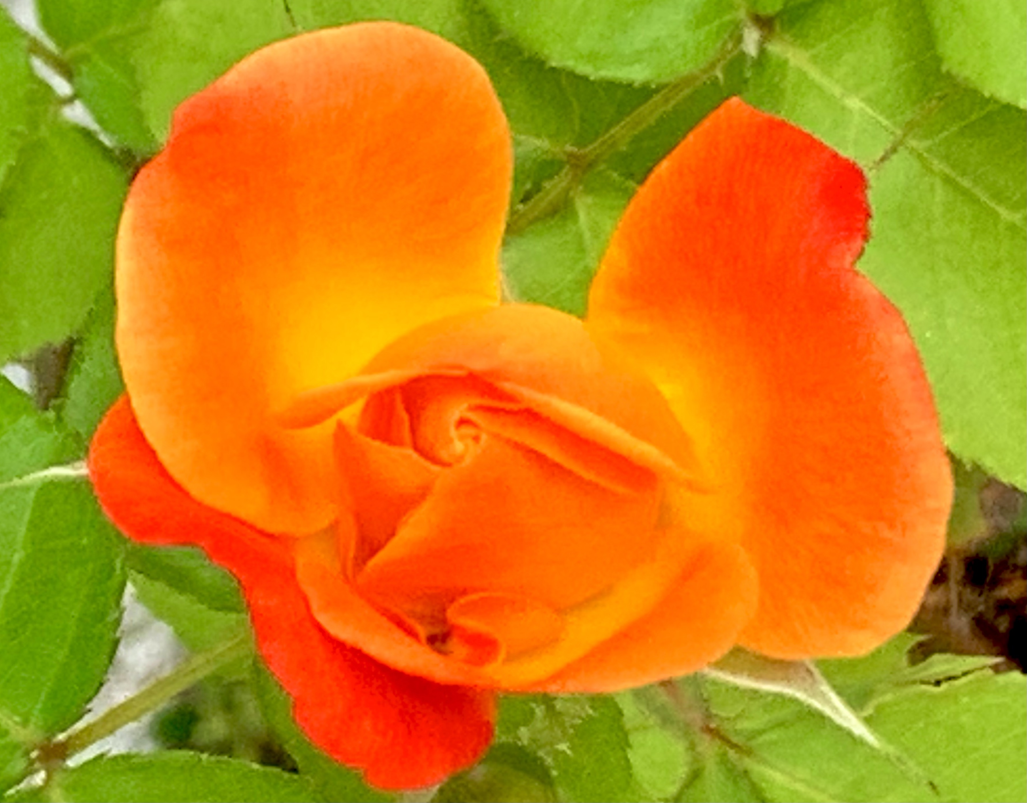
Third, there are often “Color Gradients” for both animals and plants.
Fourth, there are “Growth Gradients.” Color Gradients, are often a specific example of Growth Gradients. However, there are other types of Growth Gradients. For example, in many plants new growth is at the distal end and is smaller. Old growth is more central or more toward the roots; it is older, and is larger.
Growth Gradients apply to many plants and animals. They often apply to organizations as well. Imagine a multi-national distributor with field offices in half the countries in the world. If they move into a new country, at first, there will only be a few people; perhaps housed in a small space. Sales will grow hopefully and with the growth, new personnel and space may be added.
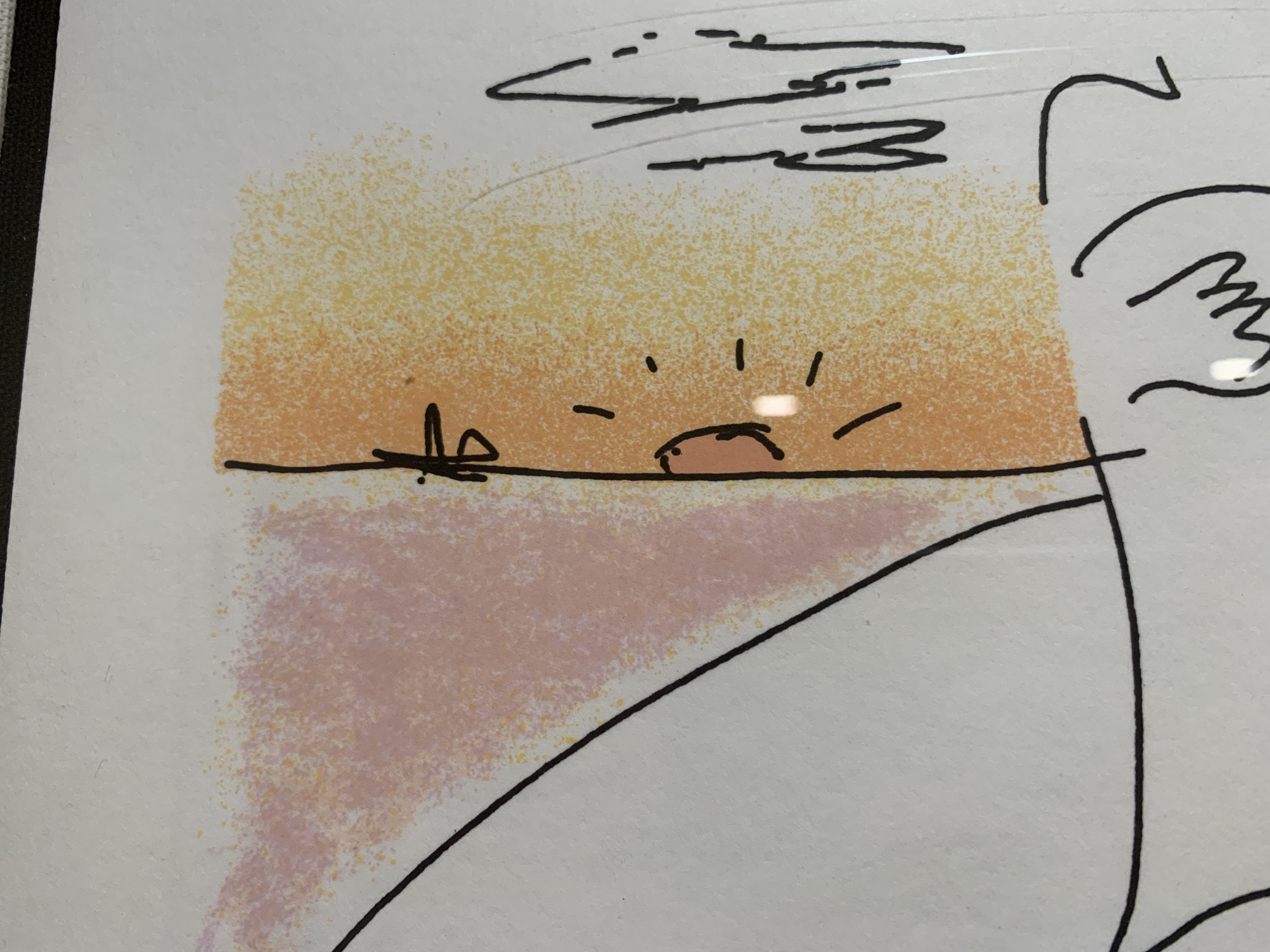
Conversely, Color Gradients can be quite intentionally added by the artist! Here’s a detail from a John Lennon lithograph. Note that “Boundaries” and “Gradients” reinforce each other. The Gradient makes the Boundary Stronger and vice versa.
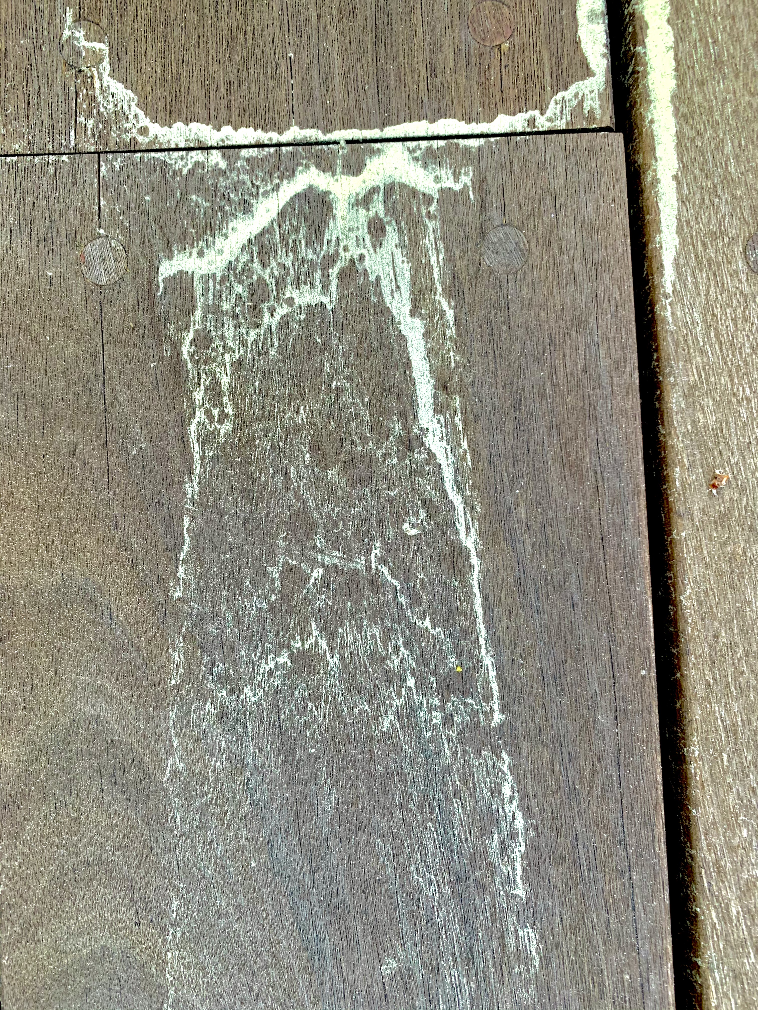
There are also “Force Gradients” that appear in response to water, wind, gravity, magnetism, etc. One could argue that “Growth Gradients” are due to forces as well. Historically, gradients can arise from evolutionary pressures. These, in turn, are instantiated, in many cases, by chemical gradients of hormones that control growth. However, there are also many non-living cases of gradients.
Finally, there are “Intentional Gradients” that are put in by artists, architects, landscape gardeners, designers, and UX designers.
Although the examples above are visual, there are also gradients in music. There are gradients in activity.
Gradients are also present in narrative. Think of the rising passion between two lovers or the increasing tension and suspense in a mystery or horror film scene.
Are there gradients in User Interfaces? One example that springs to mind was in the “Audio Distribution System” and “Olympic Message System.” These were audio messaging systems from IBM that allowed subscribers to the service to leave an audio message to a person or distribution list “on a person’s phone.” (Of course, the message was really on a server and played upon demand.) The UI’s only visual elements were an ordinary touch tone key pad circa 1980 and possibly a small booklet or template with the various command options. Primarily, the user was meant to hear Prompts for actions.
The gradient part came in the fact that the user could speed up the audio more and more as they became more and more familiar with it. That variable speed applied to prompts and also to messages. A typical user would experience slow messages, then faster messages, then, still faster messages, and so on.
In another IBM project, we built a “Personalized Education System” that would allow IT personnel to build a “Custom Course” for on-line learning that could vary continuously in length and difficulty. However, while each individual user could choose length and difficulty, they typically did not experience a gradient in that regard. By analogy, some insects may prefer to chew on new growth while others may like more mature leaves. An individual insect only experiences one “size & tenderness” yet the plant taken as a whole provides a gradient. Similarly, if you have a barbecue party again, you might offer up a range of options on how done you cook the burgers. In this case, we might say the BBQ service offers gradations though an individual burger is not a gradient. This isn’t strictly true. A well-done burger is fairly consistent throughout but a rare burger may be much more rare in the middle and charred on the edges. So, for that choice, there is a gradient of experience.
Compared to the natural environment around me, which is positively thick with gradients, I don’t see (or feel) many gradients in any of the UI’s I interact with (games aside). The fisheye lens provides one way of introducing gradient into the UI. It produces, a kind of “Perspective Gradient.”
It would be possible to put gradients into many of the visual elements of a UI. Would it make the interface look more like nature? Would it be more beautiful? Would it be distracting?
——————-
Here’s a poem that illustrates a gradient of love.
With zero contrast, nothing can be seen at all. Beyond that however, it is interesting how many plants and animals as well as good designs show the property of Contrast. Plants “use” contrast, if I may speak in teleological terms, to attract pollinators such as butterflies and bees to their flowers. Plants also use contrast to “announce” to animals who spread seeds that their fruit is ripe and ready to be eaten. If the fruit part of a plant did not make such an obvious “announcement,” a forager might damage a plant by eating all of it rather than just the sugar-rich fruit.
By contrast, fall leaves show high contrast which adds to their beauty, but this is probably just a “side-effect” of the leaves “saving” their water & chlorophyl and leaving other colorful compounds in the leaf. I suppose there could be an evolutionary advantage to a tree that is beautiful in the fall. I could imagine that bright colors attract animals and birds to “hang out” nearby and this means that the soil will be enriched by animal excretions and occasionally by deaths. In some cases, the color might “signal” animals that fall is coming and if the animals take more appropriate actions, this makes for a healthy ecosystem that in turn is good for the trees. I know of no such evidence however. It seems likely the bright colors are a beautiful side-effect of the tree breaking down the no-longer-useful chlorophyl to components that are stored in the roots. The more we learn about trees though, the more “clever” they seem so I wouldn’t put it past them to have “reason.”
Some animals, such as zebras and tigers, use contrast as a kind of camouflage. If you see a picture of a zebra or tiger out of context, you may think, “What? How is that camouflage?” But in the bright sun, grazing in tall grass (or lurking there, hoping for dinner), it actually does serve such a purpose.
There is also a more subtle kind of camouflage that some animals employ. High contrast can make it difficult for a potential predator or prey to “parse” the visual image. I believe some of the professional tennis outfits, for instance, make it harder for an opponent to “read” the actual body positions from across the court, especially with non-foveal vision. Is that what’s going on in the picture below?
Considered separately, the shadow of the fence in the photo below strikes me as more beautiful than the fence itself. This is largely due to the higher Contrast in the shadow. I think another property “Roughness” also plays a part. The fence is machine milled and regular. The shadow falls on uneven ground. Rather than obscuring the Contrast, the Roughness actually enhances it. In addition, the fence appears quite separate and distinct from the greenery behind it. However, the shadow is partly determined by the fence and partly determined by the uneven ground. This means the shadow exhibits more “Deep Interlock and Ambiguity.”
I do think the combination of fence and shadow is more beautiful than either taken alone. Taken together, there is an additional layer of Contrast between the “mechanical” regularity of the fence and the rougher feel of the shadow.
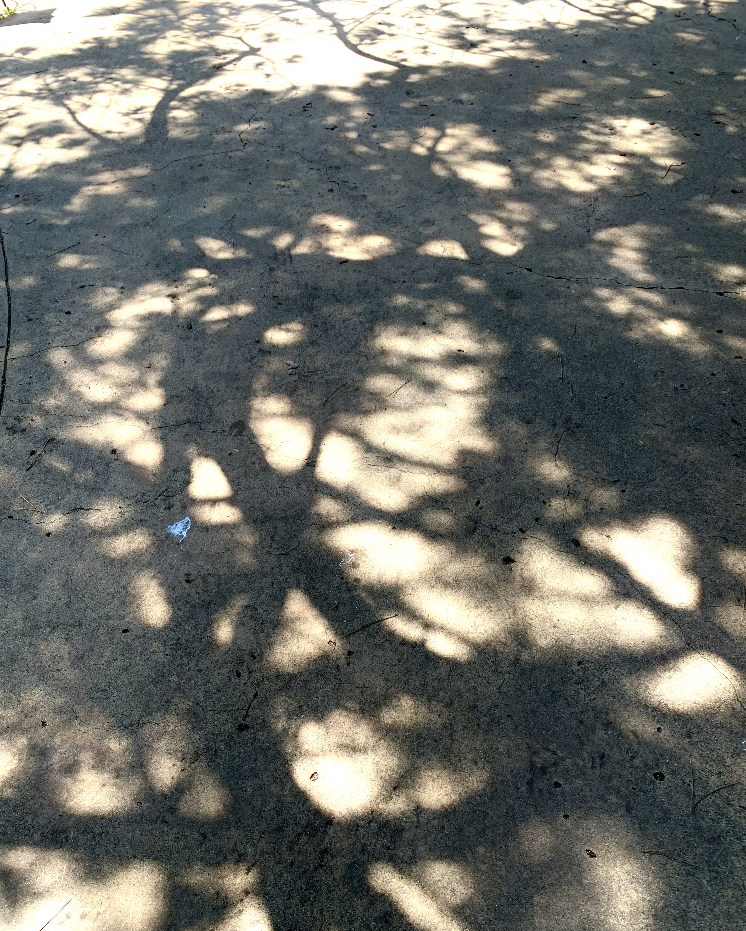
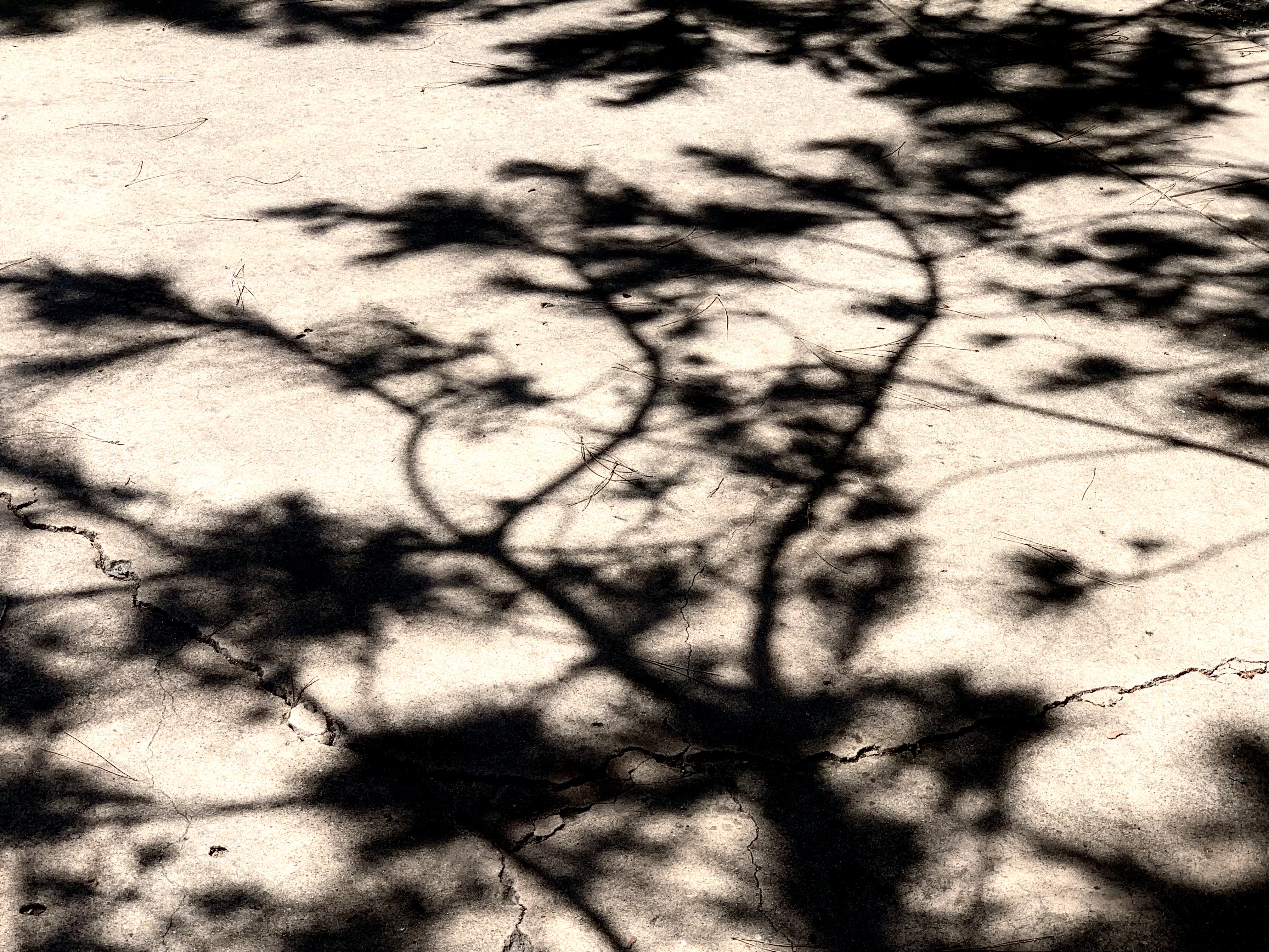
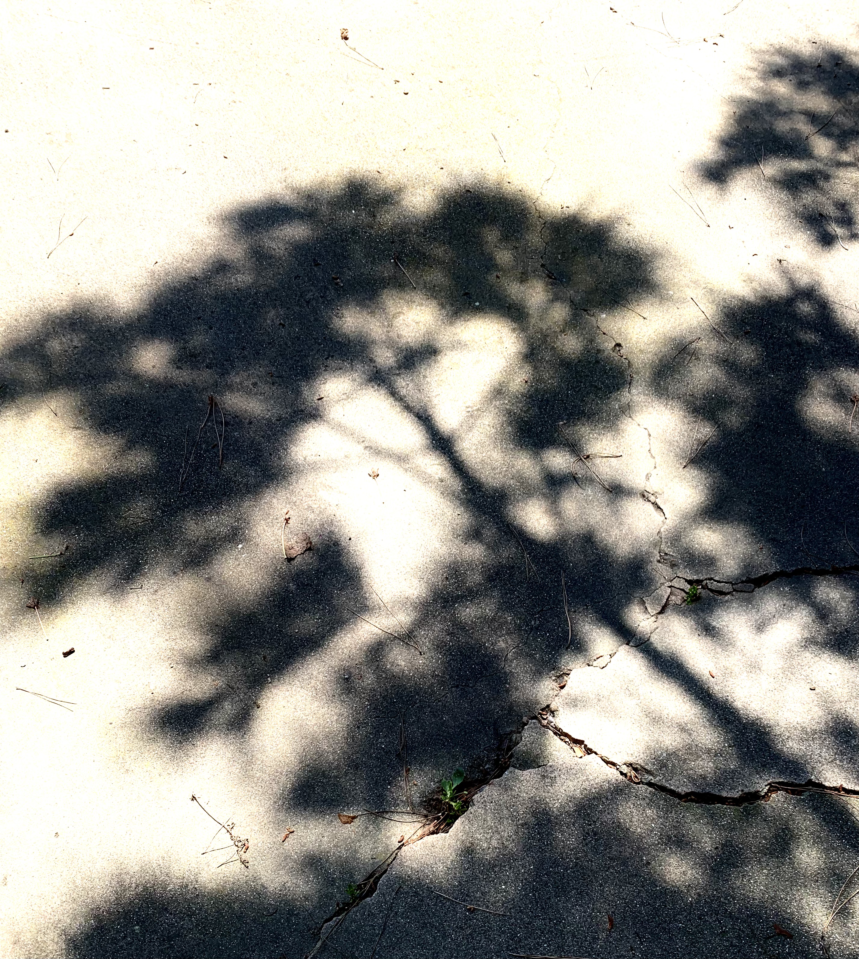
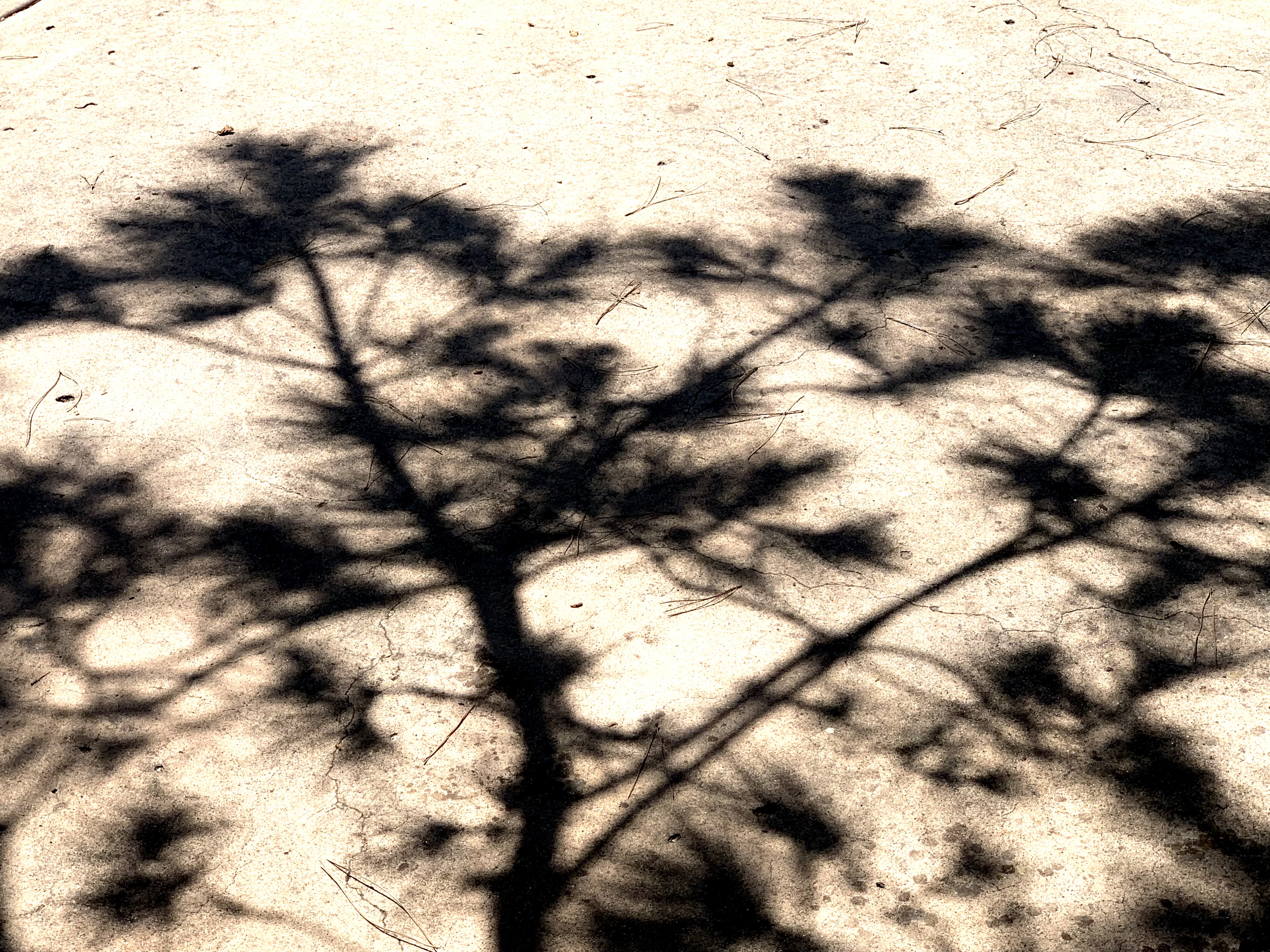
One of the things that trees do is add contrast by virtue of the branches and leaves casting irregular shadows in many places but letting bright light through in other places. Here is a simple case.
In the photo below, the landscape architect has likely intentionally designed this arbor partly with contrasts in mind. Dark vs. Light; Horizontal vs. Vertical; Straight vs. Bent; Built vs. Growing. What other contrasts do you see?
Contrast is often desirable not just in terms of vision, but also for other senses. A good salad, for instance, shows contrast in color, but also in terms of textures and tastes. Orchestral music shows contrast in terms of loudness, timbre, harmony, melody, etc.
Living things also exhibit contrast, not only in their visual appearance, but also in terms of the rhythms of life. Many plants and animals exhibit both daily cycles such as sleep and wakefulness, but also yearly cycles (hibernation, aestivation, migration, mating season, losing fall leaves, blooming & fruiting, etc.). In fact, many animals & plants only live one year.
Stories typically exhibit contrasts of various sorts. A story (whether play, movie, novel, or short story) is often more interesting when set in both wartime and peacetime, in both country and city, in two different times, etc. In addition, a good story often has contrasting characters such as hero and villain, or two less extreme characters, one of whom is a “foil” for the other. The plot itself is constructed of contrasts in value. The hero loses an athletic contest. Then, the hero wins! Then, the judges unfairly strip the hero of the medals. Then, an investigation reveals that the hero was framed and the hero prevails after all. Love may conquer all — but never without a struggle.
This succulent pictured below seems beautiful to me partly because of Contrast. Is there an aesthetic “purpose” to the contrast shown? Or, is the real “point” to provide the sharp spikes on the edge of the plant and in order to make those spikes effective, the plant needs to be drier near the edges or have a yellow pigment that somehow facilitates the growth of spikes? Perhaps the plant’s growth is limited (in the Southwestern US) by the available water and not at all by sunshine (which is plentiful). Therefore, there is no “point” to having the entire plant green.
If it seems too far-fetched to imagine a plant exhibiting contrast because it’s more beautiful, it is not to far-fetched to imagine animals exhibiting contrast to attract other animals; most notably, a mate. Insects, birds, mammals, fish, sometimes exhibit “displays” of high contrast color in order to attract mates. Typically, such displays are only used during actual mating season.
In addition to seasonal and daily “contrasts” in behavior and appearance, animals often exhibit contrast at a finer temporal granularity. As humans, we breathe several times a minute and our heart beats about once a second. Some aspects of our anatomy and physiology have evolved to provide antagonistic forces and processes. We have, for instance, our sympathetic nervous system that prepares us for “Fight or Flight” reactions. The para-sympathetic nervous system turns on a “rest and digest” mode also called “feed and breed.” Our sensory and motor systems use both excitatory and inhibitory processes to “sharpen” what we perceive and the actions we take. Our musculature often has muscles that produce “opposite” results. Our biceps bends our arm and our triceps straightens our arm. The adductors in our legs move our legs inward toward our trunk and the abductors move our legs apart.
Contrast is so prevalent in the natural order of things “out there” and in the structure and function of our own bodies that it is hardly surprising that our conceptual structures often exaggerate contrasts. We often think, for instance, in terms like these: “Up or Down? Liberal or Conservative? Good or Evil? Strong or Weak? Black or White? Growth or Decay? Orderly or Disorderly?”
If we return to the photo of the fence and its shadow, for example, we are tempted to describe the darkest parts of the shadow as being places without light while the spaces between have light. Of course, there is light, even in those shadows. Light is reflecting off the nearby trees, houses, grape vines, sand, cars, etc. There is nothing shown in this photo that has no light.
As Amanda Gorman pointed out in a Presidential Inauguration —
“For there is always light,
if only we’re brave enough to see it
If only we’re brave enough to be it.”
When it comes to User Interface Design, contrast has many uses. For example, contrast is often used to signal whether an item is chosen or not, or whether an action is available or not. Interfaces often include text and the text is easier to read if the contrast is higher. In the early days of human computer interaction, text was composed of a relatively small number of bits that were either on or off. High contrast came with the technological limitations of the devices. More recently, text often appears as dark gray on light gray rather than as black on white.
Why? I have no idea. People sometimes claim that low contrast is “easier on the eye.” So far, no-one has been able to point to empirical evidence. However, text is harder to read when the contrast is low. If the user is old, or trying to read in glare, or has limited vision, or the reader or device is moving or vibrating, low contrast text can become illegible. The “worst” cases I’ve seen are on devices such as CD players or smoke alarms. To simplify (and therefore cheapen) manufacture, the letters are not painted at all but simply embossed as white on white or (even worse) black on black. From my personal experience, few things in modern life are as pleasant as being awakened around 3 am by a screaming smoke alarm which has cryptic and unreadable directions in white on white.
At a more abstract level, a high level of conceptual contrast can often make the user experience less frustrating, more enjoyable, and more productive. What do I mean by “conceptual contrast?” In this context, I mean that two related actions or situations that are clearly differentiated in the commands, the explanations, the terms etc. are less prone to confusion. Let’s pick on what I see right before me: the high level “Pages” tool bar. “File Edit Insert Format Arrange View Share Window Help” At a visual level, these are nearly white on a black background; i.e., easy to read. But what is the conceptual contrast between “Format” and “Arrange”? How about “View” and “Window”? Are there other terms that would be better cues as to what these groups of functions do?
The same for menus within the document. I see above the material I am actually typing another use of the words “Insert” and “Text” appears right next to it. But how is this different from “Text” on the right? It’s not that any of these items are so confusing that they cannot be learned. “Style” when you are writing (as opposed to “word processing”) generally refers to something much more abstract that the type of font and the size or color of the text or the spacing between lines.
I think a more fundamental issue is that typical text editors, after the “Clippy” fiasco, have steered away from explicitly supporting the process of actual writing. Developing a truly useful aid would be much more difficult. I’m not going to try to design such a system here. To give a hint of the kind of thing I mean though, suppose that a text editor explicitly supported writing a short story. Embarking on writing a short story, the user might be presented with a choice for guidance. Perhaps this hypothetical writer wants to try writing a “locked room” mystery. And, maybe they want lots of guidance. So, the software leads them through an idea generation phase. In that phase, perhaps it is more productive to turn off various kinds of “autocorrect.” Perhaps the author is encouraged to “solve” the basic problem (how was the murder committed) before actually beginning the writing. Maybe there is a high level of visual Contrast which serves as a constant reminder to the author that they are, at this point, generating ideas.
Von Oech suggests that problem solving involves four stages that he illustrates with four “hats” — an explorer’s pith helmet for the Exploration phase; an artists beret for the Creation Phase; a judge’s wig for the Editing or testing phase; and a Viking warrior’s horned helmet for the marketing and sales phase. If such a model were supported by the software, you might expect a strongly contrasted visual interface to reinforce the phase of writing that the user was in. The Exploration phase might consist visually of cards evocative of various fields that would support research. The artistic phase might be a mind-mapping tool. And, so on. The user would know at every glance which phase of the overall writing process they were “in.”
It may be that any such process involves too much overhead or is too rigid. But what is the alternative? At present, the author must either keep almost all the information about their goals, ideas, and processes in their head or in a separate document or spreadsheet. As I look at the screen in writing there is almost no clue about “where I am” in the process of writing. Whether or not you buy into the specific four-stage model of Von Oech, I do believe that various phases of writing do offer contrasts in terms of how that phase should be supported. I only chose writing as one example.
Nearly any task that the user is engaged in has some structure to it. Scientific research, learning a foreign language, organizing a tennis tournament, planning a trip, finding a house, buying a book on-line, etc. All of these have different sub-tasks. In some cases, the user wants more flexibility; in some cases, less flexibility is actually helpful. But most “application programs” seem to me to be deficient in terms of guiding the user through a process; giving any visual indication of where the user is in the overall process, or of tailoring actions to which subtask the user is engaged in. If a user is generating ideas, for example, pointing out grammatical errors, typos, and spelling errors is distracting and not that helpful. On the other hand, if the user has finished writing a first draft and is proofreading, then such suggestions may be helpful and appreciated.
How do you see the use of Contrast in User Experience? Is Contrast best thought of as a visual property which may be nice to have but is not crucial? Or, does Contrast also apply to different subtasks or phases which need to be reflected in both the appearance of the UI and in the functionality?
The Winning Weekend Warrior focuses on the mental game for all sports using examples from tennis, golf, baseball, and other sports. It covers self-talk, imagery, mental practice, strategy, tactics, & sportsmanship. http://tinyurl.com/ng2heq3
Turing’s Nightmares explores the implications and ethics of Artificial Intelligence through fictional short stories. http://tinyurl.com/hz6dg2d
Fit in Bits shows many ways to put more fun, variety, & exercise into daily chores and habits to help with strength, flexibility, fitness, and balance. http://tinyurl.com/h6c7fce
Tales from an American Childhood recounts early experiences mainly in the American Midwest in the 1950’s and relates them to contemporary issues and events. https://tinyurl.com/y9ajvz9j
Dream Planet. Where do you run when the whole world is crumbling under the weight of human folly? When the lethal Conformers invade 22nd century Pittsburgh, escape becomes the top priority for lovebird scavengers Alex and Eva.
The Winning Weekend Warrior focuses on the mental game for all sports using examples from tennis, golf, baseball, and other sports. It covers self-talk, imagery, mental practice, strategy, tactics, & sportsmanship. http://tinyurl.com/ng2heq3
Turing’s Nightmares explores the implications and ethics of Artificial Intelligence through fictional short stories. http://tinyurl.com/hz6dg2d
Fit in Bits shows many ways to put more fun, variety, & exercise into daily chores and habits to help with strength, flexibility, fitness, and balance. http://tinyurl.com/h6c7fce
Tales from an American Childhood recounts early experiences mainly in the American Midwest in the 1950’s and relates them to contemporary issues and events. https://tinyurl.com/y9ajvz9j
Dream Planet. Where do you run when the whole world is crumbling under the weight of human folly? When the lethal Conformers invade 22nd century Pittsburgh, escape becomes the top priority for lovebird scavengers Alex and Eva.
The Winning Weekend Warrior focuses on the mental game for all sports using examples from tennis, golf, baseball, and other sports. It covers self-talk, imagery, mental practice, strategy, tactics, & sportsmanship. http://tinyurl.com/ng2heq3
Turing’s Nightmares explores the implications and ethics of Artificial Intelligence through fictional short stories. http://tinyurl.com/hz6dg2d
Fit in Bits shows many ways to put more fun, variety, & exercise into daily chores and habits to help with strength, flexibility, fitness, and balance. http://tinyurl.com/h6c7fce
Tales from an American Childhood recounts early experiences mainly in the American Midwest in the 1950’s and relates them to contemporary issues and events. https://tinyurl.com/y9ajvz9j
Dream Planet. Where do you run when the whole world is crumbling under the weight of human folly? When the lethal Conformers invade 22nd century Pittsburgh, escape becomes the top priority for lovebird scavengers Alex and Eva.
The Winning Weekend Warrior focuses on the mental game for all sports using examples from tennis, golf, baseball, and other sports. It covers self-talk, imagery, mental practice, strategy, tactics, & sportsmanship. http://tinyurl.com/ng2heq3
Turing’s Nightmares explores the implications and ethics of Artificial Intelligence through fictional short stories. http://tinyurl.com/hz6dg2d
Fit in Bits shows many ways to put more fun, variety, & exercise into daily chores and habits to help with strength, flexibility, fitness, and balance. http://tinyurl.com/h6c7fce
Tales from an American Childhood recounts early experiences mainly in the American Midwest in the 1950’s and relates them to contemporary issues and events. https://tinyurl.com/y9ajvz9j
Dream Planet. Where do you run when the whole world is crumbling under the weight of human folly? When the lethal Conformers invade 22nd century Pittsburgh, escape becomes the top priority for lovebird scavengers Alex and Eva.