• About PeterSIronwood

petersironwood

~ Finding, formulating and solving life's frustrations.

petersironwood

Tag Archives: painting

Not-Separateness

28 Monday Sep 2026

Posted by petersironwood in AI, creativity, design rationale, essay, HCI, leadership, management, nature, politics, psychology, Uncategorized, user experience

≈ Leave a comment

Tags

AI, architecture, art, beauty, Design, development, ecology, governance, GreenNewDeal, HCI, human factors, IBM, leadership, painting, peace, photography, society, technology, TNOO, UI, usability, user_experience, UX, ux-design

Not-Separateness

It seems odd to specify a property of natural order in terms of what it is not. On the other hand, I cannot come up with a positive alternative that doesn’t bring other connotations with it. I think it’s related to “unified” or “integral” or “belonging” or “inter-related” but none of those seem quite so on the mark as does “Not-Separateness.” 

Christopher Alexander’s degree from MIT was in architecture. Part of the reason he may have chosen this particular term is in reaction to some examples of architecture in which the architect seems to be in the business of constructing a building whose primary purpose is to make them famous regardless of what that building does to the neighborhood or its occupants. 

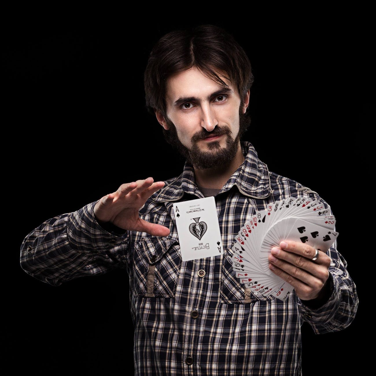
Photo by BROTE studio on Pexels.com

Imagine Mr. Bigg designs a house that is a perfect black cube set on on vertex. In effect, this design says to me: “I am BIG. I am Mr. Bigg! I am a genius! You would have never been brilliant enough to design a house that is a cube on its vertex! You would have wasted your time and done something mundane like placed the cube on the ground on one of its faces. Anyone could think of that! But I put it on a vertex!” Indeed, we may easily imagine that he says words to this effect when his interview is reported on in the (mythical) architectural journal entitled, Things that look different! 

“Mr. Bigg, you made the Bigg House out of black steel and black glass. Some critics have argued that this doesn’t fit with the existing neighborhood of stone cottages with thatched roofs.”

“Of course, little minds will always criticize Bigg ideas.” 

“Yes, yes. It also means that the construction costs of the house were quite high. And, the estimated costs of heating and cooling are much higher as well.”

“Nothing that a worthwhile (i.e., wealthy) client can’t afford.” 

“Some have also argued that it is inconvenient for the occupants who have to walk up and down at a steep angle and that furniture such as dressers, tables, chairs, and beds do not accommodate well to the tilted walls.” 

“Let me ask you a question. Would you have ever thought of putting a cube on its corner? No. I didn’t think so!” 

Of course, this is exaggeration.

But not much. 

We would hope that User Experience designers take into account the users, their tasks, their contexts, and the way in which their designs interact with other related artifacts, people and processes. We would hope that applications and artifacts and services are all designed with the property of “Not-Separateness.” 

In the early 1980’s, I worked in the IBM Office of the Chief Scientist. My main assignment was to get IBM to pay more attention to the usability of its products. As part of that process, I visited quite a few IBM development labs around the world and spoke to many development teams. On many of these visits, I was accompanied by the Chief Scientist, a brilliant physicist, who “got” usability. 

On one occasion, we watched a new printing technology. Instead of printing out black printing on a white sheet of paper sized 8.5” x 11” or A4, this printout was of no standard size. The printing was black on a shiny silver sheet that curled severely. The Chief Scientist asked the head of the development team how they envisioned this being used. 

Chief Scientist: “Once someone printed this out, what would they do with it?”

Answer: “Oh, anything they liked.” 

Chief Scientist: “I mean, would people tape this into a notebook or paste it? Or would you imagine notebooks that would bind such paper?” 

Answer: “It’s not up to me to decide how people would use it. Doesn’t it look cool?” 

Another type of answer we heard more than once to the question, “How would this be used?” 

— “Oh, it’s a (replacement/upgrade) for this other IBM product.” 


“But who would use it and for what?” 


“It has three main components. Would you like a description of the components?” 

Photo by Andru00e9 Ulyssesdesalis on Pexels.com

Of course, there is a place for “playing around” with technology and thereby discovering things which someone else may find a use for. But in design and development of a product or service, having a clear notion of context of use and the users and tasks is fundamental. Of course, other users may appropriate a product or service for purposes beyond those envisioned by the original designers. That’s cool. 

What’s not cool is designing a device that is to be used in the bright outdoor sunlight and then testing the display in a typical office environment. Have you ever run across something like that? I have. Many times. At ATMs, Gas Stations, and outdoor display maps.

A more subtle lack of contextualization in design occurs when the design team fails to realize how many interruptions happen to the user while they are trying to accomplish a single task with the new application. If you “test” the application while the user is in a quiet “usability lab” and they can give your tasks their undivided attention, then necessitating them to remember the invisible internal state of “Insert” versus “Edit” mode may not be a big deal at all. They will simply remember. But in their office environment, they may be interrupted by a phone call, a message, or their boss entering their office and asking a series of detailed questions. If they now go back to the task at hand, there is about a 50-50 chance that they will correctly guess whether they are in “Edit” mode or “Insert” mode. 

A design which shows the property of Not-Separateness is the natural result of a process which shows not-separateness. Here are a few common ways to help ensure the design process grows organically from the users and their goals & contexts. 

* Put people on the design team who are familiar with the users, and/or their tasks, and/or their contexts. 


* People on the design team observe people engaging in the relevant processes, whenever possible, not — or not only — in a “Usability Lab” but in the actual work environment. For instance:

  • Observe people actually using product P (or service S) in version N so that version N+1 can be better attuned to the needs of the users.
  • Have people think aloud while doing this.
  • Gather and understand feedback from service calls and help desks and customer complaints in order to improve over time. 

There will be benefits to a company who takes such approaches beyond initial sales. If you’ve done any gardening, you will appreciate that the quality of the tomatoes you enjoy eating is related to the quality of the soil and the quality of the care you give the tomatoes. Similarly, a product or service that has the quality of Not-Separateness will not only be useful — users will fight to keep your product or service. It becomes integrated with the environment. To change the brand means that they will have to change the way they work; possibly even with whom they work. Not-Separateness is likely a path to what business people like to call a “Cash Cow.” 
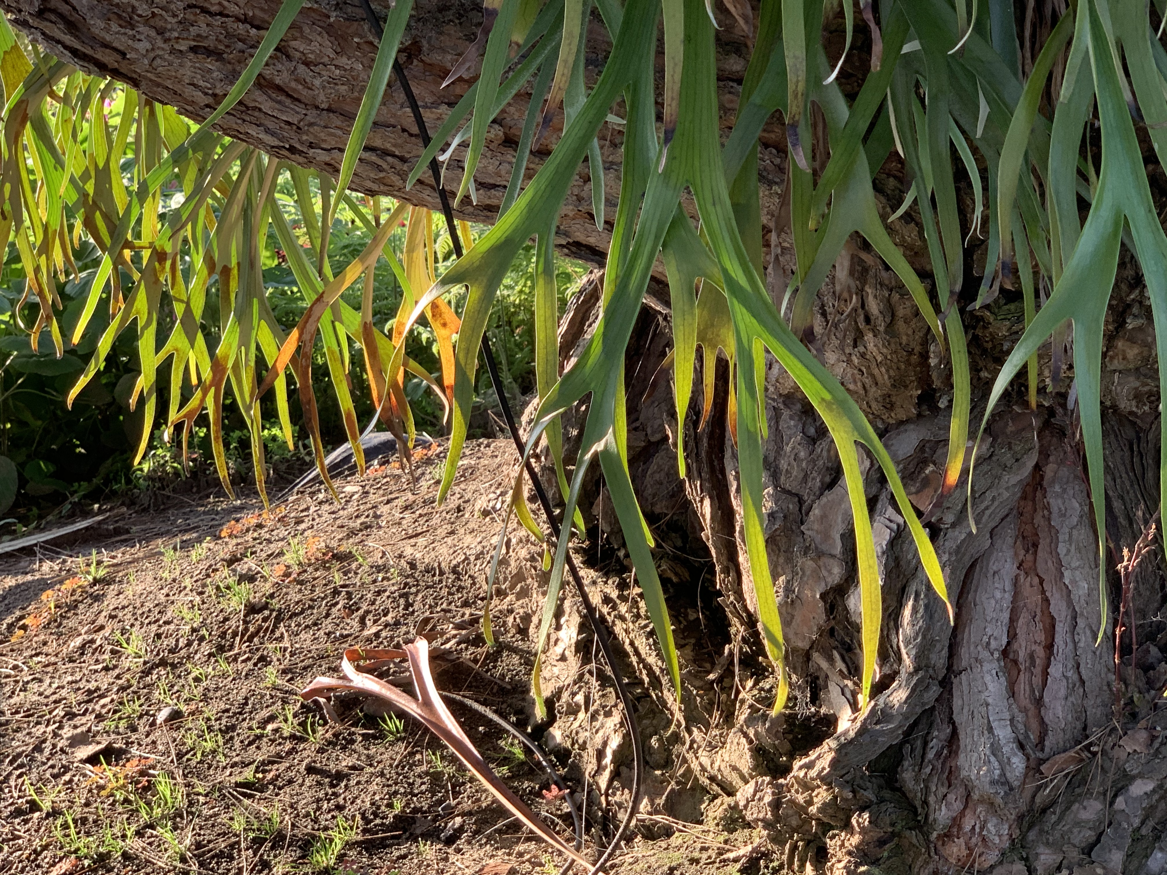
If you’ve ever walked through a neighborhood after a hurricane, you’ve likely seen many uprooted trees. When you look at the roots of an uprooted tree, what do you see? Of course, you see roots. But what else? You see rocks and soil all around and embedded into the roots. They are Not-Separate. In a hurricane, there are typically not only high winds. There is also a lot of rain. The trees are hit with a double whammy. The wind pushes the tree but the rain weakens the solid soil in which the tree is embedded. It is the combination that makes it very difficult for the tree to “hold on” and keep from falling over. 

Living things, just like us, have a 4.5 billion year history of living. The living things adapt over time to their environment and they mold the environment to their needs. They are not separate. Flowers appeal to the insects who pollinate them. The insects who pollinate them are adapted to the characteristics of the flower. A horse adapts to their rider and the rider adapts to their horse. A product or service must have a design that serves the needs of its stakeholders. For a product or service to have maximum beauty, utility, and longevity, it must also have a way to adapt to the changing needs of the users and other stakeholders. At the same time, if the users and their organizations adapt to the product or service, then true Not-Separateness is achieved. 

If you want to skimp on designing your product or service, you can make it more separate, more divorced from its context, its users, and its tasks. Of course, if you do that, you also make much easier for your users to abandon your product and switch to a new one. 

Another way to think about this in terms of systems theory is where you draw the boundary. If you draw a sharp boundary around your product, you may find that, over time, your product becomes ever more peripheral to the community you’re trying to support and your product is ever more fungible with others in its class. On the other hand, if you draw the boundary around the product or service and the people and organizations who provide the product or service then, you are on the path of ever tighter interconnect. 

“Who Speaks for Wolf” is a Pattern in a Pattern Language for Collaboration and Cooperation. It is based on a Native American story and shows the importance of making sure that knowledge and perspectives of all relevant stakeholders are taken into account when a change is contemplated. Who is “relevant” may not always be obvious, but, in my experience, many more projects fail or are delayed because of too limited a view than of too broad a view.

Who Speaks for Wolf

Not-Separateness is not only a quality of good design in terms of not overly separating the context and users from the product or service. It is also a good quality for the organization that produces products & services. Of course, some people today must manage a giant amorphous “organization” of tens of thousands of people so they set up divisions, and departments, and groups, and teams, and positions etc. There may indeed be a “UX Department” and a “Software Department” and a “Hardware Department.” That’s all fine. But it is counter-productive if the UX Department sees itself as separate from the rest of the company. To a great extent the success of the UX Department depends on the success of the Hardware and Software Departments. The Sales Department’s success will, of course, depend partly on the skills of the Sales Department. But it will also depend on the success of the UX Department, HW, SW and Services. 

Have you ever had a paper cut? It isn’t just the skin on a quarter inch of the inside of your ring finger that’s cut. You’re cut! It isn’t just that the finger feels pain. You feel pain! That causes you to take steps to ameliorate the pain and to try to make sure it doesn’t happen again. That’s why empathy in leadership is important. A leader must feel empathy for all, or the organization will disintegrate from lack of Not-Separateness. At some point, a raccoon may chew off its own arm in order to escape a trap. 

But it isn’t the first thing that occurs to them every time they experience a thorn in the paw! 

The raccoon doesn’t say to itself:  — “that paw is giving me pain! I’m going to chew it off! Then, it won’t hurt any more.”

Photo by anne sch on Pexels.com

Evolution did not evolve a raccoon that acts that way. Self-mutilation exists but it is typically a last resort.

But not for corporations. It is the first thing they think of:

“Our (you name it) Department is not performing well. Let’s lay them off and outsource it. Better yet, we’ll replace it with AI!”

What does that say to every thinking employee in the entire corporation? It says:

“You know what? All this talk about teamwork and pulling together is a total bunch of bull$hit. You cannot trust management to do what’s best for everyone. You can only trust them to do what’s best for them.” 

Living forms in nature are living forms. Their parts have severe Not-Separateness with the other parts of that form. Often, as in well-functioning families or teams, that extends to all members of the group. 

Not-Separateness is essentially deep cooperation. I give to the larger community by becoming a part of it and doing my part in it. I lend strength to the community. In return, I gain strength from that community. It is not a zero sum game, of course. The community, if it is functional, is much stronger than the sum of the individuals in that community. 

This is so deeply embedded in 4.5 billion years of evolution that it does not surprise me that we recognize beauty as being even more beautiful if it is not separate. Not-Separate enhances beauty because, like all the other properties, it is essential to life. 

Eventually, if humanity is to survive, we will realize that Not-Separateness applies to all of us. We are not there yet. But that doesn’t mean we cannot appreciate and design Not Separateness in our products, in our services, and our lives. 
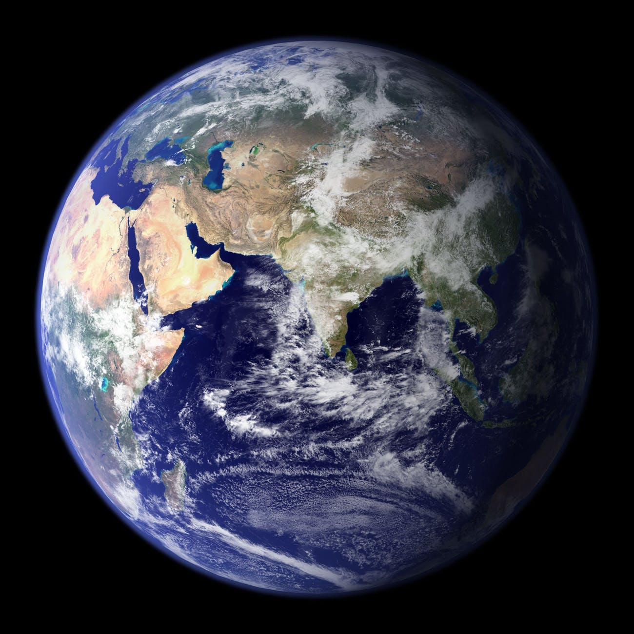
Photo by Pixabay on Pexels.com

—————-

The Declaration of Interdependence

How the Nightingale Learned to Sing

Roar, Ocean, Roar

Imagine all the people

Cancer Always Loses in the End

Ripples

Author Page on Amazon

Thomas, J.C. and Kellogg, W.A. (1989). Minimizing ecological gaps in interface design, IEEE Software, January 1989.

Thomas, J. C. (2012).   Patterns for emergent global intelligence.   In Creativity and Rationale: Enhancing Human Experience By Design J. Carroll (Ed.), New York: Springer.

Thomas, J. C. (2001). An HCI Agenda for the Next Millennium: Emergent Global Intelligence. In R. Earnshaw, R. Guedj, A. van Dam, and J. Vince (Eds.), Frontiers of human-centered computing, online communities, and virtual environments. London: Springer-Verlag.

Thomas, J.C. (1985). Human factors in IBM. IBM Research Report. RC-11267.  Yorktown Heights, NY: IBM Corporation.

Simplicity and Inner Calm

27 Sunday Sep 2026

Posted by petersironwood in Uncategorized, psychology, management, creativity, politics, nature, design rationale, essay, user experience, HCI, leadership

≈ Leave a comment

Tags

aessthetics, architecture, art, beauty, Design, HCI, human factors, leadership, life, lifestyle, management, painting, photography, TNOO, usability, user experience, UX, writing

Simplicity and Inner Calm

(Christopher Alexander, architect and city planner, proposed fifteen properties as characteristic of natural order. I’m considering them one by one in terms of society, design generally, and user experience in particular. “Simplicity and Inner Calm” is number 14.)

Photo by Nikolay Ivanov on Pexels.com

“Send me $50,000 and I’ll enroll you in a two year course in Simplicity and Inner Calm. All you have to do then is follow the twenty-five hundred rules on the Path to Enlightenment while renouncing everything else.”

Somehow, that does not seem to be in the spirit of simplicity and inner calm. Some of the properties I discussed earlier are closer to being about something “out there” that is somewhat measurable; e.g., levels of scale, boundaries, alternating repetition, roughness. Simplicity and Inner Calm are characteristics of things “out there” but they cause or at least resonate with simplicity and inner calm within a person. 

I don’t think it’s reasonable to expect a place to enforce a particular emotional state. If someone arrives at a beautiful still lake with hate and rage in their heart and possesses a determination to stay mad by God because he deserves to be mad! Then the mere presence of beautiful scenery won’t calm them in some immediate and magical way. But, I would bet money that they would be less upset an hour later than when they arrived. 

Photo by Andru00e9 Ulyssesdesalis on Pexels.com

Meanwhile, let’s imagine their identical twin also had an identical quantity of rage in their heart and arrived at a loud buzzing booming construction site and had to sit there for an hour. Such a setting, I would imagine, would do nothing to calm them and might make them even more enraged. 

Photo by Leonid Danilov on Pexels.com

Of course, as any therapist can tell you, what you do inside your head often has more to do with how you feel than does the objective situation. I certainly believe that. Yet, I also believe that situations out there make a difference on average. In my experience, being in a safe situation surrounded by natural beauty tends to make nearly everyone feel better. 
Not all situations “work” equally well for everyone, but for most of the people I have interacted with, views of distant mountains; calm clear lakes; ocean shores; a clearing in the woods — especially if there is a calm animal there; a single tree on a small hilltop — these tend to induce a feeling of simplicity and inner calm. 

There are two things that have amazed me for a long time about natural settings. I think they both relate to why natural settings seem to produce more simplicity and inner calm. 

The first mystery is auditory. I have heard the calls of many creatures in nature. Most are, in and of themselves, attractive. Some are beautiful. A few are more annoying sounds. But for me, at least, they never seem to clash. Walking through a field and forest, I may hear insects, frogs, and a dozen species of birds. But none of them clash. Fancifully, I could say that the auditory sphere in a natural setting reinforces the reality that all life is kin. I am of this world. Wilderness was the home of my ancestors and yours for four billion years. We are all instruments in one orchestra. That adds to inner calm.

The second mystery is visual. I’ve walked through many natural settings and have seen what must be every color possible to see. But the colors never “clash.” How can that be? It’s one thing to mix and match greens and blues. They don’t really seem to clash that much even in artificial settings. But what about pinks, reds, oranges? I’ve seen plenty of people wearing clothing that clashes and likely been guilty of it myself. But autumn leaves? They are all over the place chromatically, but they never clash. This also adds to inner calm.

Photo by Jacob Colvin on Pexels.com

I think the genetic reason that clashes are not prevalent in nature is that we co-evolved with the environment. Perceiving harmony in what is would have been adaptive in two important ways. First, since harmony is the natural state, feeling good while surrounded by harmony would mean that you would feel good most of the time. As Harry Potter once put it, you would have something worth fighting for. If you enjoy life, then, when the going gets tough, you are more likely to tough it out.

Second, when things go sideways in external reality, you would quickly notice the disharmony. While normally, you would feel peaceful, when the birds suddenly start fleeing in one direction and squawking, your feeling would change and you would be more likely to prepare and therefore survive whatever comes next. 

These reasons are manifest in some of the other fifteen properties. For example, the roughness of shape of autumn leaves means that there will be natural variation in color as seen even if they are actually identical (which of course, they are not). Having distributions of color is a kind of “roughness” characteristic of nature’s colors. Clothing on the other hand is another matter. The goal of mass production is lack of variability. So, 10,000 items are precisely the same color (or as close as humanly possible). If one is slightly off, it is noticeable. If each of the 10,000 items were part of a very broad, multidimensional distribution, being slightly more extreme than most would not produce a perception of clash. 

That, to me, is also the problem with monoculture as a social philosophy. I delve into this in more detail in the blog post — “A tight flock united by division.”

A tight flock united by division.

Briefly, the more everyone is supposed to “toe the line” to a particular way of doing things; e.g., which restaurants to go to, which shows to watch, which religion to believe in, what clothes to wear, what food to eat, etc., the more intolerant the society becomes. And the more intolerant it becomes, the more people try desperately to adhere to the middle of the crowded road they share with everyone they know. Everyone who does anything differently comes to be seen as a reproach to the lack of individuality in the middle of the road. And the people who insist that everyone must stay in the middle do not want to move. Not only that. They insist that they are exercising their freedom of choice by being exactly in the middle as determine by everyone else and not at all by them. It is rather humorous at one level and rather pathetic at another.

But just as such sharp and arbitrary boundaries in artificially produced goods mean clashes are more common, so too in human societies, when there is a group that insists everyone be exactly like them and, at the same time, insist that they are expressing their freedom, clashes are inevitable. Harmony and truth are no longer conceived of as being desirable. When people reject the resolution of conflict via agreed upon rules of law, what results is inevitably chaos and death. It is almost the polar opposite of Life. 

Photo by Anna Tarazevich on Pexels.com

Some epidemiologists think the various recent explosion in the variety of pollutants that we are all subject to has resulted in a much higher incidence of auto-immune diseases and allergies. The immune system sees so many different invaders, it has trouble distinguishing real threats (streptococcus, covid, cancer cells) from imaginary ones (peanut oil, cat dander, tree pollen). 

In similar fashion, people stuck on a thin sliver of what they feel is “normal” feel assailed from all sides. They can no longer distinguish real threats (COVID 19, Climate catastrophes, racial inequities) from imaginary ones (chip implantation via needles, Medicare for all, mask mandates). Clash. Clash. Clash. No “Simplicity and inner calm.” 

But from their perspective, there would be “Simplicity and inner calm” if only everyone were just like them! Most will deny this, when put so baldly, but that is essentially what they strive toward.


There can be many such factions, all with different rigid and implacable beliefs or only two (Right/Left; Catholic/Protestant; Striders/Walkers) or really, only one. It only takes one faction to reject all connection to truth in order to destroy simplicity and inner calm — even though, ironically, that is what they are actually trying to achieve. 

Moving from societal beauty to user interfaces, for the most part, I would have to say most UIs lack simplicity and inner calm. They seem to be splattered with functions and features everywhere. This is not surprising since most product managers believe that sales will be greater with more functions and features. 

Photo by Alex Knight on Pexels.com

When I use pages, I would say my user experience is mainly one of simplicity and inner calm. That mainly comes from the fact that my attention is almost entirely on writing and I ignore everything else the interface offers “around the edges” of my vision. Sometimes, something untoward happens and the “harmony” of my environment is temporarily destroyed. Then, I have to stop writing and pop out to the interface level in order to diagnose and fix the problem. Once I do that and return to writing, I again feel “simplicity and inner calm.”

On much rarer occasions, I will wish to do something “unusual”; e.g., I might want to put a table in the text to illustrate a point. Then, before I can work on the task at hand — creating the proper table — I must first search for the proper functionality. Since I do not typically do this, I am like the creature in the forest suddenly alerted to the presence of possible “predators” (such as accidentally destroying my file). 

I have found very few UI’s that, in and of themselves, are conducive to feelings of simplicity and inner calm on first use. I have often come to feel that way fairly quickly after I become conversant with the basic functions. 

Photo by Johannes Plenio on Pexels.com

We evolved for millions of years to resonate with the simplicity and inner calm of peaceful natural settings. It’s not surprising that it would be difficult to reproduce that feelings with an artificial interface. But familiarity does move us in that direction. When I glance at the toolbar across the top of the “Pages” page, e.g., I see a set of pull-down menus. I don’t recall exactly how the entire menu structure is laid out, but I do know how to use it and explore it. This familiarity, in and of itself, helps me feel more serene, more secure, safer. 

Although I am very interested in seeing new ideas in UI, I am more likely to use a different sort of UI if I am seeing a completely new kind of functionality or access to new kinds of data. I would be far less interested in trying a completely new UI for writing, say, or an application that had the same features and functions as Bluesky but with a completely different UI. 

Sometimes, even radicals are conservative. 

If you wanted to design something that evoked simplicity and inner calm, would you yourself want to be in such a state while you were designing? Would that help or hinder you? Or, perhaps you would use the design experience itself to force yourself to experience simplicity and inner calm. Do you have any examples of a UI with simplicity and inner calm? I don’t refer here to an application whose sole purpose is to guide you through meditation. There are surely many things available whose content is meant to evoke simplicity and inner calm. But are there UI’s which, in and of themselves, evoke simplicity and inner calm? 

Photo by Markus Spiske temporausch.com on Pexels.com

——————————

What if…?

The Isle of Right

John vs. Worrier

You must remember this

Shooting the moon

Checks and balances

How the nightingale learned to sing

Ah wilderness

Comes the reign

The jewels of November

The Forest

Somewhere a Bird Cries

The Dance of Billions

Author page on Amazon

Some recommended books:

The Winning Weekend Warrior focuses on the mental game for all sports using examples from tennis, golf, baseball, and other sports. It covers self-talk, imagery, mental practice, strategy, tactics, & sportsmanship. http://tinyurl.com/ng2heq3

Turing’s Nightmares explores the implications and ethics of Artificial Intelligence through fictional short stories. http://tinyurl.com/hz6dg2d

Fit in Bits shows many ways to put more fun, variety, & exercise into daily chores and habits to help with strength, flexibility, fitness, and balance. http://tinyurl.com/h6c7fce

Tales from an American Childhood recounts early experiences mainly in the American Midwest in the 1950’s and relates them to contemporary issues and events. https://tinyurl.com/y9ajvz9j

Dream Planet. Where do you run when the whole world is crumbling under the weight of human folly? When the lethal Conformers invade 22nd century Pittsburgh, escape becomes the top priority for lovebird scavengers Alex and Eva.

https://www.barnesandnoble.com/w/dream-planet-david-thomas/1148566558

Echoes. 

25 Friday Sep 2026

Posted by petersironwood in creativity, design rationale, essay, HCI, leadership, nature, politics, psychology, Uncategorized, user experience

≈ Leave a comment

Tags

art, beauty, books, Design, empathy, HCI, human factors, leadership, painting, photography, TNOO, Travel, usability, user experience, UX

Echoes. 

Among other things, I think human beings enjoy making “connections.” That applies to interpersonal connections. It also applies to connections in our own heads. “Oh, you’re the new friend I’ve been hearing so much about.” “Oh! That’s why my omelettes always stick!” “Oh, I can move immediately after I hit the ball! I don’t have to wait and see where my opponent hits it.” In other words, we like to learn. We like to see relationships that we didn’t see before. 

I think this is why I find “Echoes” a very beautiful property in architecture, in music, in poetry, and in natural beauty. Echoes need not be perfect duplications. In most cases, it’s better if that’s not overdone. Perfect duplications at the same scale are more evocative of machinery or mass production than of natural beauty. 

At this point, I am sorely tempted to tangent off on why, when you yell into a canyon, what comes back is not a perfect duplication or the original sound waves you sent out. But I will resist. 

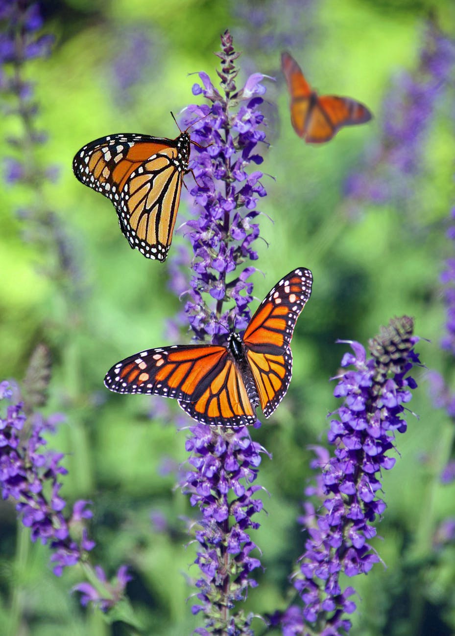
Even identical flowers or butterflies, when seen from different angles or distances, can provide a kind of echo effect. Photo by Cindy Gustafson on Pexels.com

When nature, or a designer, creates subtle echoes, it’s delightful because it allows us to make a connection that is “across” or “different from” the main show. For example, in poetry, one typically reads from start to finish. It is a linear experience. At the same time, there are often rhyme schemes so that words “echo” other words in an auditory sense. Poetry often uses metaphor which becomes a kind of “color scheme” for the room that particular poem created. 

In social interaction, if it is done skillfully, there are also echoes. Things are hinted at, shown only partially, or suggested. Slowly, a listener may become hooked on an attractive lure and end up swallowing, as they say, hook, line and sinker. If someone came right out and said up front, “Now look, I’d like to become dictator and what I need from you is to send me lots of money and thirdly, swallow any bull-crap I spew and actually, come to think of it, you might have to kill your granny and or your kids. On board?” No. Very few would take that on. Instead, it is hinted, intimated, insinuated that: “Everything that’s bad in your life — that’s not your fault! I know who is to blame and I can help right all those wrongs!” 

Echoes aren’t always bad in human interactions. Far from it. One of the most amazing things to observe is how a two or three person team in trivial pursuit or Who Wants to be a Millionaire throw twenty miscellaneous and various possible answers — all wrong — into the air and after  several minutes of being nowhere close to the answer, someone shouts: “The Mad Hatter!” And that is exactly right.

Photo by cottonbro on Pexels.com

In music, there are harmonies, themes, motifs, recapitulations, etc. In some musical settings such as cathedrals, the music may produce literal echoes. Regardless, themes are repeated, varied, morphed into something different and so on. 
So too, in architecture. If we try to imagine how buildings first came to be, it would be quite natural for them to have “echoes” because the entire building would be constructed of local materials. Stones, reeds, skins, bricks, logs, caves, etc. naturally lead to echoes because it’s all the same “stuff.” In modern skyscrapers however, it’s quite possible to design something with no echoes at all. The only point of the skyscraper is to be as efficient as humanly possible to make as much money as possible. What would be the point of “echoes”? Would it generate more profit? Sure, it might be an interesting experience for those who looked at our building. To which, a likely answer might be: “Who cares?” 

Photo by Laura Tancredi on Pexels.com

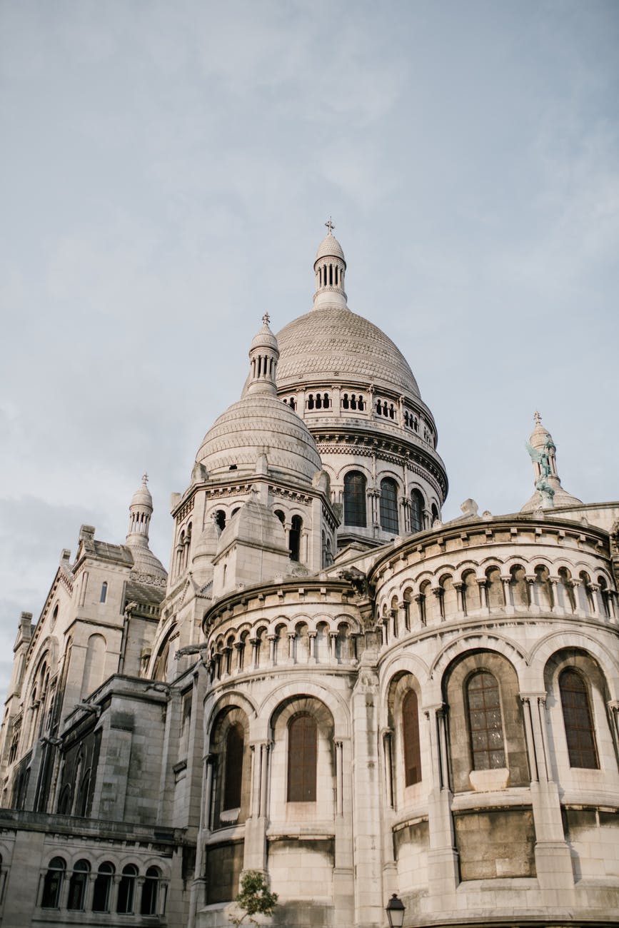
Isn’t it interesting that back when most people had next to nothing, they bothered to make cathedrals as beautiful as they knew how. But now that we have much, much more, we can’t spare the cash. (“We may be rich, but we are not yet the richest.”)

Photo by Julia Volk on Pexels.com

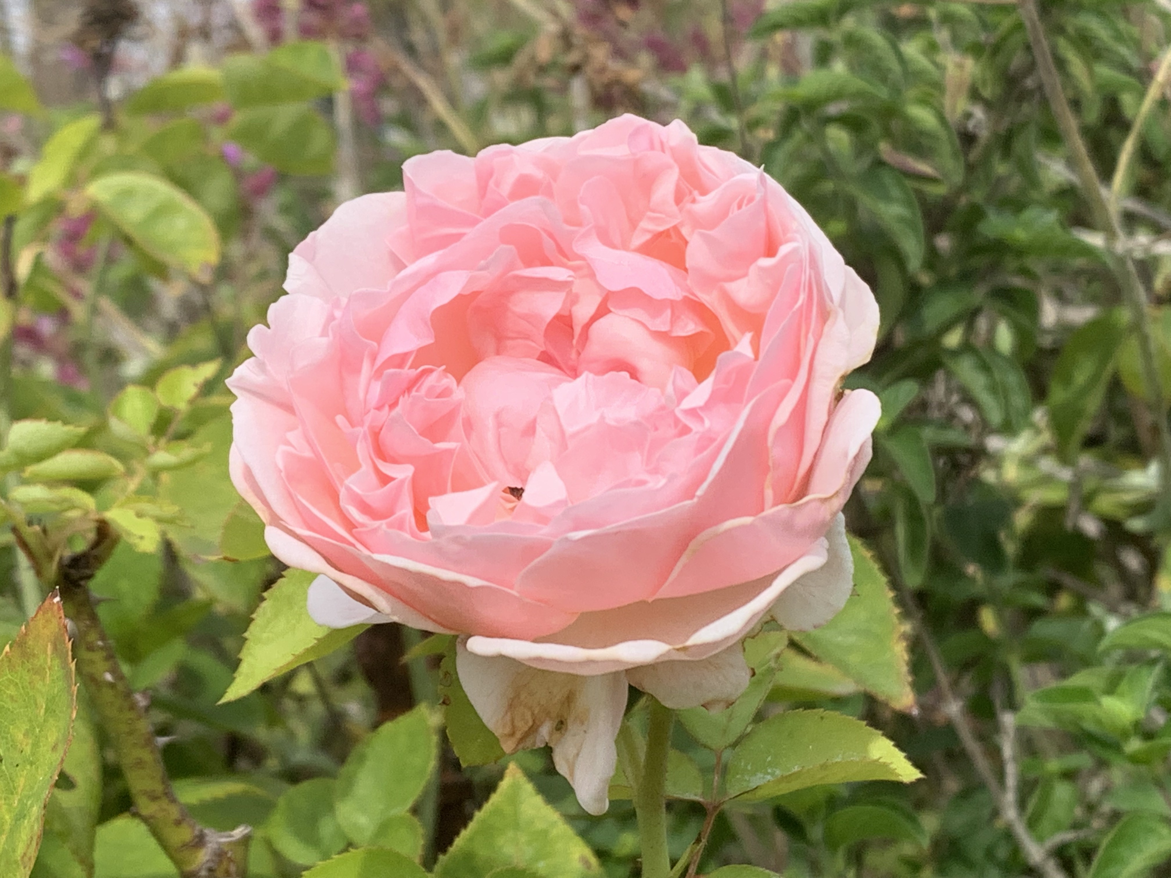
Nature is rife with echoes. Here’s one I have the privilege to witness almost every night. As the sun goes down, the light in the garden turns yellow. This means that flowers, trees, and so on will appear in higher contrast and in more golden light. A close up of white roses will look golden in the setting sun and so too will tree branches in the background. 

If you walk (or run, bike, etc.) through a garden or a forest, the experience will typically be full of echoes because you will walk by many individual oaks, beeches, roses, mayapples etc. each of which echoes to an extent all the others. In the same way that a poet puts rhyme, allusions, and other figures of speech to cause echoes both within the poem and with your memories, so too, a walk in nature will remind you of other previous experiences and of other plants and animals that you see earlier in the walk. The actions of walking themselves (or of wheeling, running, biking or cross-country skiing) are a kind of echo in much the same way that a steady rhythm in a poem causes echoes among all the stressed syllables and among all the unstressed syllables. 

—————————

Where do echoes occur in user interfaces? One of the few things that I think of are that logos associated with various pieces of software appear in different places and at different scales. For example, I recognize the small version of the Safari logo on my tool bar. To the right are open file locations in that browser. There is a small image of the landing page of each website, but each little icon also has a teeny version of the Safari logo. If I go to the Safari website, I’ll no doubt see other sizes of Safari logos. 

To the extent that developers use a common style guide, that also causes a kind of echo effect. I might see something to the right of my writing pane and say to myself:  “Ah, under ‘font’ I see a common widget next to ‘11pt’ — a widget consisting of an up and down arrow. I’ve see that before! I’ll bet I can change the font size with it. Clicking on the up arrow will make for larger font; clicking on the down arrow will make a smaller font.” 

To the extent that the use of various conventions causes correct patterns to be accessed out of my memory, those echoes seem mildly aesthetic and quite useful. Where else do you see “echoes” in user experience or in user interfaces?  Where might we include echoes in a new way that makes the user more productive? Where and how might they make the user experience richer? What might you do in your own behavior that could provide more pleasure to you and your colleagues via the use of echoes?

———————-

Listen. You can hear the echoes of your actions 

Ripples 

Myths of the Veritas: The Orange Man

True Believer

Do unto others

I can’t be bothered

Tit for Tat

It couldn’t happen to a nicer guy

Author Page on Amazon

Some suggested books. Are links themselves a kind of echo?

The Winning Weekend Warrior focuses on the mental game for all sports using examples from tennis, golf, baseball, and other sports. It covers self-talk, imagery, mental practice, strategy, tactics, & sportsmanship. http://tinyurl.com/ng2heq3

Turing’s Nightmares explores the implications and ethics of Artificial Intelligence through fictional short stories. http://tinyurl.com/hz6dg2d

Fit in Bits shows many ways to put more fun, variety, & exercise into daily chores and habits to help with strength, flexibility, fitness, and balance. http://tinyurl.com/h6c7fce

Tales from an American Childhood recounts early experiences mainly in the American Midwest in the 1950’s and relates them to contemporary issues and events. https://tinyurl.com/y9ajvz9j

Dream Planet. Where do you run when the whole world is crumbling under the weight of human folly? When the lethal Conformers invade 22nd century Pittsburgh, escape becomes the top priority for lovebird scavengers Alex and Eva.

https://www.barnesandnoble.com/w/dream-planet-david-thomas/1148566558

10A. Gradients

23 Wednesday Sep 2026

Posted by petersironwood in creativity, design rationale, essay, HCI, leadership, management, nature, poetry, politics, psychology, Uncategorized, user experience

≈ Leave a comment

Tags

aesthetics, art, beauty, books, Design, gradients, HCI, human_factors, painting, photography, poetry, TNOO, usability, user_experience, UX, writing

10A. Gradients

My first conscious memory of thinking about “gradients” was in college biology. Gradients of chemicals make a difference in terms of cell differentiation, our professor explained. 

For the past few days, I’ve been walking the garden on the lookout for “gradients.” As an experiment, I’m going to break up the discussion of gradients into sub-categories. 

Visually, all the various gradients look similar. I am categorizing them by the cause of the gradient. 

So, first, we have “Perspective Gradient” … as we look at identical or nearly identical items at different distances, they will obviously appear to have different sizes and different distances between those items. 

Second, we have “Light Gradient.” For example, a series of spheres or cylinders lit by a single source, the three-dimensional shape will result in a gradient of light and dark from most angles. 

Third, there are often “Color Gradients” for both animals and plants. 

Fourth, there are “Growth Gradients.” Color Gradients, are often a specific example of Growth Gradients. However, there are other types of Growth Gradients. For example, in many plants new growth is at the distal end and is smaller. Old growth is more central or more toward the roots; it is older, and is larger. 

Growth Gradients apply to many plants and animals. They often apply to organizations as well. Imagine a multi-national distributor with field offices in half the countries in the world. If they move into a new country, at first, there will only be a few people; perhaps housed in a small space. Sales will grow hopefully and with the growth, new personnel and space may be added. 

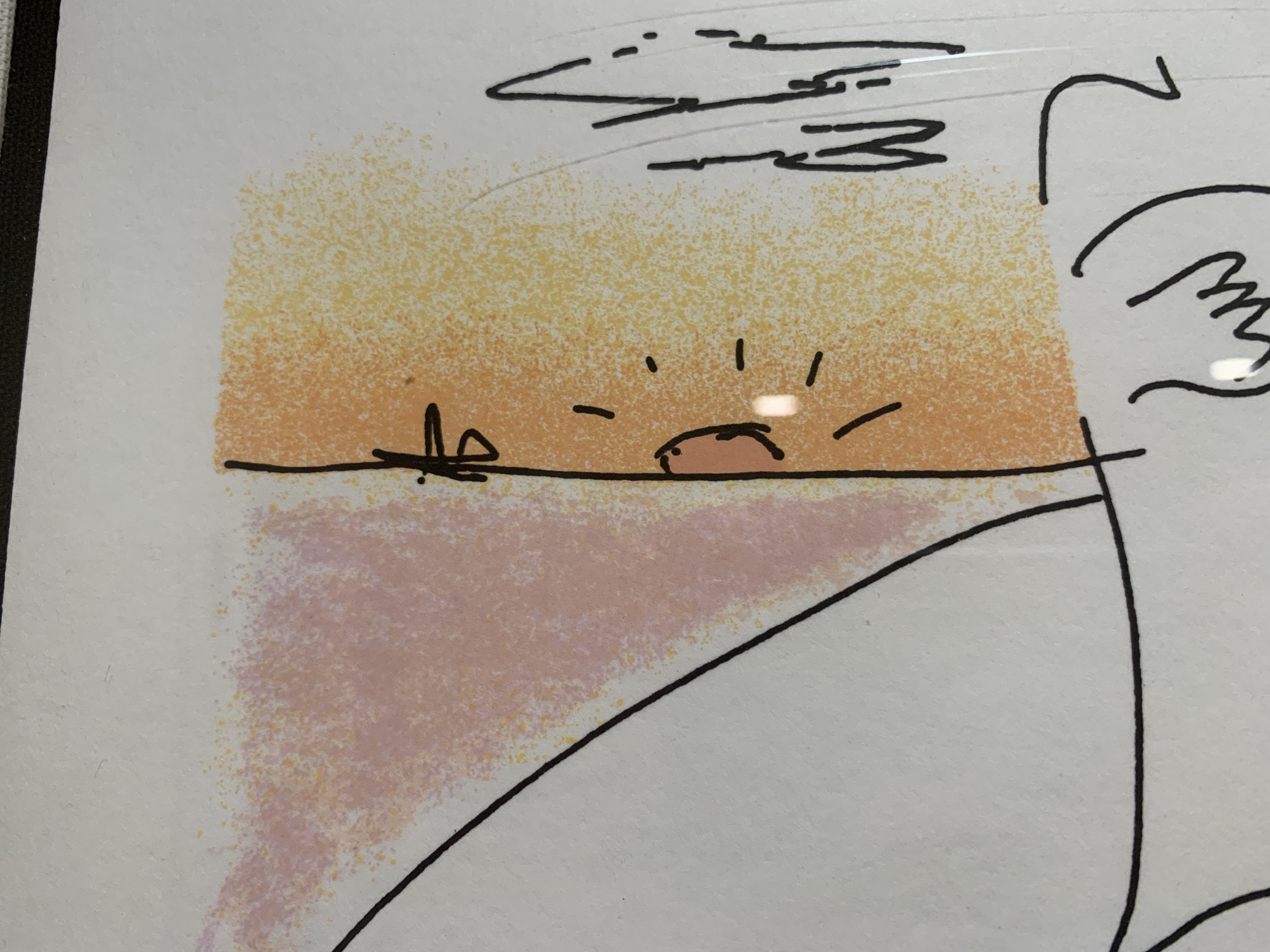
Conversely, Color Gradients can be quite intentionally added by the artist! Here’s a detail from a John Lennon lithograph. Note that “Boundaries” and “Gradients” reinforce each other. The Gradient makes the Boundary Stronger and vice versa.


There are also “Force Gradients” that appear in response to water, wind, gravity, magnetism, etc. One could argue that “Growth Gradients” are due to forces as well. Historically, gradients can arise from evolutionary pressures. These, in turn, are instantiated, in many cases, by chemical gradients of hormones that control growth. However, there are also many non-living cases of gradients.


Finally, there are “Intentional Gradients” that are put in by artists, architects, landscape gardeners, designers, and UX designers. 

Although the examples above are visual, there are also gradients in music. There are gradients in activity. 

Gradients are also present in narrative. Think of the rising passion between two lovers or the increasing tension and suspense in a mystery or horror film scene. 

Photo by Thirdman on Pexels.com

Are there gradients in User Interfaces? One example that springs to mind was in the “Audio Distribution System” and “Olympic Message System.” These were audio messaging systems from IBM that allowed subscribers to the service to leave an audio message to a person or distribution list “on a person’s phone.” (Of course, the message was really on a server and played upon demand.) The UI’s only visual elements were an ordinary touch tone key pad circa 1980 and possibly a small booklet or template with the various command options. Primarily, the user was meant to hear Prompts for actions. 

The gradient part came in the fact that the user could speed up the audio more and more as they became more and more familiar with it. That variable speed applied to prompts and also to messages. A typical user would experience slow messages, then faster messages, then, still faster messages, and so on.

In another IBM project, we built a “Personalized Education System” that would allow IT personnel to build a “Custom Course” for on-line learning that could vary continuously in length and difficulty. However, while each individual user could choose length and difficulty, they typically did not experience a gradient in that regard. By analogy, some insects may prefer to chew on new growth while others may like more mature leaves. An individual insect only experiences one “size & tenderness” yet the plant taken as a whole provides a gradient. Similarly, if you have a barbecue party again, you might offer up a range of options on how done you cook the burgers. In this case, we might say the BBQ service offers gradations though an individual burger is not a gradient. This isn’t strictly true. A well-done burger is fairly consistent throughout but a rare burger may be much more rare in the middle and charred on the edges. So, for that choice, there is a gradient of experience. 

Compared to the natural environment around me, which is positively thick with gradients, I don’t see (or feel) many gradients in any of the UI’s I interact with (games aside). The fisheye lens provides one way of introducing gradient into the UI. It produces, a kind of “Perspective Gradient.” 

https://citeseerx.ist.psu.edu/viewdoc/download?doi=10.1.1.124.1233&rep=rep1&type=pdf

It would be possible to put gradients into many of the visual elements of a UI. Would it make the interface look more like nature? Would it be more beautiful? Would it be distracting? 

——————-

Here’s a poem that illustrates a gradient of love. 

Wonder, wonder, who kept the wonder

Here’s a poem with a gradient of tension and suspense 

Late on the Interstate 

Here’s a story that exhibits gradient. 

As Gold as it Gets

What kind of gradients do you see in this poem?

Somewhere a Bird Cries

6. Good Shape

16 Wednesday Sep 2026

Posted by petersironwood in creativity, design rationale, HCI, leadership, management, nature, politics, psychology, Uncategorized, user experience

≈ Leave a comment

Tags

art, beauty, creativity, Design, flowers, Good shape, HCI, painting, photography, UX, writing

6. Good Shape.

Good Shape. Positive Space. These seem to be highly related concepts. Most of the pictures I used as illustrations of Positive Space could equally well illustrate Good Shape. A Positive Space is often composed of multiple good shapes arranged in a “balanced way.” 

In order to illustrate “Good Shape,” I decided to take some pictures to illustrate “Bad Shape.” Since I have surrounded myself mainly with nature or with artifacts that were intentionally designed to be aesthetically pleasing, it turned out to be more difficult than I imagined at first. The other issue is that when I take photographs, I (like most people) “frame” the picture so that “Good Shape” is clear. I began to intentionally brake that habitual way of framing with pictures of flowers that overlap. The natural beauty of flowers is so rich that, to me, even a quasi-random framing still results in a beautiful picture. 

This turns out not to be the case with artifacts however. 

Although some of the elements of this seem to have “Good Shape,” the overall composition lacks a coherent center. It seems to me to be an artificial “kludge” of colors, textures, and shapes and there is no overall “Good Shape.” 

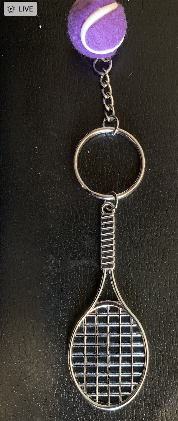
By re-arranging the elements into this form (above), to me, it seems to get closer to “Good Shape” but the purple “tennis ball” seems ill-proportioned and out of place. In “real tennis” there is a physical reason for the ball to be fuzzy but here, the fuzziness of the ball seems added on and arbitrary. 

Here too (above), the overall composition lacks “Good Shape.” The large semi-random dark blob in the middle has no real “Center.” The elements around the edges do not cohere or reflect off of each other. None of the elements around the edges are complete enough to have “Good Shape” except possibly the links of the small chain. 

Here is another example of quasi-random elements brought together into a single picture. Though to me, both the wood and the stone are in and of themselves beautiful, there is nothing about the composition that integrates into a whole. There is no center, no echoes, no alternating repetition, no levels of scale, and despite the nice texture of the stone and wood, the overall effect, to me, is lacking in “Natural Order” and in beauty. 

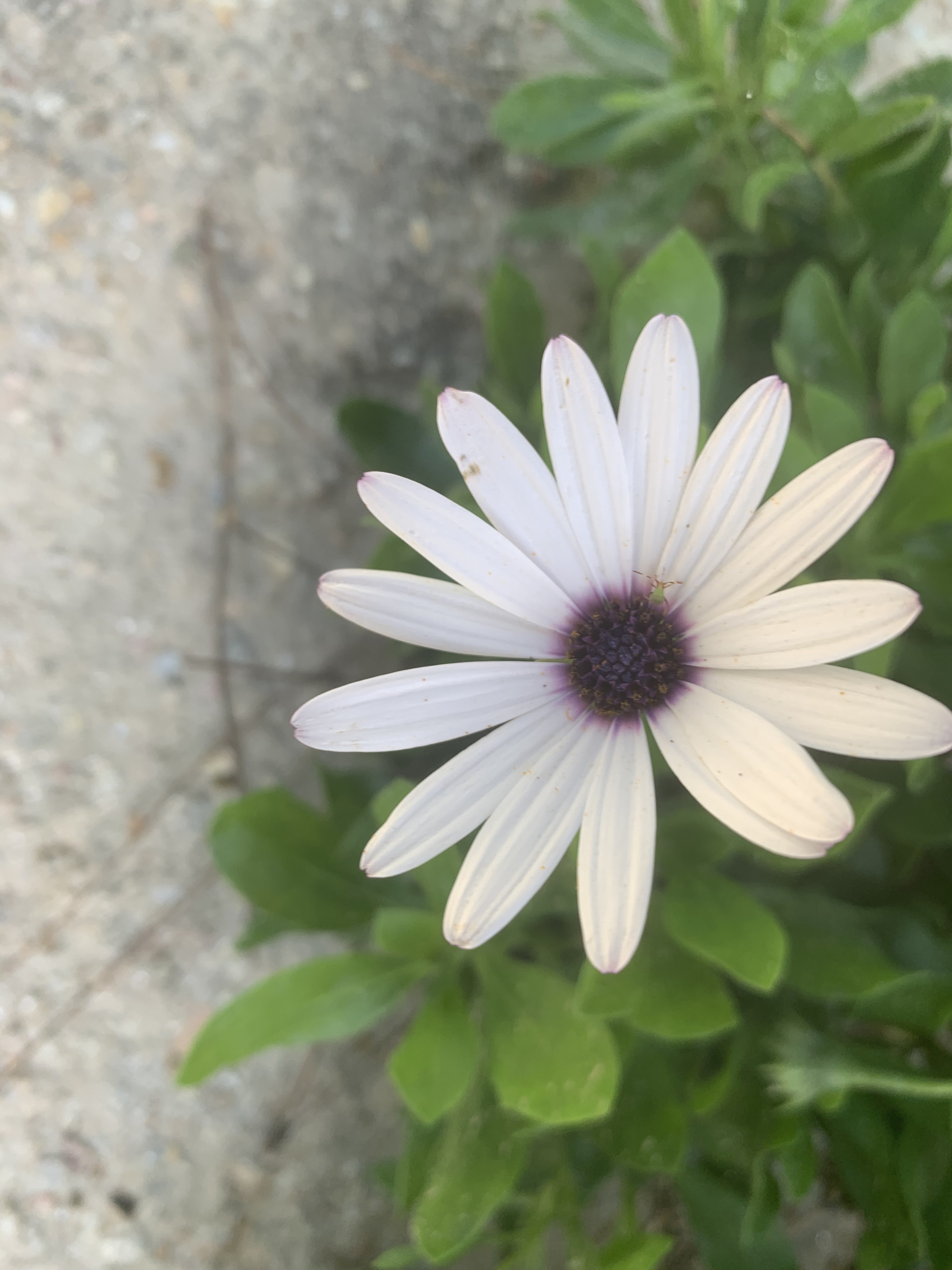
By way of contrast, the flower here seems to have a good overall shape reinforced by a Strong Center, Alternating Repetition, and each of the petals themselves has Good Shape. Around the flower, to me, is a “Positive Space.” Note that one of the petals seems slightly out of place. To me, however, this does not spoil the “Good Shape.”

The same can be said of these flowers. 

It isn’t necessary to have overall “simplicity” in order to have “Good Shape.” These flowers are not “simple” in shape, but they still have “Good Shape.” 

The bird on a branch shown above seems to me to have “Good Shape” even though it is (in outline) lacking symmetry. Though lacking symmetry in profile, the shape strikes me as “balanced.” I don’t perceive the bird as having to exert a lot of energy to keep from “falling off the branch.” The bird’s shape, like the shapes of most animals and plants is the result of 4.5 billion years of evolutionary history. 

Many people view some creatures as “enemies” and therefore “creepy” or “yucky” or perhaps even as dangerous. If you can set that aside and simply look though, I think you can see that “Good Shape” characterizes all sorts of animals (as well as plants). 

At a more abstract level, it even seems that natural animal behavior often shows beauty. That also seems characteristic of skilled human behavior. The Olympics show plenty of examples. It is hard to imagine an “ugly” baseball swing resulting in a home run. The runners, jumpers, throwers, gymnasts, tennis players, and so on produce “Good Shape” in three spatial dimensions and one temporal dimension. 

I play tennis several times a week. I’m not averse to winning a point even if the ball hits my frame, skids off to the net cord and drops over for a winner. But — I never feel as pleased by such outsized luck as when I hit a good shot that results from proper choice, preparation, and execution (and a history of practice and reflection). I never think of a lucky mis-hit as “beautiful.” 

The concept of “Good Shape” even applies to more complex human organizations and endeavors. Racism, for instance, to me is truly ugly. It is not based on truth, but on a kludge of lies masquerading as truth. White Supremacy for instance, basically says, “We’re white! That makes us superior! In fact, we’re so superior, that we insist every aspect of our society be tilted so we can be guaranteed a win!” 

Huh? 

Bad logic is never beautiful. 

The “Good Shape” exhibited by most plants and animals reflects both a long evolutionary balance of forces (phylogeny) and the development of a particular organism (ontogeny). When biology goes awry, as in cancer, the result is not beauty. The “logic” of cancer is that billions of years of evolution that allows our bodies to work harmoniously is put aside for short-sighted egotism. A random cell says, in effect, “I’m no longer going to do my part for the body as a whole. Instead, I’m going to grab all I can for myself and grow in an unrestricted way!” 

Such a cell, by making that decision, signs its own death warrant. Either the body destroys the cancer and therefore the cancer dies — or, the cancer prevails and in that case it destroys the life of the organism it was supposed to be a part of — and then it dies anyway! It’s an “ugly” decision both because it is disproportionate and because it is illogical. It aims to be self-serving, but it is not even self-serving. It guarantees its own death and kills more life along the way. 

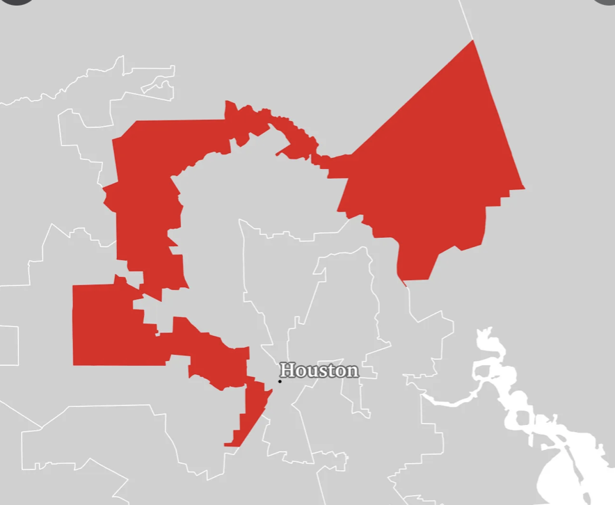
It’s the same, to me, with any dysfunctional human organization. If democracy is perverted by some people demanding that decisions be made so that they can have their way regardless of how it impacts the overall tree of life and the overall health of a city, state, or nation, it lacks “Good Shape” and instead becomes a distorted kludge lacking symmetry, lacking balance, lacking life. It is no accident that “Gerrymandered” districts do not have “Good Shape.” 

In extreme cases, not surprisingly, dictatorships have resulted in a war on truth, beauty, and life itself. It’s no “accident” that Hitler, Stalin, and Mao were each responsible for millions of human deaths. Their activities also show utter disregard for the beauty of the natural environment and the plants and animals of the planet. 

When it comes to User Experience, the most obvious way to apply “Good Shape” is to the visual elements of the interface — icons, windows, menus, tool bars etc. However, I think it also applies to the design process. Are the needs of all stakeholders taken into consideration? 

Do the various disciplines involved in design respect each other? Do people tell the truth and show trust? Does the company treat its users with respect and tell the truth in its various communications? 

If a company provides “free games” or “free services” that are purportedly for entertainment or education but the real purpose is to gather data to sell to advertisers or foreign powers trying to use the data to destroy democracy, it would seem to me that business model itself — the raison d’êtrefor the entire project is an “ugly shape” regardless of how pretty the icons are. 

What do you think? Do the concepts of natural beauty apply to the design of organizations and even governments?

—————————————

Christopher Alexander – Fundamental Property 6: Good Shape

Cancer always loses in the end

Fascism Leads to Chaos

Who Speaks for Wolf? 

Voter Suppression is Life Suppression

The Orange Man

Stoned Soup

The Broken Times

All We Stand to Lose

After All

Imagine All the People

Roar, Ocean, Roar!

The Dance of Billions

Photo by Pixabay on Pexels.com

Negative Space

02 Friday Jan 2026

Posted by petersironwood in creativity, management, psychology, sports, Uncategorized

≈ Leave a comment

Tags

AI, art, creativity, Design, HCI, illustration, music, negative space, painting, poetry, problem formulation, problem framing, sports, thinking, thought, UX, writing

Negative Space

When you look at a scene, it is natural to concentrate on the objects in the scene. So too, when one begins to design, it is natural to concentrate your attention on the things you intentionally put into the design whether those are menus, icons, images, banners, buttons and so on. You tend to give little thought to what is not there because, after all, there’s nothing there! 

IMG_9815

As your expertise grows, you will find it useful to spend some time and resources thinking about what is not there; the “negative space” if you will. In art, the “negative space” refers to the space around and between the objects. Often, paying attention to the “negative space” can result in a much more interesting and aesthetically pleasing composition. It is a concept that has applications far beyond artistic visual composition however. 

Consider music for a moment, or better yet, listen to some and you will note that the silence is just as important as are the notes. Increase or decrease the silence in a tune by a factor of two and it becomes a different, and in most cases much worse, tune. 

printed musical note page

Photo by Pixabay on Pexels.com

The same can be said of great acting whether on stage or in a movie. The silence while we wait for the actor’s response to some news — while they are saying nothing and possibly even showing nothing or very little on their face, can often be the most poignant and moving parts of the picture. If the actor reacts “too quickly” with no space, we can tell that the stimulus presented is something that they “trigger” on because they are upset about it or trying to deny it. The leading man, for instance, asks a seemingly innocent question on a first date, such as, “So, do you like French Cuis…” “NO!” she cuts in. The audience’s attention is immediately drawn to see what comes next. The response that is too fast indicates a “sore spot.” Did the leading lady want to become a French chef? Did she just end a love affair with a Frenchman? What is going on here? 

IMG_6022

On the other hand, imagine the leading man, says, “So, do you like French Cuisine?” One beat, two beats go by. No answer. A long pause. The leading lady’s face shows nothing. Perhaps she tightens her lips ever so slightly or frowns to the slightest possible extent. The pause continues. The leading man tilts his head as though to ask whether she’s okay. Finally, we come to expect a tirade about the French or French Cuisine or French wine or … something. Instead, after this long pause, the leading lady says nothing but punctuates her silence with something that sounds like a cross between a humorless laugh and a karate grunt. There are probably no words she could have said which would have intrigued us more than the non-response. We think, “What the hell is going on with her and French Cuisine?”  

IMG_9504

Speaking of French Cuisine, when you go to a fine restaurant, your focus is on the food. So too is the focus on the chef and the server. But the space is important as well. It is annoying when you are paying good money to have a nice dining experience and you are shown to your table, given menus and then ignored for the next twenty-five minutes. On the other hand, it is equally annoying when your server comes back every 30 seconds and asks, “Are you ready to order yet or do you need more time?” The optimal time to wait between courses is not always obvious either. Some people need or want much more time between courses. Maybe this nice dinner is all they have planned for the evening. The patrons are having a nice quiet dinner with good conversation. They are in no hurry. Just as one of the diners launches into a complex story or joke, the server comes over and interrupts to tell about the specials. Conversely, another foursome may be planning on attending a play and long pauses between courses may mean missing the first act. 

The negative space in dining is not just about the timing of events. It is also about the spatial arrangement of the food, the spacing between textures and colors. Often, the artistic arrangement is as much about the negative space as the objects on the plate. 

Sometimes, the food itself has positive and negative elements. In a meal with varied and complex and contrasting tastes, for instance, the rice or the bread can provide a kind of “negative space” between the tastier and more salient constituents. These neutral or negative elements allow more contrast among the salient elements than if the more salient elements were enjoyed right after each other. I’m reminded of a line from Kahil Gibran’s The Prophet:

“Let there be spaces in your togetherness.”

Negative space is important in architecture, painting, typography, cinematography, the design of user interfaces, culinary arts, music, and the design of other stimuli. It is also important in activity.

IMG_2769


One of the first popular video games was called “Asteroids.” In this black and white vector graphics game, you controlled a small space ship that shut bullets in the direction the space ship was aimed. All you could control was the speed and direction of the space ship and whether it was shooting. The screen also showed a number of large, irregular “asteroids” that you were meant to hit. When you hit one of these large asteroids with a bullet, it split into two moderate asteroids. When you hit a moderately sized asteroid with a bullet, it split into two small asteroids. When you hit a small asteroid with a bullet, it disappeared. If you got hit by an asteroid, you would die. There was also a flying saucer who came to hassle you. Anyway, I found that if I focused on all these floating asteroids and trying to not to get hit by one, it was a difficult game. For me, at least, it was much better to visualize a path among the asteroids and try to follow that path. In a way, concentrating on the negative space, helped. 

action athletes ball blur

Photo by Pixabay on Pexels.com

The importance of negative space in sports can hardly be over-emphasized. In American football, the back tries to find the holes to run through. In soccer, players seek paths between. In baseball, the hitter wants to “hit it where they ain’t.” In tennis, beginners often play only during half a point. Their attention is focused on the ball and the opposing player(s). They choose a target on the other side of the court and watch to see how well they hit that target. Just as their opponent begins to hit the ball they shift their attention to their opponent and watch where that opponent hits the ball, scurrying there as quickly as possible so as to hit the next shot. What does such a player do between the time they hit the ball and their opponent hits the ball? They watch! They want to see where the next ball goes. If you are young and fast and your opponent is not well skilled, you can often get away with this process. However, what higher level players do is something quite different though it may look similar. The good player has a target in mind but watches the ball while their mind has the target clearly in mind. By watching the ball, they are much less likely to mis-hit the ball. Furthermore, they are not giving away their intended target with their body language. Perhaps most importantly, long before their opponent hits a return shot, the good player thinks about the open spaces on their side of the court and go to cover the most likely of those spaces. 

Many otherwise well-skilled athletes only focus on the game during play. For example, many hitters on amateur softball teams, pay little or no attention to the game while their team is batting until they are “on deck” (almost ready for a turn at bat). This is absurd in the majors, but it’s even more absurd in amateur games. You should be taking this time to learn about the opposing pitcher and about the weaknesses in the opponent team’s fielders. Just because you’re not in the batter’s box doesn’t mean you can’t improve your play. Similarly, in tennis, you can use the time between points to think about tactics and strategy, as well as to mentally “reset” yourself if necessary. Some players wave their hands in front of their face after a point as a reminder/trigger to forget about what just happened and focus on the next point. Some will even turn away from the play, seemingly to talk with their “imaginary friend.” 

To close, a very short, short story based on true events in my first trip to Japan. 

tokyo tower behind black and white dojo building during daytime

Photo by Pixabay on Pexels.com

The Touch of One Hand Clasping

Japan, Tokyo, 1977. I walk crowded streets and beautiful gardens where care is taken for spaces as well as things that grow. I struggle — try to speak Japanese language but usually mispronounce “Key-Ray-Ee-Des” (It is beautiful) as “Key-Rah-Ee-Des” (It is dirty). I tip-toe through minefields of culture steeped in subtlety; lose huge chunks of flesh and karma with my thunderous, blunderous New York strides.

Shin-Ju-Ku: lights dim Times Square into grandmother’s fruit cellar. Row on countless row of Japanese stare hypnotized at small vertical pin-ball game called Pah-Chinn-Koe. This bright hustle bustle hassle hides deeper subtlety, deeper calm, inside, beneath, where foreign eyes can peer not.

I enter Tokyo subway. Then — she enters — total stranger, totally beautiful, black hair, endless eyes. I, of course, having learned small little in my many minefield walks, look everywhere but at her. Better, she looks everywhere but at me. We ride, totally not looking at each other. She stands in middle — nowhere to hold on to — unprotected, beautiful, vulnerable.

Suddenly, train lurches. Simultaneously: she shoots hand out to only spot I can possibly reach while I shoot hand out to only spot she can reach. Our hands clasp strongly for instant and I save her from fall. 

Slowly, we release.

Next stop, she rushes out. But — just before the doors bang shut, she turns — looks straight into my eyes. “Kohn-bahn-wah” she says (“Good Evening”).

Thus, Japanese beauty touches beyond body into very soul of clumsy Westerner.

———————————-

woman holding pink petaled flower

Photo by Đàm Tướng Quân on Pexels.com

Negative space….

———————————————-

Author Page on Amazon 

The Void

After All

It was in his Nature

Life is a Dance

Take a Glance; Join the Dance

Life Will Find a Way

At Least he’s Our Monster

What About the Butter Dish?

The Gods of Old

The Truth about Clouds and Gods

The Bubble People

Comes the Dawn

Is a Dream?

Good Morning!

Camelot is in your Heart

The Tree of Life

Inventing a New Color

30 Wednesday Nov 2016

Posted by petersironwood in Uncategorized

≈ 3 Comments

Tags

colors, invention, painting, short story

Inventing A New Color — A Chapter from Tales from an American Childhood

PicturesfromiPhoneChinaParisPrinceton 271

After my dad returned from World War II, he married my mom and nine months later, I was born. We lived in a number of places, but when I was about three and a half, we moved to Portugal. My dad headed up a tire factory there. I don’t remember much about Portugal, but I do recall going with him to some of his fancy dinners. For reasons I did not understand at the time, when I was five, my mother and I took the long ocean liner ride back to America without my dad. Mom and I lived with grandpa and grandma at their house. I attended a kindergarten in Firestone Park and had a very nice teacher. I loved kindergarten.

I missed my dad but liked grandpa and grandma. She told me “Old Pete” stories and we listened to radio shows such as Roy Rogers, Hop-along Cassidy, and Tom Corbett and the Space Cadets. “Little Grandma” lived there too. She was my grandpa’s mom and stooped over very tiny, very old, and looked like a Native American. Much later, I learned that that was because she was Native American or perhaps half Native American. I loved “Little Grandma.”

Grandpa worked as an engineer and designed airplane wings, among other things. Grandpa was also a painter and his beautiful and detailed oils hung in large wooden frames throughout his house. Mostly, these were landscapes but there were also portraits and my personal favorite depicted two warships firing cannons at each other while being tossed on giant waves. Grandpa taught me many things. Naturally, I wanted to return the favor. When I was about five, I overheard him saying that it was impossible to invent a new color. Well, I could definitely teach him something about that! I loved the idea of being an inventor.

In the middle of kindergarten, my dad returned from Portugal and re-united with my mom. He bought a house and we moved away to a different neighborhood from grandpa & grandma. I had to start school in a new kindergarten with all strange kids. The very first day, my new teacher decided that I would lead the parade and draped the rope of a large drum around my neck. I didn’t want to play the drum and I made that about as clear as I could to her, but nonetheless, I ended up marching around the room with the heavy drum around my neck. I hated kindergarten.

My dad worked as an engineer and my mom was a teacher so both of them were gone all day. They hired a housekeeper to take care of me. And, somehow, after the first day, I convinced my housekeeper that I did not need to go to kindergarten any more. This was fine with me because she was nice enough to give me my favorite lunch every day — a jar of maraschino cherries!  They were so sweet and such a pretty red. And, not only were the cherries themselves delicious. The jars proved to be perfect for my experiments! So, in the second half of kindergarten, I stayed home and instead spent my time inventing a new color to show grandpa. I had a paint set and I water and I had lots of empty cherry jars. It was all a matter of time and careful work. At last, I would be able to teach grandpa something. I love teaching.

After many weeks of careful work, I finally created a new color! When grandpa and grandma came to visit, I was ready. Under my bed were about 40 little jars of diluted paint. Thirty-nine of them were failed attempts. But one of them contained the prize. I carefully crawled under the bed and located my invention, pulled it out, and scampered into the living room where the adults practiced their buzz-talk.

Buzz-talk sounded serious and low but didn’t actually mean anything so far as I could tell. Surely, no-one could mind if I interrupted buzz-talk by announcing my invention. I proudly held out my prize to grandpa. Grandpa was very smart, so the fact that he did not immediately catch the significance of this jar surprised me. He merely glanced at the watery liquid in the maraschino cherry jar without comment.

I decided that I’d better clue him in. “Grandpa! It’s a new color!” He glanced at it again and said, “I’ve seen it before.” And just like that, he went back to buzz-talk!  Crest-fallen, I wandered back to my bedroom and placed the prize beneath my bed with all the failed experiments. Apparently, this was just another one. Despite this terrible turn of events, I hardly gave up. I just redoubled my efforts. I knew there was a new color out there somewhere and I would find the perfect mix and next time be successful! I loved the challenge.

Grandpa had already taught me that red and yellow paint made orange; that yellow and blue paint made green; and that red and blue paint made purple. So, obviously, most of my experiments involved various proportions of red and green, purple and yellow or orange and blue. Most of them ended up as fairly similar shades of gray-brown. But if I mixed very carefully, I produced not dull gray-brown but something with a slight tinge of something…new! I somehow found other jars because I needed more than just the supply offered by one a day lunch-time maraschino cherry jars. I didn’t think bigger jars would have anything to do with inventing a new color, but it was possible. After a few weeks, grandpa and grandma came over to visit again. And again, I interrupted their dull living room buzz talk by showing off my latest creation. This time, I was more apprehensive. The first time, after all, I had known for sure I had a new color. This time, I was uncertain. I waited for the right opportunity — that slight pause in the buzz-talk — to display my new creation.

“I’ve seen that,” Grandpa said and turned back to buzz-talk. I wasn’t yet old enough to argue. And, even now, years later, if someone claims they have seen a color and you think they have not seen the color, I am still not sure how to argue. Convincing other people is seldom an easy task and convincing them that their own perception is limited — that is extremely difficult. Many times, I have heard the old saw, “In the land of the blind, the one-eyed man is king.” I actually doubt that. I suspect in the land of the blind, the one-eyed man is more likely to be declared in league with Satan and end up being stoned to death.

Let’s think about this. Suppose you are the one-eyed person in the land of the blind. Say everyone is hungry and you see a berry bush a couple hundred yards away. Now what? Well, you could say, “Hey, everyone! I see a berry bush over there (uselessly pointing). Let’s go pick some berries.” Everyone else says, “What berry bush? I don’t feel one. I don’t hear one. I don’t smell one. There’s no berry bush. Be quiet and stop talking non-sense.” Alternatively, you could just quietly walk over to the berry bush and bring back a small quantity for everyone to share. Of course, if everyone went, you could bring back a lot more, but no-one wants to follow you. You bring back some berries but people would be suspicious. They might well think you had been hiding these and had many more you failed to share.

Similarly, if you saw a pack of hyenas headed your way and warned people, the blind might well think you were in league with the hyenas. After all, you were the first one to know about them. You must have told the hyenas where everyone was. At long last, if you were the one-eyed person, you might be pretty tempted to put out that other eye. Life would run a lot smoother for you. Alternatively, you could leave the tribe and live on your own. And, many people do make this choice, essentially. But it’s a pretty lonely life. You could try to patiently explain that just as sometimes they could smell things they could not feel and feel things they could not smell, and hear things they could not yet feel or smell, that you could “see”…ah, that’s the sticky bit.  How do you explain sight to the unsighted?

Of course, my grandfather was not blind. Far from it. He was not only an adult, with more power and experience and knowledge than a five year old kid. He was, in fact, an artist. He was an expert on color. I could see evidence of his expertise everywhere. His paintings adorned our house and his own. So, he probably was right about the particular colors I had shown him so far.  But that didn’t mean that I couldn’t invent one next time that was truly new. So, back to the lab, I went. I failed a few more times and eventually gave up. Inventing a new color really was impossible.

Or was it?

Many years later, I attended an art exhibit in Pittsburg. It featured many kinds of “modern art” including a very cool kinesthetic art exhibit. In one exhibit, I simply stood on a platform in front of a large rotating disk. I watched the disk rotate until quite unexpectedly, the disk was quite still and I was rotating the other direction!

Of particular interest were some extremely large extremely brightly colored canvasses which featured huge swaths of complementary colors. If I stared for a good long time at the super bright red and then moved my eyes over to the super bright green, the combination of temporal and spatial contrast produced an unearthly bright green, a “supersaturated” color impossible to produce by merely using one pigment. While I had not invented this, at least I now had experienced a color it was likely my grandpa never had. I could not really check this out though because he was long dead. Of course, I have met him in dreams many times and in the dreams he’s not really dead. It was all a big mistake. And, in my dreams, there are often landscapes painted in supersaturated colors that even he has to admit are new inventions. I love it when even the wisdom of elders may be mistaken and changes over time.

My grandpa knew that we humans are all mortal but he also knew that we still had some fragmentary art that was thousands of years old. Perhaps art provides a kind of immortality. When I was about ten, grandpa visited Europe and saw many of the oil paintings of the “Old Masters” that he had admired so much. He saw with his own eyes that, over time, the oil that they used turned yellow and the colors that they had used were transformed. Father Time himself invented new colors for these artists. When, he returned from Europe, he switched from oil painting to water colors. Beyond that, he limited himself to using only three pigments all of which were oxides of metals. He was also very careful in his choice of canvas for the same reason. He stuck to these constraints so that his paintings, unlike those of the “Old Masters”, would not yellow or fade with time.

Grandpa’s paintings were designed by an artist/engineer to be stable and unchanging over time. When Grandpa died, I inherited quite a few of my favorite water colors and I can testify that the colors were extremely stable over time. They remained stable, that is, up until the time we moved to California and almost everything we owned was burned up in a moving van fire. What was burned up included all our furniture, electronics, papers, and almost all clothing and paintings. All the carefully laid pigments of metals were altered forever. All of the work and effort were now white ash floating somewhere in the sky near Continental Divide Arizona. A little carelessness on the part of a trucker in too much of a hurry, perhaps, to check the lubrication and the whole truck went up in flames. Robert Burns comes to mind.

It seems to me that our country once comprised a long-standing collaborative work of art involving many artists and many colors. This was a painting of scale and magnificence, though not yet completed. Every shade of the rainbow and more besides swept from sea to shining sea. The painting combined portraiture and landscape, scenes of war and peace, city, country, rivers, lakes, deep woods, and shining plains. Yet, somehow, people became impatient with the progress of the painting. Maybe, they thought, the work would go faster if we just painted the whole canvas white. They no longer cared what the end result looked like. They just wanted to get done so we could move on to the next project. We really couldn’t take the time to make sure the bearings were lubricated. And, now, the transport burned up along with the painting. What’s left are scattered white flakes snowing down on the countryside. I love irony, but I loved the paintings more.

At some point, grandpa said something else to me about color. He said that most people look at color in the light but that there is also color in the shadow. And, so, despite the deepening, darkening shadows, I am trying to see the color hidden there in those shadows. It is too soon to know whether I am inventing a new color, inventing a new way to look at color, or just seeing what is actually an after-image — beautiful for now, but sure to soon fade to the dull white gray of old and sooted snow. Maybe one of us can invent a new color or a new way of painting or a new way of looking or a new way of helping people be less impatient with the slow careful progress required for a timeless, collaborative work of art. Inventing new colors is not easy work; that I can say for sure, as is restoring true color that has faded to a uniform and pasty gray.

Perhaps I’ll buy a jar of maraschino cherries.

author page on Amazon

Subscribe

  • Entries (RSS)
  • Comments (RSS)

Archives

  • October 2026
  • September 2026
  • August 2026
  • July 2026
  • June 2026
  • May 2026
  • April 2026
  • March 2026
  • February 2026
  • January 2026
  • December 2025
  • November 2025
  • October 2025
  • September 2025
  • August 2025
  • July 2025
  • June 2025
  • May 2025
  • April 2025
  • March 2025
  • February 2025
  • January 2025
  • December 2024
  • November 2024
  • October 2024
  • September 2024
  • July 2024
  • April 2024
  • March 2024
  • February 2024
  • January 2024
  • December 2023
  • August 2023
  • July 2023
  • May 2023
  • April 2023
  • March 2023
  • February 2023
  • January 2023
  • December 2022
  • November 2022
  • October 2022
  • September 2022
  • August 2022
  • July 2022
  • June 2022
  • May 2022
  • April 2022
  • March 2022
  • February 2022
  • January 2022
  • December 2021
  • November 2021
  • October 2021
  • September 2021
  • August 2021
  • July 2021
  • June 2021
  • May 2021
  • April 2021
  • March 2021
  • February 2021
  • January 2021
  • December 2020
  • November 2020
  • October 2020
  • September 2020
  • August 2020
  • July 2020
  • June 2020
  • May 2020
  • April 2020
  • March 2020
  • February 2020
  • January 2020
  • December 2019
  • November 2019
  • October 2019
  • September 2019
  • August 2019
  • July 2019
  • June 2019
  • May 2019
  • April 2019
  • March 2019
  • February 2019
  • January 2019
  • December 2018
  • November 2018
  • October 2018
  • September 2018
  • August 2018
  • July 2018
  • June 2018
  • May 2018
  • April 2018
  • March 2018
  • February 2018
  • January 2018
  • December 2017
  • November 2017
  • October 2017
  • September 2017
  • August 2017
  • July 2017
  • June 2017
  • May 2017
  • April 2017
  • March 2017
  • February 2017
  • January 2017
  • December 2016
  • November 2016
  • October 2016
  • September 2016
  • August 2016
  • July 2016
  • June 2016
  • May 2016
  • April 2016
  • March 2016
  • February 2016
  • January 2016
  • December 2015
  • November 2015
  • October 2015
  • September 2015
  • August 2015
  • May 2015
  • January 2015
  • July 2014
  • January 2014
  • December 2013
  • November 2013

Categories

  • AI
  • America
  • apocalypse
  • cats
  • COVID-19
  • creativity
  • design rationale
  • dogs
  • driverless cars
  • essay
    • guns
  • family
  • fantasy
  • fiction
  • HCI
  • health
  • leadership
  • love
  • management
  • nature
  • pets
  • poetry
  • politics
  • psychology
  • Sadie
  • satire
  • science
  • sports
  • story
  • The Singularity
  • Travel
  • Uncategorized
  • user experience
  • Veritas
  • Walkabout Diaries

Meta

  • Create account
  • Log in

Blog at WordPress.com.

  • Subscribe Subscribed
    petersironwood
    Join 653 other subscribers

    Have a WordPress.com account? Log in now.

  • petersironwood
    View site in Reader
    Manage subscriptionsSign upLog in
    Report this content
    Collapse this bar
Loading Comments...