• About PeterSIronwood

petersironwood

~ Finding, formulating and solving life's frustrations.

petersironwood

Tag Archives: leadership

What to do? Whom to Believe?

02 Friday Oct 2026

Posted by petersironwood in America, essay, leadership, management, politics, psychology, satire, Uncategorized

≈ Leave a comment

Tags

America, books, cognitive dissonance, deception, Democracy, fantasy, fiction, leadership, lies, politics, problemsolving, psychology, short story, thinking, truth, USA, writing

What to do? What to do? 

Everyone seems about to go for the throat. People are not sure whom to trust. Should they trust doctors who spend years and years learning about calculus, chemistry, biology and then more years in medical school learning about anatomy, physiology, and medicine and then more years as an intern and resident? Or, instead, maybe how about believing a yelling, screaming talk show host? Hard to tell? Maybe no-one ever taught us how to tell liars from truth tellers. There is no simple formula that will guarantee us to be 100% accurate, but maybe we can think together about it. 
——————-

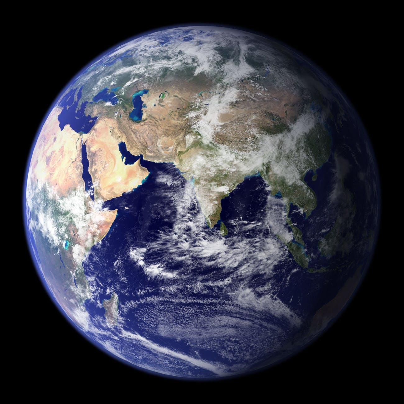
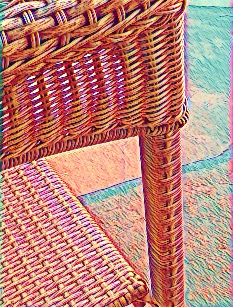
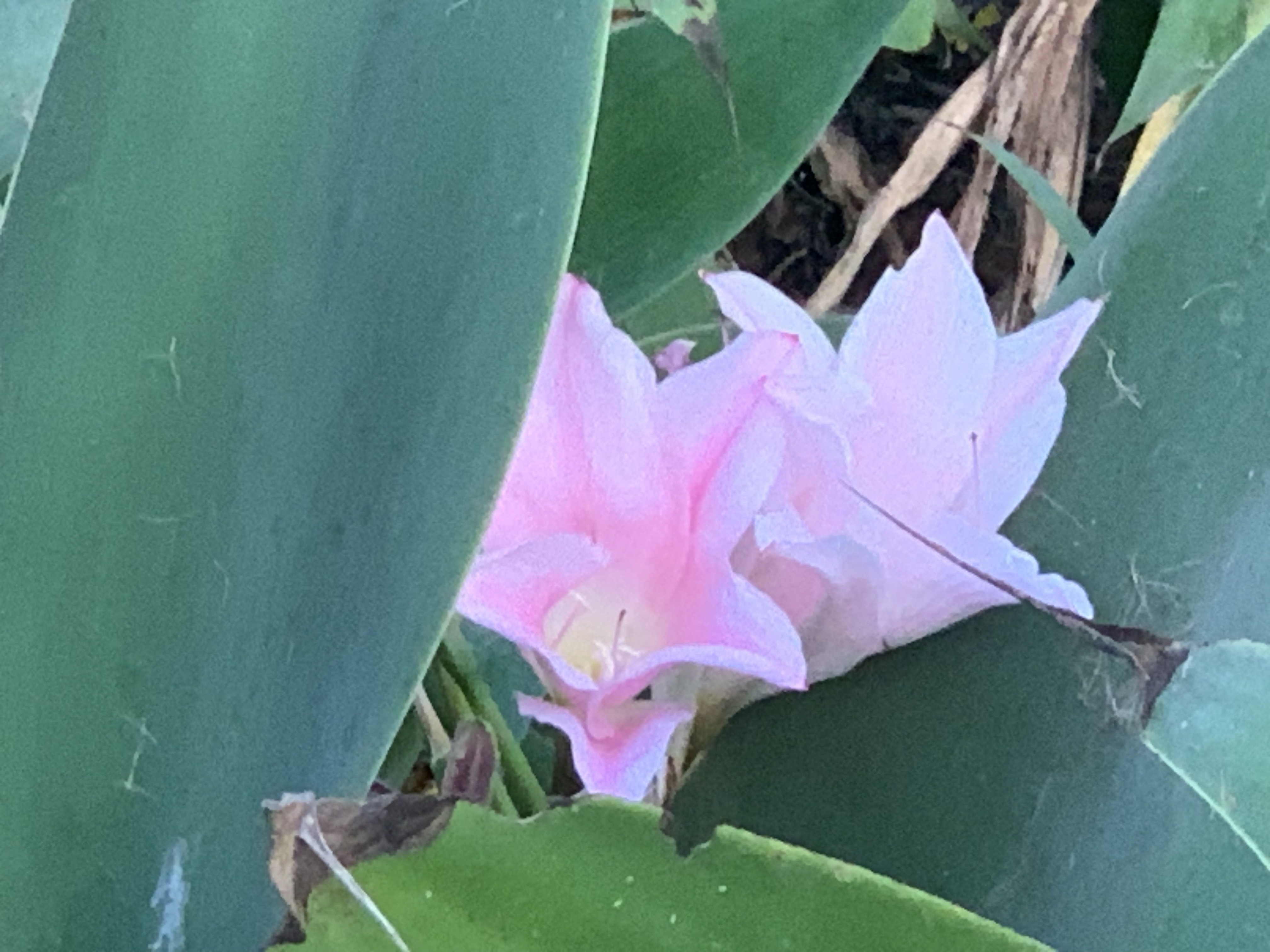
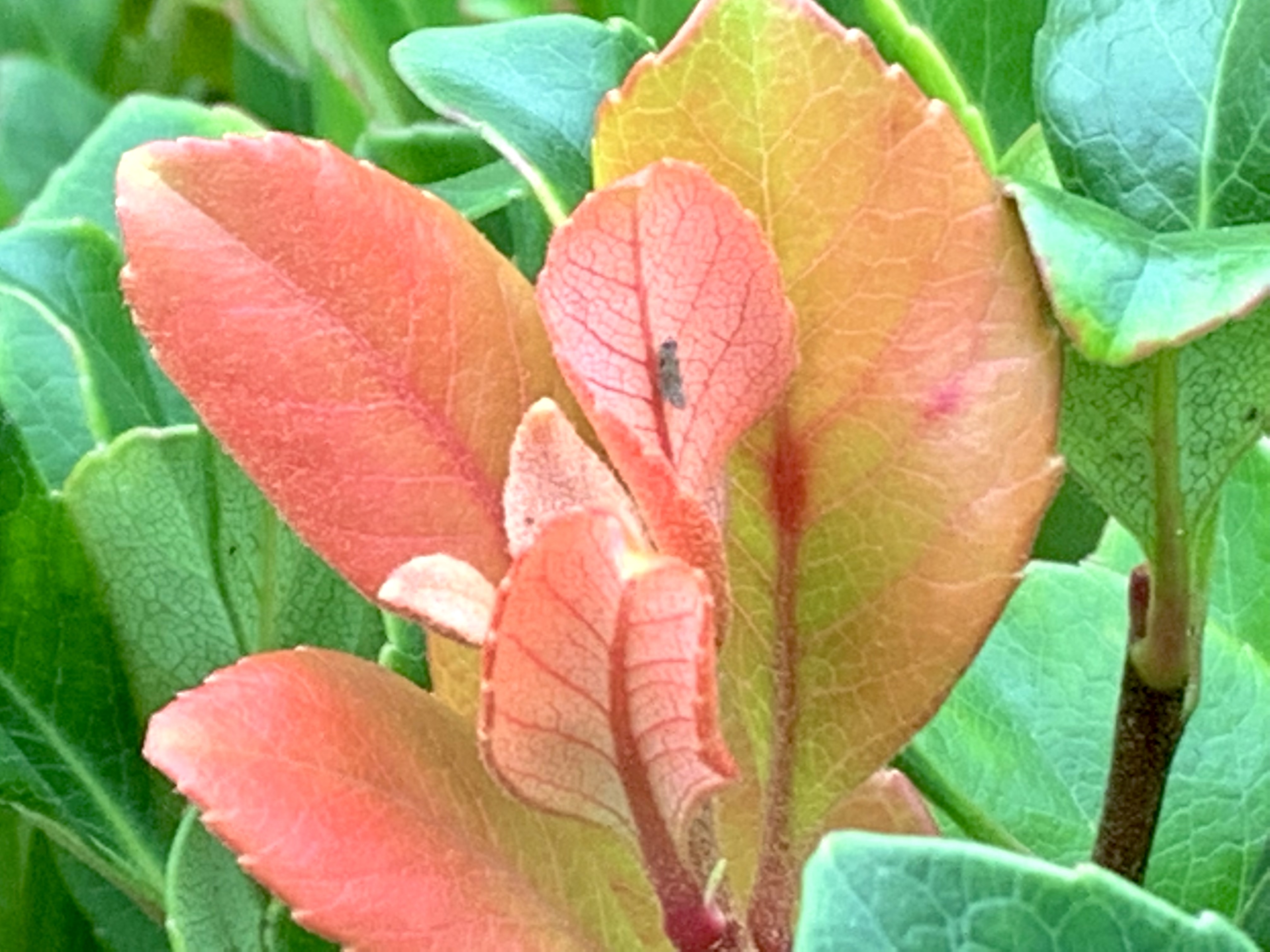
(Processed photo from one I took on Maui.)

Sam sat alone at the local sandwich shop, and began contemplating whether to have dessert after his nice lunch. It was a club sandwich, already a lot of calories, but what the hell, he thinks. With what the doctor said this morning, I should be free to eat anything I want, 

Three older guys — strangers — come in and waddle up to a table next to Sam’s. The trio have their menus but before glancing at them, they look up at a nearby TV and raise their fists. There’s a roar because someone has just run back a kickoff for a touchdown.

Andy says, “Wow! What a run back. I played in high school. Not easy running back a kickoff all the way into the end zone.” 

Sam regards the threesome. It’s hard for him to believe any of them were ever fit enough to play football, but most people do gain weight with age and lack of exercise, so — the portly stranger could be telling the truth.

Bob says, “I played in high school and college. I was good. Blew my knee out as a sophomore though and lost my scholarship.” This too seems plausible to eavesdropping Sam.

Cal says, “I played in high school, college, and went pro. I was fantastic. Probably the best runner and wide receiver and quarterback in the history of Ohio State. I played free safety too. Had more tackles than anyone before or since. If I were playing quarterback, no way that guy would have scored. I was the top draft pick five years running. A lot of quarterbacks these days are too chicken to tackle anyone. I would have nailed him. I was breaking all the records for the Houston Texans! But I got bored. Football’s really a simple game.” 

Sam thinks that Cal is bragging way too much. His story is a priori unlikely. Regardless of what he says or how he says it, the chances that a random person is the best anything at Ohio State is highly unlikely. He played back, wide receiver, quarterback and free safety? That’s unlikely. Extremely unlikely. 

Sam frowns and shakes his head. What does it mean to be the “top draft pick” for five years? If that were true, it would lead naturally to an explanation but none was provided. Further, quarterbacks may be told not to risk their careers making a tackle on a punt return. But what quarterback is on the field to defend a kickoff return? 

Houston Texans? Their first season was 2002. This guy looks to be at least 65. So…he was playing all those positions when he was 45? That seems highly unlikely. Got bored playing football? Possible, but again seems very highly unlikely. Football’s a really simple game? Really? 

Cal’s story has a lot of holes in it. Now Sam laughs that he ever swallowed any of it.

Bob says, “You played for the Houston Texans? You mean the Oilers?” 

Cal shoves his chair back hard enough to spill water on the table. He pushes on the arms of his chair and manages to stand up and he yells even louder, pounding the table to illustrate just how much he believes in what he’s saying. “I said Texans and I mean Texans! I was the best in the whole damned state of Texas! The whole south for that matter!”

Sam laughs to himself, thinking, Well, that settles it I guess. Cal is really passionate and loud so he must be telling the truth, right?

No. 

Wrong. 

People who are telling the truth do not feel the need to scream and yell and make even more outrageous claims the first time someone questions them. 

Sam snorts at the ridiculous claims and then has an idea. It takes Sam 20 seconds to pull out his iPhone and look up Eli Manning, the first name that popped into his head. 

Sam reasons: “If Cal were really the best football player in the history of Texas, he could have easily verified it by finding his own entry on the web  (likely on Wikipedia) and shown his table mates the entry. He would not have had to scream and yell and pound the table.”

Sam thinks: Okay, but no-one’s going to fall for a con man like that. 

{Really? Don’t be too sure, Sam}. 

Cal says to the approaching and attractive server: “Hey, darling. You look yummier than anything on the menu. Do you know who I am? Do you know what I did before I became a billionaire? Go ahead guys. Tell this lucky sweetheart who’s going to be leaving someone a very big tip!” 

Andy and Bob may think: Well, at least he’s going to leave the tip.

So, Andy and Bob outline Cal’s biography in the football hall of fame (where his name definitely does not appear should anyone actually look it up). 

Andy and Bob feel pretty sheepish about joining in this pack of lies. But Cal doesn’t think they have been anywhere near lavish enough in their description of him. Cal says: “Oh, on, guys! Make this girl’s day! Tell her she’s had the pleasure of serving the greatest football player in the history of the game! I don’t say that. That’s what everyone says! Right, guys?” 

Now Sam looks over and can see that Andy and Bob are both a bit embarrassed. They’ve gone along with Cal’s lies, but they don’t want to admit to that now because it proves that they are also liars. So they go along with the bigger lie. 

Andy says, “Yeah. Something else, right? He was OSU’s best player ever. Yep.” 

Bob says, “Uh-huh.” 

Cal shakes his head at Bob. “Come on! God, that’s the damndest weakest most candy-ass description I’ve ever heard, Bob. Tell her how many touchdowns I had. Just me. At OSU!” 

Bob looks bewildered. He knows it’s all a lie. People all over the restaurant are starting to look over at the table and more than a few are looking admiringly at Cal. 

Bob thinks to himself, Quite a few cute chicks here. Cal can’t handle all of them.”  He feels inspired. He takes out his iPhone and says, “Damn. Battery’s about gone. Let me just … here … fifty touchdowns. My God! That is amazing!” 

Cal rolls his eyes. “Give me that damned phone! That’s not right! It’s two hundred and fifty. Not fifty. Yep. There it is. I’m going to look up how many interceptions I had. Oh, crap! Battery dead. Hey guys, I gotta skedaddle. Here’s your crap cellphone back Bob.”

By now, Andy and Bob are both too embarrassed to come clean. Cal makes a big show out of taking out his wallet and thumbing a large pile of cash. He makes it look as though he’s leaving a big tip but actually only leaves a couple bucks. Andy and Bob split the entire bill.

Sam shakes his head slowly as he watches the three waltz out. Their server looks in awe of Cal and stares him out of the establishment. She even stares with some desire — despite the fact that Cal is grossly overweight and barely able to wobble his way out of the restaurant. But she imagines how once he must have been quite a specimen and it’s that image that is the real target of her desire. 

She also looks forward to finding out just how giant of a tip he left her. A few moments later, she walks over to the “billionaire’s” table and before opening up the placard, tries to guess how much it is. Several of her colleagues have come over as well. She turns around and tells them to back off. “It’s my tip, thank you very much” she says. “Just remember, I’m the one who tried to convince you all to share tips but you wouldn’t have any of it.”

They back off, slightly miffed. Now, the young lady has made up her mind it will be at least a hundred dollars, but she dares to hope that maybe he did something crazy and left her a thousand!! 

She notices her hands trembling as she opens up the placard and sees three bills. 

All ones. She looks more carefully at the bills. 

They

Are 

All 

Ones

Photo by Pixabay on Pexels.com

She blinks. She sets her jaw. She’s not going to let her colleagues see her disappointment or that he stiffed her, especially after he felt her thigh. All the way up. She forces a gleeful tone into her voice and jams the outer corners of her lips up towards her ears. “Oh, boy!” She shouts with intended but pretended joy. “This will buy me a new iPhone!” As she said this, each successive word increased in loudness and pitch. She sounded a lot like someone desperately peddling costume jewelry on channel 666 at 4 am.

Her colleagues glance at each other. She fooled no-one. They all realize she got stiffed. Each is torn between comforting her, making fun or her, or just pretending along with her. For the sake of keeping a reasonably happy work environment, they all choose to go along with her. 

Sam shakes his head and looks down at his melted coffee ice cream with hazelnuts. Now it’s just cold coffee with a lot of wet nuts. 

And, then Sam realizes that that is the least tragic thing that happened here today. In the length of time it took his ice cream to melt, one liar became seven liars. 

Same took a deep breath. This is what’s happening inside me, he realized. 

That’s how my cancer grew so fast. 
———————

A lot is not a little

The Truth Train

Try the Truth

The Orange Man

The Wobbly Man

Come back to the light side

My Cousin Bobby

Where Does Your Loyalty Lie?

Cancer Always Loses in the End

Imagine All the People

All we Stand to Lose

After All

Somewhere a Bird Cries

The Dance of Billions

An Open Sore from Hell

Roar, Ocean, Roar!

Author page on Amazon

The Winning Weekend Warrior focuses on the mental game for all sports using examples from tennis, golf, baseball, and other sports. It covers self-talk, imagery, mental practice, strategy, tactics, & sportsmanship. http://tinyurl.com/ng2heq3

Turing’s Nightmares explores the implications and ethics of Artificial Intelligence through fictional short stories. http://tinyurl.com/hz6dg2d

Fit in Bits shows many ways to put more fun, variety, & exercise into daily chores and habits to help with strength, flexibility, fitness, and balance. http://tinyurl.com/h6c7fce

Tales from an American Childhood recounts early experiences mainly in the American Midwest in the 1950’s and relates them to contemporary issues and events. https://tinyurl.com/y9ajvz9j

Dream Planet. Where do you run when the whole world is crumbling under the weight of human folly? When the lethal Conformers invade 22nd century Pittsburgh, escape becomes the top priority for lovebird scavengers Alex and Eva.

https://www.barnesandnoble.com/w/dream-planet-david-thomas/1148566558

Not-Separateness

28 Monday Sep 2026

Posted by petersironwood in AI, creativity, design rationale, essay, HCI, leadership, management, nature, politics, psychology, Uncategorized, user experience

≈ Leave a comment

Tags

AI, architecture, art, beauty, Design, development, ecology, governance, GreenNewDeal, HCI, human factors, IBM, leadership, painting, peace, photography, society, technology, TNOO, UI, usability, user_experience, UX, ux-design

Not-Separateness

It seems odd to specify a property of natural order in terms of what it is not. On the other hand, I cannot come up with a positive alternative that doesn’t bring other connotations with it. I think it’s related to “unified” or “integral” or “belonging” or “inter-related” but none of those seem quite so on the mark as does “Not-Separateness.” 

Christopher Alexander’s degree from MIT was in architecture. Part of the reason he may have chosen this particular term is in reaction to some examples of architecture in which the architect seems to be in the business of constructing a building whose primary purpose is to make them famous regardless of what that building does to the neighborhood or its occupants. 

Photo by BROTE studio on Pexels.com

Imagine Mr. Bigg designs a house that is a perfect black cube set on on vertex. In effect, this design says to me: “I am BIG. I am Mr. Bigg! I am a genius! You would have never been brilliant enough to design a house that is a cube on its vertex! You would have wasted your time and done something mundane like placed the cube on the ground on one of its faces. Anyone could think of that! But I put it on a vertex!” Indeed, we may easily imagine that he says words to this effect when his interview is reported on in the (mythical) architectural journal entitled, Things that look different! 

“Mr. Bigg, you made the Bigg House out of black steel and black glass. Some critics have argued that this doesn’t fit with the existing neighborhood of stone cottages with thatched roofs.”

“Of course, little minds will always criticize Bigg ideas.” 

“Yes, yes. It also means that the construction costs of the house were quite high. And, the estimated costs of heating and cooling are much higher as well.”

“Nothing that a worthwhile (i.e., wealthy) client can’t afford.” 

“Some have also argued that it is inconvenient for the occupants who have to walk up and down at a steep angle and that furniture such as dressers, tables, chairs, and beds do not accommodate well to the tilted walls.” 

“Let me ask you a question. Would you have ever thought of putting a cube on its corner? No. I didn’t think so!” 

Of course, this is exaggeration.

But not much. 

We would hope that User Experience designers take into account the users, their tasks, their contexts, and the way in which their designs interact with other related artifacts, people and processes. We would hope that applications and artifacts and services are all designed with the property of “Not-Separateness.” 

In the early 1980’s, I worked in the IBM Office of the Chief Scientist. My main assignment was to get IBM to pay more attention to the usability of its products. As part of that process, I visited quite a few IBM development labs around the world and spoke to many development teams. On many of these visits, I was accompanied by the Chief Scientist, a brilliant physicist, who “got” usability. 

On one occasion, we watched a new printing technology. Instead of printing out black printing on a white sheet of paper sized 8.5” x 11” or A4, this printout was of no standard size. The printing was black on a shiny silver sheet that curled severely. The Chief Scientist asked the head of the development team how they envisioned this being used. 

Chief Scientist: “Once someone printed this out, what would they do with it?”

Answer: “Oh, anything they liked.” 

Chief Scientist: “I mean, would people tape this into a notebook or paste it? Or would you imagine notebooks that would bind such paper?” 

Answer: “It’s not up to me to decide how people would use it. Doesn’t it look cool?” 

Another type of answer we heard more than once to the question, “How would this be used?” 

— “Oh, it’s a (replacement/upgrade) for this other IBM product.” 


“But who would use it and for what?” 


“It has three main components. Would you like a description of the components?” 

Photo by Andru00e9 Ulyssesdesalis on Pexels.com

Of course, there is a place for “playing around” with technology and thereby discovering things which someone else may find a use for. But in design and development of a product or service, having a clear notion of context of use and the users and tasks is fundamental. Of course, other users may appropriate a product or service for purposes beyond those envisioned by the original designers. That’s cool. 

What’s not cool is designing a device that is to be used in the bright outdoor sunlight and then testing the display in a typical office environment. Have you ever run across something like that? I have. Many times. At ATMs, Gas Stations, and outdoor display maps.

A more subtle lack of contextualization in design occurs when the design team fails to realize how many interruptions happen to the user while they are trying to accomplish a single task with the new application. If you “test” the application while the user is in a quiet “usability lab” and they can give your tasks their undivided attention, then necessitating them to remember the invisible internal state of “Insert” versus “Edit” mode may not be a big deal at all. They will simply remember. But in their office environment, they may be interrupted by a phone call, a message, or their boss entering their office and asking a series of detailed questions. If they now go back to the task at hand, there is about a 50-50 chance that they will correctly guess whether they are in “Edit” mode or “Insert” mode. 

A design which shows the property of Not-Separateness is the natural result of a process which shows not-separateness. Here are a few common ways to help ensure the design process grows organically from the users and their goals & contexts. 

* Put people on the design team who are familiar with the users, and/or their tasks, and/or their contexts. 


* People on the design team observe people engaging in the relevant processes, whenever possible, not — or not only — in a “Usability Lab” but in the actual work environment. For instance:

  • Observe people actually using product P (or service S) in version N so that version N+1 can be better attuned to the needs of the users.
  • Have people think aloud while doing this.
  • Gather and understand feedback from service calls and help desks and customer complaints in order to improve over time. 

There will be benefits to a company who takes such approaches beyond initial sales. If you’ve done any gardening, you will appreciate that the quality of the tomatoes you enjoy eating is related to the quality of the soil and the quality of the care you give the tomatoes. Similarly, a product or service that has the quality of Not-Separateness will not only be useful — users will fight to keep your product or service. It becomes integrated with the environment. To change the brand means that they will have to change the way they work; possibly even with whom they work. Not-Separateness is likely a path to what business people like to call a “Cash Cow.” 

If you’ve ever walked through a neighborhood after a hurricane, you’ve likely seen many uprooted trees. When you look at the roots of an uprooted tree, what do you see? Of course, you see roots. But what else? You see rocks and soil all around and embedded into the roots. They are Not-Separate. In a hurricane, there are typically not only high winds. There is also a lot of rain. The trees are hit with a double whammy. The wind pushes the tree but the rain weakens the solid soil in which the tree is embedded. It is the combination that makes it very difficult for the tree to “hold on” and keep from falling over. 

Living things, just like us, have a 4.5 billion year history of living. The living things adapt over time to their environment and they mold the environment to their needs. They are not separate. Flowers appeal to the insects who pollinate them. The insects who pollinate them are adapted to the characteristics of the flower. A horse adapts to their rider and the rider adapts to their horse. A product or service must have a design that serves the needs of its stakeholders. For a product or service to have maximum beauty, utility, and longevity, it must also have a way to adapt to the changing needs of the users and other stakeholders. At the same time, if the users and their organizations adapt to the product or service, then true Not-Separateness is achieved. 

If you want to skimp on designing your product or service, you can make it more separate, more divorced from its context, its users, and its tasks. Of course, if you do that, you also make much easier for your users to abandon your product and switch to a new one. 

Another way to think about this in terms of systems theory is where you draw the boundary. If you draw a sharp boundary around your product, you may find that, over time, your product becomes ever more peripheral to the community you’re trying to support and your product is ever more fungible with others in its class. On the other hand, if you draw the boundary around the product or service and the people and organizations who provide the product or service then, you are on the path of ever tighter interconnect. 

“Who Speaks for Wolf” is a Pattern in a Pattern Language for Collaboration and Cooperation. It is based on a Native American story and shows the importance of making sure that knowledge and perspectives of all relevant stakeholders are taken into account when a change is contemplated. Who is “relevant” may not always be obvious, but, in my experience, many more projects fail or are delayed because of too limited a view than of too broad a view.

Who Speaks for Wolf

Not-Separateness is not only a quality of good design in terms of not overly separating the context and users from the product or service. It is also a good quality for the organization that produces products & services. Of course, some people today must manage a giant amorphous “organization” of tens of thousands of people so they set up divisions, and departments, and groups, and teams, and positions etc. There may indeed be a “UX Department” and a “Software Department” and a “Hardware Department.” That’s all fine. But it is counter-productive if the UX Department sees itself as separate from the rest of the company. To a great extent the success of the UX Department depends on the success of the Hardware and Software Departments. The Sales Department’s success will, of course, depend partly on the skills of the Sales Department. But it will also depend on the success of the UX Department, HW, SW and Services. 

Have you ever had a paper cut? It isn’t just the skin on a quarter inch of the inside of your ring finger that’s cut. You’re cut! It isn’t just that the finger feels pain. You feel pain! That causes you to take steps to ameliorate the pain and to try to make sure it doesn’t happen again. That’s why empathy in leadership is important. A leader must feel empathy for all, or the organization will disintegrate from lack of Not-Separateness. At some point, a raccoon may chew off its own arm in order to escape a trap. 

But it isn’t the first thing that occurs to them every time they experience a thorn in the paw! 

The raccoon doesn’t say to itself:  — “that paw is giving me pain! I’m going to chew it off! Then, it won’t hurt any more.”

Photo by anne sch on Pexels.com

Evolution did not evolve a raccoon that acts that way. Self-mutilation exists but it is typically a last resort.

But not for corporations. It is the first thing they think of:

“Our (you name it) Department is not performing well. Let’s lay them off and outsource it. Better yet, we’ll replace it with AI!”

What does that say to every thinking employee in the entire corporation? It says:

“You know what? All this talk about teamwork and pulling together is a total bunch of bull$hit. You cannot trust management to do what’s best for everyone. You can only trust them to do what’s best for them.” 

Living forms in nature are living forms. Their parts have severe Not-Separateness with the other parts of that form. Often, as in well-functioning families or teams, that extends to all members of the group. 

Not-Separateness is essentially deep cooperation. I give to the larger community by becoming a part of it and doing my part in it. I lend strength to the community. In return, I gain strength from that community. It is not a zero sum game, of course. The community, if it is functional, is much stronger than the sum of the individuals in that community. 

This is so deeply embedded in 4.5 billion years of evolution that it does not surprise me that we recognize beauty as being even more beautiful if it is not separate. Not-Separate enhances beauty because, like all the other properties, it is essential to life. 

Eventually, if humanity is to survive, we will realize that Not-Separateness applies to all of us. We are not there yet. But that doesn’t mean we cannot appreciate and design Not Separateness in our products, in our services, and our lives. 

Photo by Pixabay on Pexels.com

—————-

The Declaration of Interdependence

How the Nightingale Learned to Sing

Roar, Ocean, Roar

Imagine all the people

Cancer Always Loses in the End

Ripples

Author Page on Amazon

Thomas, J.C. and Kellogg, W.A. (1989). Minimizing ecological gaps in interface design, IEEE Software, January 1989.

Thomas, J. C. (2012).   Patterns for emergent global intelligence.   In Creativity and Rationale: Enhancing Human Experience By Design J. Carroll (Ed.), New York: Springer.

Thomas, J. C. (2001). An HCI Agenda for the Next Millennium: Emergent Global Intelligence. In R. Earnshaw, R. Guedj, A. van Dam, and J. Vince (Eds.), Frontiers of human-centered computing, online communities, and virtual environments. London: Springer-Verlag.

Thomas, J.C. (1985). Human factors in IBM. IBM Research Report. RC-11267.  Yorktown Heights, NY: IBM Corporation.

Simplicity and Inner Calm

27 Sunday Sep 2026

Posted by petersironwood in Uncategorized, psychology, management, creativity, politics, nature, design rationale, essay, user experience, HCI, leadership

≈ Leave a comment

Tags

aessthetics, architecture, art, beauty, Design, HCI, human factors, leadership, life, lifestyle, management, painting, photography, TNOO, usability, user experience, UX, writing

Simplicity and Inner Calm

(Christopher Alexander, architect and city planner, proposed fifteen properties as characteristic of natural order. I’m considering them one by one in terms of society, design generally, and user experience in particular. “Simplicity and Inner Calm” is number 14.)

Photo by Nikolay Ivanov on Pexels.com

“Send me $50,000 and I’ll enroll you in a two year course in Simplicity and Inner Calm. All you have to do then is follow the twenty-five hundred rules on the Path to Enlightenment while renouncing everything else.”

Somehow, that does not seem to be in the spirit of simplicity and inner calm. Some of the properties I discussed earlier are closer to being about something “out there” that is somewhat measurable; e.g., levels of scale, boundaries, alternating repetition, roughness. Simplicity and Inner Calm are characteristics of things “out there” but they cause or at least resonate with simplicity and inner calm within a person. 

I don’t think it’s reasonable to expect a place to enforce a particular emotional state. If someone arrives at a beautiful still lake with hate and rage in their heart and possesses a determination to stay mad by God because he deserves to be mad! Then the mere presence of beautiful scenery won’t calm them in some immediate and magical way. But, I would bet money that they would be less upset an hour later than when they arrived. 

Photo by Andru00e9 Ulyssesdesalis on Pexels.com

Meanwhile, let’s imagine their identical twin also had an identical quantity of rage in their heart and arrived at a loud buzzing booming construction site and had to sit there for an hour. Such a setting, I would imagine, would do nothing to calm them and might make them even more enraged. 

Photo by Leonid Danilov on Pexels.com

Of course, as any therapist can tell you, what you do inside your head often has more to do with how you feel than does the objective situation. I certainly believe that. Yet, I also believe that situations out there make a difference on average. In my experience, being in a safe situation surrounded by natural beauty tends to make nearly everyone feel better. 

Not all situations “work” equally well for everyone, but for most of the people I have interacted with, views of distant mountains; calm clear lakes; ocean shores; a clearing in the woods — especially if there is a calm animal there; a single tree on a small hilltop — these tend to induce a feeling of simplicity and inner calm. 

There are two things that have amazed me for a long time about natural settings. I think they both relate to why natural settings seem to produce more simplicity and inner calm. 

The first mystery is auditory. I have heard the calls of many creatures in nature. Most are, in and of themselves, attractive. Some are beautiful. A few are more annoying sounds. But for me, at least, they never seem to clash. Walking through a field and forest, I may hear insects, frogs, and a dozen species of birds. But none of them clash. Fancifully, I could say that the auditory sphere in a natural setting reinforces the reality that all life is kin. I am of this world. Wilderness was the home of my ancestors and yours for four billion years. We are all instruments in one orchestra. That adds to inner calm.

The second mystery is visual. I’ve walked through many natural settings and have seen what must be every color possible to see. But the colors never “clash.” How can that be? It’s one thing to mix and match greens and blues. They don’t really seem to clash that much even in artificial settings. But what about pinks, reds, oranges? I’ve seen plenty of people wearing clothing that clashes and likely been guilty of it myself. But autumn leaves? They are all over the place chromatically, but they never clash. This also adds to inner calm.

Photo by Jacob Colvin on Pexels.com

I think the genetic reason that clashes are not prevalent in nature is that we co-evolved with the environment. Perceiving harmony in what is would have been adaptive in two important ways. First, since harmony is the natural state, feeling good while surrounded by harmony would mean that you would feel good most of the time. As Harry Potter once put it, you would have something worth fighting for. If you enjoy life, then, when the going gets tough, you are more likely to tough it out.

Second, when things go sideways in external reality, you would quickly notice the disharmony. While normally, you would feel peaceful, when the birds suddenly start fleeing in one direction and squawking, your feeling would change and you would be more likely to prepare and therefore survive whatever comes next. 

These reasons are manifest in some of the other fifteen properties. For example, the roughness of shape of autumn leaves means that there will be natural variation in color as seen even if they are actually identical (which of course, they are not). Having distributions of color is a kind of “roughness” characteristic of nature’s colors. Clothing on the other hand is another matter. The goal of mass production is lack of variability. So, 10,000 items are precisely the same color (or as close as humanly possible). If one is slightly off, it is noticeable. If each of the 10,000 items were part of a very broad, multidimensional distribution, being slightly more extreme than most would not produce a perception of clash. 

That, to me, is also the problem with monoculture as a social philosophy. I delve into this in more detail in the blog post — “A tight flock united by division.”

A tight flock united by division.

Briefly, the more everyone is supposed to “toe the line” to a particular way of doing things; e.g., which restaurants to go to, which shows to watch, which religion to believe in, what clothes to wear, what food to eat, etc., the more intolerant the society becomes. And the more intolerant it becomes, the more people try desperately to adhere to the middle of the crowded road they share with everyone they know. Everyone who does anything differently comes to be seen as a reproach to the lack of individuality in the middle of the road. And the people who insist that everyone must stay in the middle do not want to move. Not only that. They insist that they are exercising their freedom of choice by being exactly in the middle as determine by everyone else and not at all by them. It is rather humorous at one level and rather pathetic at another.

But just as such sharp and arbitrary boundaries in artificially produced goods mean clashes are more common, so too in human societies, when there is a group that insists everyone be exactly like them and, at the same time, insist that they are expressing their freedom, clashes are inevitable. Harmony and truth are no longer conceived of as being desirable. When people reject the resolution of conflict via agreed upon rules of law, what results is inevitably chaos and death. It is almost the polar opposite of Life. 

Photo by Anna Tarazevich on Pexels.com

Some epidemiologists think the various recent explosion in the variety of pollutants that we are all subject to has resulted in a much higher incidence of auto-immune diseases and allergies. The immune system sees so many different invaders, it has trouble distinguishing real threats (streptococcus, covid, cancer cells) from imaginary ones (peanut oil, cat dander, tree pollen). 

In similar fashion, people stuck on a thin sliver of what they feel is “normal” feel assailed from all sides. They can no longer distinguish real threats (COVID 19, Climate catastrophes, racial inequities) from imaginary ones (chip implantation via needles, Medicare for all, mask mandates). Clash. Clash. Clash. No “Simplicity and inner calm.” 

But from their perspective, there would be “Simplicity and inner calm” if only everyone were just like them! Most will deny this, when put so baldly, but that is essentially what they strive toward.


There can be many such factions, all with different rigid and implacable beliefs or only two (Right/Left; Catholic/Protestant; Striders/Walkers) or really, only one. It only takes one faction to reject all connection to truth in order to destroy simplicity and inner calm — even though, ironically, that is what they are actually trying to achieve. 

Moving from societal beauty to user interfaces, for the most part, I would have to say most UIs lack simplicity and inner calm. They seem to be splattered with functions and features everywhere. This is not surprising since most product managers believe that sales will be greater with more functions and features. 

Photo by Alex Knight on Pexels.com

When I use pages, I would say my user experience is mainly one of simplicity and inner calm. That mainly comes from the fact that my attention is almost entirely on writing and I ignore everything else the interface offers “around the edges” of my vision. Sometimes, something untoward happens and the “harmony” of my environment is temporarily destroyed. Then, I have to stop writing and pop out to the interface level in order to diagnose and fix the problem. Once I do that and return to writing, I again feel “simplicity and inner calm.”

On much rarer occasions, I will wish to do something “unusual”; e.g., I might want to put a table in the text to illustrate a point. Then, before I can work on the task at hand — creating the proper table — I must first search for the proper functionality. Since I do not typically do this, I am like the creature in the forest suddenly alerted to the presence of possible “predators” (such as accidentally destroying my file). 

I have found very few UI’s that, in and of themselves, are conducive to feelings of simplicity and inner calm on first use. I have often come to feel that way fairly quickly after I become conversant with the basic functions. 

Photo by Johannes Plenio on Pexels.com

We evolved for millions of years to resonate with the simplicity and inner calm of peaceful natural settings. It’s not surprising that it would be difficult to reproduce that feelings with an artificial interface. But familiarity does move us in that direction. When I glance at the toolbar across the top of the “Pages” page, e.g., I see a set of pull-down menus. I don’t recall exactly how the entire menu structure is laid out, but I do know how to use it and explore it. This familiarity, in and of itself, helps me feel more serene, more secure, safer. 

Although I am very interested in seeing new ideas in UI, I am more likely to use a different sort of UI if I am seeing a completely new kind of functionality or access to new kinds of data. I would be far less interested in trying a completely new UI for writing, say, or an application that had the same features and functions as Bluesky but with a completely different UI. 

Sometimes, even radicals are conservative. 

If you wanted to design something that evoked simplicity and inner calm, would you yourself want to be in such a state while you were designing? Would that help or hinder you? Or, perhaps you would use the design experience itself to force yourself to experience simplicity and inner calm. Do you have any examples of a UI with simplicity and inner calm? I don’t refer here to an application whose sole purpose is to guide you through meditation. There are surely many things available whose content is meant to evoke simplicity and inner calm. But are there UI’s which, in and of themselves, evoke simplicity and inner calm? 

Photo by Markus Spiske temporausch.com on Pexels.com

——————————

What if…?

The Isle of Right

John vs. Worrier

You must remember this

Shooting the moon

Checks and balances

How the nightingale learned to sing

Ah wilderness

Comes the reign

The jewels of November

The Forest

Somewhere a Bird Cries

The Dance of Billions

Author page on Amazon

Some recommended books:

The Winning Weekend Warrior focuses on the mental game for all sports using examples from tennis, golf, baseball, and other sports. It covers self-talk, imagery, mental practice, strategy, tactics, & sportsmanship. http://tinyurl.com/ng2heq3

Turing’s Nightmares explores the implications and ethics of Artificial Intelligence through fictional short stories. http://tinyurl.com/hz6dg2d

Fit in Bits shows many ways to put more fun, variety, & exercise into daily chores and habits to help with strength, flexibility, fitness, and balance. http://tinyurl.com/h6c7fce

Tales from an American Childhood recounts early experiences mainly in the American Midwest in the 1950’s and relates them to contemporary issues and events. https://tinyurl.com/y9ajvz9j

Dream Planet. Where do you run when the whole world is crumbling under the weight of human folly? When the lethal Conformers invade 22nd century Pittsburgh, escape becomes the top priority for lovebird scavengers Alex and Eva.

https://www.barnesandnoble.com/w/dream-planet-david-thomas/1148566558

The Void

26 Saturday Sep 2026

Posted by petersironwood in creativity, design rationale, essay, health, leadership, management, nature, psychology, Uncategorized, user experience

≈ Leave a comment

Tags

aesthetics, beauty, calm, creativity, death, HCI, human factors, leadership, life, love, mental-health, mindfulness, pattern language, productivity, psychology, the-void, TNOO, UI, usability, user experience, UX, vacuum, void, writing

The Void

While all the previous properties of natural order seem positive, clear, and obvious, this one seems mildly scary. It reminds me of death, somehow. It’s true that individual death is part of the overall reality of life. Yet, “The Void” still seems scary. It’s reminiscent of whirlpools, caverns, the abyss. I suppose some of our tiny distant ancestors may have faced the dark mouth cavity of a large predator — a shark, a cave bear, a saber toothed tiger. And a few of those who were terrified enough to flood their bodies with adrenalin may have escaped to reproduce and pass on the terror of utter darkness genes to their offspring, including me.

In a friendlier interpretation, the void could be thought of as “empty” space, or more accurately, extra space not filled with functional items. From that perspective, The Void promotes rest, relaxation, rebirth, regeneration. Your day should include “The Void” in terms of activity — sleep, certainly, but also times that are unscheduled and restorative. If you are scheduling a day long meeting and every minute is accounted for ahead of time, there is no “margin” for something which catches the passion of participants to spill over into. There is no time for unanticipated contingencies or for people to reflect on what is happening. 

Similarly, a space (whether computer memory or physical space) that is completely “taken up” with data or things becomes inflexible. In extreme cases, nothing can be done because there is no room to move things. 

Photo by cottonbro on Pexels.com

When I was a kid, I used to enjoy puzzles that consisted of 15 square pieces and one blank space. The idea was to move the pieces around until the pieces were arranged into a particular numeric sequence (or made a picture). It’s immediately obvious that if there is no space, there is no way to move the pieces and whatever order they are in is the order that they will stay in. 

It seems that people who want to control everything want exactly that — no space — no void — no possibility for change. It may be related to the mystery of overworking so many people with long hours despite decades of research showing people are more productive with shorter hours. 

In a living human being, there is typically “space” in our respiratory system and our digestive system. To have zero space means we cannot eat and we cannot breathe. We do have spaces within our body — ventricles in the brain, sinuses in the head, and — crucially — females have a place that can accommodate the creation of a new life within. 

A hive, or a garden, or a city may indeed be crowded, but if it literally has zero space, it dies, just as we would. The void allows flow — in the case of the individual human body, space allows for the flow of food and the flow of air. 

A science that has no void, no space, has no flexibility. It is no longer science but dogma. 

A budget with no space, no void, means every penny has been pre-assigned and this is not an effective way to budget. 

Games typically have space (Go, Chess, Checkers, Monopoly) as do sports (Tennis, Baseball, Soccer, Basketball). Play often consist of using, changing, and manipulating space. The baseball pitcher tries to throw the ball so that it crosses through spaces where the hitter cannot easily hit it well. The hitter tried to hit the ball where the fielders cannot reach the ball. The tennis player tries to “build a point” by creating more space; e.g., by pulling their opponent progressively wider so that a shot can be hit into such a large space that it cannot be reached at all. In most games and sports, the amount of empty space, particularly at the beginning of play is relatively large. In chess, as in American football, play begins with a large space between the teams. In many games, there are special terms for spaces. A “Luft” in chess is a place for your King to go if attacked on the back rank by a queen or rook. In American football, the quarterback throws passes from the “pocket” which is supposed to protect them from tacklers.  

Under Umbrage, everything living and loving was smothered by a rule, or at least she wished it were.

To me, “The Void” connotes more than space, however. “The Void” seems to refer to a relatively large, concentrated space. In music, for example, without any space, there is just a long, annoying noise. But “The Void” isn’t just the space between notes. It seems as though it must be a significant silence such as after the tuning and before the first note is played or the space between movements in a symphony. 

Of course, we can contemplate things at different scales. If we see Alternating Repetition from a distance that allows us to see the alternating repetition, we might see gaps as spaces, but not as examples of “The Void.” If we moved our point of view so that only one such gap were visible, it might become an example of “The Void” at that closer-in scale. 

Most of our everyday reality is physically made up of empty space. Every atom is more than 99.999 % empty space. At that scale, it’s mostly void or at least mostly space. And, at the other extreme, although it may seem that space is crowded when you see the Starship Enterprise go through the universe at “Warp 9” that’s an illusion to make it more interesting. Most of the universe (and our solar system) is empty space. The sun which is by far the largest object in our solar system has a diameter of 865,000 miles. That’s big! But the nearest planet, Mercury, is 40 million miles away. And, that planet is the only thing in such a close orbit. 

Once I was driving with my family from San Francisco to Salt Lake City. Around 3 am, in the absolute middle of nowhere with no lights and no moon, I stopped the car and ran a quarter mile from the road into the desert to look up at the stars. It doesn’t “look” empty of course. Far from it. Yet the sheer blackness of the background and the vastness of it made it seem like a true void. In fact, because of contrast with the sharp and sparkling stars, the vast void was made into even more of a vast void. 

An atrium, a central courtyard, a reflecting pool — can these be voids that strengthen the center? 

If we look at a void, does that produce a different aesthetic feeling from when we are in a void that surrounds us? If you and your family or friends or tribe huddle around a campfire at night, the fire is a center. You can see the faces of people in the firelight. But you are aware that each of you knows that surrounding your little group is darkness. Sometimes, in movies, someone will remark, “Well, it’s quiet.” To which, the proper response is, “Yeah. Too quiet!” When the frogs and crickets stop making noise, the heaviness of the silence becomes oppressive. It might mean that large predators are about, each with their own maw of void. Being in a large space that has no perceptible features is awe-inspiring or even fear-inspiring. Looking at a large space that is situated in the context of a pattern may echo that feeling slightly, but to me, it feels very different. 

The same tune can be played on a piccolo or a base vile. 

When it comes to user experience, what comes to mind for me is the empty page or the empty canvas or the empty spreadsheet. These are large unfilled spaces. To compose, whatever the medium, requires of us a kind of courage. We must “enter” the empty space. In order to write, we must also allow for empty space within us. As I write, I find that there is always a rhythm of “describing” things that have “come up” for explication and then pausing — staring as it were into the blackness, the void, of my own consciousness. I allow things to arise from that inner void and show themselves. I don’t know what it will be. 

I think that process (and not wanting it disrupted) is one reason that I, like so many others, found “Clippy” to be so annoying. Whenever I was allowing for the void to reveal to me what I wanted to say, “Clippy” would imagine I was stuck and offer a suggestion (invariably irrelevant). 

Perhaps you or one of your kids has played “8-ball.” You ask it a question then you shake it a little and an answer “appears” in a little window. The most enthralling time is that space between when you ask the question and the answer appears. Of course, it’s fun thinking of the questions and interpreting the answers, but the most dramatic part is waiting for the answer to appear. In that moment, you may suddenly realize what answer you want to appear.

Photo by Monica Silvestre on Pexels.com


If an application is to support any kind of creative activity, it should not “rush” the user and it should provide the user empty space in which to create. That emptiness can be intimidating, but I still think it’s necessary. 

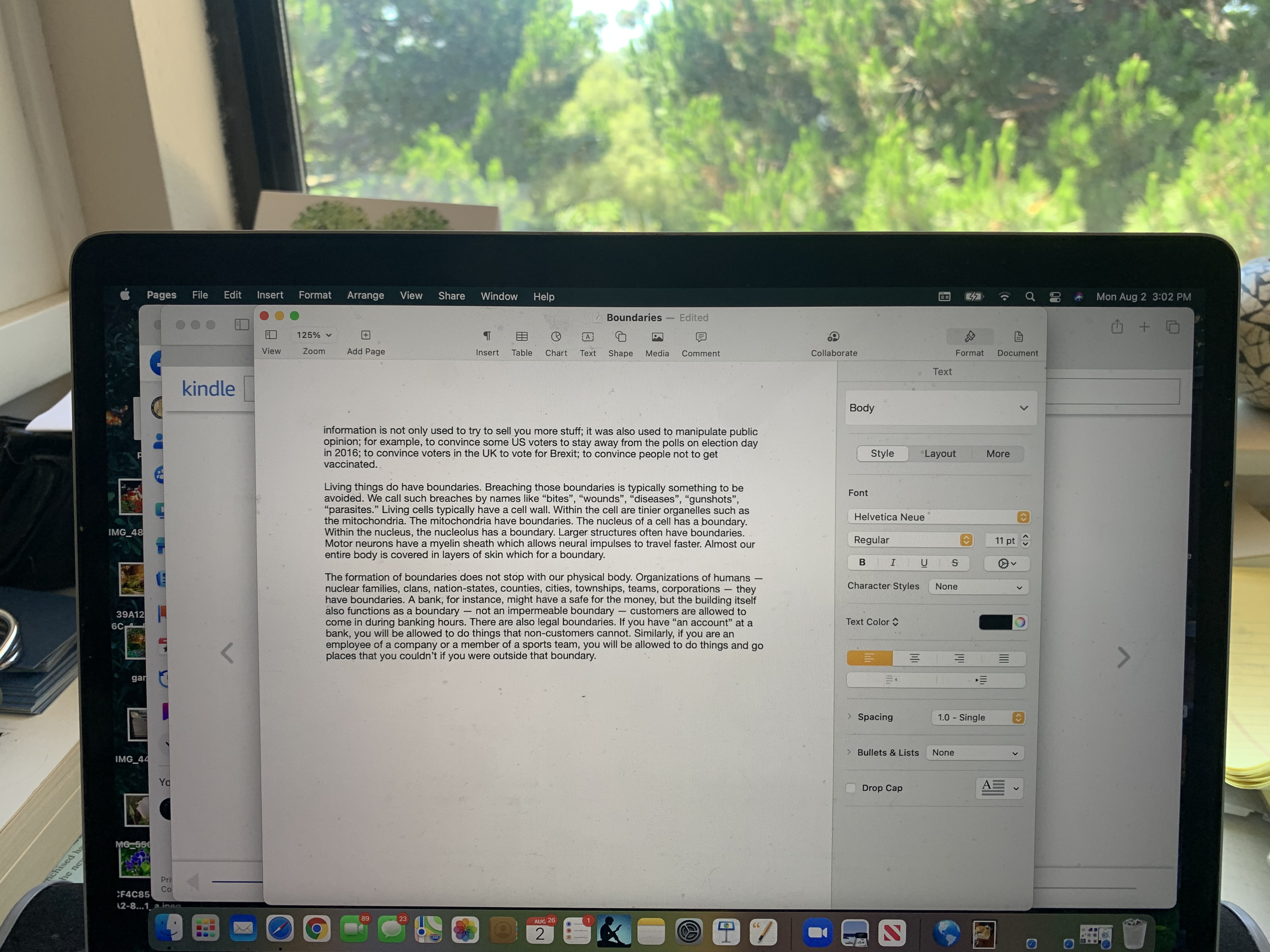
My desktop has many icons, tool bars, and windows. The only true void is the blank part of the writing pane in Pages. Visually, since the blank part of the page is white, it doesn’t seem much like a void. There is enough space between the icons and menu items to make them legible, but there is no “void” there. Visually, the only thing that really strikes me as a void is the totally black rounded rectangle beside the color sphere in the Format window. It’s black because that is the color of the text I’m writing in. Its function is nothing like that of an actual void.

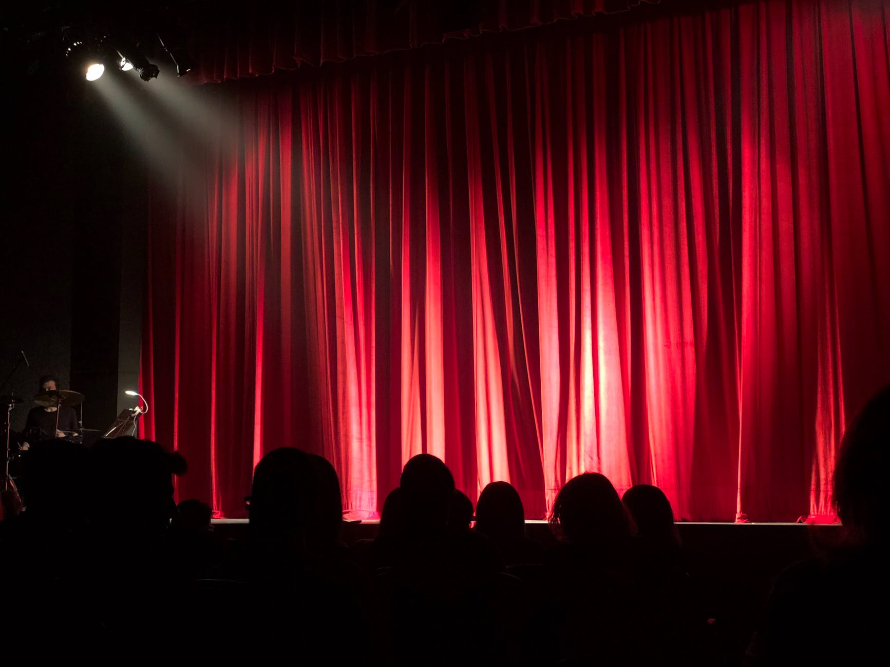
The void may symbolize death, but it also symbolizes life. It is the happening place. It is the dance floor. It is the game board. It is the playing field. It is waiting for the curtain to rise. It is the movie theater when the lights go out but the movie has not begun. It is also the movie theater when the credits have done rolling but before the house lights have come up. If it is death, it is also rebirth. If it is birth, it is also the end. 

As every moment of our existence and our attention becomes evermore commoditized and sold to the highest bidder, there is ever more pressure to eliminate the “wasted space” inherent in the void. 

Photo by Leonid Danilov on Pexels.com

Running into the ocean; diving into a pool; deciding to have a child; moving; divorcing; falling in love; losing a loved one; starting a composition; beginning a design — these are moments when we brush up against the void or enter it or avoid it or incorporate it into ourselves. We like to fool ourselves that there is some process or routine or formula or piece of software that can take all the uncertainty out of these transitions into the unknown.

That’s all illusion. It’s the very nature of life itself — that dance on the razor edge between chaos and repetition — to embrace the void. We try always to “avoid” The Void. 


Nature doesn’t “abhor a vacuum.” Nature is mostly vacuum.

Photo by Johannes Plenio on Pexels.com


But often, we abhor a vacuum. Our productivity tools are geared toward reducing “The Void” as much as possible. Children are shuttled from one high intensity activity to another to ensure that when they apply to college, there will be no gaps or voids in their resume. Every box should be checked. Then, they will get into a college–one which will ensure that they will get a high-paying job that will enable to them to work their entire lives so that there will be no uncertainty.

I am also a product of that “Avoid The Void” culture, so I find it hard to imagine what it would mean to design a tool or UI or app that embraced and encouraged The Void. There are some specific mobile apps that support meditation or listening to music or breathing. What of composition though? Whether it is programming, writing, drawing, or creating a business plan, is there a place for The Void to be supported? How would you encourage it? What visual elements or other sensory elements could be used to support it? How would you measure how well you did? 

Or, is it easier to avoid the whole topic? 

—————————————————-

The sound of one hand clasping 

Take a while or three

That cold walk home

Wordless perfection 

Life will find a way

The bubble people

The jewels of November

The lost sapphire 

Author Page on Amazon

The Winning Weekend Warrior focuses on the mental game for all sports using examples from tennis, golf, baseball, and other sports. It covers self-talk, imagery, mental practice, strategy, tactics, & sportsmanship. http://tinyurl.com/ng2heq3

Turing’s Nightmares explores the implications and ethics of Artificial Intelligence through fictional short stories. http://tinyurl.com/hz6dg2d

Fit in Bits shows many ways to put more fun, variety, & exercise into daily chores and habits to help with strength, flexibility, fitness, and balance. http://tinyurl.com/h6c7fce

Tales from an American Childhood recounts early experiences mainly in the American Midwest in the 1950’s and relates them to contemporary issues and events. https://tinyurl.com/y9ajvz9j

Dream Planet. Where do you run when the whole world is crumbling under the weight of human folly? When the lethal Conformers invade 22nd century Pittsburgh, escape becomes the top priority for lovebird scavengers Alex and Eva.

https://www.barnesandnoble.com/w/dream-planet-david-thomas/1148566558

Echoes. 

25 Friday Sep 2026

Posted by petersironwood in creativity, design rationale, essay, HCI, leadership, nature, politics, psychology, Uncategorized, user experience

≈ Leave a comment

Tags

art, beauty, books, Design, empathy, HCI, human factors, leadership, painting, photography, TNOO, Travel, usability, user experience, UX

Echoes. 

Among other things, I think human beings enjoy making “connections.” That applies to interpersonal connections. It also applies to connections in our own heads. “Oh, you’re the new friend I’ve been hearing so much about.” “Oh! That’s why my omelettes always stick!” “Oh, I can move immediately after I hit the ball! I don’t have to wait and see where my opponent hits it.” In other words, we like to learn. We like to see relationships that we didn’t see before. 

I think this is why I find “Echoes” a very beautiful property in architecture, in music, in poetry, and in natural beauty. Echoes need not be perfect duplications. In most cases, it’s better if that’s not overdone. Perfect duplications at the same scale are more evocative of machinery or mass production than of natural beauty. 

At this point, I am sorely tempted to tangent off on why, when you yell into a canyon, what comes back is not a perfect duplication or the original sound waves you sent out. But I will resist. 

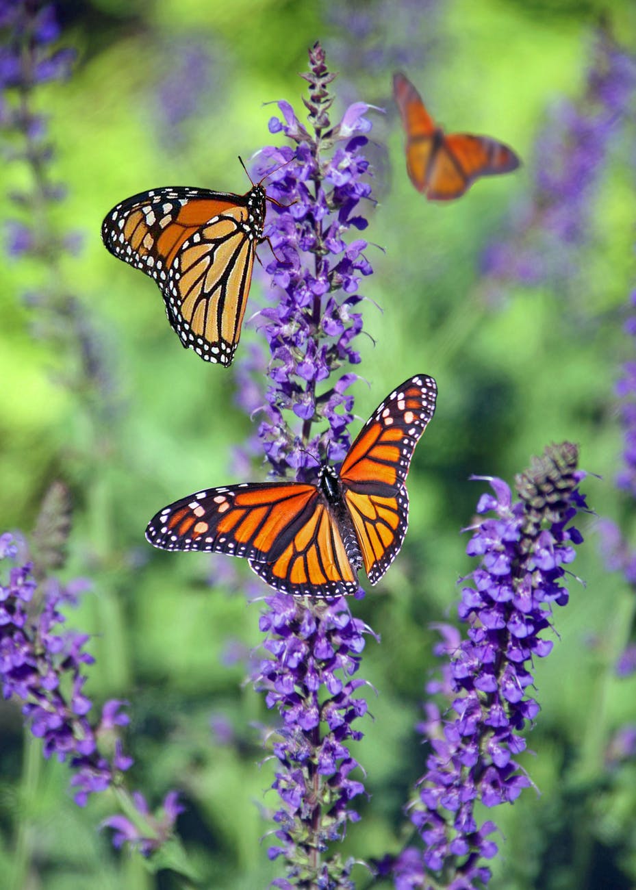
Even identical flowers or butterflies, when seen from different angles or distances, can provide a kind of echo effect. Photo by Cindy Gustafson on Pexels.com

When nature, or a designer, creates subtle echoes, it’s delightful because it allows us to make a connection that is “across” or “different from” the main show. For example, in poetry, one typically reads from start to finish. It is a linear experience. At the same time, there are often rhyme schemes so that words “echo” other words in an auditory sense. Poetry often uses metaphor which becomes a kind of “color scheme” for the room that particular poem created. 

In social interaction, if it is done skillfully, there are also echoes. Things are hinted at, shown only partially, or suggested. Slowly, a listener may become hooked on an attractive lure and end up swallowing, as they say, hook, line and sinker. If someone came right out and said up front, “Now look, I’d like to become dictator and what I need from you is to send me lots of money and thirdly, swallow any bull-crap I spew and actually, come to think of it, you might have to kill your granny and or your kids. On board?” No. Very few would take that on. Instead, it is hinted, intimated, insinuated that: “Everything that’s bad in your life — that’s not your fault! I know who is to blame and I can help right all those wrongs!” 

Echoes aren’t always bad in human interactions. Far from it. One of the most amazing things to observe is how a two or three person team in trivial pursuit or Who Wants to be a Millionaire throw twenty miscellaneous and various possible answers — all wrong — into the air and after  several minutes of being nowhere close to the answer, someone shouts: “The Mad Hatter!” And that is exactly right.

Photo by cottonbro on Pexels.com

In music, there are harmonies, themes, motifs, recapitulations, etc. In some musical settings such as cathedrals, the music may produce literal echoes. Regardless, themes are repeated, varied, morphed into something different and so on. 

So too, in architecture. If we try to imagine how buildings first came to be, it would be quite natural for them to have “echoes” because the entire building would be constructed of local materials. Stones, reeds, skins, bricks, logs, caves, etc. naturally lead to echoes because it’s all the same “stuff.” In modern skyscrapers however, it’s quite possible to design something with no echoes at all. The only point of the skyscraper is to be as efficient as humanly possible to make as much money as possible. What would be the point of “echoes”? Would it generate more profit? Sure, it might be an interesting experience for those who looked at our building. To which, a likely answer might be: “Who cares?” 

Photo by Laura Tancredi on Pexels.com

Isn’t it interesting that back when most people had next to nothing, they bothered to make cathedrals as beautiful as they knew how. But now that we have much, much more, we can’t spare the cash. (“We may be rich, but we are not yet the richest.”)

Photo by Julia Volk on Pexels.com

Nature is rife with echoes. Here’s one I have the privilege to witness almost every night. As the sun goes down, the light in the garden turns yellow. This means that flowers, trees, and so on will appear in higher contrast and in more golden light. A close up of white roses will look golden in the setting sun and so too will tree branches in the background. 

If you walk (or run, bike, etc.) through a garden or a forest, the experience will typically be full of echoes because you will walk by many individual oaks, beeches, roses, mayapples etc. each of which echoes to an extent all the others. In the same way that a poet puts rhyme, allusions, and other figures of speech to cause echoes both within the poem and with your memories, so too, a walk in nature will remind you of other previous experiences and of other plants and animals that you see earlier in the walk. The actions of walking themselves (or of wheeling, running, biking or cross-country skiing) are a kind of echo in much the same way that a steady rhythm in a poem causes echoes among all the stressed syllables and among all the unstressed syllables. 

—————————

Where do echoes occur in user interfaces? One of the few things that I think of are that logos associated with various pieces of software appear in different places and at different scales. For example, I recognize the small version of the Safari logo on my tool bar. To the right are open file locations in that browser. There is a small image of the landing page of each website, but each little icon also has a teeny version of the Safari logo. If I go to the Safari website, I’ll no doubt see other sizes of Safari logos. 

To the extent that developers use a common style guide, that also causes a kind of echo effect. I might see something to the right of my writing pane and say to myself:  “Ah, under ‘font’ I see a common widget next to ‘11pt’ — a widget consisting of an up and down arrow. I’ve see that before! I’ll bet I can change the font size with it. Clicking on the up arrow will make for larger font; clicking on the down arrow will make a smaller font.” 

To the extent that the use of various conventions causes correct patterns to be accessed out of my memory, those echoes seem mildly aesthetic and quite useful. Where else do you see “echoes” in user experience or in user interfaces?  Where might we include echoes in a new way that makes the user more productive? Where and how might they make the user experience richer? What might you do in your own behavior that could provide more pleasure to you and your colleagues via the use of echoes?

———————-

Listen. You can hear the echoes of your actions 

Ripples 

Myths of the Veritas: The Orange Man

True Believer

Do unto others

I can’t be bothered

Tit for Tat

It couldn’t happen to a nicer guy

Author Page on Amazon

Some suggested books. Are links themselves a kind of echo?

The Winning Weekend Warrior focuses on the mental game for all sports using examples from tennis, golf, baseball, and other sports. It covers self-talk, imagery, mental practice, strategy, tactics, & sportsmanship. http://tinyurl.com/ng2heq3

Turing’s Nightmares explores the implications and ethics of Artificial Intelligence through fictional short stories. http://tinyurl.com/hz6dg2d

Fit in Bits shows many ways to put more fun, variety, & exercise into daily chores and habits to help with strength, flexibility, fitness, and balance. http://tinyurl.com/h6c7fce

Tales from an American Childhood recounts early experiences mainly in the American Midwest in the 1950’s and relates them to contemporary issues and events. https://tinyurl.com/y9ajvz9j

Dream Planet. Where do you run when the whole world is crumbling under the weight of human folly? When the lethal Conformers invade 22nd century Pittsburgh, escape becomes the top priority for lovebird scavengers Alex and Eva.

https://www.barnesandnoble.com/w/dream-planet-david-thomas/1148566558

11. Roughness

24 Thursday Sep 2026

Posted by petersironwood in creativity, design rationale, essay, HCI, leadership, management, nature, politics, psychology, Uncategorized, user experience

≈ Leave a comment

Tags

adaptation, architecture, art, beauty, Design, evolution, HCI, human_factors, leadership, organizations, psychology, Roughness, TNOO, UI, usability, user experience, UX, writing

Roughness

Materials and organisms in the natural world such as wood, rock, clouds, reeds, water, animals, and plants exhibit a degree of roughness. By contrast, mass production ideally produces items that are identical and “sharp” or “smooth” at the boundaries. 

Think of the difference between a hand-thrown pot and a cup that is mass produced. Think of the difference between a cottage made of stone and a house made of prefabricated walls. Think of a path with flagstones and gravel versus a “sidewalk.” 

A rough path may mean it takes you longer to reach your goal. It may also make the entire journey more enlightening and enjoyable.

Perhaps because our ancestors evolved in a natural world for billions of years, we sense that roughness connotes something natural. To me, the property of “roughness” evokes beauty and comfort while perfectly straight lines and rectangles makes me feel as though I am in, and perhaps imprisoned in, a purposefully constructed space. Someone who builds a tower of stones or wooden blocks must be mindful of the whole. Tiny to moderate variations in size, angle and texture mean the constructor must pay careful attention. No two constructions are identical. By contrast, if you and I were to build a plastic rectangular lego tower of a specified size out of specified blocks, the results would be indistinguishable. It is much like cursive script versus printing. It is much like making a stew from scratch versus heating up a TV dinner. 

An old house is prone to crumbling, leaks, misalignments, idiosyncrasies, and cracks. If we allow the house to go completely to ruin, it becomes impractical or at least quite inconvenient to live in. On the other hand, a little bit of roughness gives the abode more character. Since glass is actually a fluid, old windows begin to “flow” slightly introducing irregularities in the glass and therefore in what is seen through the glass. A new window, on the other hand, it typically “perfect” and therefore somewhat boring. 

As a driveway ages, the effect of nearby life and natural forces begins to produce small cracks. These make the surface more interesting visually. It also requires someone walking to pay more attention to where they are stepping; that is, to be more in the moment. Such cracks encourage further incursions by living forms. 

Flowers often exhibit beautiful symmetry. The symmetry, to me, is made more beautiful because of slight variations in the size, angle and color of the individual petals. If instead, you imagine a mathematically perfect flower in which there is zero perceptible difference in the size, angle and color of the petals, do you feel that is more beautiful? Does it make you feel more comfortable? 

I don’t mind that your keyboard may be identical to mine (although probably not quite because my ‘N’ key and ‘A’ key are completely illegible and the ‘E’ key nearly so). I use the computer as a tool. Sometimes, it is used to produce art of one sort or another. But if the art that everyone produced were as much the same as the keyboards, it would seem sterile, non-living, mechanical. A brand new chair will hopefully be evenly painted and the upholstery will be unworn. Over time, the paint will begin to chip and the upholstery will be threadbare and potentially stained in places. 

We have been taught to see such things as flaws, defects, and imperfections. But are they? At some point, the “ravages of time” (or, more accurately, perhaps, the “ravages of entropy”) can make things less than ideally functional. For instance, your tires wear over time and, while they may look more interesting, overly worn tires are a safety hazard for you, for your passengers, and for everyone else on or near the road. 

Similarly, if you must undergo surgery, there’s a good reason for your surgeon to use a machine-tooled scalpel with a “perfect” edge. Railroad cars and railroad tracks that were too diverse from each other might look more interesting, but they would be less safe. 

In many cases, however, roughness does not negatively impact functionality. Roughness looks better without negatively impacting functionality. A chair, baseball glove, or pair of shoes that is slightly worn still works. Perhaps it even works better. A new baseball mitt or pair of shoes needs to be “broken in” for optimal use.

Roughness in the body of a living thing often allows local adaptation. The muscles in your body, for example, are not of a “pre-specified” and precise size. If you exercise a muscle, it will get stronger and grow larger. That allows your body to adapt to your circumstances. Your skin is also capable of growing stronger in places where it needs to be. Your bones grow stronger if they are required to bear a greater load. 

Roughness also exists across individuals within a species. Unlike items that come off the assembly line, items that come from life have slight variations from each other. Some seeds are smaller; some are larger; some are stickier; some are smoother. In some cases, these differences will have no impact on the viability of the seed. But sometimes they might. Life is always trying little “experiments” of small variations to see whether one might be better than another. And, by the way, that is not some minor feature of life: in many ways, that is life: the balance between repetition and variation. 

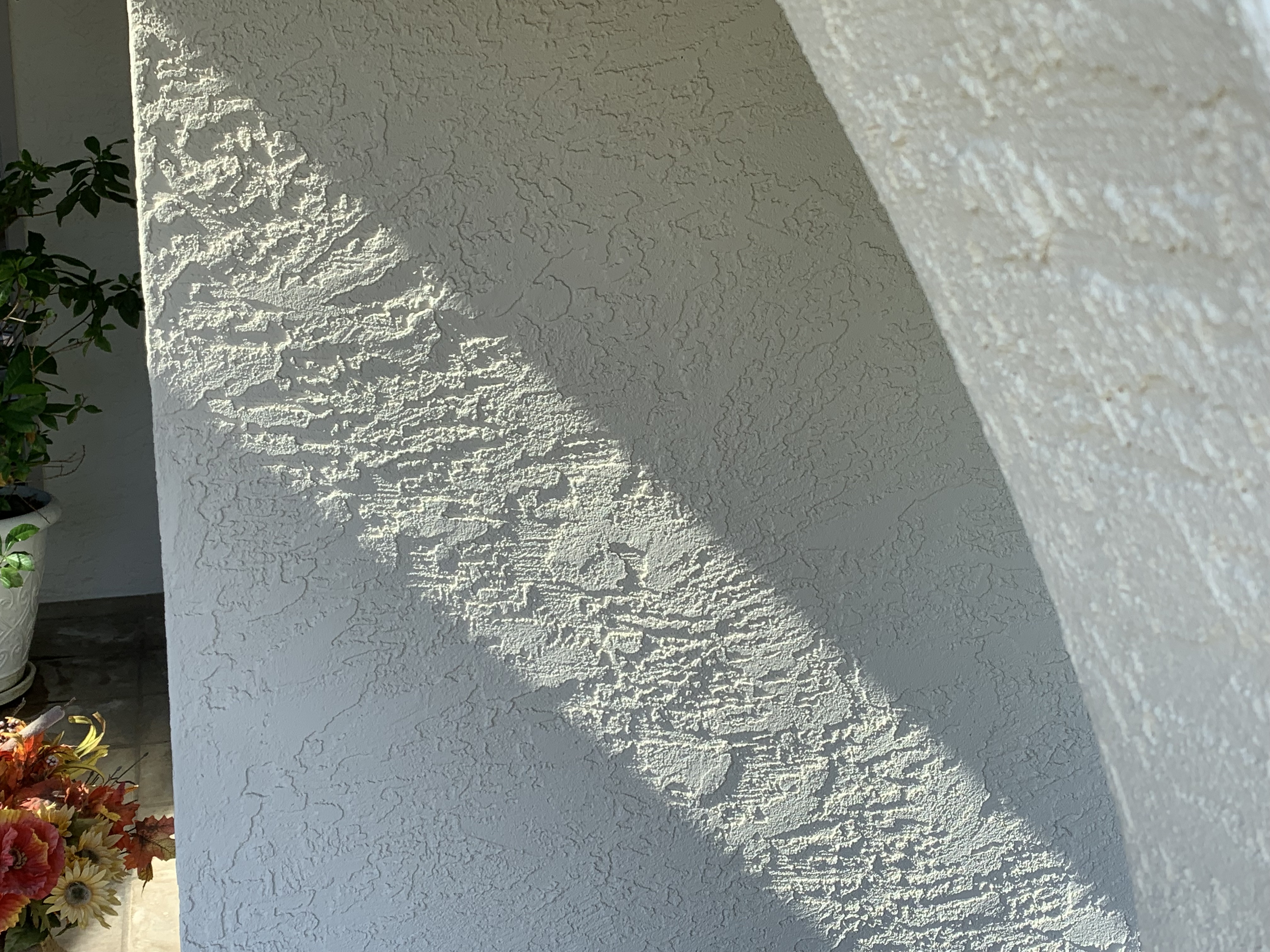
To me, the roughness of stucco adds to its beauty.

It’s ironic that our minds, which sprung from this balance, often strive for imbalance. To make things “simpler” we like to over-regularize and over-specify. Sometimes, you can go a rather long ways in one particular direction if you take such a drastic step. But if you’ve miscalculated in any way, or if your data were inaccurate, or if conditions changed after your data were collected, you’ll be stuck speeding down a railroad track toward what is now obvious disaster. Trying to impose an absolute pre-specification of action that actually works for every set of circumstances is impossible. To achieve something like it, people sometimes ignore the complexities (the roughness) in real life, and throw things into a small number of buckets. Making decisions on the basis of what bucket something is in, is a lot like judging a book by its cover. Such a process takes things which are, in fact, rough and treats them as though they were mathematically perfect.

Because of the “roughness” of circumstances, many societies have found that putting in place the human judgement of many with countervailing interests often works best. In America, for instance, there are three branches of federal government. The judge conducts a trial, with different people advocating for the two sides. In many cases, a jury of twelve decides guilt or innocence. 

Living systems are robust to various changes in circumstances. A conventional car engine, for instance, is designed to use gasoline or diesel. Put in the wrong fuel and you might ruin the engine. But what about a human being? You can use a tremendous number of different kinds of fuel in the form of food. This is just one of the many millions of ways that various life forms show resilience and robustness. Because life endlessly plays; because it exhibits roughness; because it is diverse; because of this, it adapts and it evolves. 

Meanwhile, as we look at things, we feel intuitively that “Roughness” is conducive to life and is also one of the quintessential aspects of life.  

“One could do worse than be a swinger of birches.” — Robert Frost, Birches

If you have ever swung on birches, or tried to climb any other kind of tree, you know that each is shaped and branched a little differently. From the ground, it’s easy to glance at a tree and think the branches are all basically the same. They are not. And if you are a kid who actually spends a lot of time climbing trees (as I once did), you pay attention to the peculiarities of specific trees and specific branches on those trees. Why? So as not to kill yourself, or worse, hear your parents say “I told you so!” after you break your arm swinging from a tree, say. But the miracle is that, although you are not immortal, you can heal your broken arm. In order for that to happen, obviously, some parts of your body have to do things differently than they have been doing. The “Roughness” of life isn’t only a visual characteristic. It’s also a characteristic of the processes of life. It’s also characteristic of a the processes of a healthy organization. 

As a kid, I would have learned every branch of this tree. Noticing “Roughness” is being mindful and sometimes noticing “Roughness” saves lives.

When it comes to the elements of a User Interface, in most cases, the elements are modeled after machines, not natural phenomena or living things. Is that necessary? Perhaps a designs that incorporates “Roughness” would be harder to program, harder to maintain, and may be even confusing to users? What do you think? 

In physical objects, usage often creates or exacerbates “Roughness.” Could it be advantageous for this to happen with UI elements as well? Would window edges that looked “handmade” or “rough hewn” be more beautiful? More comforting? More usable? Less usable? Right now, conventional systems would make it harder to “calculate” the edges of a rough window than a conventional, straight-edged window. Must it be so? Or, could different architectures make roughness easier to calculate and require fewer resources?

When I think about the broader User Experience in terms of Roughness, what I imagine is that a system that has “Roughness” might mean that there is flexibility in the order in which subtasks are carried out. Perhaps, it means that you offer the user of a word processing application different options in terms of font, style, documents. etc. Perhaps it even means that the user can design their own font or create their own document type. What do you think “Roughness” means in terms of User Experience? 

———————————

A short story about the lack of “Roughness.” 

As Gold as it Gets

As Gold as it Gets

A short story illustrating that likely things are not the only things that happen in life. 

Wilbur’s Story

Wilbur’s Story

Categories are useful. But to guide such a horse effectively, hold the reins loosely. 

What about the butter dish?

Wilbur’s Story

Essays on America: Labelism

Checks and Balances

Bounce

The Winning Weekend Warrior focuses on the mental game for all sports using examples from tennis, golf, baseball, and other sports. It covers self-talk, imagery, mental practice, strategy, tactics, & sportsmanship. http://tinyurl.com/ng2heq3

Turing’s Nightmares explores the implications and ethics of Artificial Intelligence through fictional short stories. http://tinyurl.com/hz6dg2d

Fit in Bits shows many ways to put more fun, variety, & exercise into daily chores and habits to help with strength, flexibility, fitness, and balance. http://tinyurl.com/h6c7fce

Tales from an American Childhood recounts early experiences mainly in the American Midwest in the 1950’s and relates them to contemporary issues and events. https://tinyurl.com/y9ajvz9j

Dream Planet. Where do you run when the whole world is crumbling under the weight of human folly? When the lethal Conformers invade 22nd century Pittsburgh, escape becomes the top priority for lovebird scavengers Alex and Eva.

https://www.barnesandnoble.com/w/dream-planet-david-thomas/1148566558

9. Contrast

21 Monday Sep 2026

Posted by petersironwood in creativity, design rationale, essay, HCI, leadership, management, nature, psychology, Uncategorized, user experience

≈ Leave a comment

Tags

aesthetics, art, beauty, HCI, human_factors, leadership, nature, order, photography, poetry, usability, user_experience, UX, writing

9. Contrast

With zero contrast, nothing can be seen at all. Beyond that however, it is interesting how many plants and animals as well as good designs show the property of Contrast. Plants “use” contrast, if I may speak in teleological terms, to attract pollinators such as butterflies and bees to their flowers. Plants also use contrast to “announce” to animals who spread seeds that their fruit is ripe and ready to be eaten. If the fruit part of a plant did not make such an obvious “announcement,” a forager might damage a plant by eating all of it rather than just the sugar-rich fruit. 

By contrast, fall leaves show high contrast which adds to their beauty, but this is probably just a “side-effect” of the leaves “saving” their water & chlorophyl and leaving other colorful compounds in the leaf. I suppose there could be an evolutionary advantage to a tree that is beautiful in the fall. I could imagine that bright colors attract animals and birds to “hang out” nearby and this means that the soil will be enriched by animal excretions and occasionally by deaths. In some cases, the color might “signal” animals that fall is coming and if the animals take more appropriate actions, this makes for a healthy ecosystem that in turn is good for the trees. I know of no such evidence however. It seems likely the bright colors are a beautiful side-effect of the tree breaking down the no-longer-useful chlorophyl to components that are stored in the roots. The more we learn about trees though, the more “clever” they seem so I wouldn’t put it past them to have “reason.”

Some animals, such as zebras and tigers, use contrast as a kind of camouflage. If you see a picture of a zebra or tiger out of context, you may think, “What? How is that camouflage?” But in the bright sun, grazing in tall grass (or lurking there, hoping for dinner), it actually does serve such a purpose. 

Photo by Sayantan Kundu on Pexels.com

There is also a more subtle kind of camouflage that some animals employ. High contrast can make it difficult for a potential predator or prey to “parse” the visual image. I believe some of the professional tennis outfits, for instance, make it harder for an opponent to “read” the actual body positions from across the court, especially with non-foveal vision. Is that what’s going on in the picture below? 

Considered separately, the shadow of the fence in the photo below strikes me as more beautiful than the fence itself. This is largely due to the higher Contrast in the shadow. I think another property “Roughness” also plays a part. The fence is machine milled and regular. The shadow falls on uneven ground. Rather than obscuring the Contrast, the Roughness actually enhances it. In addition, the fence appears quite separate and distinct from the greenery behind it. However, the shadow is partly determined by the fence and partly determined by the uneven ground. This means the shadow exhibits more “Deep Interlock and Ambiguity.” 

I do think the combination of fence and shadow is more beautiful than either taken alone. Taken together, there is an additional layer of Contrast between the “mechanical” regularity of the fence and the rougher feel of the shadow. 

One of the things that trees do is add contrast by virtue of the branches and leaves casting irregular shadows in many places but letting bright light through in other places. Here is a simple case. 

In the photo below, the landscape architect has likely intentionally designed this arbor partly with contrasts in mind. Dark vs. Light; Horizontal vs. Vertical; Straight vs. Bent; Built vs. Growing. What other contrasts do you see? 

Contrast is often desirable not just in terms of vision, but also for other senses. A good salad, for instance, shows contrast in color, but also in terms of textures and tastes. Orchestral music shows contrast in terms of loudness, timbre, harmony, melody, etc. 

Living things also exhibit contrast, not only in their visual appearance, but also in terms of the rhythms of life. Many plants and animals exhibit both daily cycles such as sleep and wakefulness, but also yearly cycles (hibernation, aestivation, migration, mating season, losing fall leaves, blooming & fruiting, etc.). In fact, many animals & plants only live one year. 

Photo by Zaw Win Tun on Pexels.com

Stories typically exhibit contrasts of various sorts. A story (whether play, movie, novel, or short story) is often more interesting when set in both wartime and peacetime, in both country and city, in two different times, etc. In addition, a good story often has contrasting characters such as hero and villain, or two less extreme characters, one of whom is a “foil” for the other. The plot itself is constructed of contrasts in value. The hero loses an athletic contest. Then, the hero wins! Then, the judges unfairly strip the hero of the medals. Then, an investigation reveals that the hero was framed and the hero prevails after all. Love may conquer all — but never without a struggle. 

This succulent pictured below seems beautiful to me partly because of Contrast. Is there an aesthetic “purpose” to the contrast shown? Or, is the real “point” to provide the sharp spikes on the edge of the plant and in order to make those spikes effective, the plant needs to be drier near the edges or have a yellow pigment that somehow facilitates the growth of spikes? Perhaps the plant’s growth is limited (in the Southwestern US) by the available water and not at all by sunshine (which is plentiful). Therefore, there is no “point” to having the entire plant green. 

If it seems too far-fetched to imagine a plant exhibiting contrast because it’s more beautiful, it is not to far-fetched to imagine animals exhibiting contrast to attract other animals; most notably, a mate. Insects, birds, mammals, fish, sometimes exhibit “displays” of high contrast color in order to attract mates. Typically, such displays are only used during actual mating season. 

In addition to seasonal and daily “contrasts” in behavior and appearance, animals often exhibit contrast at a finer temporal granularity. As humans, we breathe several times a minute and our heart beats about once a second. Some aspects of our anatomy and physiology have evolved to provide antagonistic forces and processes. We have, for instance, our sympathetic nervous system that prepares us for “Fight or Flight” reactions. The para-sympathetic nervous system turns on a “rest and digest” mode also called “feed and breed.” Our sensory and motor systems use both excitatory and inhibitory processes to “sharpen” what we perceive and the actions we take. Our musculature often has muscles that produce “opposite” results. Our biceps bends our arm and our triceps straightens our arm. The adductors in our legs move our legs inward toward our trunk and the abductors move our legs apart. 

Contrast is so prevalent in the natural order of things “out there” and in the structure and function of our own bodies that it is hardly surprising that our conceptual structures often exaggerate contrasts. We often think, for instance, in terms like these: “Up or Down? Liberal or Conservative? Good or Evil? Strong or Weak? Black or White? Growth or Decay? Orderly or Disorderly?” 

If we return to the photo of the fence and its shadow, for example, we are tempted to describe the darkest parts of the shadow as being places without light while the spaces between have light. Of course, there is light, even in those shadows. Light is reflecting off the nearby trees, houses, grape vines, sand, cars, etc. There is nothing shown in this photo that has no light.

As Amanda Gorman pointed out in a Presidential Inauguration — 

“For there is always light,

if only we’re brave enough to see it

If only we’re brave enough to be it.”

When it comes to User Interface Design, contrast has many uses. For example, contrast is often used to signal whether an item is chosen or not, or whether an action is available or not. Interfaces often include text and the text is easier to read if the contrast is higher. In the early days of human computer interaction, text was composed of a relatively small number of bits that were either on or off. High contrast came with the technological limitations of the devices. More recently, text often appears as dark gray on light gray rather than as black on white.

Why? I have no idea. People sometimes claim that low contrast is “easier on the eye.” So far, no-one has been able to point to empirical evidence. However, text is harder to read when the contrast is low. If the user is old, or trying to read in glare, or has limited vision, or the reader or device is moving or vibrating, low contrast text can become illegible. The “worst” cases I’ve seen are on devices such as CD players or smoke alarms. To simplify (and therefore cheapen) manufacture, the letters are not painted at all but simply embossed as white on white or (even worse) black on black. From my personal experience, few things in modern life are as pleasant as being awakened around 3 am by a screaming smoke alarm which has cryptic and unreadable directions in white on white. 

At a more abstract level, a high level of conceptual contrast can often make the user experience less frustrating, more enjoyable, and more productive. What do I mean by “conceptual contrast?” In this context, I mean that two related actions or situations that are clearly differentiated in the commands, the explanations, the terms etc. are less prone to confusion. Let’s pick on what I see right before me: the high level “Pages” tool bar. “File Edit Insert Format Arrange View Share Window Help” At a visual level, these are nearly white on a black background; i.e., easy to read. But what is the conceptual contrast between “Format” and “Arrange”? How about “View” and “Window”? Are there other terms that would be better cues as to what these groups of functions do? 

The same for menus within the document. I see above the material I am actually typing another use of the words “Insert” and “Text” appears right next to it. But how is this different from “Text” on the right? It’s not that any of these items are so confusing that they cannot be learned. “Style” when you are writing (as opposed to “word processing”) generally refers to something much more abstract that the type of font and the size or color of the text or the spacing between lines. 

I think a more fundamental issue is that typical text editors, after the “Clippy” fiasco, have steered away from explicitly supporting the process of actual writing. Developing a truly useful aid would be much more difficult. I’m not going to try to design such a system here. To give a hint of the kind of thing I mean though, suppose that a text editor explicitly supported writing a short story. Embarking on writing a short story, the user might be presented with a choice for guidance. Perhaps this hypothetical writer wants to try writing a “locked room” mystery. And, maybe they want lots of guidance. So, the software leads them through an idea generation phase. In that phase, perhaps it is more productive to turn off various kinds of “autocorrect.” Perhaps the author is encouraged to “solve” the basic problem (how was the murder committed) before actually beginning the writing. Maybe there is a high level of visual Contrast which serves as a constant reminder to the author that they are, at this point, generating ideas. 

Von Oech suggests that problem solving involves four stages that he illustrates with four “hats” — an explorer’s pith helmet for the Exploration phase; an artists beret for the Creation Phase; a judge’s wig for the Editing or testing phase; and a Viking warrior’s horned helmet for the marketing and sales phase. If such a model were supported by the software, you might expect a strongly contrasted visual interface to reinforce the phase of writing that the user was in. The Exploration phase might consist visually of cards evocative of various fields that would support research. The artistic phase might be a mind-mapping tool. And, so on. The user would know at every glance which phase of the overall writing process they were “in.” 

It may be that any such process involves too much overhead or is too rigid. But what is the alternative? At present, the author must either keep almost all the information about their goals, ideas, and processes in their head or in a separate document or spreadsheet. As I look at the screen in writing there is almost no clue about “where I am” in the process of writing. Whether or not you buy into the specific four-stage model of Von Oech, I do believe that various phases of writing do offer contrasts in terms of how that phase should be supported. I only chose writing as one example. 

Nearly any task that the user is engaged in has some structure to it. Scientific research, learning a foreign language, organizing a tennis tournament, planning a trip, finding a house, buying a book on-line, etc. All of these have different sub-tasks. In some cases, the user wants more flexibility; in some cases, less flexibility is actually helpful. But most “application programs” seem to me to be deficient in terms of guiding the user through a process; giving any visual indication of where the user is in the overall process, or of tailoring actions to which subtask the user is engaged in. If a user is generating ideas, for example, pointing out grammatical errors, typos, and spelling errors is distracting and not that helpful. On the other hand, if the user has finished writing a first draft and is proofreading, then such suggestions may be helpful and appreciated. 

How do you see the use of Contrast in User Experience? Is Contrast best thought of as a visual property which may be nice to have but is not crucial? Or, does Contrast also apply to different subtasks or phases which need to be reflected in both the appearance of the UI and in the functionality? 

———————-

The 4 Roles of Creativity: Explorer, Artist, Judge, Warrior

http://creativethink.com

Some poems that provide Contrast. 

Here is a poem that contrasts a “before” and “after” state. 

How the Nightingale Learned to Sing

Here’s a poem that contrasts two different views about how powerful you are. 

Roar, Ocean, Roar

Here’s a poem that contrasts natural beauty with mechanical sameness.

The Forest

Here’s a poem about music that contrasts various acoustic elements to mirror changes in music. 

Piano 

Here’s a poem that contrasts the gentle and caring beginnings of love with becoming jaded. 

Wonder, wonder, who kept the wonder? 

Here’s a poem that contrasts the importance of adult work with the importance of a child’s play. 

The Most Serious Work

Here’s a poem that contrasts two ways to frame resistance to tyranny

Roar, Ocean, Roar!

Here’s a poem that contrasts love and guns

Love and Guns

4. Alternating Repetition

14 Monday Sep 2026

Posted by petersironwood in creativity, design rationale, HCI, leadership, management, nature, psychology, Uncategorized, user experience

≈ Leave a comment

Tags

aesthetics, architecture, art, beauty, Design, diversity, HCI, human factors, leadership, order, repetition, UX, writing

(This is the fourth post in a series of 15 which aim to examine the fifteen properties of natural order postulated by Christopher Alexander. I wonder whether the property of “Alternating Repetition” could be more frequently incorporated into User Experience and what the pros and cons might be).

4. Alternating Repetition

In nature, whether we look at clouds, waves, mountain ranges, forests, plants, the leaves of plants, or almost any animal, we see alternating repetition. Such natural repetition is almost never a precise and complete replication. Just as every reproductive act of life introduces an element of recombination as well as the possibility of mutation, so too the repetitions we see in life are not mathematical. We indeed see patterns repeated in a line or in a circle, but the instances in living things show variation. Similarly, human artifacts made with the hands; e.g., weaving or poetry or rock walls or tennis strokes show repetition but with slight and subtle variations. 

If you look at modern industrial society, you see many examples of exact repetition. It’s true that if you looked at 10,000 examples of the same brand and model pen, or notebook, or scissors, or streak knives under a microscope, you could likely find small differences. To the naked eye, however, they would appear identical. Seeing 10,000 pebbles, leaves, or waves you would always see slight to moderate differences. To me, it makes a difference in terms of beauty. Handmade items and human actions naturally show more variation than things produced by machines. 

Photo by Pixabay on Pexels.com

The various “elements” of a User Interface generally have the feel of something made by machine. The size of all the application icons on the tool bar, for instance, are the same. They are all almost the same exact shape and size. On my tool bar the icons for Finder, Launchpad, Mail, Safari, Chrome, FaceTime, Messenger, Maps, Photos, Contacts, Calendar, Reminders, Notes, System Preferences, Keynote, Pages, Preview, and News are the same. However, the Kindle icon is slightly larger and more square. The Zoom icon is very slightly rounder. [NOTE: This is no longer true in 2026]. The icon for Facebook is still circular, however. In other words, there is some slight variation, but mainly the icons are the same in outline, but different inside. But the set of icons on the tool bar has no sense of “harmony” whatsoever–at least, not to me.

Note that the tool bar is both abnormally homogeneous in terms of positioning and size but completely disconnected in terms of the images which differ in a random disharmony seldom exhibited in nature.

Instead, each icon seems to scream out its individuality without regard to its neighbors. (Which reminds me of things like not masking, getting vaccinations, or telling the truth, for instance, because you don’t feel like it so who cares what the consequences to others are). Anyway, the layout of the toolbar, to me, it’s reminiscent of driving down the highway and seeing a sequence of billboards, each advertising some random product or service in no particular order. Often, each billboard is the same size but they are independent of each other. The one exception I can think of were the “Burma Shave” signs along the highway. Each sign was a small rectangle with several words on it. About a quarter mile down the road, another sign would appear. They were meant to be seen in a specific order and together, they made a kind of “story” which usually rhymed. Typically, the signs touted the joys of the product — “Burma Shave” — or, provided public service announcements about safe driving. 

In the early days of computing, putting in “variation” might have been insanely wasteful of space and processing time. This is no longer true. Yet, the “look and feel” of User Interfaces remains, for the most part, quite “mechanical” or “mechanistic” rather than “natural.” Sometimes modern computer games include naturalistic looking variations in how repeated plants, rocks, clouds, etc. are represented. Look at the palm trees and you will see variations among the trees that are reminiscent of the real palm trees I see every day in the San Diego area. In addition, each tree contains a number of fronds that repeat a generic theme; yet, each front is somewhat different. The fronds themselves each contain alternating repetition, just as do real palm tree fronds. 

We might consider whether it would make sense to put more natural looking alternating repetition into the more utilitarian aspects of user experience. For example, could it be both more beautiful and more useful to allow more variation in the way files are represented visually?  Will Hill, James Hollan, Dave Wrobleski, & Tim McCandless suggested (in a CHI ’92 paper) that physical documents such as manuals naturally show wear in places where they are most used. They suggested that the visual representation of computer documents might be altered slightly to show which documents have been used or edited more and also that such cues within a document might also be useful. 

Hill, William; Hollan, James; Wrobleski, Dave; McCandless, Tim; “Edit Wear and Read Wear,” Human factors in computing systems: Striking a balance. Proceedings of the 9th annual conference. SIGCHI ’92 Proceedings (Monterey, CA), Addison-Wesley, 1992, pp. 3-9.

One of the few cookbooks I use with some regularity is entitled, Fat Free and Flavor Full. The recipe I’ve used many times is the black bean salad. If I open the physical book, it naturally falls open to that particular recipe. “Open Recent” I find a very useful features of the Pages application, but I don’t see a way to look at files based on overall frequency of use. It could be the case that there are some applications for which you would want specific files to be easily found depending on the season or the date. The authors of “Edit Wear and Read Wear” were mainly talking about the utility of encoding information about a file into its visual representation. There might well be aesthetic reasons to do so as well. 

The wooden blinds shown below exhibit alternating repetition in several ways. First, there is the matter of perspective. Some variation almost always presents itself simply by virtue of the fact that I typically view the blinds at an angle and some are closer to me than others. This means that the size, and the retinal shape are slightly different. Second, there is variation caused by slight changes in the angle of the slats relative to vertical. Third, each slat is made of wood. The wood itself shows rings (or more commonly a planar projection of the concentric cylinders. 

The wooden blinds, because they are illuminated from the outside by tree-filtered sunlight also show further variation; however I don’t think that is typically “alternating repetition.” Perhaps not coincidentally, although I find it a little interesting, I can’t say I find that source of variation to be beautiful to me. The other three all add to the aesthetics, at least to me. 

Is it feasible to introduce alternating repetition with slight variation into User Interfaces? Would it be desirable? What negative side-effects might arise? Do you even agree with Christopher Alexander that Alternating Repetition is an aspect of natural beauty and beautiful design? One thing that occurs to me is that if some element of the UI is more variable in outline etc., it may mean that the actions upon that object must deal with that variability. If designed greenfield, that might not be too difficult. But if, for example, the code for dragging and dropping was written under a presumption of zero variability, that might be problematic. What do you think?

——————-

Discussion of Alternating Repetition with additional visual examples can be found here: 

The Fifteen Fundamental Properties of Living Structure. 4. Alternating Repetition

Because Christopher Alexander wrote a book, about the 15 properties, his examples are mainly visual. But alternating repetition as an element of beauty is also clearly present in music and in dance. There is a little of it, it seems to me, in culinary arts as well. I am also reminded of the smelling actions of my dog, Sadie. As she watches an animal without charging it, she waves her nose back and forth quite deliberately in a kind of “sampling” of the surrounding air. A bear will sometimes move sideways with alternating repetition to provide better depth perception of a far away target (like me!). But that’s a story for another time.

Use Diversity as a Resource

The Tree of Life

Life is a Dance

Take a Glance; Join the Dance

Piano

The Winning Weekend Warrior focuses on the mental game for all sports using examples from tennis, golf, baseball, and other sports. It covers self-talk, imagery, mental practice, strategy, tactics, & sportsmanship. http://tinyurl.com/ng2heq3

Turing’s Nightmares explores the implications and ethics of Artificial Intelligence through fictional short stories. http://tinyurl.com/hz6dg2d

Fit in Bits shows many ways to put more fun, variety, & exercise into daily chores and habits to help with strength, flexibility, fitness, and balance. http://tinyurl.com/h6c7fce

Tales from an American Childhood recounts early experiences mainly in the American Midwest in the 1950’s and relates them to contemporary issues and events. https://tinyurl.com/y9ajvz9j

Dream Planet. Where do you run when the whole world is crumbling under the weight of human folly? When the lethal Conformers invade 22nd century Pittsburgh, escape becomes the top priority for lovebird scavengers Alex and Eva.

https://www.barnesandnoble.com/w/dream-planet-david-thomas/1148566558
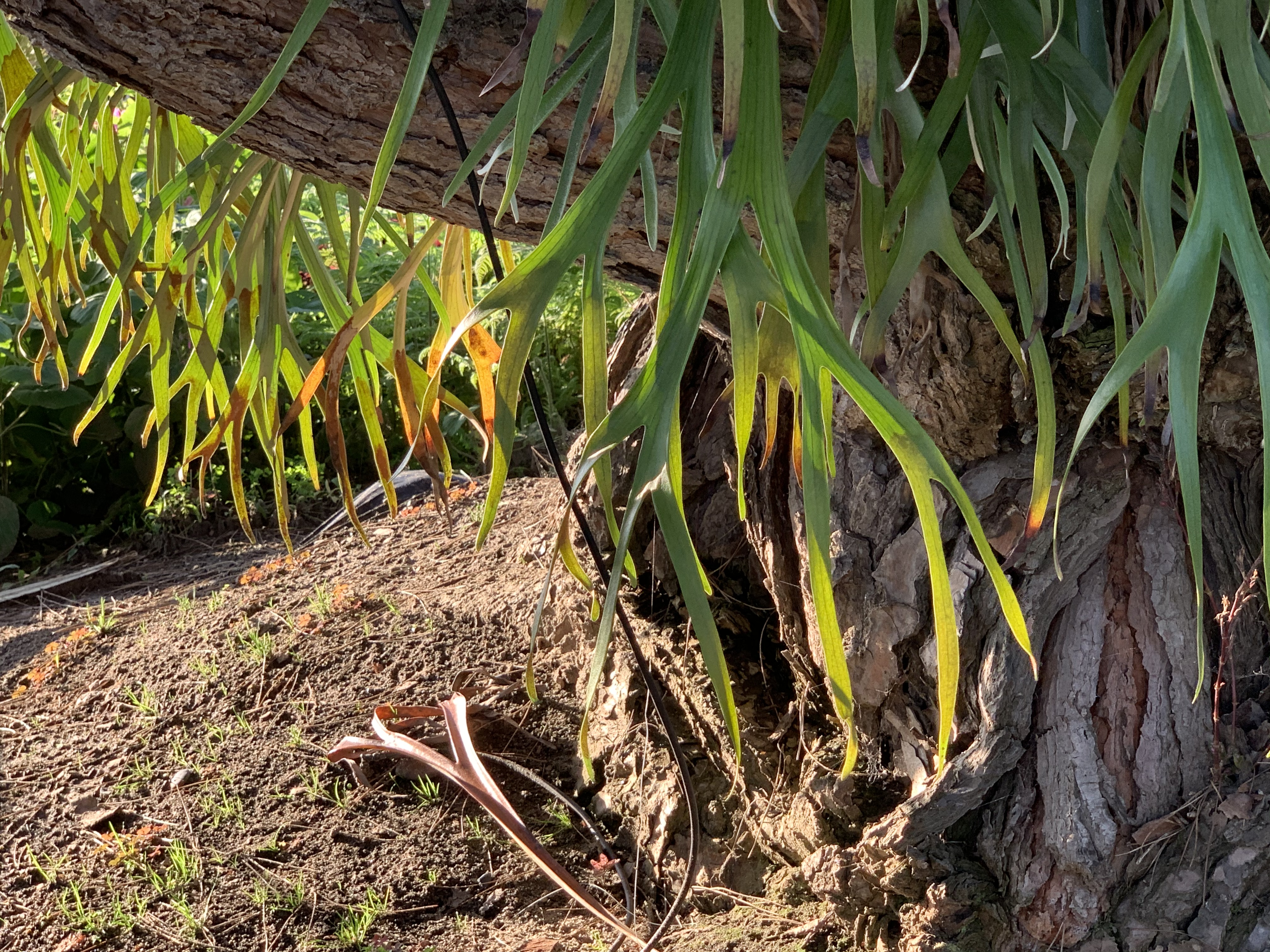
Do Not Hate

08 Tuesday Sep 2026

Posted by petersironwood in America, leadership, poetry, politics, psychology, Uncategorized

≈ 1 Comment

Tags

Democracy, leadership, life, love, mental-health, peace, poetry, politics, truth, ubuntu, USA, writing

Do not hate.

Do not hate.
Demonstrate. 

Do not hate. 

Educate.

Do not hate.

Navigate.

Do not hate. 

Negotiate. 

Do not hate.
Cooperate.

Justified?
It may well be. 
Everyone who ever hates

Can generate a heap of lies
To make their hate seem justified.

But why be fustified? 

When there are so many better things

To fill your heart and mind?

Do not hate. 

Demonstrate.

Show through word and deed

That hate and greed 

Are not the only creed.

Do not hate.
Educate.

Hate is always based on lies.
There may be one you really do despise.

But everyone? 

That’s a loaded gun

Aimed without a thought

About the cost. 

Do not hate.
Navigate. 

The shortest path 

Is not always the fastest path.

Look ahead.

Use your head. 

Don’t get dead.

Do not hate.
Negotiate. 

It doesn’t always work.

But it’s always worth a try.

Just don’t be a jerk. 

Diplomacy apply. 

Do not hate.

Cooperate. 

There’s at least one thing

About the world that both sides love

Of that you sing

Help that thing rise above.

But mainly, do not hate

Because it hurts you to hate.

Guernica

A Civil War there Never Was

Somewhere a Bird Cries

The Crows and Me

Imagine All the People

Roar, Ocean, Roar

Small Steps

The Dance of Billions

Some recommended books:

The Winning Weekend Warrior focuses on the mental game for all sports using examples from tennis, golf, baseball, and other sports. It covers self-talk, imagery, mental practice, strategy, tactics, & sportsmanship. http://tinyurl.com/ng2heq3

Turing’s Nightmares explores the implications and ethics of Artificial Intelligence through fictional short stories. http://tinyurl.com/hz6dg2d

Fit in Bits shows many ways to put more fun, variety, & exercise into daily chores and habits to help with strength, flexibility, fitness, and balance. http://tinyurl.com/h6c7fce

Tales from an American Childhood recounts early experiences mainly in the American Midwest in the 1950’s and relates them to contemporary issues and events. https://tinyurl.com/y9ajvz9j

Dream Planet. Where do you run when the whole world is crumbling under the weight of human folly? When the lethal Conformers invade 22nd century Pittsburgh, escape becomes the top priority for lovebird scavengers Alex and Eva.

https://www.barnesandnoble.com/w/dream-planet-david-thomas/1148566558

Query By Example

08 Tuesday Sep 2026
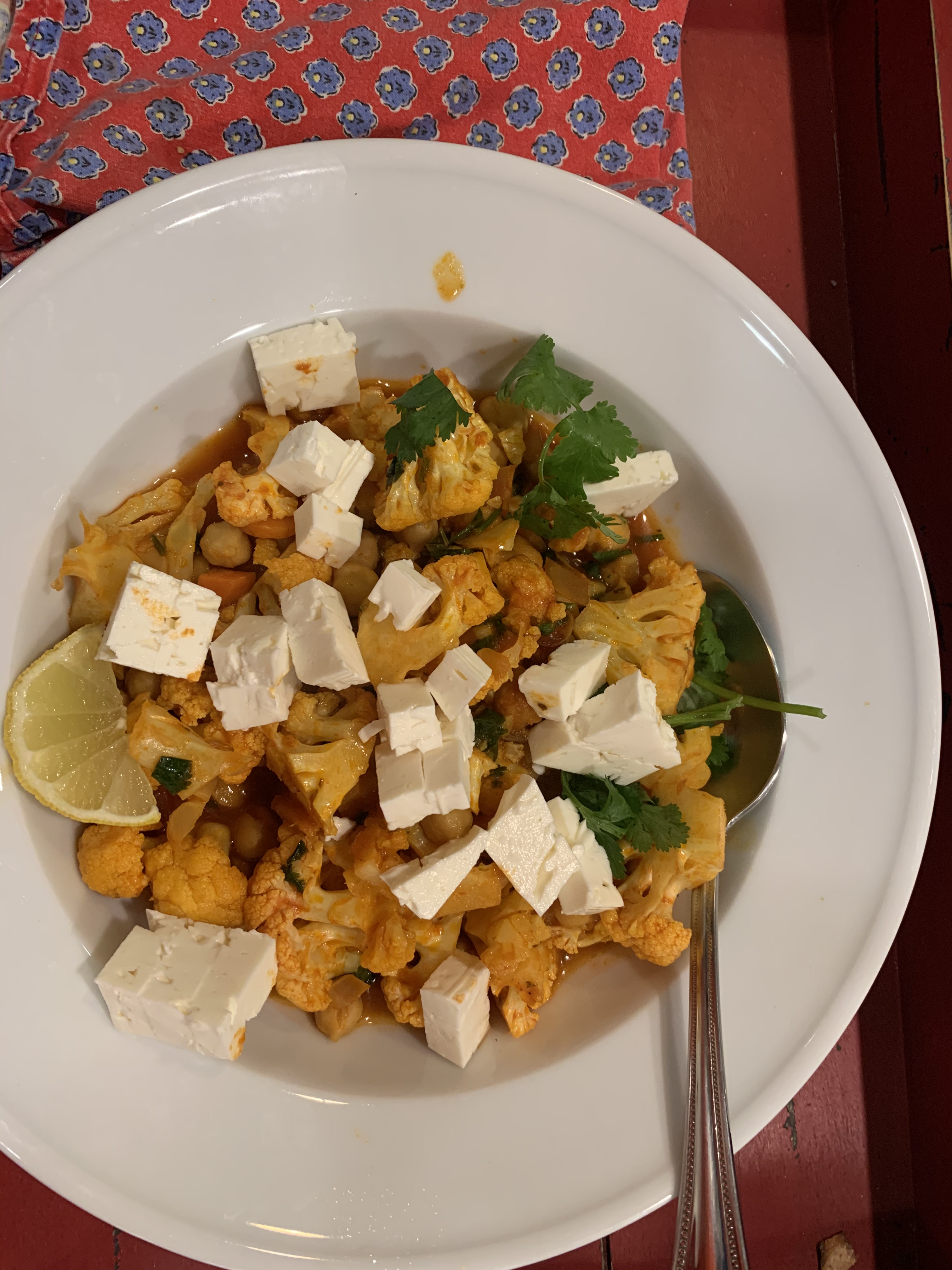
Posted by petersironwood in AI, design rationale, HCI, leadership, management, psychology, science, Uncategorized, user experience

≈ Leave a comment

Tags

AI, Artificial Intelligence, expertise, HCI, human factors, IBM, leadership, QBE, research, technology, usability, UX, writing

Photo by RF._.studio on Pexels.com

This is part of a series on experiences in my career in Human Computer Interaction and some lessons learned.

I joined IBM Research on the winter solstice of 1973. I had earned a Ph.D. in Experimental Psychology from the University of Michigan and for the previous few years, I had managed a research project at Harvard Medical School on the “Psychology of Aging.” At the time, I was married and had three small children. I mention this because I was funded by so-called “soft money” which basically meant that my salary depended on a research grant. I helped write a renewal of the grant but the decision was “deferred”; that is, it was neither funded nor unfunded. Then, it was deferred again. This meant that if the grant were not funded, I would only have a few weeks to find a new job. That seemed far too short so I began to look other places for a job. 

Lessons Learned: #1 If you want continuity of personnel in your laboratory, make sure you have overlapping and multiple grants or other sources of income. 

In this case, the grant actually was ultimately approved, but by that time, I had already agreed to join IBM Research. That turned out to be fine, by the way. It was a wonderful place to work.

One of the reasons that I got the job at IBM was that I already knew something about computers. I had taken several computer science courses in grad school along with the needed psych courses. More importantly, our “Psychology of Aging” study was run by a PDP-8 and I had programmed the computer to run our suite of experiments and to do data analyses on the results. I had taken a week-long course at DEC in Maynard, Massachusetts on the assembly language, another week-long course on the machine language, and another week-long course actually tracing the circuitry with a probe and oscilloscope. I felt I “understood” the PDP-8 at a fairly deep level. 

At IBM, I did not have that familiar machine. Instead, I was connected to a mainframe via a dumb terminal. The first day at IBM, I got my userid and tried to log on to APL (A programming language I had not used before). I tried following the manual but I could not seem to get logged on. After hours of trying, I finally gave up and went down to the computer room and found someone willing to help. I showed him the logon instructions I was trying to follow and he immediately said, “Oh, yeah, that doesn’t work any more. We changed that months ago. Here’s how you need to do it now.” The manual I had may have looked new, but it was out of date. 

Lessons Learned: #2 Manuals can be wrong. These days, most are online. But they can still be wrong.

Lessons Learned: #3 Someone who knows how to do something can save you hours with a few minutes of their time. 

Of course, it’s more respectful, efficient, and a better learning experience if you can figure it out on your own. But sometimes you can’t. My stumbling block was not due to an error in logic, or a lack of in-depth knowledge. It was simply that the computer center administrators had changed something arbitrary so that the documentation I was given about how to log on for the first time was no longer accurate. 

In order to teach myself APL, I wrote a very small program to “predict” how long I was going to live “based on” some behaviors that I was interested in controlling. My main goal was to learn APL. My secondary goal was to motivate myself, for instance, to exercise more, lose weight, and not drink too much alcohol. I had no intention or pretensions of making this prediction “accurate.” If I had been doing a consulting gig for an insurance company setting life insurance rates, for example, I would have given far more attention to see precisely what the real data were and incorporated many more variables into the regression model. 

Here’s a link, 

https://www.death-clock.org

by the way, to a more accurate model than the one I used, but it’s still simple to use. Note that my goal was to motivate myself and so I intentionally exaggerated the impact of those behaviors I was trying to change. I had programmed it. I knew how “bogus” the calculation was — nonetheless — here’s the interesting thing though: 

Lessons Learned #4: Even an over-simple model that the user knows is over-simple can still motivate change. 

Photo by Mike on Pexels.com

At last we come to the actual project I worked on — the usability and learnability of Query By Example. One of my colleagues, Moshe Zloof, invented the language for relational data bases. He had designed the language but not yet implemented it. I did not immediately test the design; first, I sought to understand it. In seeking to understand it in depth, prior to testing it, the two of us had some sense-making discussions. Moshe improved the design; in particular, our discussions uncovered some ambiguities and inconsistencies that were not at all obvious when he simply gave talks about the design. This brings me to the next lesson learned which has proven true in nearly every study of early stage designs that I’ve been involved with over the course of six decades.

Lessons Learned #5: Don’t just accept a surface description of something; understand it as deeply as you can before designing a study.  

In this particular case, it was possible for me to understand it in some depth. Relational data bases and second order logic are things I was capable of understanding. If it had been an interface to running a nuclear reactor or using the artificial heart that Moshe had designed earlier in his career, that would have been a much more difficult task for me.

I wanted to understand, not just the “logic” of Query By Example, but also possible contexts of use. For instance, my manager & I visited Burlington, Vermont to talk with IBMer’s who actually used query languages to understand what was happening in chip production lines. At one point, a particular production line that had been producing nearly 100% perfect chips starting having a much higher error rate. Using their query facility, they were quickly able to diagnose the cause of the change which was a supplier of one of the raw materials using a different source. In turn, this meant a slightly different profile of trace impurities in the substrate. Of course, this is only one example, but to me, understanding something in depth means not only understanding its internal logic but also understanding real users, their real tasks, and their context of use. 

Photo by Chokniti Khongchum on Pexels.com

I won’t go into all the details of the pencil & paper study or the results. High School students and then college students were taught the basics of the language and then given a simple relational data base and a set of questions stated in English which they had to translate into Query By Example. Briefly, the bottom line was that Query By Example was easy to learn and easy to use. However, there were still questions that people had difficulty with. In analyzing the data and doing some further experiments, the difficulties that people tended to have, stemmed not so much from Query By Example per se, but from what I much later came to call “labelism” — that is, confusing a label with the thing that label refers to. 

Here’s a simple example of the type of confusion we saw. In Query By Example (and other query languages) there is usually an OR operator and an AND operator. (These operators can be important for doing advanced queries with search engines as well). If you are interested in getting a list of pets you might adopt and you’re willing to adopt dogs or cats, you might ask for “cat OR dog.”  If you only want long-haired cats, you might ask for “cat” AND “long hair.” 

English, however, can be tricky.

If you and I (as opposed to you and a query language) are having a conversation, you might say, “I hear there are many pets that need to be adopted.” 

I say, “Yes, there are all kinds of pets. There are snakes, dogs, turtles, rabbits, cats…” 

You say, “Let me stop you right there. I’m only interested in adopting cats and dogs. Those are the only animals I’d want to adopt.” 

See what you said there? You exact words included: “…cats and dog.” If you put “Cats AND dogs” into a query against the data base of available pets, however, you will get the null set (that is, nothing) back. There are no animals who are both cats and dogs! (Though my part Main Coon cats, Luna and Charles Wallace, can play fetch like dogs). 

When people were presented with an English statement that included the English word “and” — regardless of the actual syntax and context, some of them had difficulty using the OR operator. If instead, the query in English had set up like this: “Oh, I don’t want reptiles. I’d be happy with adopting a cat or a dog, however” then, they’d have no problem translating it into the OR operator in the query language. 

Lessons Learned: #6 Sometimes the difficulty people have in using a product, a service, or a prototype is not due to the interface details but with the structure of the task, their background, and their training.  

By analogy, you will not allow me to beat Carlos Alcaraz or Jannik Sinner at tennis by giving me a better tennis racquet! (Although if you gave one of them a toothpick for a tennis racquet, I might have a shot).

Photo by Isabella Mendes on Pexels.com


That sounds obvious and even absurd, but I promise you, some companies get so greedy that they want you to design a system that allows people who do not understand the task and have minimal background and training to nonetheless be able to perform that task. And, to be fair, it isn’t just the companies who are greedy. They are steered into thinking that they can get away with this absurdity because some outsourcing companies (and more recently, AI companies) tell them they can do it.

One example you may have encountered is having “help desk” personnel who have no understanding of a product go through a script to help you “solve your problem.” Sometimes, it works. But many times it doesn’t. When it does not work, you might not be able to “fix” the system by making the interface to the scripts easier to use for the help desk folks. The problem is much deeper (in some cases). Yes, a really bad interface can make it difficult even for a really knowledgeable and capable person to do the job. But often, even a really great interface cannot always substitute for actual expertise.

——————————————————-

Essays on America: Labelism 

Other posts on problem formulation: 

The Doorbell’s Ringing

Reframing the Problem

I Say Hello

I Went in Seeking Clarity

Who Knows What?

Measure for Measure

Labelism

Destroying Natural Intelligence

Some relevant Books I recommend:

Turing’s Nightmares explores the implications and ethics of Artificial Intelligence through fictional short stories. http://tinyurl.com/hz6dg2d

https://us.macmillan.com/books/9780374619336/enshittification

https://us.macmillan.com/books/9780374621575/thereversecentaursguidetolifeafterai

← Older posts

Subscribe

  • Entries (RSS)
  • Comments (RSS)

Archives

  • October 2026
  • September 2026
  • August 2026
  • July 2026
  • June 2026
  • May 2026
  • April 2026
  • March 2026
  • February 2026
  • January 2026
  • December 2025
  • November 2025
  • October 2025
  • September 2025
  • August 2025
  • July 2025
  • June 2025
  • May 2025
  • April 2025
  • March 2025
  • February 2025
  • January 2025
  • December 2024
  • November 2024
  • October 2024
  • September 2024
  • July 2024
  • April 2024
  • March 2024
  • February 2024
  • January 2024
  • December 2023
  • August 2023
  • July 2023
  • May 2023
  • April 2023
  • March 2023
  • February 2023
  • January 2023
  • December 2022
  • November 2022
  • October 2022
  • September 2022
  • August 2022
  • July 2022
  • June 2022
  • May 2022
  • April 2022
  • March 2022
  • February 2022
  • January 2022
  • December 2021
  • November 2021
  • October 2021
  • September 2021
  • August 2021
  • July 2021
  • June 2021
  • May 2021
  • April 2021
  • March 2021
  • February 2021
  • January 2021
  • December 2020
  • November 2020
  • October 2020
  • September 2020
  • August 2020
  • July 2020
  • June 2020
  • May 2020
  • April 2020
  • March 2020
  • February 2020
  • January 2020
  • December 2019
  • November 2019
  • October 2019
  • September 2019
  • August 2019
  • July 2019
  • June 2019
  • May 2019
  • April 2019
  • March 2019
  • February 2019
  • January 2019
  • December 2018
  • November 2018
  • October 2018
  • September 2018
  • August 2018
  • July 2018
  • June 2018
  • May 2018
  • April 2018
  • March 2018
  • February 2018
  • January 2018
  • December 2017
  • November 2017
  • October 2017
  • September 2017
  • August 2017
  • July 2017
  • June 2017
  • May 2017
  • April 2017
  • March 2017
  • February 2017
  • January 2017
  • December 2016
  • November 2016
  • October 2016
  • September 2016
  • August 2016
  • July 2016
  • June 2016
  • May 2016
  • April 2016
  • March 2016
  • February 2016
  • January 2016
  • December 2015
  • November 2015
  • October 2015
  • September 2015
  • August 2015
  • May 2015
  • January 2015
  • July 2014
  • January 2014
  • December 2013
  • November 2013

Categories

  • AI
  • America
  • apocalypse
  • cats
  • COVID-19
  • creativity
  • design rationale
  • dogs
  • driverless cars
  • essay
    • guns
  • family
  • fantasy
  • fiction
  • HCI
  • health
  • leadership
  • love
  • management
  • nature
  • pets
  • poetry
  • politics
  • psychology
  • Sadie
  • satire
  • science
  • sports
  • story
  • The Singularity
  • Travel
  • Uncategorized
  • user experience
  • Veritas
  • Walkabout Diaries

Meta

  • Create account
  • Log in

Blog at WordPress.com.

  • Subscribe Subscribed
    petersironwood
    Join 653 other subscribers

    Have a WordPress.com account? Log in now.

  • petersironwood
    View site in Reader
    Manage subscriptionsSign upLog in
    Report this content
    Collapse this bar
Loading Comments...