• About PeterSIronwood

petersironwood

~ Finding, formulating and solving life's frustrations.

petersironwood

Tag Archives: user_experience

Not-Separateness

28 Monday Sep 2026

Posted by petersironwood in AI, creativity, design rationale, essay, HCI, leadership, management, nature, politics, psychology, Uncategorized, user experience

≈ Leave a comment

Tags

AI, architecture, art, beauty, Design, development, ecology, governance, GreenNewDeal, HCI, human factors, IBM, leadership, painting, peace, photography, society, technology, TNOO, UI, usability, user_experience, UX, ux-design

Not-Separateness

It seems odd to specify a property of natural order in terms of what it is not. On the other hand, I cannot come up with a positive alternative that doesn’t bring other connotations with it. I think it’s related to “unified” or “integral” or “belonging” or “inter-related” but none of those seem quite so on the mark as does “Not-Separateness.” 

Christopher Alexander’s degree from MIT was in architecture. Part of the reason he may have chosen this particular term is in reaction to some examples of architecture in which the architect seems to be in the business of constructing a building whose primary purpose is to make them famous regardless of what that building does to the neighborhood or its occupants. 

Photo by BROTE studio on Pexels.com

Imagine Mr. Bigg designs a house that is a perfect black cube set on on vertex. In effect, this design says to me: “I am BIG. I am Mr. Bigg! I am a genius! You would have never been brilliant enough to design a house that is a cube on its vertex! You would have wasted your time and done something mundane like placed the cube on the ground on one of its faces. Anyone could think of that! But I put it on a vertex!” Indeed, we may easily imagine that he says words to this effect when his interview is reported on in the (mythical) architectural journal entitled, Things that look different! 

“Mr. Bigg, you made the Bigg House out of black steel and black glass. Some critics have argued that this doesn’t fit with the existing neighborhood of stone cottages with thatched roofs.”

“Of course, little minds will always criticize Bigg ideas.” 

“Yes, yes. It also means that the construction costs of the house were quite high. And, the estimated costs of heating and cooling are much higher as well.”

“Nothing that a worthwhile (i.e., wealthy) client can’t afford.” 

“Some have also argued that it is inconvenient for the occupants who have to walk up and down at a steep angle and that furniture such as dressers, tables, chairs, and beds do not accommodate well to the tilted walls.” 

“Let me ask you a question. Would you have ever thought of putting a cube on its corner? No. I didn’t think so!” 

Of course, this is exaggeration.

But not much. 

We would hope that User Experience designers take into account the users, their tasks, their contexts, and the way in which their designs interact with other related artifacts, people and processes. We would hope that applications and artifacts and services are all designed with the property of “Not-Separateness.” 

In the early 1980’s, I worked in the IBM Office of the Chief Scientist. My main assignment was to get IBM to pay more attention to the usability of its products. As part of that process, I visited quite a few IBM development labs around the world and spoke to many development teams. On many of these visits, I was accompanied by the Chief Scientist, a brilliant physicist, who “got” usability. 

On one occasion, we watched a new printing technology. Instead of printing out black printing on a white sheet of paper sized 8.5” x 11” or A4, this printout was of no standard size. The printing was black on a shiny silver sheet that curled severely. The Chief Scientist asked the head of the development team how they envisioned this being used. 

Chief Scientist: “Once someone printed this out, what would they do with it?”

Answer: “Oh, anything they liked.” 

Chief Scientist: “I mean, would people tape this into a notebook or paste it? Or would you imagine notebooks that would bind such paper?” 

Answer: “It’s not up to me to decide how people would use it. Doesn’t it look cool?” 

Another type of answer we heard more than once to the question, “How would this be used?” 

— “Oh, it’s a (replacement/upgrade) for this other IBM product.” 


“But who would use it and for what?” 


“It has three main components. Would you like a description of the components?” 

Photo by Andru00e9 Ulyssesdesalis on Pexels.com

Of course, there is a place for “playing around” with technology and thereby discovering things which someone else may find a use for. But in design and development of a product or service, having a clear notion of context of use and the users and tasks is fundamental. Of course, other users may appropriate a product or service for purposes beyond those envisioned by the original designers. That’s cool. 

What’s not cool is designing a device that is to be used in the bright outdoor sunlight and then testing the display in a typical office environment. Have you ever run across something like that? I have. Many times. At ATMs, Gas Stations, and outdoor display maps.

A more subtle lack of contextualization in design occurs when the design team fails to realize how many interruptions happen to the user while they are trying to accomplish a single task with the new application. If you “test” the application while the user is in a quiet “usability lab” and they can give your tasks their undivided attention, then necessitating them to remember the invisible internal state of “Insert” versus “Edit” mode may not be a big deal at all. They will simply remember. But in their office environment, they may be interrupted by a phone call, a message, or their boss entering their office and asking a series of detailed questions. If they now go back to the task at hand, there is about a 50-50 chance that they will correctly guess whether they are in “Edit” mode or “Insert” mode. 

A design which shows the property of Not-Separateness is the natural result of a process which shows not-separateness. Here are a few common ways to help ensure the design process grows organically from the users and their goals & contexts. 

* Put people on the design team who are familiar with the users, and/or their tasks, and/or their contexts. 


* People on the design team observe people engaging in the relevant processes, whenever possible, not — or not only — in a “Usability Lab” but in the actual work environment. For instance:

  • Observe people actually using product P (or service S) in version N so that version N+1 can be better attuned to the needs of the users.
  • Have people think aloud while doing this.
  • Gather and understand feedback from service calls and help desks and customer complaints in order to improve over time. 

There will be benefits to a company who takes such approaches beyond initial sales. If you’ve done any gardening, you will appreciate that the quality of the tomatoes you enjoy eating is related to the quality of the soil and the quality of the care you give the tomatoes. Similarly, a product or service that has the quality of Not-Separateness will not only be useful — users will fight to keep your product or service. It becomes integrated with the environment. To change the brand means that they will have to change the way they work; possibly even with whom they work. Not-Separateness is likely a path to what business people like to call a “Cash Cow.” 
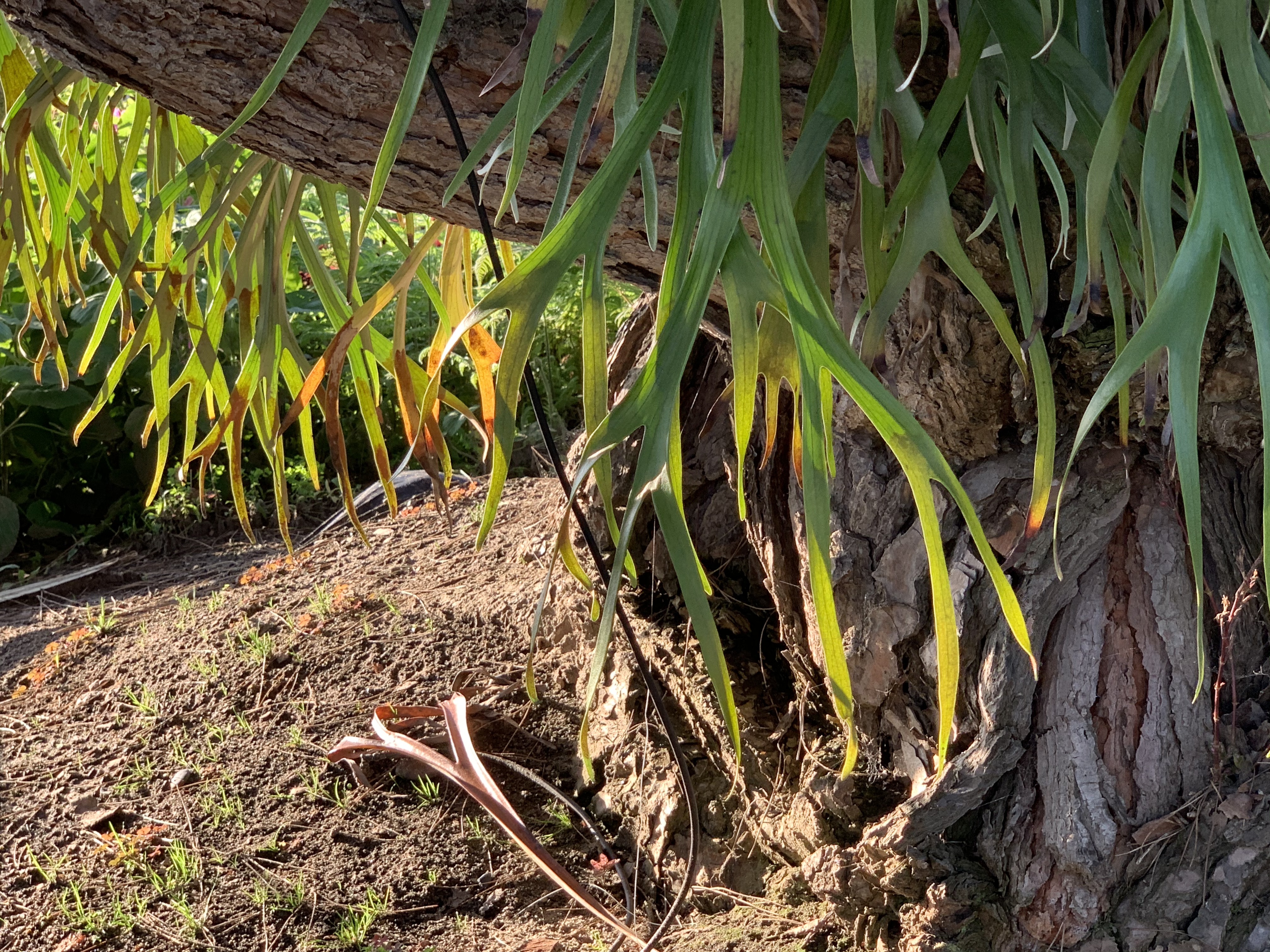
If you’ve ever walked through a neighborhood after a hurricane, you’ve likely seen many uprooted trees. When you look at the roots of an uprooted tree, what do you see? Of course, you see roots. But what else? You see rocks and soil all around and embedded into the roots. They are Not-Separate. In a hurricane, there are typically not only high winds. There is also a lot of rain. The trees are hit with a double whammy. The wind pushes the tree but the rain weakens the solid soil in which the tree is embedded. It is the combination that makes it very difficult for the tree to “hold on” and keep from falling over. 

Living things, just like us, have a 4.5 billion year history of living. The living things adapt over time to their environment and they mold the environment to their needs. They are not separate. Flowers appeal to the insects who pollinate them. The insects who pollinate them are adapted to the characteristics of the flower. A horse adapts to their rider and the rider adapts to their horse. A product or service must have a design that serves the needs of its stakeholders. For a product or service to have maximum beauty, utility, and longevity, it must also have a way to adapt to the changing needs of the users and other stakeholders. At the same time, if the users and their organizations adapt to the product or service, then true Not-Separateness is achieved. 

If you want to skimp on designing your product or service, you can make it more separate, more divorced from its context, its users, and its tasks. Of course, if you do that, you also make much easier for your users to abandon your product and switch to a new one. 

Another way to think about this in terms of systems theory is where you draw the boundary. If you draw a sharp boundary around your product, you may find that, over time, your product becomes ever more peripheral to the community you’re trying to support and your product is ever more fungible with others in its class. On the other hand, if you draw the boundary around the product or service and the people and organizations who provide the product or service then, you are on the path of ever tighter interconnect. 

“Who Speaks for Wolf” is a Pattern in a Pattern Language for Collaboration and Cooperation. It is based on a Native American story and shows the importance of making sure that knowledge and perspectives of all relevant stakeholders are taken into account when a change is contemplated. Who is “relevant” may not always be obvious, but, in my experience, many more projects fail or are delayed because of too limited a view than of too broad a view.

Who Speaks for Wolf

Not-Separateness is not only a quality of good design in terms of not overly separating the context and users from the product or service. It is also a good quality for the organization that produces products & services. Of course, some people today must manage a giant amorphous “organization” of tens of thousands of people so they set up divisions, and departments, and groups, and teams, and positions etc. There may indeed be a “UX Department” and a “Software Department” and a “Hardware Department.” That’s all fine. But it is counter-productive if the UX Department sees itself as separate from the rest of the company. To a great extent the success of the UX Department depends on the success of the Hardware and Software Departments. The Sales Department’s success will, of course, depend partly on the skills of the Sales Department. But it will also depend on the success of the UX Department, HW, SW and Services. 

Have you ever had a paper cut? It isn’t just the skin on a quarter inch of the inside of your ring finger that’s cut. You’re cut! It isn’t just that the finger feels pain. You feel pain! That causes you to take steps to ameliorate the pain and to try to make sure it doesn’t happen again. That’s why empathy in leadership is important. A leader must feel empathy for all, or the organization will disintegrate from lack of Not-Separateness. At some point, a raccoon may chew off its own arm in order to escape a trap. 

But it isn’t the first thing that occurs to them every time they experience a thorn in the paw! 

The raccoon doesn’t say to itself:  — “that paw is giving me pain! I’m going to chew it off! Then, it won’t hurt any more.”

Photo by anne sch on Pexels.com

Evolution did not evolve a raccoon that acts that way. Self-mutilation exists but it is typically a last resort.

But not for corporations. It is the first thing they think of:

“Our (you name it) Department is not performing well. Let’s lay them off and outsource it. Better yet, we’ll replace it with AI!”

What does that say to every thinking employee in the entire corporation? It says:

“You know what? All this talk about teamwork and pulling together is a total bunch of bull$hit. You cannot trust management to do what’s best for everyone. You can only trust them to do what’s best for them.” 

Living forms in nature are living forms. Their parts have severe Not-Separateness with the other parts of that form. Often, as in well-functioning families or teams, that extends to all members of the group. 

Not-Separateness is essentially deep cooperation. I give to the larger community by becoming a part of it and doing my part in it. I lend strength to the community. In return, I gain strength from that community. It is not a zero sum game, of course. The community, if it is functional, is much stronger than the sum of the individuals in that community. 

This is so deeply embedded in 4.5 billion years of evolution that it does not surprise me that we recognize beauty as being even more beautiful if it is not separate. Not-Separate enhances beauty because, like all the other properties, it is essential to life. 

Eventually, if humanity is to survive, we will realize that Not-Separateness applies to all of us. We are not there yet. But that doesn’t mean we cannot appreciate and design Not Separateness in our products, in our services, and our lives. 
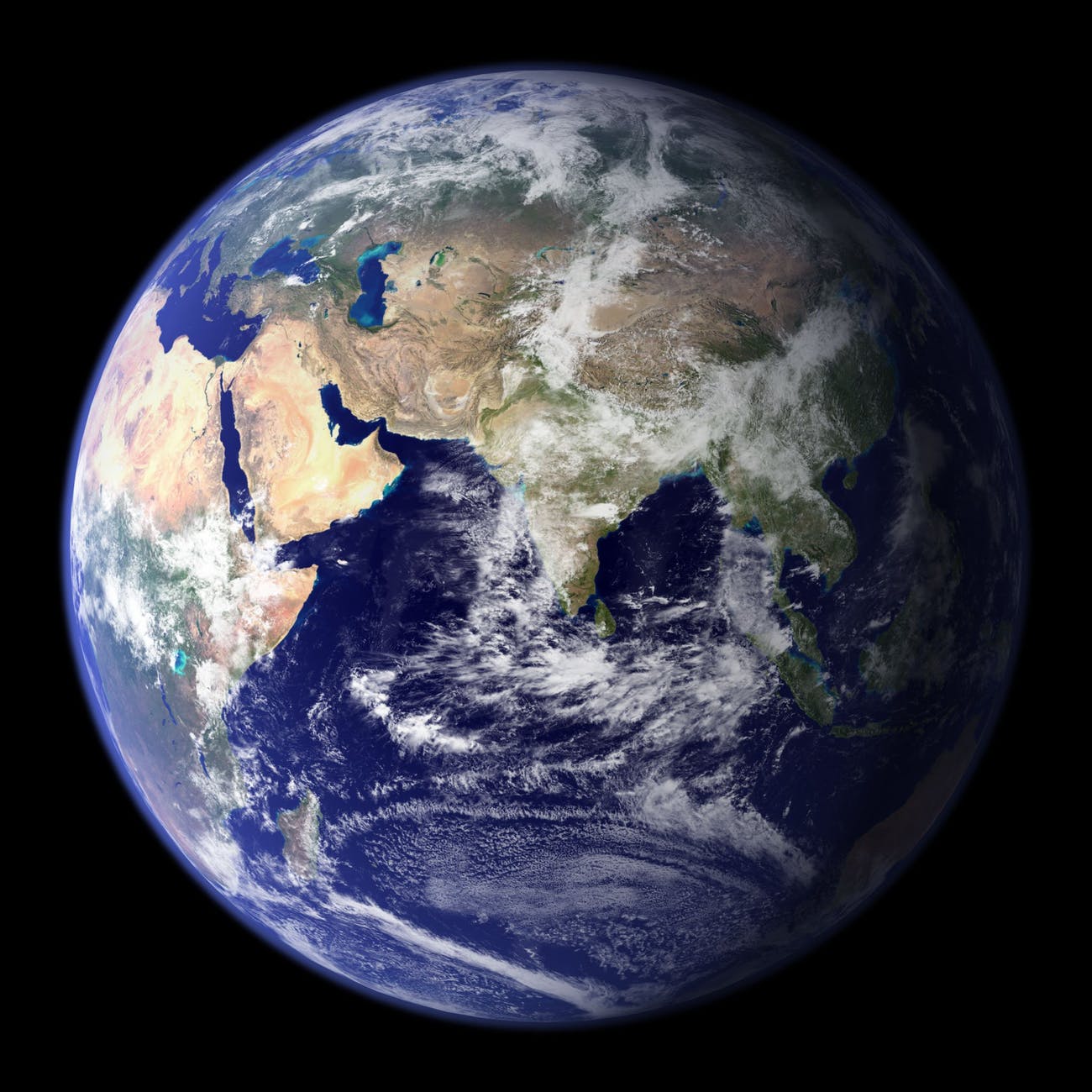
Photo by Pixabay on Pexels.com

—————-

The Declaration of Interdependence

How the Nightingale Learned to Sing

Roar, Ocean, Roar

Imagine all the people

Cancer Always Loses in the End

Ripples

Author Page on Amazon

Thomas, J.C. and Kellogg, W.A. (1989). Minimizing ecological gaps in interface design, IEEE Software, January 1989.

Thomas, J. C. (2012).   Patterns for emergent global intelligence.   In Creativity and Rationale: Enhancing Human Experience By Design J. Carroll (Ed.), New York: Springer.

Thomas, J. C. (2001). An HCI Agenda for the Next Millennium: Emergent Global Intelligence. In R. Earnshaw, R. Guedj, A. van Dam, and J. Vince (Eds.), Frontiers of human-centered computing, online communities, and virtual environments. London: Springer-Verlag.

Thomas, J.C. (1985). Human factors in IBM. IBM Research Report. RC-11267.  Yorktown Heights, NY: IBM Corporation.

10A. Gradients

23 Wednesday Sep 2026

Posted by petersironwood in creativity, design rationale, essay, HCI, leadership, management, nature, poetry, politics, psychology, Uncategorized, user experience

≈ Leave a comment

Tags

aesthetics, art, beauty, books, Design, gradients, HCI, human_factors, painting, photography, poetry, TNOO, usability, user_experience, UX, writing

10A. Gradients

My first conscious memory of thinking about “gradients” was in college biology. Gradients of chemicals make a difference in terms of cell differentiation, our professor explained. 

For the past few days, I’ve been walking the garden on the lookout for “gradients.” As an experiment, I’m going to break up the discussion of gradients into sub-categories. 

Visually, all the various gradients look similar. I am categorizing them by the cause of the gradient. 

So, first, we have “Perspective Gradient” … as we look at identical or nearly identical items at different distances, they will obviously appear to have different sizes and different distances between those items. 

Second, we have “Light Gradient.” For example, a series of spheres or cylinders lit by a single source, the three-dimensional shape will result in a gradient of light and dark from most angles. 

Third, there are often “Color Gradients” for both animals and plants. 

Fourth, there are “Growth Gradients.” Color Gradients, are often a specific example of Growth Gradients. However, there are other types of Growth Gradients. For example, in many plants new growth is at the distal end and is smaller. Old growth is more central or more toward the roots; it is older, and is larger. 

Growth Gradients apply to many plants and animals. They often apply to organizations as well. Imagine a multi-national distributor with field offices in half the countries in the world. If they move into a new country, at first, there will only be a few people; perhaps housed in a small space. Sales will grow hopefully and with the growth, new personnel and space may be added. 

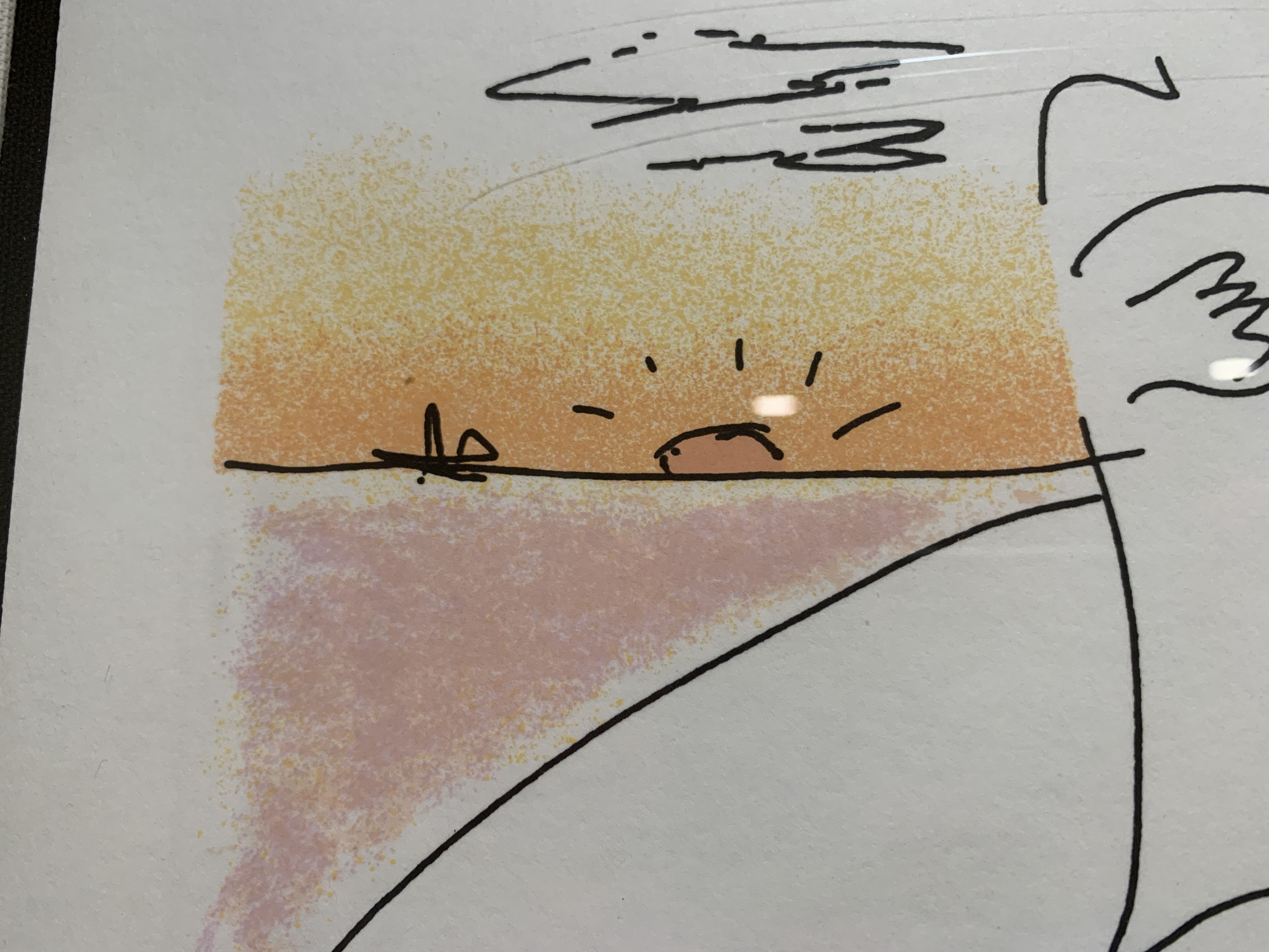
Conversely, Color Gradients can be quite intentionally added by the artist! Here’s a detail from a John Lennon lithograph. Note that “Boundaries” and “Gradients” reinforce each other. The Gradient makes the Boundary Stronger and vice versa.


There are also “Force Gradients” that appear in response to water, wind, gravity, magnetism, etc. One could argue that “Growth Gradients” are due to forces as well. Historically, gradients can arise from evolutionary pressures. These, in turn, are instantiated, in many cases, by chemical gradients of hormones that control growth. However, there are also many non-living cases of gradients.


Finally, there are “Intentional Gradients” that are put in by artists, architects, landscape gardeners, designers, and UX designers. 

Although the examples above are visual, there are also gradients in music. There are gradients in activity. 

Gradients are also present in narrative. Think of the rising passion between two lovers or the increasing tension and suspense in a mystery or horror film scene. 

Photo by Thirdman on Pexels.com

Are there gradients in User Interfaces? One example that springs to mind was in the “Audio Distribution System” and “Olympic Message System.” These were audio messaging systems from IBM that allowed subscribers to the service to leave an audio message to a person or distribution list “on a person’s phone.” (Of course, the message was really on a server and played upon demand.) The UI’s only visual elements were an ordinary touch tone key pad circa 1980 and possibly a small booklet or template with the various command options. Primarily, the user was meant to hear Prompts for actions. 

The gradient part came in the fact that the user could speed up the audio more and more as they became more and more familiar with it. That variable speed applied to prompts and also to messages. A typical user would experience slow messages, then faster messages, then, still faster messages, and so on.

In another IBM project, we built a “Personalized Education System” that would allow IT personnel to build a “Custom Course” for on-line learning that could vary continuously in length and difficulty. However, while each individual user could choose length and difficulty, they typically did not experience a gradient in that regard. By analogy, some insects may prefer to chew on new growth while others may like more mature leaves. An individual insect only experiences one “size & tenderness” yet the plant taken as a whole provides a gradient. Similarly, if you have a barbecue party again, you might offer up a range of options on how done you cook the burgers. In this case, we might say the BBQ service offers gradations though an individual burger is not a gradient. This isn’t strictly true. A well-done burger is fairly consistent throughout but a rare burger may be much more rare in the middle and charred on the edges. So, for that choice, there is a gradient of experience. 

Compared to the natural environment around me, which is positively thick with gradients, I don’t see (or feel) many gradients in any of the UI’s I interact with (games aside). The fisheye lens provides one way of introducing gradient into the UI. It produces, a kind of “Perspective Gradient.” 

https://citeseerx.ist.psu.edu/viewdoc/download?doi=10.1.1.124.1233&rep=rep1&type=pdf

It would be possible to put gradients into many of the visual elements of a UI. Would it make the interface look more like nature? Would it be more beautiful? Would it be distracting? 

——————-

Here’s a poem that illustrates a gradient of love. 

Wonder, wonder, who kept the wonder

Here’s a poem with a gradient of tension and suspense 

Late on the Interstate 

Here’s a story that exhibits gradient. 

As Gold as it Gets

What kind of gradients do you see in this poem?

Somewhere a Bird Cries

9. Contrast

21 Monday Sep 2026

Posted by petersironwood in creativity, design rationale, essay, HCI, leadership, management, nature, psychology, Uncategorized, user experience

≈ Leave a comment

Tags

aesthetics, art, beauty, HCI, human_factors, leadership, nature, order, photography, poetry, usability, user_experience, UX, writing

9. Contrast

With zero contrast, nothing can be seen at all. Beyond that however, it is interesting how many plants and animals as well as good designs show the property of Contrast. Plants “use” contrast, if I may speak in teleological terms, to attract pollinators such as butterflies and bees to their flowers. Plants also use contrast to “announce” to animals who spread seeds that their fruit is ripe and ready to be eaten. If the fruit part of a plant did not make such an obvious “announcement,” a forager might damage a plant by eating all of it rather than just the sugar-rich fruit. 

By contrast, fall leaves show high contrast which adds to their beauty, but this is probably just a “side-effect” of the leaves “saving” their water & chlorophyl and leaving other colorful compounds in the leaf. I suppose there could be an evolutionary advantage to a tree that is beautiful in the fall. I could imagine that bright colors attract animals and birds to “hang out” nearby and this means that the soil will be enriched by animal excretions and occasionally by deaths. In some cases, the color might “signal” animals that fall is coming and if the animals take more appropriate actions, this makes for a healthy ecosystem that in turn is good for the trees. I know of no such evidence however. It seems likely the bright colors are a beautiful side-effect of the tree breaking down the no-longer-useful chlorophyl to components that are stored in the roots. The more we learn about trees though, the more “clever” they seem so I wouldn’t put it past them to have “reason.”

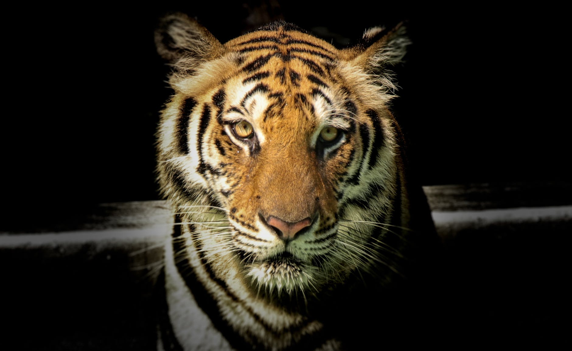
Some animals, such as zebras and tigers, use contrast as a kind of camouflage. If you see a picture of a zebra or tiger out of context, you may think, “What? How is that camouflage?” But in the bright sun, grazing in tall grass (or lurking there, hoping for dinner), it actually does serve such a purpose. 

Photo by Sayantan Kundu on Pexels.com

There is also a more subtle kind of camouflage that some animals employ. High contrast can make it difficult for a potential predator or prey to “parse” the visual image. I believe some of the professional tennis outfits, for instance, make it harder for an opponent to “read” the actual body positions from across the court, especially with non-foveal vision. Is that what’s going on in the picture below? 

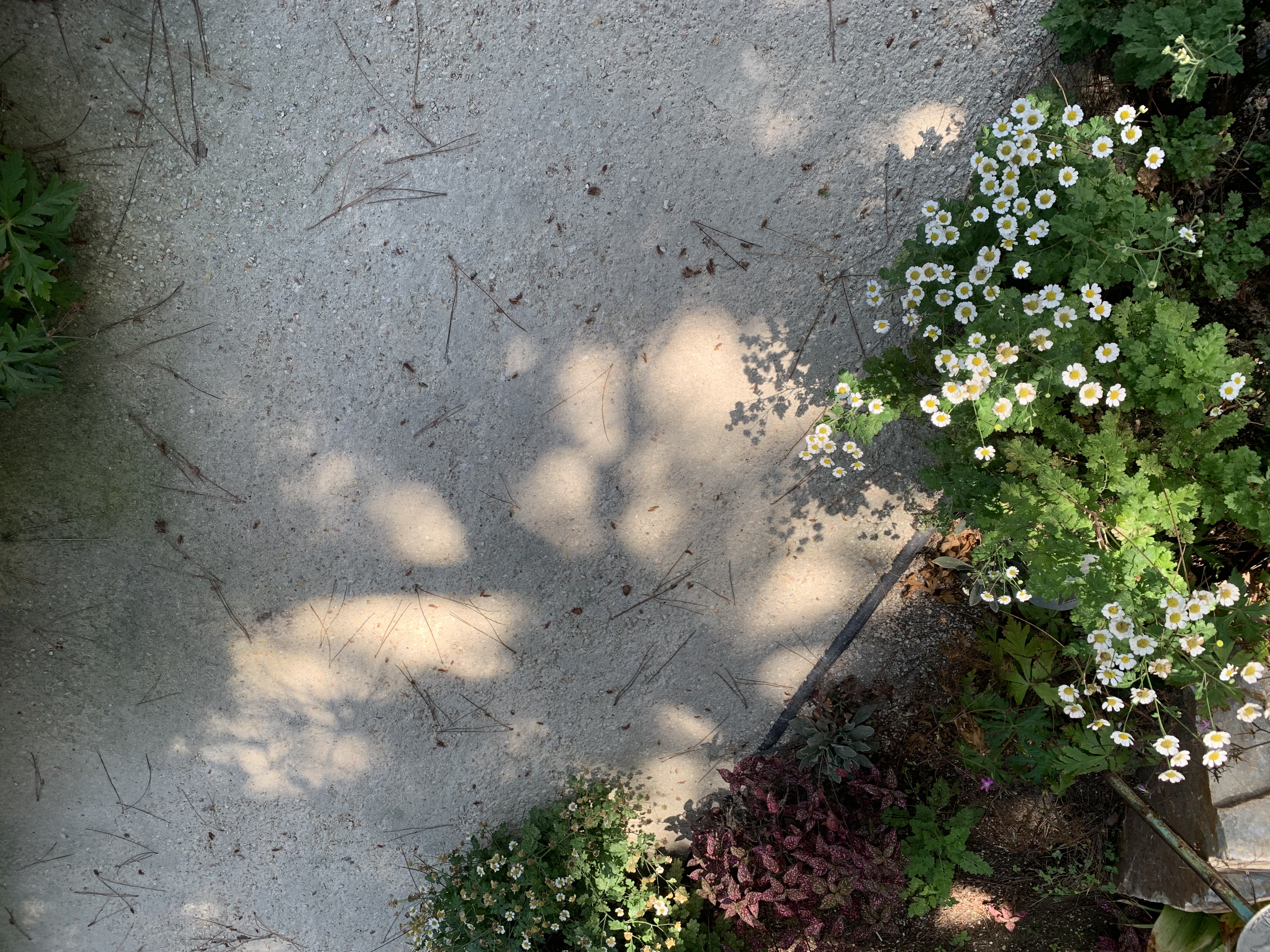
Considered separately, the shadow of the fence in the photo below strikes me as more beautiful than the fence itself. This is largely due to the higher Contrast in the shadow. I think another property “Roughness” also plays a part. The fence is machine milled and regular. The shadow falls on uneven ground. Rather than obscuring the Contrast, the Roughness actually enhances it. In addition, the fence appears quite separate and distinct from the greenery behind it. However, the shadow is partly determined by the fence and partly determined by the uneven ground. This means the shadow exhibits more “Deep Interlock and Ambiguity.” 

I do think the combination of fence and shadow is more beautiful than either taken alone. Taken together, there is an additional layer of Contrast between the “mechanical” regularity of the fence and the rougher feel of the shadow. 

One of the things that trees do is add contrast by virtue of the branches and leaves casting irregular shadows in many places but letting bright light through in other places. Here is a simple case. 

In the photo below, the landscape architect has likely intentionally designed this arbor partly with contrasts in mind. Dark vs. Light; Horizontal vs. Vertical; Straight vs. Bent; Built vs. Growing. What other contrasts do you see? 

Contrast is often desirable not just in terms of vision, but also for other senses. A good salad, for instance, shows contrast in color, but also in terms of textures and tastes. Orchestral music shows contrast in terms of loudness, timbre, harmony, melody, etc. 

Living things also exhibit contrast, not only in their visual appearance, but also in terms of the rhythms of life. Many plants and animals exhibit both daily cycles such as sleep and wakefulness, but also yearly cycles (hibernation, aestivation, migration, mating season, losing fall leaves, blooming & fruiting, etc.). In fact, many animals & plants only live one year. 

Photo by Zaw Win Tun on Pexels.com

Stories typically exhibit contrasts of various sorts. A story (whether play, movie, novel, or short story) is often more interesting when set in both wartime and peacetime, in both country and city, in two different times, etc. In addition, a good story often has contrasting characters such as hero and villain, or two less extreme characters, one of whom is a “foil” for the other. The plot itself is constructed of contrasts in value. The hero loses an athletic contest. Then, the hero wins! Then, the judges unfairly strip the hero of the medals. Then, an investigation reveals that the hero was framed and the hero prevails after all. Love may conquer all — but never without a struggle. 

This succulent pictured below seems beautiful to me partly because of Contrast. Is there an aesthetic “purpose” to the contrast shown? Or, is the real “point” to provide the sharp spikes on the edge of the plant and in order to make those spikes effective, the plant needs to be drier near the edges or have a yellow pigment that somehow facilitates the growth of spikes? Perhaps the plant’s growth is limited (in the Southwestern US) by the available water and not at all by sunshine (which is plentiful). Therefore, there is no “point” to having the entire plant green. 

If it seems too far-fetched to imagine a plant exhibiting contrast because it’s more beautiful, it is not to far-fetched to imagine animals exhibiting contrast to attract other animals; most notably, a mate. Insects, birds, mammals, fish, sometimes exhibit “displays” of high contrast color in order to attract mates. Typically, such displays are only used during actual mating season. 

In addition to seasonal and daily “contrasts” in behavior and appearance, animals often exhibit contrast at a finer temporal granularity. As humans, we breathe several times a minute and our heart beats about once a second. Some aspects of our anatomy and physiology have evolved to provide antagonistic forces and processes. We have, for instance, our sympathetic nervous system that prepares us for “Fight or Flight” reactions. The para-sympathetic nervous system turns on a “rest and digest” mode also called “feed and breed.” Our sensory and motor systems use both excitatory and inhibitory processes to “sharpen” what we perceive and the actions we take. Our musculature often has muscles that produce “opposite” results. Our biceps bends our arm and our triceps straightens our arm. The adductors in our legs move our legs inward toward our trunk and the abductors move our legs apart. 

Contrast is so prevalent in the natural order of things “out there” and in the structure and function of our own bodies that it is hardly surprising that our conceptual structures often exaggerate contrasts. We often think, for instance, in terms like these: “Up or Down? Liberal or Conservative? Good or Evil? Strong or Weak? Black or White? Growth or Decay? Orderly or Disorderly?” 

If we return to the photo of the fence and its shadow, for example, we are tempted to describe the darkest parts of the shadow as being places without light while the spaces between have light. Of course, there is light, even in those shadows. Light is reflecting off the nearby trees, houses, grape vines, sand, cars, etc. There is nothing shown in this photo that has no light.

As Amanda Gorman pointed out in a Presidential Inauguration — 

“For there is always light,

if only we’re brave enough to see it

If only we’re brave enough to be it.”

When it comes to User Interface Design, contrast has many uses. For example, contrast is often used to signal whether an item is chosen or not, or whether an action is available or not. Interfaces often include text and the text is easier to read if the contrast is higher. In the early days of human computer interaction, text was composed of a relatively small number of bits that were either on or off. High contrast came with the technological limitations of the devices. More recently, text often appears as dark gray on light gray rather than as black on white.

Why? I have no idea. People sometimes claim that low contrast is “easier on the eye.” So far, no-one has been able to point to empirical evidence. However, text is harder to read when the contrast is low. If the user is old, or trying to read in glare, or has limited vision, or the reader or device is moving or vibrating, low contrast text can become illegible. The “worst” cases I’ve seen are on devices such as CD players or smoke alarms. To simplify (and therefore cheapen) manufacture, the letters are not painted at all but simply embossed as white on white or (even worse) black on black. From my personal experience, few things in modern life are as pleasant as being awakened around 3 am by a screaming smoke alarm which has cryptic and unreadable directions in white on white. 

At a more abstract level, a high level of conceptual contrast can often make the user experience less frustrating, more enjoyable, and more productive. What do I mean by “conceptual contrast?” In this context, I mean that two related actions or situations that are clearly differentiated in the commands, the explanations, the terms etc. are less prone to confusion. Let’s pick on what I see right before me: the high level “Pages” tool bar. “File Edit Insert Format Arrange View Share Window Help” At a visual level, these are nearly white on a black background; i.e., easy to read. But what is the conceptual contrast between “Format” and “Arrange”? How about “View” and “Window”? Are there other terms that would be better cues as to what these groups of functions do? 

The same for menus within the document. I see above the material I am actually typing another use of the words “Insert” and “Text” appears right next to it. But how is this different from “Text” on the right? It’s not that any of these items are so confusing that they cannot be learned. “Style” when you are writing (as opposed to “word processing”) generally refers to something much more abstract that the type of font and the size or color of the text or the spacing between lines. 

I think a more fundamental issue is that typical text editors, after the “Clippy” fiasco, have steered away from explicitly supporting the process of actual writing. Developing a truly useful aid would be much more difficult. I’m not going to try to design such a system here. To give a hint of the kind of thing I mean though, suppose that a text editor explicitly supported writing a short story. Embarking on writing a short story, the user might be presented with a choice for guidance. Perhaps this hypothetical writer wants to try writing a “locked room” mystery. And, maybe they want lots of guidance. So, the software leads them through an idea generation phase. In that phase, perhaps it is more productive to turn off various kinds of “autocorrect.” Perhaps the author is encouraged to “solve” the basic problem (how was the murder committed) before actually beginning the writing. Maybe there is a high level of visual Contrast which serves as a constant reminder to the author that they are, at this point, generating ideas. 

Von Oech suggests that problem solving involves four stages that he illustrates with four “hats” — an explorer’s pith helmet for the Exploration phase; an artists beret for the Creation Phase; a judge’s wig for the Editing or testing phase; and a Viking warrior’s horned helmet for the marketing and sales phase. If such a model were supported by the software, you might expect a strongly contrasted visual interface to reinforce the phase of writing that the user was in. The Exploration phase might consist visually of cards evocative of various fields that would support research. The artistic phase might be a mind-mapping tool. And, so on. The user would know at every glance which phase of the overall writing process they were “in.” 

It may be that any such process involves too much overhead or is too rigid. But what is the alternative? At present, the author must either keep almost all the information about their goals, ideas, and processes in their head or in a separate document or spreadsheet. As I look at the screen in writing there is almost no clue about “where I am” in the process of writing. Whether or not you buy into the specific four-stage model of Von Oech, I do believe that various phases of writing do offer contrasts in terms of how that phase should be supported. I only chose writing as one example. 

Nearly any task that the user is engaged in has some structure to it. Scientific research, learning a foreign language, organizing a tennis tournament, planning a trip, finding a house, buying a book on-line, etc. All of these have different sub-tasks. In some cases, the user wants more flexibility; in some cases, less flexibility is actually helpful. But most “application programs” seem to me to be deficient in terms of guiding the user through a process; giving any visual indication of where the user is in the overall process, or of tailoring actions to which subtask the user is engaged in. If a user is generating ideas, for example, pointing out grammatical errors, typos, and spelling errors is distracting and not that helpful. On the other hand, if the user has finished writing a first draft and is proofreading, then such suggestions may be helpful and appreciated. 

How do you see the use of Contrast in User Experience? Is Contrast best thought of as a visual property which may be nice to have but is not crucial? Or, does Contrast also apply to different subtasks or phases which need to be reflected in both the appearance of the UI and in the functionality? 

———————-

The 4 Roles of Creativity: Explorer, Artist, Judge, Warrior

http://creativethink.com

Some poems that provide Contrast. 

Here is a poem that contrasts a “before” and “after” state. 

How the Nightingale Learned to Sing

Here’s a poem that contrasts two different views about how powerful you are. 

Roar, Ocean, Roar

Here’s a poem that contrasts natural beauty with mechanical sameness.

The Forest

Here’s a poem about music that contrasts various acoustic elements to mirror changes in music. 

Piano 

Here’s a poem that contrasts the gentle and caring beginnings of love with becoming jaded. 

Wonder, wonder, who kept the wonder? 

Here’s a poem that contrasts the importance of adult work with the importance of a child’s play. 

The Most Serious Work

Here’s a poem that contrasts two ways to frame resistance to tyranny

Roar, Ocean, Roar!

Here’s a poem that contrasts love and guns

Love and Guns

5. Positive Space

15 Tuesday Sep 2026

Posted by petersironwood in creativity, design rationale, love, nature, psychology, Uncategorized, user experience

≈ Leave a comment

Tags

aesthetics, art, beauty, books, Christopher Alexander., Design, freedom, greed, growth, HCI, life, nature, pattern language, Patterns, politics, psychology, responsibility, usability, user_experience, UX

5. Positive Space

(This is the fifth in a series of 15 blogs that explore Christopher Alexander’s “Fifteen Properties” of good design, natural beauty, living spaces, etc.). 

Life is a dance on the edge between chaos, on the one hand, and sameness & repetition on the other hand. Repetition without variation or change is not life. On the other hand, endless random variation without any pattern or principle is also not life. Planet Earth is sometimes said to be a “Goldilocks Planet” — not too hot and not too cold — to support life. Most of the life forms on planet earth themselves exhibit a “positive shape” — a shape that wants to expand and fill out — and yet, there are limits because of circulation, gravity, communication etc. so that growth is typically not unrestricted. The tension between trying to grow and having to stick close enough to form creates positive space. 

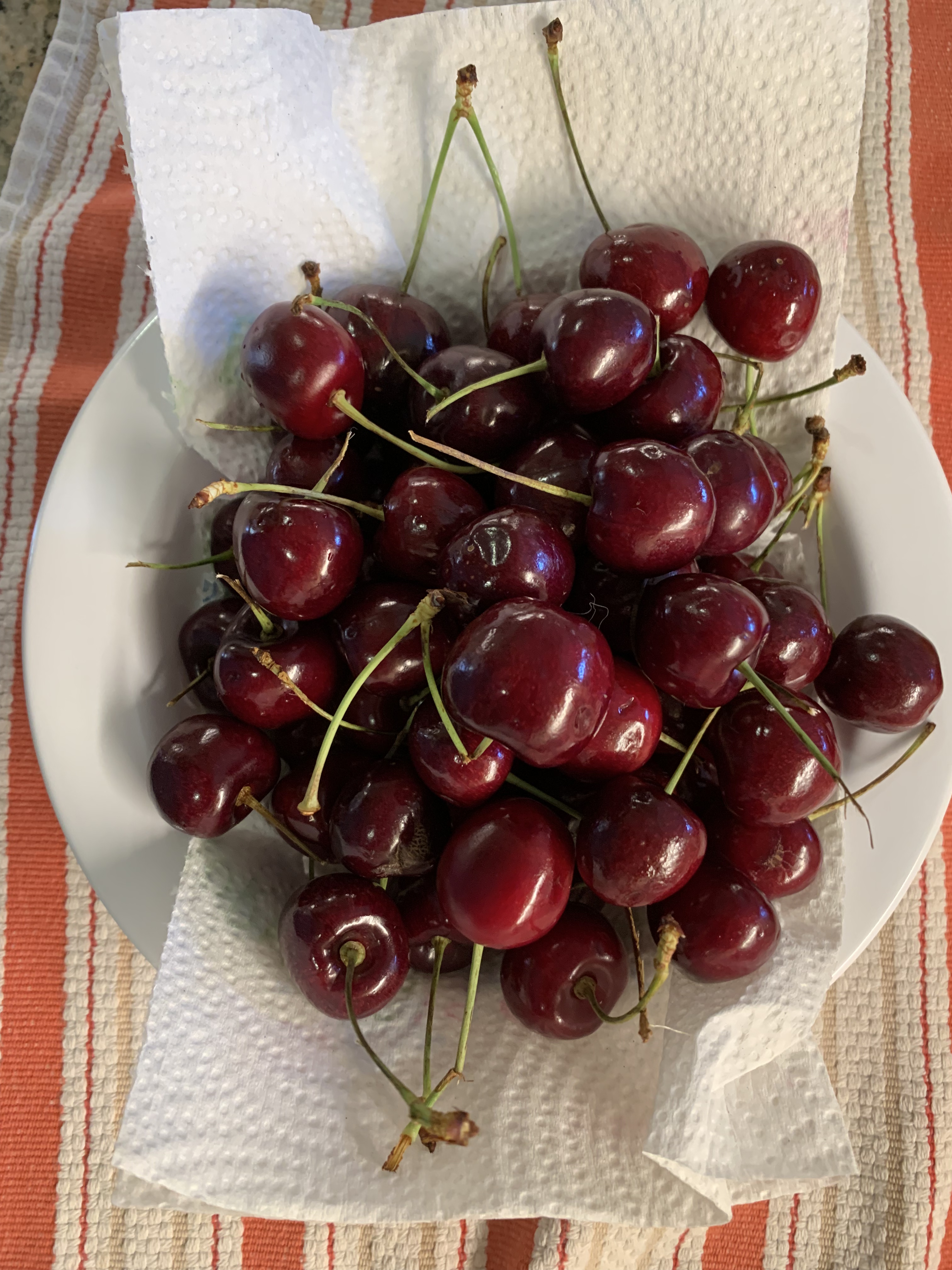
Life may not always be “a bowl of cherries” but nonetheless, a bowl of cherries does illustrate the property of “positive space.” The bowl connotes living things trying to expand right up to the boundaries possible. A bowl that is filled with cherries and even slightly over-filled but without inducing a fear of spillage, to me, connotes life being vigorous and healthy. To me, a single cherry sitting all alone in a large bowl seems to exhibit positive space much less — at least at the scale of the bowl. 

When I look at an individual cherry, I also see positive space. The cherry is not a perfect sphere, featureless and smooth. If it were, to me, it would be a much less positive space. The fact that there is a stem and a noticeable indentation where the stem goes provides a kind of center. So too does the slight asymmetry of the cherry. It appears as though it might have developed as two halves that tried to circle a space at the same time from two different directions – clockwise and counterclockwise. They met and merged to form the almost spherical cherry. 

The lobes of this red pepper show positive shape.

The cherry is not the only natural food that has this kind of positive space. Think of corn on the cob. Each kernel seems to have tried to grow as large as it can. It pushes up against and into other kernels. Each kernel seems therefore to be “bursting with life.” 

Consider a cucumber. It’s roughly cylindrical. But “roughly” is important here. To me, it would seem much less an example of “Positive Space” if it were literally a cylinder. It tapers at the ends and it bulges at the middle. That seems more “positive.” 

To a person who doesn’t understand that life is primarily a cooperative endeavor among all the parts of the vast tree of life, but instead sees the world only as a zero-sum game, it must seem as though the positive living space of a cucumber makes the space around the cucumber less positive and less living. But this is not true! The space around the cucumber’s slightly rotund shape is much more positive and living than the space around a perfect cylinder. 

Think of a tree trunk compared with a telephone pole. They are both made of wood and they are both approximately cylindrical. But a tree trunk feels much more alive to us than a telephone pole. I don’t think this is simply because we “know” a tree is alive. It looks more alive and if you allow yourself to “tune in” to it, it feels more alive. And, importantly, not only does the space that the tree inhabits seem more living. So too does the space around it! A long line of telephone poles may exhibit “Levels of Scale” and “Alternating Repetition” and such a picture may make us feel some life to it. 

Photo by Lerkrat Tangsri on Pexels.com

But a single telephone pole does nothing to stir life in me. In that sense, it’s nothing like a tree. It’s flat and it kills the space on either side as well. The columns in the Parthenon are roughly cylindrical and obviously not literally alive. But they, unlike a telephone pole, have positive space and create positive space around them. Life is not fundamentally a zero-sum game. The bee does not “steal” the flowers pollen and thus damage the flower. The bee helps the flower. The flower helps the bee. Positive space in an object does not steal from or detract from the space around the object. It enhances it! 

Similarly, the “competition” for space among the kernels of corn on a cob of corn shows that competition can be a beautiful thing. I like to see the kernels pushing against each other. All of them seem living and positive. Imagine instead a cob of corn in which one kernel had grown like a giant spider of orange cancer and took up 98% of the cob. Aside from this one ultra-greedy cell, there were only a few widely spaced and shriveled up kernels. Would you pick that from the pile of corn? Would you want to slather it with butter and bite into it? I sure wouldn’t! And to me, that is exactly what cruelty, unfairness, and greed look like. It might seem positive — after all, the dictator is trying to “grow.” That is true but he’s rigged the game. Competition is no longer beautiful when the game is rigged. Competition is no longer beautiful when your tennis opponent slices off your leg before the match starts or pays off the chair umpire to call everything you hit out. 

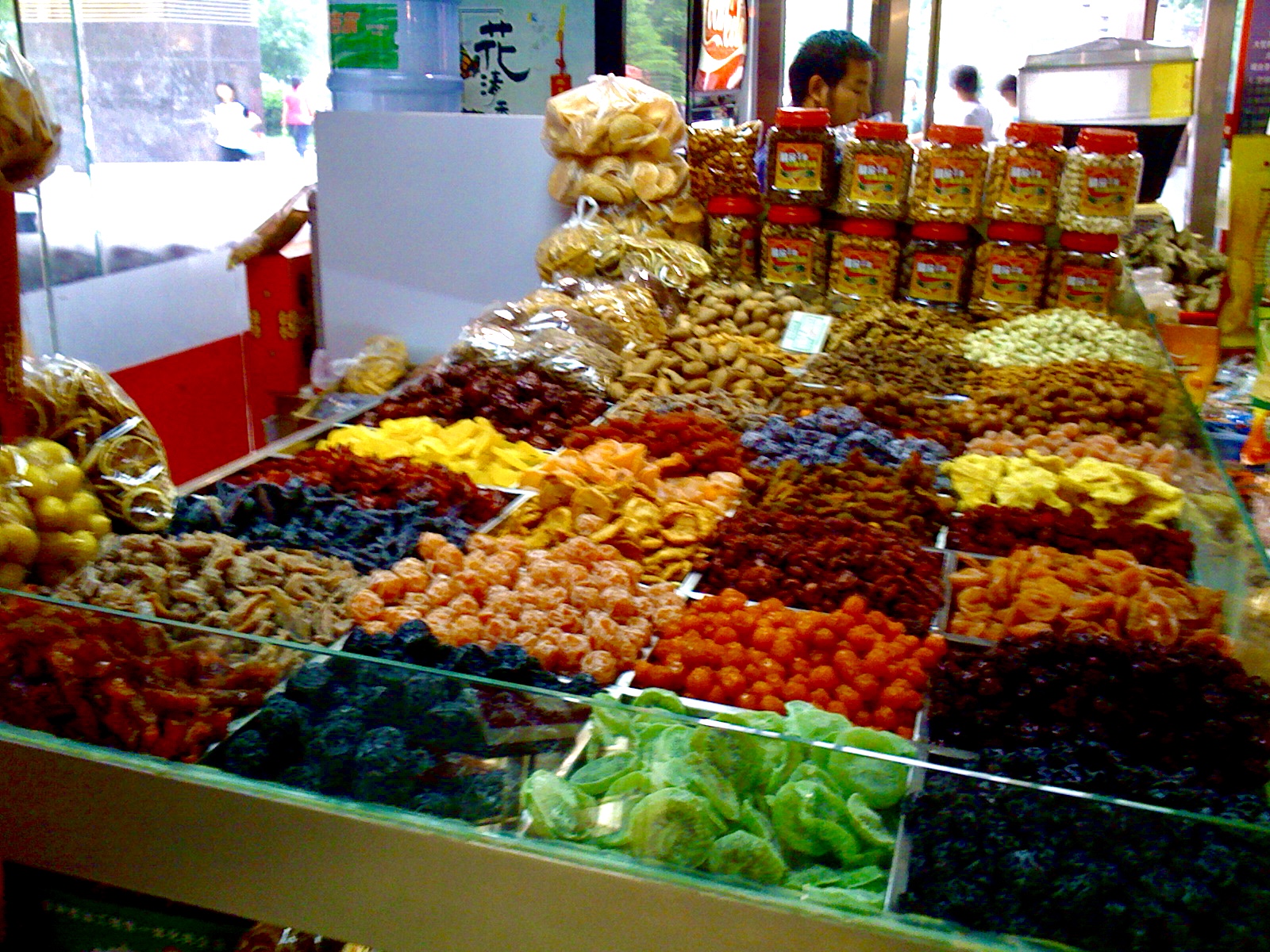
I don’t think there’s anything particularly special about cucumbers or cherries or corn. I just happened to have been washing vegetables before writing this. These radishes also exhibit positive space. And, although their shape is not the same as a cherry or a cucumber, the radishes also enhance the space around them. And, so does the avocado. An avocado that is just past ideal ripeness begins to flatten irregularly and the “pebbles” of the skin also flatten making a less positive space. The pebbles of a perfectly ripe avocado are themselves tiny positive spaces that add to the overall impression of vigor. 

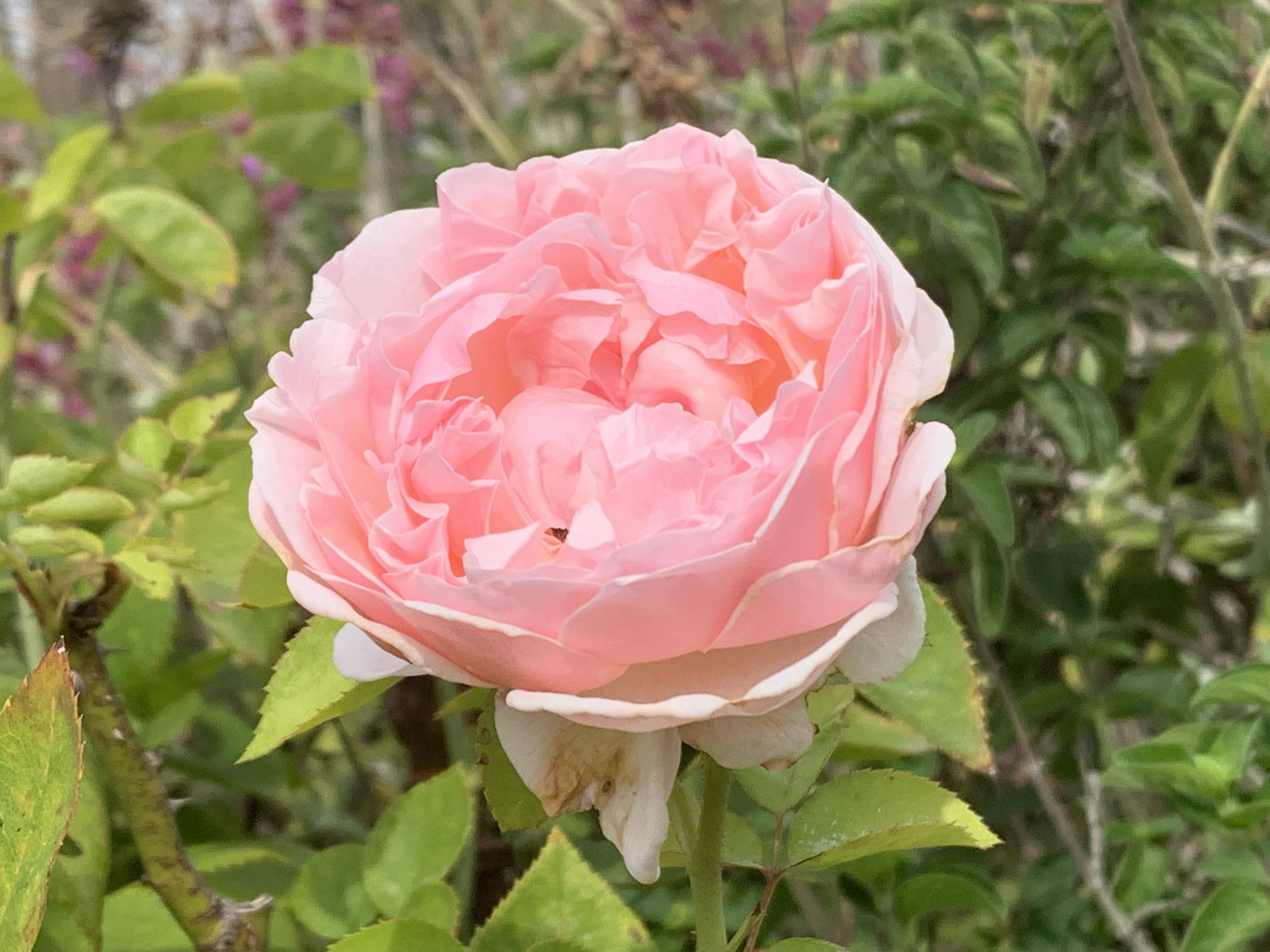
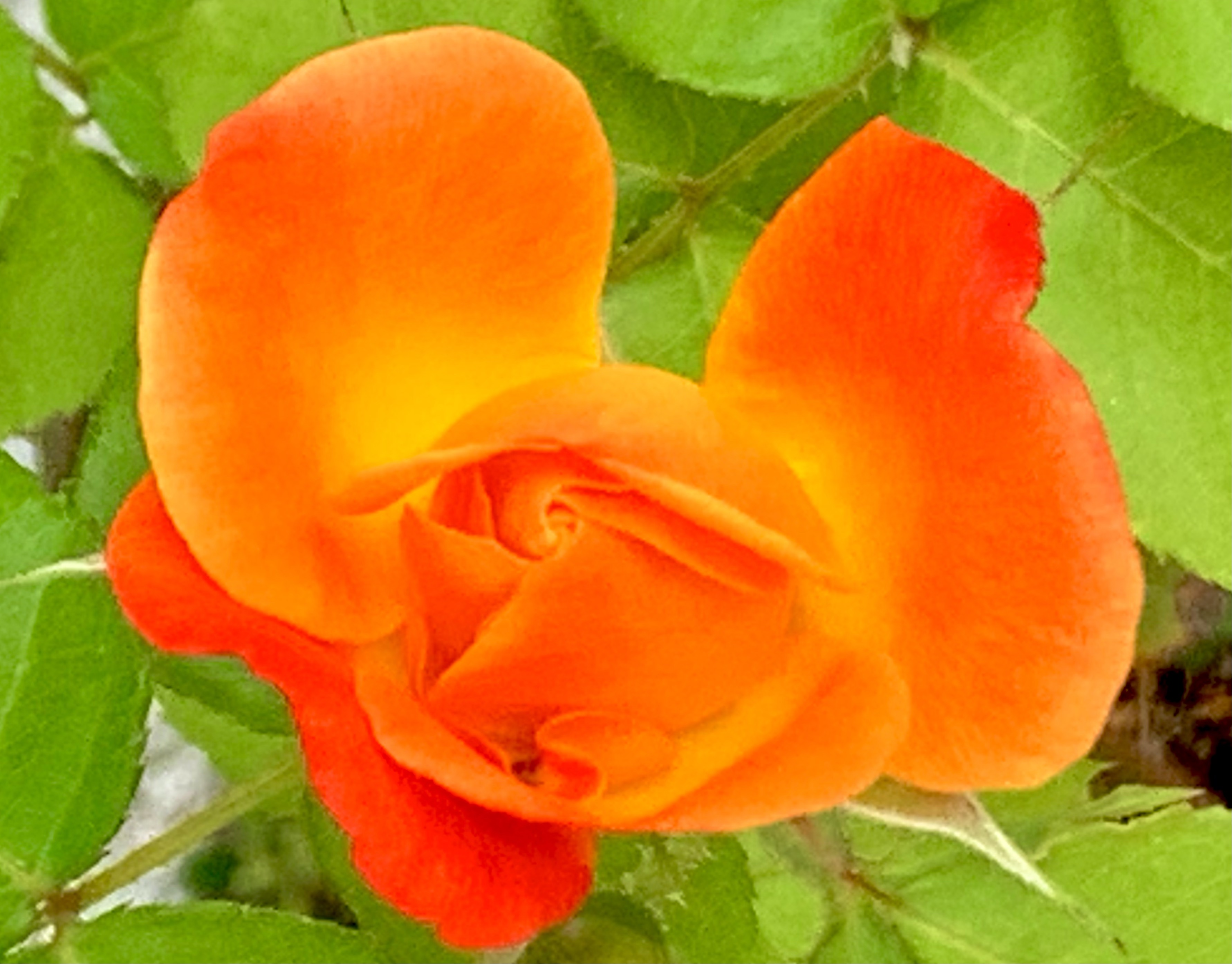
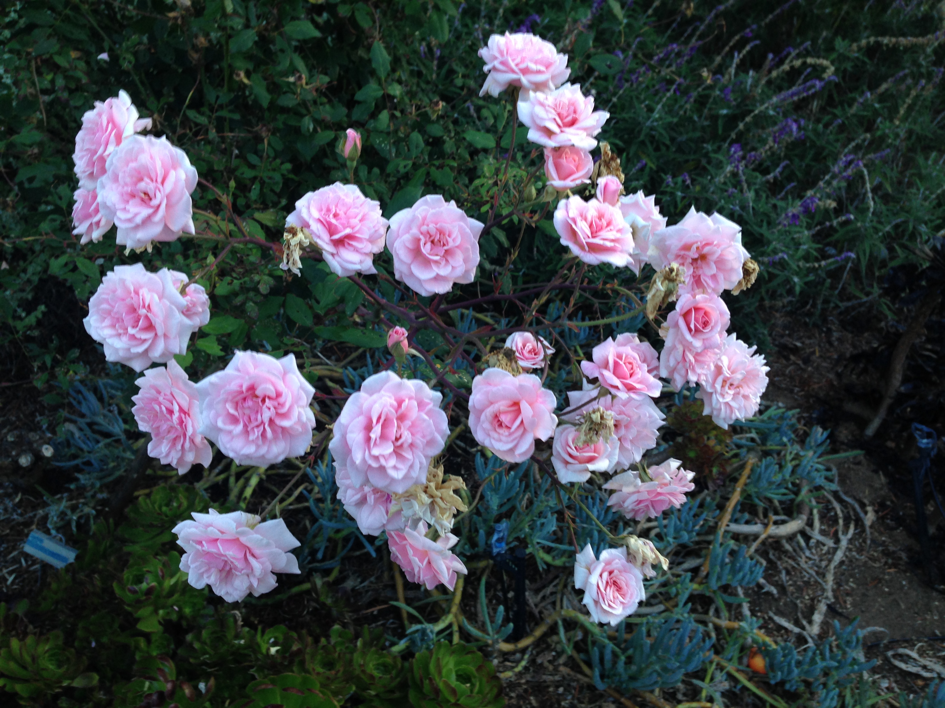
Flowers provide numerous examples of positive space. And, so far as I can tell, the positive space of flowers invariably also enhances the positivity of the space around them. 

Animals also generally exhibit positive space. Their shapes, after all, come about through a struggle among different tradeoffs that have been “learned” by each species over four and a half billion years. But whether you look at the leg of a turtle, the leg of a turkey, or the leg of a polar bear, you will see positive space. The shapes are quite different because their histories are quite different. But in every case, the shape is determined by the history and each of those histories is the same length — 4.5 billion years. The fact that each of these shapes comes about through the dance of trying to survive and thrive in all their various habitats makes every one of them beautiful in its own right — even those whom most of us don’t particularly like to interact with such as rattlesnakes or lions. Even if we don’t wish to come face to face with a lion or grizzly bear, we do recognize their beauty. And, I would claim that as those animals walk through any landscape, they will not only exhibit their own positive shape; they will also enhance the positivity of the shape around where they are walking. Think how many times photographers and painters have put an animal in the foreground of a landscape. Of course, doing so makes the scene immediately more living, more interesting, and more beautiful. 

Photo by Anastasia Shuraeva on Pexels.com

What does this have to do with the user’s experience on a computing device? I would have to say that most interfaces on most devices do not do much to bring the interface “alive” including having positive space. The tool bar icons on this version of my Mac are very slightly “bulging” like a living cell (or kernel of corn). Even more subtly, the windows have slightly rounded corners. 

It’s an entirely different story with many games though. It seems to me that some of the game artists are among the best artists in the world. They have created many very beautiful games. Could they be more beautiful still if game designers consciously thought about using Christopher Alexander’s “Properties” in general, and “Positive Space” in particular? I think so, but for many games, such as Horizon Zero Dawn, many of the elements are copied so closely from nature that aspects such as “Positive Space” are mostly already taken care of by evolutionary bias toward the beautiful. (Yes, I do think there is such a bias, but it will have to be the subject of a different post.)

What about other applications and systems? Do you think you’ve seen good examples of “Positive Space” in such systems? How could you see incorporating “Positive Space” in UX? 

At a more societal level, it seems to me that freedom is closely related to “positive space.” Each individual should be free to expand, grow, experiment, so long as it doesn’t impinge much on those around them. Imposing overly strict boundaries makes life less interesting and less lively. Growth without any sense of balance or notion of how a particular piece of life relates to the whole is called cancer. A society which allows or even encourages theft, rape, fraud and other felonies under the banner of “freedom” is doomed to ultimate failure with lots of pain along the way.

————————————

Winning by Cheating is Losing

Life Will Find a Way

Math Class: Who are you?

Life is a dance

Myths of the Veritas: The Forgotten Field

Cancer Always Loses in the End

When GREED is the only creed

The After Times

After All

Somewhere a Bird Cries

The Dance of Billions

Some recommended books —

The Winning Weekend Warrior focuses on the mental game for all sports using examples from tennis, golf, baseball, and other sports. It covers self-talk, imagery, mental practice, strategy, tactics, & sportsmanship. http://tinyurl.com/ng2heq3

Turing’s Nightmares explores the implications and ethics of Artificial Intelligence through fictional short stories. http://tinyurl.com/hz6dg2d

Fit in Bits shows many ways to put more fun, variety, & exercise into daily chores and habits to help with strength, flexibility, fitness, and balance. http://tinyurl.com/h6c7fce

Tales from an American Childhood recounts early experiences mainly in the American Midwest in the 1950’s and relates them to contemporary issues and events. https://tinyurl.com/y9ajvz9j

Dream Planet. Where do you run when the whole world is crumbling under the weight of human folly? When the lethal Conformers invade 22nd century Pittsburgh, escape becomes the top priority for lovebird scavengers Alex and Eva.

https://www.barnesandnoble.com/w/dream-planet-david-thomas/1148566558

3. Boundaries

13 Sunday Sep 2026

Posted by petersironwood in Uncategorized

≈ Leave a comment

Tags

Design, UX, HCI, ethics, usability, life, greed, truth, nature, beauty, writing, boundary, limit, privacy, user_experience

3. Boundaries

Here are a few thoughts about “Boundaries” and how they apply in User Experience. 

I decided to gift a copy of of Volume One on The Nature of Order to my daughter earlier today. I logged on to Amazon and looked at my address book. I am aware that she moved fairly recently. So, I was scrolling through my earlier text conversations with her to see whether she had told me of her new address. I couldn’t find a text about her new address so I texted her to get the new address. 

Suddenly, a popup window appeared from SIRI. It had her new address. I hadn’t said anything aloud. I thought of SIRI as a voice-activated service on my iPhone. It was disconcerting to have it “notice” my text message and then suggest an answer (which turned out to be correct). 

Last week, after physical therapy, my therapist & I began to discuss the time for my next appointment. I pulled up the calendar application on my iPhone and went to a particular day and began to type in her name. After the first two characters were typed in, the “type-ahead” function suggested three possible “completions” the first of which was the time we had been orally discussing (which was not a common time nor the time of any of my recent appointments with her). It also filled in her complete name and the purpose of the appointment, but that was more understandable. 

Photo by Nikolay Ivanov on Pexels.com

One sense of “Boundaries” in User Experience connects with a notion of “boundaries” that is much discussed in contemporary mental health. We are advised to “establish boundaries” with co-workers, family, friends, and strangers. We don’t necessarily want to share personal information with everyone or let everyone touch us in any way they choose to. If intimate details are shared in a recovery group or group therapy, it is generally agreed that such details will not be shared with others. 

We sometimes extend the idea of informational boundaries to written materials as well. If, for instance, we keep a personal diary, we do not expect other people to “search for it” or to read it. In the short story, “Jennifer’s Invitation,” (link below) about my shy attempt as a third-grader to invite my girlfriend to my birthday party, I relied on my expectation that she would read a paper I “accidentally” dropped on the sidewalk. But she was so protective of my privacy that she wouldn’t even glance at my paper. I lost track of Jennifer, but I’m pretty sure she never became CEO of an IT company.

On the other hand, if we write and publish an autobiography, then we can expect that other people will feel justified in discussing the contents. To me, it would seem odd for an author to feel “violated” if people start talking about the contents of their autobiography (or their blog).

When it comes to modern interactions with computer software however, the boundaries are invisible — and sometimes non-existent. It can feel as though I write a private diary on paper; lock it up in a safe immediately; and then — without any sign that the safe has been broken into, I suddenly find details of my personal life revealed! 

There appear to be boundaries between applications, and certainly between devices but these boundaries may be illusory. I find that troubling and confusing. I think the first application of “Boundaries” as a property of UX is that apparent boundaries should be real. There may be exceptions for exceptional circumstances; e.g., the police may get a search warrant to search your house if there is reasonable suspicion that you have committed a crime. 

When a social media site analyzes your reactions, relationships, and word usage to determine what to try to sell you and what type of approach is most likely to succeed, that does not strike me as a reasonable response to an “emergency.” As most readers know by now, such information is not only used to try to sell you more stuff; it was also used to manipulate public opinion; for example, to convince some US voters to stay away from the polls on election day in 2016; to convince voters in the UK to vote for Brexit; to convince people not to get vaccinated. 

Living things do have boundaries. Breaching those boundaries is typically something to be avoided. We call such breaches by names like “bites”, “wounds”, “diseases”, “gunshots”, “parasites.” Living cells typically have a cell wall. Within the cell are tinier organelles such as the mitochondria. The mitochondria have boundaries. The nucleus of a cell has a boundary. Within the nucleus, the nucleolus has a boundary. Larger structures often have boundaries. Motor neurons have a myelin sheath which allows neural impulses to travel faster. Almost our entire body is covered in layers of skin which serve for us a boundary.


The formation of boundaries does not stop with our physical body. Organizations of humans — nuclear families, clans, nation-states, counties, cities, townships, teams, corporations — they have boundaries. A bank, for instance, might have a safe for the money, but the building itself also functions as a boundary — not an impermeable boundary — customers are allowed to come in during banking hours. There are also legal boundaries. If you have “an account” at a bank, you will be allowed to do things that non-customers cannot. Similarly, if you are an employee of a company or a member of a sports team, you will be allowed to do things and go places that you couldn’t if you were outside that boundary. 

All boundaries are semi-permeable. Boundaries change over time. A thorn tears your skin. Your boundary is broken. If you’re not careful, bacteria can get in and cause an infection. Your white blood cells destroy the invading bacteria. Your body heals. If the cut was bad enough, you may get a scar and the scar is now part of your “boundary.” It isn’t only at the level of the body that changes occur. Your social boundaries change too.

You get married. You get divorced. You are born. You join a team. You quit the team. You sell your house and other people buy it. Now, you are no longer allowed to come into the house without an invitation. Meanwhile, you buy another house. You have acquired new boundaries. Or, perhaps, you have no home. You are homeless and your boundaries are not so secure. 

Most of our possessions have clearly defined boundaries. Your hammer is separate from your saw which is separate from your drill. They come from an earlier time and the “boundary” of such objects are determined by their shape. More recently, such tools (and nearly everything else!) comes packaged in bubble wrap which forms an additional boundary. This makes it harder for people to hide one under their clothes and walk out without paying. Such packaging has the added advantage that it will require time and energy on your part before you can actually start using the tool for its intended purpose. Not only that — such packaging helps pollute our world beyond the pollution required by “old style” tools.

Photo by cottonbro on Pexels.com


Once you have separated your new tool purchase from its packaging, if you have any energy left, you can saw a board, or drill a hole, or hammer a nail. But you do not expect (not yet, at least), the saw to “communicate” behind the scenes with your drill. Or to communicate with you. You’d be surprised if it piped up and said, “Gee, Gene, you just sawed a board. Now, you have taken up the drill. Would you like suggestions on how to build a dog house?” (That’s what Clippy would do). 

(Link to Wikipedia article on “Clippy” and how it was parodied). https://en.wikipedia.org/wiki/Office_Assistant

Clippy tried to be helpful. But it didn’t really have enough information about my tasks, goals, and context to actually be helpful. But today’s behind-the-scenes information sharing with dark forces is not trying to be helpful. It’s trying to get you to change your behavior for someone else’s benefit — and you don’t even know who those someones are. 

Notice that if you buy a house (which typically comes with doors and keys), you can lock the house and the default is that it keeps everyone else out — except those you’ve given a key to or those who have rung your doorbell or otherwise asked for permission to come in. Typically, if a rare visitor comes to your house, you make arrangements for a time and a place. The piano tuner comes to tune your piano. You might let them use your bathroom or even offer them something to drink. But you don’t expect the piano tuner to redecorate your study or to spend the night uninvited. 

Photo by Mike on Pexels.com

That’s kind of what does happen in the electronic world though. In many cases, you cannot visit a website or use an application unless you give permission for the “guest” to rifle through the choices you make. Just to be clear, these “choices” are not only explicit choices; your “choices” can include how long you linger over a particular message or video clip. In many cases, you have not just given a key to a specific vendor, application, or website — in many cases, you have also given them rights, essentially, to make as many copies of your front door key as they care to make and hand them out to whomever they like. 

These are missing boundaries, not so much in the user interface design, but in the socio-technical context in which we use our technology. 

In the physical world in which we evolved, invasion of privacy typically involved symmetry. If I can see your eyes, you can see mine. Conversely, if I can’t see anyone, chances are that they can’t see me. Of course, this isn’t literally true. A tiger’s camouflaging stripes may mean that they can see the gazelles even though the gazelles cannot see them. The astounding eyesight of the eagle allows them to see a mouse on the ground and start their deadly dive before the mouse can see the eagle. 

In the electronic world, it isn’t genetically coded asymmetries of information that allows other people to invade your boundaries — in many cases without your permission or even knowledge. It is an asymmetry that comes from money and time. You don’t have anything like the fortune that rich companies have. They can hire experts at subverting your boundaries. They can hire an entirely different set of experts to convince you that it’s all okay. They can afford to hire still other experts to defend themselves in a court of law should you seek redress for any particularly unethical behavior. They can afford to (and do) hire politicians as well in order to make laws to protect their unfettered access to your data. You typically cannot afford to hire politicians to protect your right to privacy. 

You probably don’t have 10,000 to 100,000 people working for you. Companies not only have the money to spy on you. They also have to time to collect and analyze your behavior & make sense of it. You don’t. Perhaps, every once in a while, you take the time to wade through a “privacy policy.” In most cases, since experts were hired to make the text as incomprehensible as possible, you likely didn’t see much value in reading the document. 

The Nature of Order is about aesthetics, not ethics. And, this post was meant to be about aesthetics, not ethics. 

The poem by Keats, Ode on a Grecian Urn, 

https://www.poetryfoundation.org/poems/44477/ode-on-a-grecian-urn

ends thusly: 

“Beauty is truth, truth beauty,—that is all

                Ye know on earth, and all ye need to know.”

Life includes differences in sensory capability. And life includes camouflage. Generally, however, when you get to the end a cliff and step off, you have a pretty good idea what’s going to happen. The boundary is visible to you, to a bison, to a mouse, to a lemming, to an eagle. 

Photo by Pixabay on Pexels.com

When we walk through the woods in northeastern USA where I lived for many years, we run the risk of being attacked by a deer tick. The dear tick makes a hole in you and starts sucking your blood (oh, while they’re at it, they may inject a large does of Lyme disease bacteria into your blood stream). You don’t notice it, because the deer tick is “kind enough” to administer a local anesthetic so you don’t feel any pain from this invasion of your person; this breaking of boundaries. It’s a one-sided breach. The deer tick is well aware of the invasion. It’s the whole point! But you do not perceive the breach. At least, I didn’t. Twice. Thankfully, I don’t seem to have any long-lasting effects though I have several friends who are still suffering from the effects. 

A one-sided boundary breach, doesn’t seem “aesthetic” to me. Nor does it seem “truthful.” The little orange deer tick, is, in a very real sense, lying to me. It uses its narcotic to tell me, “No worries! There’s no wound here! There’s no deer tick sucking your blood. There’s no deer tick injecting a serious disease into your blood. No, no. All is well!” It seems the opposite of beauty and the opposite of truth.

I suppose if I had been born a deer tick, I might view things differently. 

———————-

Myths of the Veritas: The Orange Man

Pattern Language for Collaboration and Teamwork

Jennifer’s Invitation

Your Cage is Unlocked

What Line?

Roar, Ocean, Roar!

Stoned Soup

How the Nightingale Learned to Sing

Some recommended books:

The Winning Weekend Warrior focuses on the mental game for all sports using examples from tennis, golf, baseball, and other sports. It covers self-talk, imagery, mental practice, strategy, tactics, & sportsmanship. http://tinyurl.com/ng2heq3

Turing’s Nightmares explores the implications and ethics of Artificial Intelligence through fictional short stories. http://tinyurl.com/hz6dg2d

Fit in Bits shows many ways to put more fun, variety, & exercise into daily chores and habits to help with strength, flexibility, fitness, and balance. http://tinyurl.com/h6c7fce

Tales from an American Childhood recounts early experiences mainly in the American Midwest in the 1950’s and relates them to contemporary issues and events. https://tinyurl.com/y9ajvz9j

Dream Planet. Where do you run when the whole world is crumbling under the weight of human folly? When the lethal Conformers invade 22nd century Pittsburgh, escape becomes the top priority for lovebird scavengers Alex and Eva.

https://www.barnesandnoble.com/w/dream-planet-david-thomas/1148566558

https://www.goodreads.com/en/book/show/222376640-enshittification

Subscribe

  • Entries (RSS)
  • Comments (RSS)

Archives

  • October 2026
  • September 2026
  • August 2026
  • July 2026
  • June 2026
  • May 2026
  • April 2026
  • March 2026
  • February 2026
  • January 2026
  • December 2025
  • November 2025
  • October 2025
  • September 2025
  • August 2025
  • July 2025
  • June 2025
  • May 2025
  • April 2025
  • March 2025
  • February 2025
  • January 2025
  • December 2024
  • November 2024
  • October 2024
  • September 2024
  • July 2024
  • April 2024
  • March 2024
  • February 2024
  • January 2024
  • December 2023
  • August 2023
  • July 2023
  • May 2023
  • April 2023
  • March 2023
  • February 2023
  • January 2023
  • December 2022
  • November 2022
  • October 2022
  • September 2022
  • August 2022
  • July 2022
  • June 2022
  • May 2022
  • April 2022
  • March 2022
  • February 2022
  • January 2022
  • December 2021
  • November 2021
  • October 2021
  • September 2021
  • August 2021
  • July 2021
  • June 2021
  • May 2021
  • April 2021
  • March 2021
  • February 2021
  • January 2021
  • December 2020
  • November 2020
  • October 2020
  • September 2020
  • August 2020
  • July 2020
  • June 2020
  • May 2020
  • April 2020
  • March 2020
  • February 2020
  • January 2020
  • December 2019
  • November 2019
  • October 2019
  • September 2019
  • August 2019
  • July 2019
  • June 2019
  • May 2019
  • April 2019
  • March 2019
  • February 2019
  • January 2019
  • December 2018
  • November 2018
  • October 2018
  • September 2018
  • August 2018
  • July 2018
  • June 2018
  • May 2018
  • April 2018
  • March 2018
  • February 2018
  • January 2018
  • December 2017
  • November 2017
  • October 2017
  • September 2017
  • August 2017
  • July 2017
  • June 2017
  • May 2017
  • April 2017
  • March 2017
  • February 2017
  • January 2017
  • December 2016
  • November 2016
  • October 2016
  • September 2016
  • August 2016
  • July 2016
  • June 2016
  • May 2016
  • April 2016
  • March 2016
  • February 2016
  • January 2016
  • December 2015
  • November 2015
  • October 2015
  • September 2015
  • August 2015
  • May 2015
  • January 2015
  • July 2014
  • January 2014
  • December 2013
  • November 2013

Categories

  • AI
  • America
  • apocalypse
  • cats
  • COVID-19
  • creativity
  • design rationale
  • dogs
  • driverless cars
  • essay
    • guns
  • family
  • fantasy
  • fiction
  • HCI
  • health
  • leadership
  • love
  • management
  • nature
  • pets
  • poetry
  • politics
  • psychology
  • Sadie
  • satire
  • science
  • sports
  • story
  • The Singularity
  • Travel
  • Uncategorized
  • user experience
  • Veritas
  • Walkabout Diaries

Meta

  • Create account
  • Log in

Blog at WordPress.com.

  • Subscribe Subscribed
    petersironwood
    Join 645 other subscribers

    Have a WordPress.com account? Log in now.

  • petersironwood
    View site in Reader
    Manage subscriptionsSign upLog in
    Report this content
    Collapse this bar
Loading Comments...