• About PeterSIronwood

petersironwood

~ Finding, formulating and solving life's frustrations.

petersironwood

Category Archives: design rationale

7. Local Symmetries

17 Thursday Sep 2026

Posted by petersironwood in Uncategorized, psychology, creativity, nature, design rationale, user experience, leadership

≈ Leave a comment

Tags

architecture, art, books, Design, HCI, photography, psychology, usability, UX
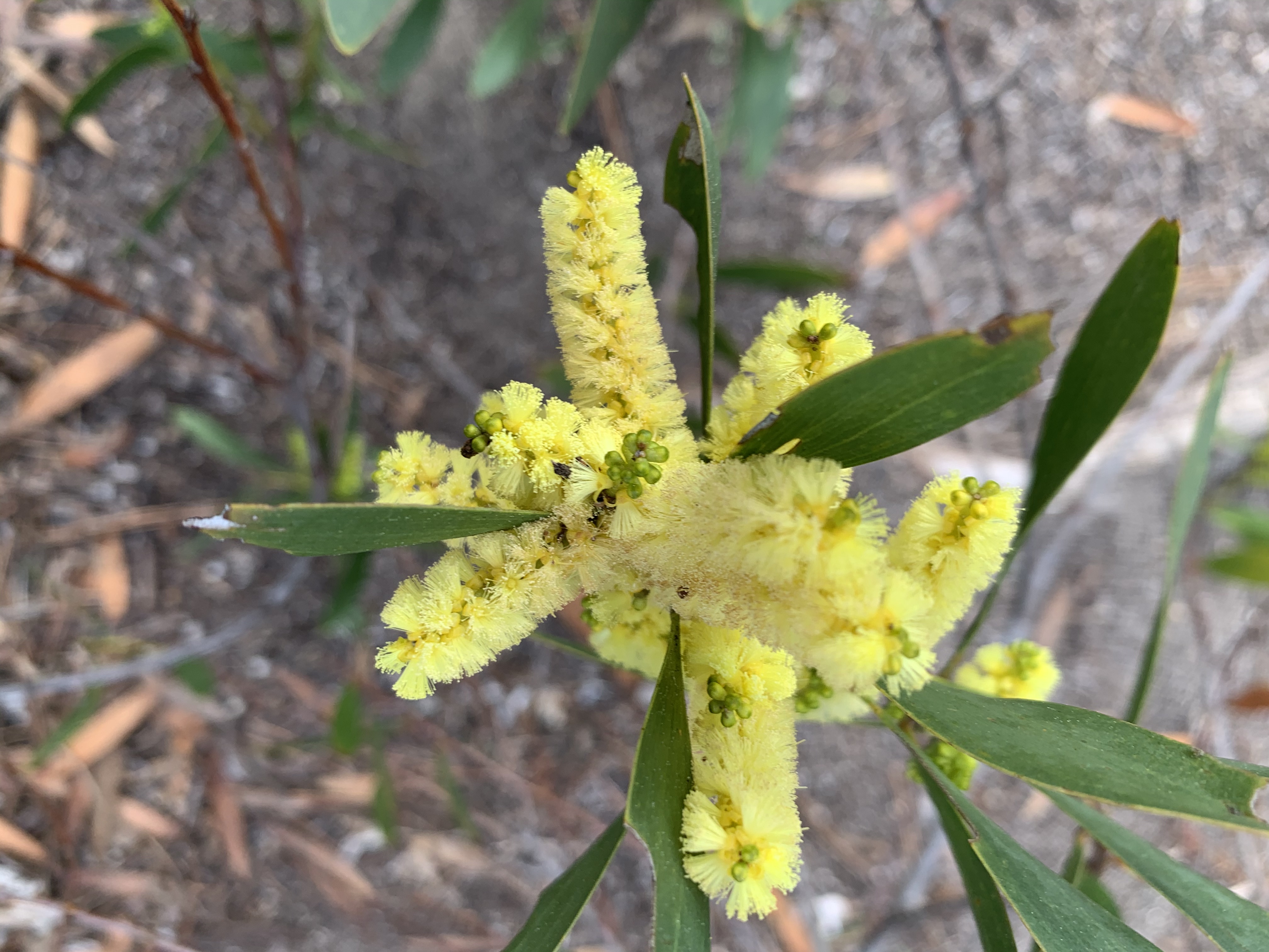
7. Local Symmetries. 

Complex organizations typically have many levels of organizations. In life, there are cells which often have symmetry. The human body has large-scale bilateral symmetry (two eyes, two ears, two arms, two legs, two sides to the brain, etc.). If we look at our hands, we see a thumb and four fingers. Each finger, and the thumb, each have roughly bilateral symmetry. Symmetries such as these are visible. 

There are also often functional symmetries in living systems as well. We breathe in. We breath out. Our nervous system has excitatory circuits and inhibitory circuits. Most complex organisms reproduce via two sexes. Many animals have cycles of sleep and wakefulness. Often birds, and other animals have migrations tied to the cycle of the seasons. Trees are able to draw water up and move water down. 

Photo by Wendy Wei on Pexels.com

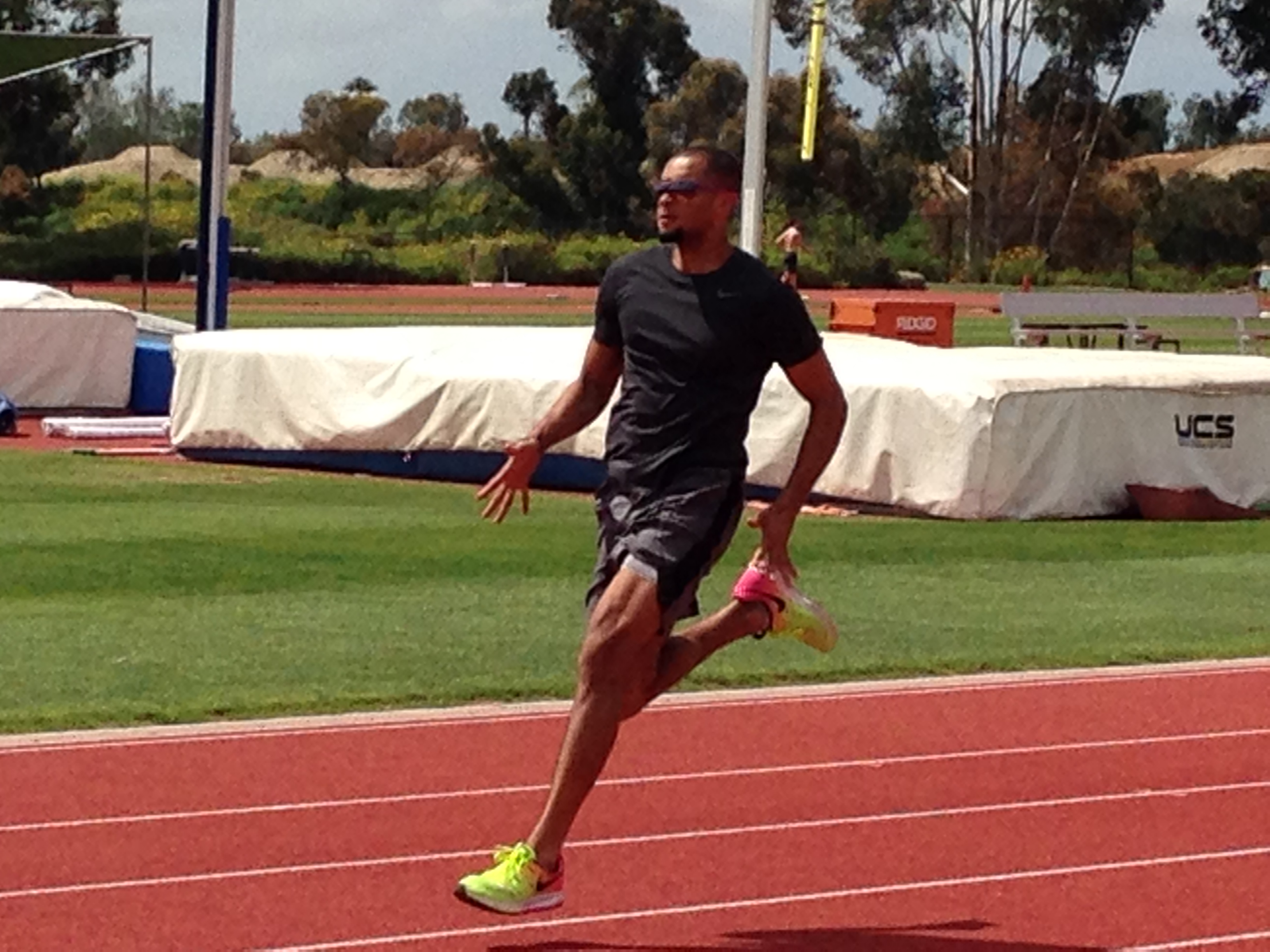
The structural symmetries and the functional symmetries are often connected. When a person runs, for example, they use one leg and then the other. In fact, as your left leg goes forward, typically so does your right arm. As you move your right leg forward, you move you left arm forward. As you breathe in, your rib cage expands on both sides symmetrically. As you breathe out, your rib cage contracts on both sides symmetrically. 
Human organizations often have functional symmetries as well as structural symmetries. For example, most organizations have an “onboarding process” as well as a “termination process.” Our physical artifacts often exhibit local symmetries and these are often related to our physical and behavioral symmetries. A long boat, for instance, allows for multiple rowers to row in unison. The boat and oars are symmetrical and so is the rowing of the boat. 

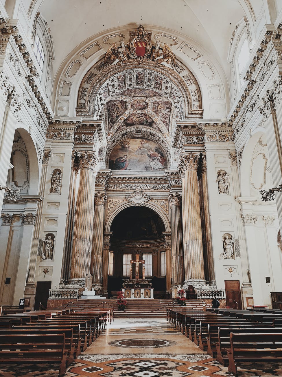
Photo by Patrick Case on Pexels.com

Human artifacts of many scales may exhibit local symmetries for two reasons. First, since most natural living things exhibit local symmetries, copying that may strike us a more beautiful. In addition, if one learns the skills necessary to make the left half of a canoe, one already knows a lot about how to make the right half, provided the canoe has bilateral symmetry. The same is true of an oar, a cane, a bowl, etc. It also makes it easier for the user of the artifact. 

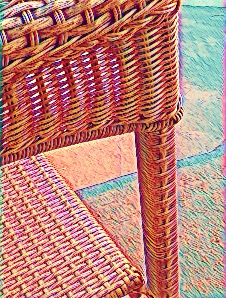
As a user of an artifact such a chair, for example, you come to expect that the right arm rest and the left arm rest will be at the same height and be equally hard. If the arm rests are at different heights, you will, I believe, be more likely to bang your elbow when shifting position or reaching for something. 

One could, no doubt, adapt fairly quickly to a chair which had two different kinds of arm rests, but imagine a keyboard for your computer in which every key was a different size and shape. Or, imagine a piano keyboard in which all the keys were at different spacings, and sizes. 
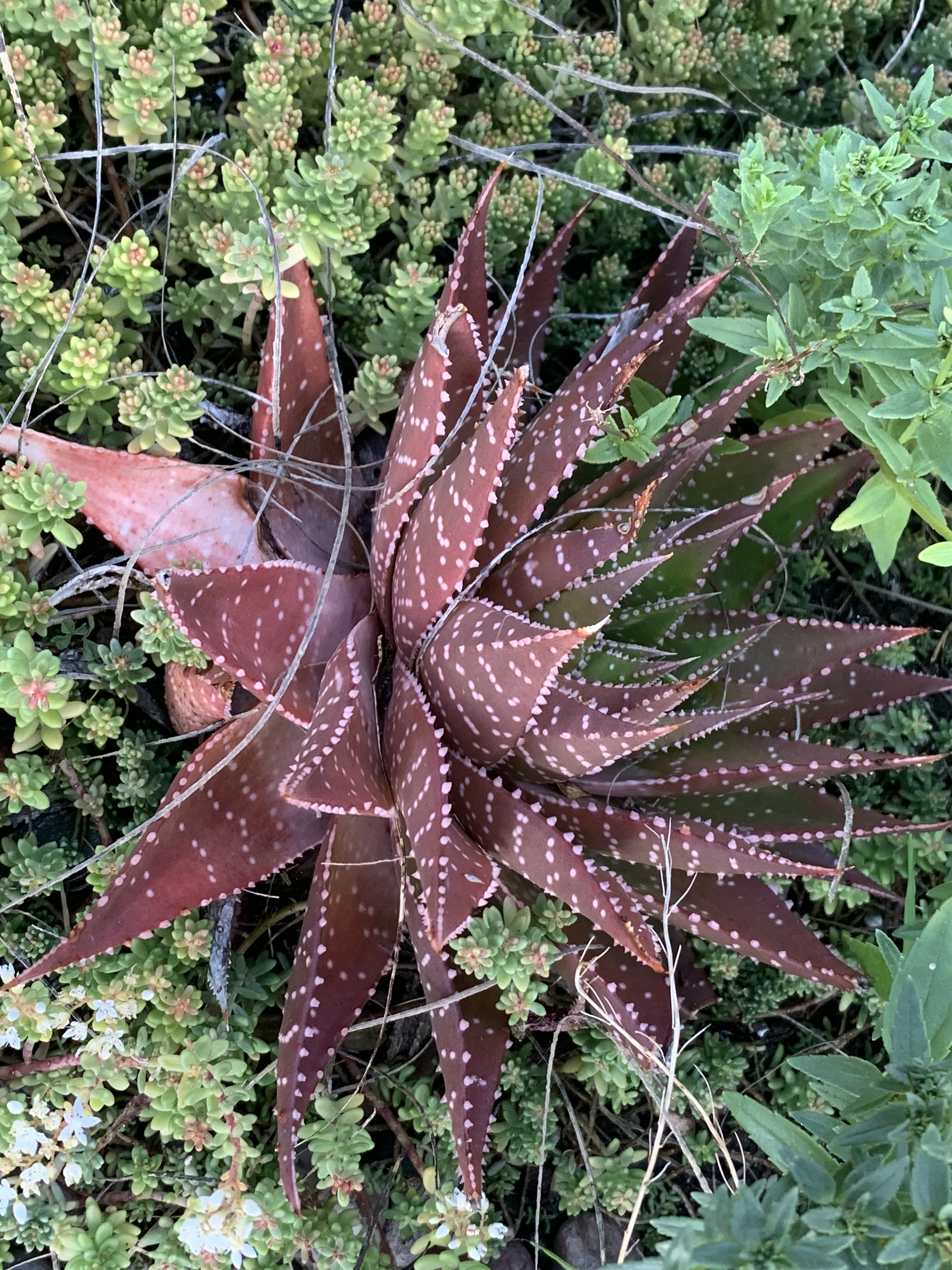
Local symmetries also offer another advantage. Systems with local symmetries are easier to repair or maintain. Imagine how much more expensive it would be to maintain a piano, for example, if a repair shop had to keep 88 different sizes of keys! In a similar fashion, imagine a programmer decided it would be fun to program every pull-down menu with completely different algorithms. When the next release of the application required changes or additions, it would make understanding and modifying the code much more difficult. 

Why does local symmetry, as opposed to merely, symmetry, make sense? Let’s go back to the chair example. It might make sense for a family to have three chairs for three different sized people; e.g., a papa bear chair, a mama bear chair, and a baby bear chair. Or, think of tee-shirts that come in Small, Medium, Large, and Extra Large. It makes no sense to make every tee-shirt the same size. People differ a lot in their size. But for mass manufacturing, it does make sense that the left and right sleeves match for any particular size. Similarly, it doesn’t matter that the arms on papa bear’s chair are of a different size than the arms on baby bear’s chair. It doesn’t matter if the teeth on my comb are different from the teeth on your comb. It doesn’t matter if the tires on my Saab match the tires on your Range Rover. And, generally, this is true for most artifacts, organizational structures, architectural features, and anatomical features. Local symmetry almost always has four advantages: 1) it adds to beauty. 2) it’s easier to create 3) it’s easier for the user and 4) it’s easier to maintain or repair. 

Design always carries messages. Design which solves our problem or beautifies our world or resonates and echoes the properties of natural beauty carries the messages: “I care. I am a bit like you. I am making this for you and others like us. It shows the beauty that I see is a lot like the beauty (and usefulness) that you see. You are not alone. We are in this together. You and I both belong to “Team Humanity.” 

What could be more important? 

On the other hand, (notice the oblique reference to symmetry) when I look at most of the screens of most of the interfaces I deal with on a daily basis, there is generally a decided lack of local symmetry. Would they look more natural and more beautiful if there were more local symmetry. I think so. What’s less clear is whether they would be more usable. Much of the screen is taken up with words and icons. In drop-down, pop-up, and flyover menus, there are lists which mainly consist of words. Words, by virtue of the nature of written language are of different lengths.

On the other hand, programming languages and functionalities often do exhibit local symmetry. This probably makes learning and using such languages more tractable.

———————————————-

Design – Interpretation Model of Communication

Design Interpretation Analysis of Natural English

Some recommended books:

The Winning Weekend Warrior focuses on the mental game for all sports using examples from tennis, golf, baseball, and other sports. It covers self-talk, imagery, mental practice, strategy, tactics, & sportsmanship. http://tinyurl.com/ng2heq3

Turing’s Nightmares explores the implications and ethics of Artificial Intelligence through fictional short stories. http://tinyurl.com/hz6dg2d

Fit in Bits shows many ways to put more fun, variety, & exercise into daily chores and habits to help with strength, flexibility, fitness, and balance. http://tinyurl.com/h6c7fce

Tales from an American Childhood recounts early experiences mainly in the American Midwest in the 1950’s and relates them to contemporary issues and events. https://tinyurl.com/y9ajvz9j

Dream Planet. Where do you run when the whole world is crumbling under the weight of human folly? When the lethal Conformers invade 22nd century Pittsburgh, escape becomes the top priority for lovebird scavengers Alex and Eva.

https://www.barnesandnoble.com/w/dream-planet-david-thomas/1148566558



The Walkabout Diaries:

The Walkabout Diaries:

The Walkabout Diaries:

Travels with Sadie

Travels with Sadie

Travels with Sadie

6. Good Shape

16 Wednesday Sep 2026

Posted by petersironwood in creativity, design rationale, HCI, leadership, management, nature, politics, psychology, Uncategorized, user experience

≈ Leave a comment

Tags

art, beauty, creativity, Design, flowers, Good shape, HCI, painting, photography, UX, writing

6. Good Shape.

Good Shape. Positive Space. These seem to be highly related concepts. Most of the pictures I used as illustrations of Positive Space could equally well illustrate Good Shape. A Positive Space is often composed of multiple good shapes arranged in a “balanced way.” 

In order to illustrate “Good Shape,” I decided to take some pictures to illustrate “Bad Shape.” Since I have surrounded myself mainly with nature or with artifacts that were intentionally designed to be aesthetically pleasing, it turned out to be more difficult than I imagined at first. The other issue is that when I take photographs, I (like most people) “frame” the picture so that “Good Shape” is clear. I began to intentionally brake that habitual way of framing with pictures of flowers that overlap. The natural beauty of flowers is so rich that, to me, even a quasi-random framing still results in a beautiful picture. 

This turns out not to be the case with artifacts however. 

Although some of the elements of this seem to have “Good Shape,” the overall composition lacks a coherent center. It seems to me to be an artificial “kludge” of colors, textures, and shapes and there is no overall “Good Shape.” 

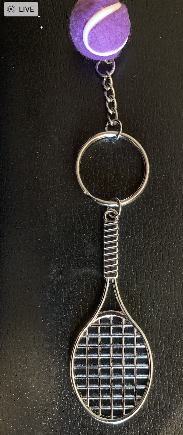
By re-arranging the elements into this form (above), to me, it seems to get closer to “Good Shape” but the purple “tennis ball” seems ill-proportioned and out of place. In “real tennis” there is a physical reason for the ball to be fuzzy but here, the fuzziness of the ball seems added on and arbitrary. 

Here too (above), the overall composition lacks “Good Shape.” The large semi-random dark blob in the middle has no real “Center.” The elements around the edges do not cohere or reflect off of each other. None of the elements around the edges are complete enough to have “Good Shape” except possibly the links of the small chain. 

Here is another example of quasi-random elements brought together into a single picture. Though to me, both the wood and the stone are in and of themselves beautiful, there is nothing about the composition that integrates into a whole. There is no center, no echoes, no alternating repetition, no levels of scale, and despite the nice texture of the stone and wood, the overall effect, to me, is lacking in “Natural Order” and in beauty. 

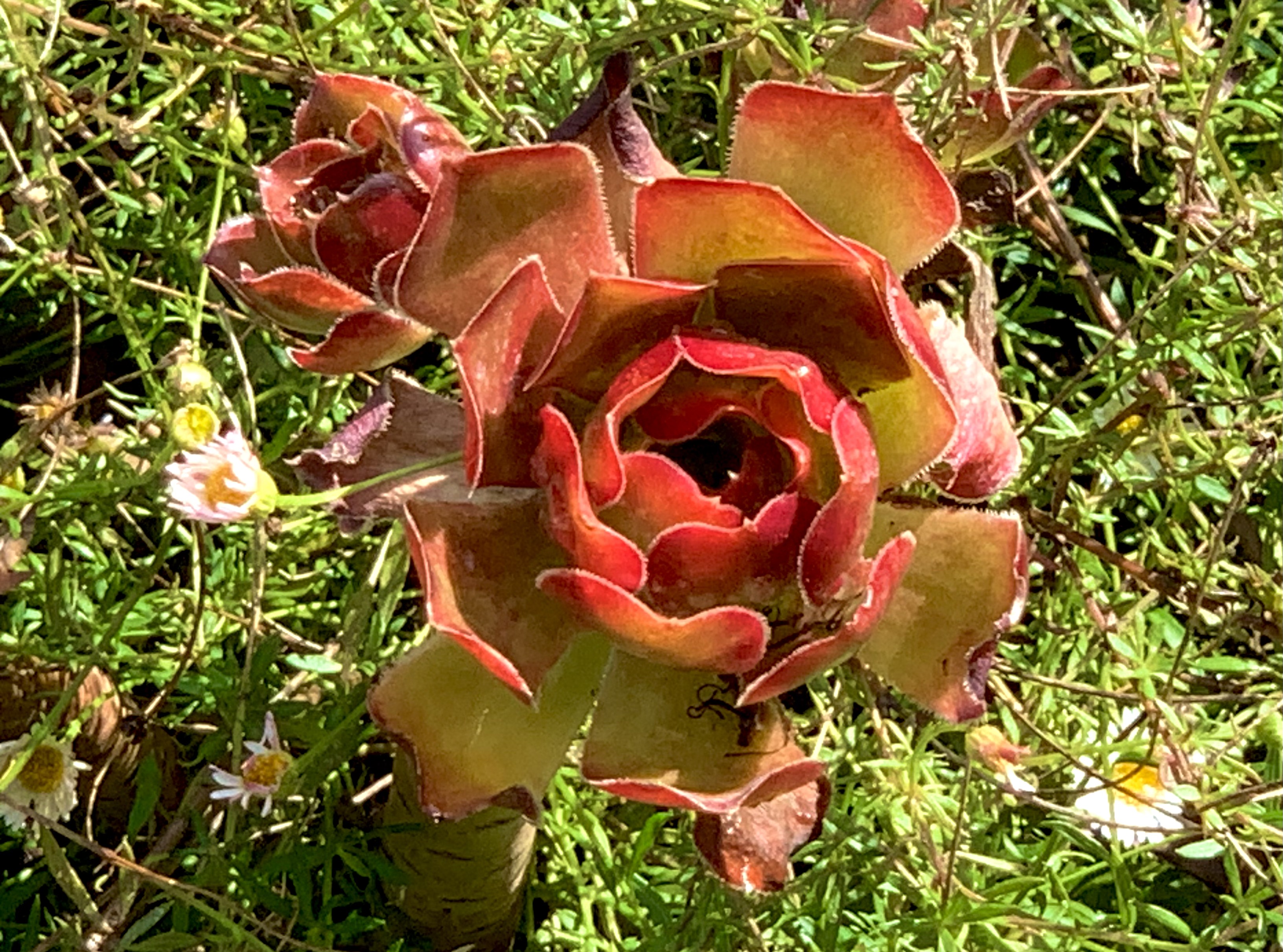
By way of contrast, the flower here seems to have a good overall shape reinforced by a Strong Center, Alternating Repetition, and each of the petals themselves has Good Shape. Around the flower, to me, is a “Positive Space.” Note that one of the petals seems slightly out of place. To me, however, this does not spoil the “Good Shape.”

The same can be said of these flowers. 

It isn’t necessary to have overall “simplicity” in order to have “Good Shape.” These flowers are not “simple” in shape, but they still have “Good Shape.” 

The bird on a branch shown above seems to me to have “Good Shape” even though it is (in outline) lacking symmetry. Though lacking symmetry in profile, the shape strikes me as “balanced.” I don’t perceive the bird as having to exert a lot of energy to keep from “falling off the branch.” The bird’s shape, like the shapes of most animals and plants is the result of 4.5 billion years of evolutionary history. 

Many people view some creatures as “enemies” and therefore “creepy” or “yucky” or perhaps even as dangerous. If you can set that aside and simply look though, I think you can see that “Good Shape” characterizes all sorts of animals (as well as plants). 

At a more abstract level, it even seems that natural animal behavior often shows beauty. That also seems characteristic of skilled human behavior. The Olympics show plenty of examples. It is hard to imagine an “ugly” baseball swing resulting in a home run. The runners, jumpers, throwers, gymnasts, tennis players, and so on produce “Good Shape” in three spatial dimensions and one temporal dimension. 

I play tennis several times a week. I’m not averse to winning a point even if the ball hits my frame, skids off to the net cord and drops over for a winner. But — I never feel as pleased by such outsized luck as when I hit a good shot that results from proper choice, preparation, and execution (and a history of practice and reflection). I never think of a lucky mis-hit as “beautiful.” 

The concept of “Good Shape” even applies to more complex human organizations and endeavors. Racism, for instance, to me is truly ugly. It is not based on truth, but on a kludge of lies masquerading as truth. White Supremacy for instance, basically says, “We’re white! That makes us superior! In fact, we’re so superior, that we insist every aspect of our society be tilted so we can be guaranteed a win!” 

Huh? 

Bad logic is never beautiful. 

The “Good Shape” exhibited by most plants and animals reflects both a long evolutionary balance of forces (phylogeny) and the development of a particular organism (ontogeny). When biology goes awry, as in cancer, the result is not beauty. The “logic” of cancer is that billions of years of evolution that allows our bodies to work harmoniously is put aside for short-sighted egotism. A random cell says, in effect, “I’m no longer going to do my part for the body as a whole. Instead, I’m going to grab all I can for myself and grow in an unrestricted way!” 

Such a cell, by making that decision, signs its own death warrant. Either the body destroys the cancer and therefore the cancer dies — or, the cancer prevails and in that case it destroys the life of the organism it was supposed to be a part of — and then it dies anyway! It’s an “ugly” decision both because it is disproportionate and because it is illogical. It aims to be self-serving, but it is not even self-serving. It guarantees its own death and kills more life along the way. 

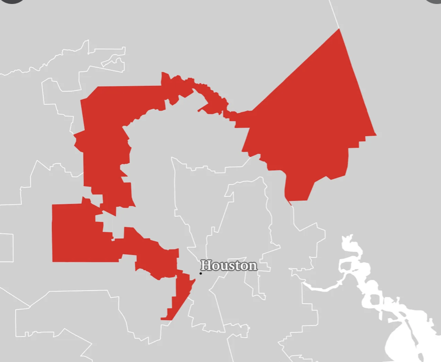
It’s the same, to me, with any dysfunctional human organization. If democracy is perverted by some people demanding that decisions be made so that they can have their way regardless of how it impacts the overall tree of life and the overall health of a city, state, or nation, it lacks “Good Shape” and instead becomes a distorted kludge lacking symmetry, lacking balance, lacking life. It is no accident that “Gerrymandered” districts do not have “Good Shape.” 

In extreme cases, not surprisingly, dictatorships have resulted in a war on truth, beauty, and life itself. It’s no “accident” that Hitler, Stalin, and Mao were each responsible for millions of human deaths. Their activities also show utter disregard for the beauty of the natural environment and the plants and animals of the planet. 

When it comes to User Experience, the most obvious way to apply “Good Shape” is to the visual elements of the interface — icons, windows, menus, tool bars etc. However, I think it also applies to the design process. Are the needs of all stakeholders taken into consideration? 

Do the various disciplines involved in design respect each other? Do people tell the truth and show trust? Does the company treat its users with respect and tell the truth in its various communications? 

If a company provides “free games” or “free services” that are purportedly for entertainment or education but the real purpose is to gather data to sell to advertisers or foreign powers trying to use the data to destroy democracy, it would seem to me that business model itself — the raison d’êtrefor the entire project is an “ugly shape” regardless of how pretty the icons are. 

What do you think? Do the concepts of natural beauty apply to the design of organizations and even governments?

—————————————

Christopher Alexander – Fundamental Property 6: Good Shape

Cancer always loses in the end

Fascism Leads to Chaos

Who Speaks for Wolf? 

Voter Suppression is Life Suppression

The Orange Man

Stoned Soup

The Broken Times

All We Stand to Lose

After All

Imagine All the People

Roar, Ocean, Roar!

The Dance of Billions

Photo by Pixabay on Pexels.com

5. Positive Space

15 Tuesday Sep 2026

Posted by petersironwood in creativity, design rationale, love, nature, psychology, Uncategorized, user experience

≈ Leave a comment

Tags

aesthetics, art, beauty, books, Christopher Alexander., Design, freedom, greed, growth, HCI, life, nature, pattern language, Patterns, politics, psychology, responsibility, usability, user_experience, UX

5. Positive Space

(This is the fifth in a series of 15 blogs that explore Christopher Alexander’s “Fifteen Properties” of good design, natural beauty, living spaces, etc.). 

Life is a dance on the edge between chaos, on the one hand, and sameness & repetition on the other hand. Repetition without variation or change is not life. On the other hand, endless random variation without any pattern or principle is also not life. Planet Earth is sometimes said to be a “Goldilocks Planet” — not too hot and not too cold — to support life. Most of the life forms on planet earth themselves exhibit a “positive shape” — a shape that wants to expand and fill out — and yet, there are limits because of circulation, gravity, communication etc. so that growth is typically not unrestricted. The tension between trying to grow and having to stick close enough to form creates positive space. 

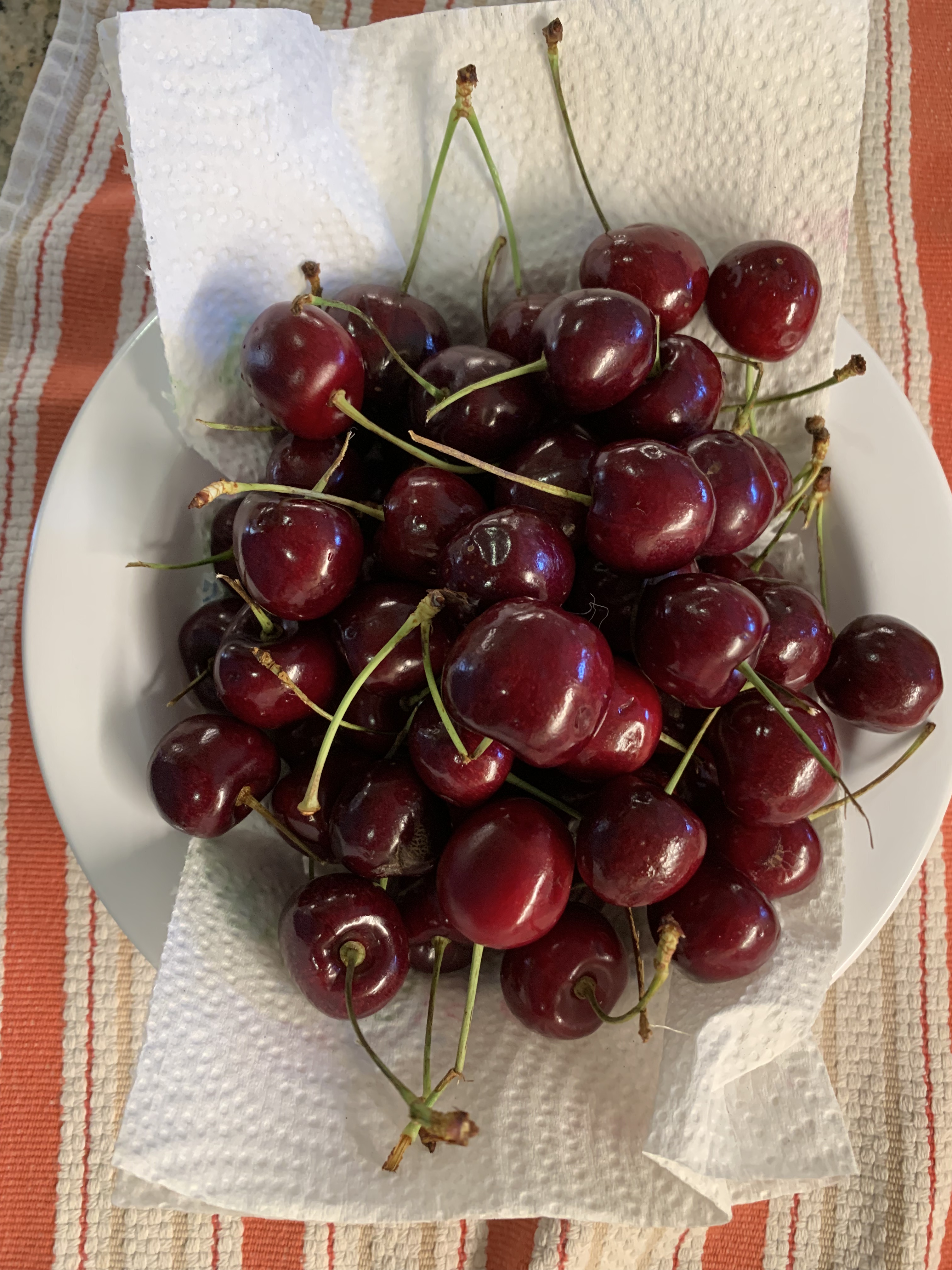
Life may not always be “a bowl of cherries” but nonetheless, a bowl of cherries does illustrate the property of “positive space.” The bowl connotes living things trying to expand right up to the boundaries possible. A bowl that is filled with cherries and even slightly over-filled but without inducing a fear of spillage, to me, connotes life being vigorous and healthy. To me, a single cherry sitting all alone in a large bowl seems to exhibit positive space much less — at least at the scale of the bowl. 

When I look at an individual cherry, I also see positive space. The cherry is not a perfect sphere, featureless and smooth. If it were, to me, it would be a much less positive space. The fact that there is a stem and a noticeable indentation where the stem goes provides a kind of center. So too does the slight asymmetry of the cherry. It appears as though it might have developed as two halves that tried to circle a space at the same time from two different directions – clockwise and counterclockwise. They met and merged to form the almost spherical cherry. 

The lobes of this red pepper show positive shape.

The cherry is not the only natural food that has this kind of positive space. Think of corn on the cob. Each kernel seems to have tried to grow as large as it can. It pushes up against and into other kernels. Each kernel seems therefore to be “bursting with life.” 

Consider a cucumber. It’s roughly cylindrical. But “roughly” is important here. To me, it would seem much less an example of “Positive Space” if it were literally a cylinder. It tapers at the ends and it bulges at the middle. That seems more “positive.” 

To a person who doesn’t understand that life is primarily a cooperative endeavor among all the parts of the vast tree of life, but instead sees the world only as a zero-sum game, it must seem as though the positive living space of a cucumber makes the space around the cucumber less positive and less living. But this is not true! The space around the cucumber’s slightly rotund shape is much more positive and living than the space around a perfect cylinder. 

Think of a tree trunk compared with a telephone pole. They are both made of wood and they are both approximately cylindrical. But a tree trunk feels much more alive to us than a telephone pole. I don’t think this is simply because we “know” a tree is alive. It looks more alive and if you allow yourself to “tune in” to it, it feels more alive. And, importantly, not only does the space that the tree inhabits seem more living. So too does the space around it! A long line of telephone poles may exhibit “Levels of Scale” and “Alternating Repetition” and such a picture may make us feel some life to it. 

Photo by Lerkrat Tangsri on Pexels.com

But a single telephone pole does nothing to stir life in me. In that sense, it’s nothing like a tree. It’s flat and it kills the space on either side as well. The columns in the Parthenon are roughly cylindrical and obviously not literally alive. But they, unlike a telephone pole, have positive space and create positive space around them. Life is not fundamentally a zero-sum game. The bee does not “steal” the flowers pollen and thus damage the flower. The bee helps the flower. The flower helps the bee. Positive space in an object does not steal from or detract from the space around the object. It enhances it! 

Similarly, the “competition” for space among the kernels of corn on a cob of corn shows that competition can be a beautiful thing. I like to see the kernels pushing against each other. All of them seem living and positive. Imagine instead a cob of corn in which one kernel had grown like a giant spider of orange cancer and took up 98% of the cob. Aside from this one ultra-greedy cell, there were only a few widely spaced and shriveled up kernels. Would you pick that from the pile of corn? Would you want to slather it with butter and bite into it? I sure wouldn’t! And to me, that is exactly what cruelty, unfairness, and greed look like. It might seem positive — after all, the dictator is trying to “grow.” That is true but he’s rigged the game. Competition is no longer beautiful when the game is rigged. Competition is no longer beautiful when your tennis opponent slices off your leg before the match starts or pays off the chair umpire to call everything you hit out. 

I don’t think there’s anything particularly special about cucumbers or cherries or corn. I just happened to have been washing vegetables before writing this. These radishes also exhibit positive space. And, although their shape is not the same as a cherry or a cucumber, the radishes also enhance the space around them. And, so does the avocado. An avocado that is just past ideal ripeness begins to flatten irregularly and the “pebbles” of the skin also flatten making a less positive space. The pebbles of a perfectly ripe avocado are themselves tiny positive spaces that add to the overall impression of vigor. 

Flowers provide numerous examples of positive space. And, so far as I can tell, the positive space of flowers invariably also enhances the positivity of the space around them. 

Animals also generally exhibit positive space. Their shapes, after all, come about through a struggle among different tradeoffs that have been “learned” by each species over four and a half billion years. But whether you look at the leg of a turtle, the leg of a turkey, or the leg of a polar bear, you will see positive space. The shapes are quite different because their histories are quite different. But in every case, the shape is determined by the history and each of those histories is the same length — 4.5 billion years. The fact that each of these shapes comes about through the dance of trying to survive and thrive in all their various habitats makes every one of them beautiful in its own right — even those whom most of us don’t particularly like to interact with such as rattlesnakes or lions. Even if we don’t wish to come face to face with a lion or grizzly bear, we do recognize their beauty. And, I would claim that as those animals walk through any landscape, they will not only exhibit their own positive shape; they will also enhance the positivity of the shape around where they are walking. Think how many times photographers and painters have put an animal in the foreground of a landscape. Of course, doing so makes the scene immediately more living, more interesting, and more beautiful. 

Photo by Anastasia Shuraeva on Pexels.com

What does this have to do with the user’s experience on a computing device? I would have to say that most interfaces on most devices do not do much to bring the interface “alive” including having positive space. The tool bar icons on this version of my Mac are very slightly “bulging” like a living cell (or kernel of corn). Even more subtly, the windows have slightly rounded corners. 

It’s an entirely different story with many games though. It seems to me that some of the game artists are among the best artists in the world. They have created many very beautiful games. Could they be more beautiful still if game designers consciously thought about using Christopher Alexander’s “Properties” in general, and “Positive Space” in particular? I think so, but for many games, such as Horizon Zero Dawn, many of the elements are copied so closely from nature that aspects such as “Positive Space” are mostly already taken care of by evolutionary bias toward the beautiful. (Yes, I do think there is such a bias, but it will have to be the subject of a different post.)

What about other applications and systems? Do you think you’ve seen good examples of “Positive Space” in such systems? How could you see incorporating “Positive Space” in UX? 

At a more societal level, it seems to me that freedom is closely related to “positive space.” Each individual should be free to expand, grow, experiment, so long as it doesn’t impinge much on those around them. Imposing overly strict boundaries makes life less interesting and less lively. Growth without any sense of balance or notion of how a particular piece of life relates to the whole is called cancer. A society which allows or even encourages theft, rape, fraud and other felonies under the banner of “freedom” is doomed to ultimate failure with lots of pain along the way.

————————————

Winning by Cheating is Losing

Life Will Find a Way

Math Class: Who are you?

Life is a dance

Myths of the Veritas: The Forgotten Field

Cancer Always Loses in the End

When GREED is the only creed

The After Times

After All

Somewhere a Bird Cries

The Dance of Billions

Some recommended books —

The Winning Weekend Warrior focuses on the mental game for all sports using examples from tennis, golf, baseball, and other sports. It covers self-talk, imagery, mental practice, strategy, tactics, & sportsmanship. http://tinyurl.com/ng2heq3

Turing’s Nightmares explores the implications and ethics of Artificial Intelligence through fictional short stories. http://tinyurl.com/hz6dg2d

Fit in Bits shows many ways to put more fun, variety, & exercise into daily chores and habits to help with strength, flexibility, fitness, and balance. http://tinyurl.com/h6c7fce

Tales from an American Childhood recounts early experiences mainly in the American Midwest in the 1950’s and relates them to contemporary issues and events. https://tinyurl.com/y9ajvz9j

Dream Planet. Where do you run when the whole world is crumbling under the weight of human folly? When the lethal Conformers invade 22nd century Pittsburgh, escape becomes the top priority for lovebird scavengers Alex and Eva.

https://www.barnesandnoble.com/w/dream-planet-david-thomas/1148566558

4. Alternating Repetition

14 Monday Sep 2026

Posted by petersironwood in creativity, design rationale, HCI, leadership, management, nature, psychology, Uncategorized, user experience

≈ Leave a comment

Tags

aesthetics, architecture, art, beauty, Design, diversity, HCI, human factors, leadership, order, repetition, UX, writing

(This is the fourth post in a series of 15 which aim to examine the fifteen properties of natural order postulated by Christopher Alexander. I wonder whether the property of “Alternating Repetition” could be more frequently incorporated into User Experience and what the pros and cons might be).

4. Alternating Repetition

In nature, whether we look at clouds, waves, mountain ranges, forests, plants, the leaves of plants, or almost any animal, we see alternating repetition. Such natural repetition is almost never a precise and complete replication. Just as every reproductive act of life introduces an element of recombination as well as the possibility of mutation, so too the repetitions we see in life are not mathematical. We indeed see patterns repeated in a line or in a circle, but the instances in living things show variation. Similarly, human artifacts made with the hands; e.g., weaving or poetry or rock walls or tennis strokes show repetition but with slight and subtle variations. 

If you look at modern industrial society, you see many examples of exact repetition. It’s true that if you looked at 10,000 examples of the same brand and model pen, or notebook, or scissors, or streak knives under a microscope, you could likely find small differences. To the naked eye, however, they would appear identical. Seeing 10,000 pebbles, leaves, or waves you would always see slight to moderate differences. To me, it makes a difference in terms of beauty. Handmade items and human actions naturally show more variation than things produced by machines. 

Photo by Pixabay on Pexels.com

The various “elements” of a User Interface generally have the feel of something made by machine. The size of all the application icons on the tool bar, for instance, are the same. They are all almost the same exact shape and size. On my tool bar the icons for Finder, Launchpad, Mail, Safari, Chrome, FaceTime, Messenger, Maps, Photos, Contacts, Calendar, Reminders, Notes, System Preferences, Keynote, Pages, Preview, and News are the same. However, the Kindle icon is slightly larger and more square. The Zoom icon is very slightly rounder. [NOTE: This is no longer true in 2026]. The icon for Facebook is still circular, however. In other words, there is some slight variation, but mainly the icons are the same in outline, but different inside. But the set of icons on the tool bar has no sense of “harmony” whatsoever–at least, not to me.

Note that the tool bar is both abnormally homogeneous in terms of positioning and size but completely disconnected in terms of the images which differ in a random disharmony seldom exhibited in nature.

Instead, each icon seems to scream out its individuality without regard to its neighbors. (Which reminds me of things like not masking, getting vaccinations, or telling the truth, for instance, because you don’t feel like it so who cares what the consequences to others are). Anyway, the layout of the toolbar, to me, it’s reminiscent of driving down the highway and seeing a sequence of billboards, each advertising some random product or service in no particular order. Often, each billboard is the same size but they are independent of each other. The one exception I can think of were the “Burma Shave” signs along the highway. Each sign was a small rectangle with several words on it. About a quarter mile down the road, another sign would appear. They were meant to be seen in a specific order and together, they made a kind of “story” which usually rhymed. Typically, the signs touted the joys of the product — “Burma Shave” — or, provided public service announcements about safe driving. 

In the early days of computing, putting in “variation” might have been insanely wasteful of space and processing time. This is no longer true. Yet, the “look and feel” of User Interfaces remains, for the most part, quite “mechanical” or “mechanistic” rather than “natural.” Sometimes modern computer games include naturalistic looking variations in how repeated plants, rocks, clouds, etc. are represented. Look at the palm trees and you will see variations among the trees that are reminiscent of the real palm trees I see every day in the San Diego area. In addition, each tree contains a number of fronds that repeat a generic theme; yet, each front is somewhat different. The fronds themselves each contain alternating repetition, just as do real palm tree fronds. 

We might consider whether it would make sense to put more natural looking alternating repetition into the more utilitarian aspects of user experience. For example, could it be both more beautiful and more useful to allow more variation in the way files are represented visually?  Will Hill, James Hollan, Dave Wrobleski, & Tim McCandless suggested (in a CHI ’92 paper) that physical documents such as manuals naturally show wear in places where they are most used. They suggested that the visual representation of computer documents might be altered slightly to show which documents have been used or edited more and also that such cues within a document might also be useful. 

Hill, William; Hollan, James; Wrobleski, Dave; McCandless, Tim; “Edit Wear and Read Wear,” Human factors in computing systems: Striking a balance. Proceedings of the 9th annual conference. SIGCHI ’92 Proceedings (Monterey, CA), Addison-Wesley, 1992, pp. 3-9.

One of the few cookbooks I use with some regularity is entitled, Fat Free and Flavor Full. The recipe I’ve used many times is the black bean salad. If I open the physical book, it naturally falls open to that particular recipe. “Open Recent” I find a very useful features of the Pages application, but I don’t see a way to look at files based on overall frequency of use. It could be the case that there are some applications for which you would want specific files to be easily found depending on the season or the date. The authors of “Edit Wear and Read Wear” were mainly talking about the utility of encoding information about a file into its visual representation. There might well be aesthetic reasons to do so as well. 

The wooden blinds shown below exhibit alternating repetition in several ways. First, there is the matter of perspective. Some variation almost always presents itself simply by virtue of the fact that I typically view the blinds at an angle and some are closer to me than others. This means that the size, and the retinal shape are slightly different. Second, there is variation caused by slight changes in the angle of the slats relative to vertical. Third, each slat is made of wood. The wood itself shows rings (or more commonly a planar projection of the concentric cylinders. 

The wooden blinds, because they are illuminated from the outside by tree-filtered sunlight also show further variation; however I don’t think that is typically “alternating repetition.” Perhaps not coincidentally, although I find it a little interesting, I can’t say I find that source of variation to be beautiful to me. The other three all add to the aesthetics, at least to me. 

Is it feasible to introduce alternating repetition with slight variation into User Interfaces? Would it be desirable? What negative side-effects might arise? Do you even agree with Christopher Alexander that Alternating Repetition is an aspect of natural beauty and beautiful design? One thing that occurs to me is that if some element of the UI is more variable in outline etc., it may mean that the actions upon that object must deal with that variability. If designed greenfield, that might not be too difficult. But if, for example, the code for dragging and dropping was written under a presumption of zero variability, that might be problematic. What do you think?

——————-

Discussion of Alternating Repetition with additional visual examples can be found here: 

The Fifteen Fundamental Properties of Living Structure. 4. Alternating Repetition

Because Christopher Alexander wrote a book, about the 15 properties, his examples are mainly visual. But alternating repetition as an element of beauty is also clearly present in music and in dance. There is a little of it, it seems to me, in culinary arts as well. I am also reminded of the smelling actions of my dog, Sadie. As she watches an animal without charging it, she waves her nose back and forth quite deliberately in a kind of “sampling” of the surrounding air. A bear will sometimes move sideways with alternating repetition to provide better depth perception of a far away target (like me!). But that’s a story for another time.

Use Diversity as a Resource

The Tree of Life

Life is a Dance

Take a Glance; Join the Dance

Piano

The Winning Weekend Warrior focuses on the mental game for all sports using examples from tennis, golf, baseball, and other sports. It covers self-talk, imagery, mental practice, strategy, tactics, & sportsmanship. http://tinyurl.com/ng2heq3

Turing’s Nightmares explores the implications and ethics of Artificial Intelligence through fictional short stories. http://tinyurl.com/hz6dg2d

Fit in Bits shows many ways to put more fun, variety, & exercise into daily chores and habits to help with strength, flexibility, fitness, and balance. http://tinyurl.com/h6c7fce

Tales from an American Childhood recounts early experiences mainly in the American Midwest in the 1950’s and relates them to contemporary issues and events. https://tinyurl.com/y9ajvz9j

Dream Planet. Where do you run when the whole world is crumbling under the weight of human folly? When the lethal Conformers invade 22nd century Pittsburgh, escape becomes the top priority for lovebird scavengers Alex and Eva.

https://www.barnesandnoble.com/w/dream-planet-david-thomas/1148566558

Strong Centers

12 Saturday Sep 2026

Posted by petersironwood in creativity, design rationale, HCI, nature, psychology, Uncategorized, user experience

≈ Leave a comment

Tags

aesthetics, architecture, art, beauty, Christopher Alexander., Design, HCI, human factors, usability, UX

This is the second posting in a series of fifteen which examine Christopher Alexander’s “Fifteen Properties” of natural beauty and suggests how these properties might apply to user experience design. 

Photo by Dominika Greguu0161ovu00e1 on Pexels.com

2. “Strong centers” is probably one of the most overlooked properties of design in UX/HCI. Often, what exists for the user, from their perspective, is a “sprawl” of functions, tool bars, and icons with no obvious overall or subsidiary organization. A better design would allow the user to quickly find a “home base” from which, it would be obvious where to find subsidiary home bases. There is some sense in which hyperbolic trees, fisheye lenses, and home pages partly begin to address this issue. 

Instead of “strong centers”, the impression I often get in looking at applications for word processing, organizing photos, searching, or dealing with settings is that the designers are given or generate a long list of functions to be supported. Which ones are related to which though? Which ones are central? In many cases, UX practitioners give users (or, more often, potential users), a set of cards with one function each and ask the users to sort these into piles. I am not against such studies, but they are unlikely to lead to a coherent design with a strong center. The users are not, in most cases, professional designers. In many cases, an application is supposed to support many different specific actions. For example, I use word processors to write essays, poems, and fiction. I also use a word processor to proofread something, to re-organize ideas, to “jot down” a bunch of ideas, or to write an outline. These are very different tasks, at least to me. If asked to sort cards, I would do it differently depending on which type of task and which type of material I’m thinking about. 

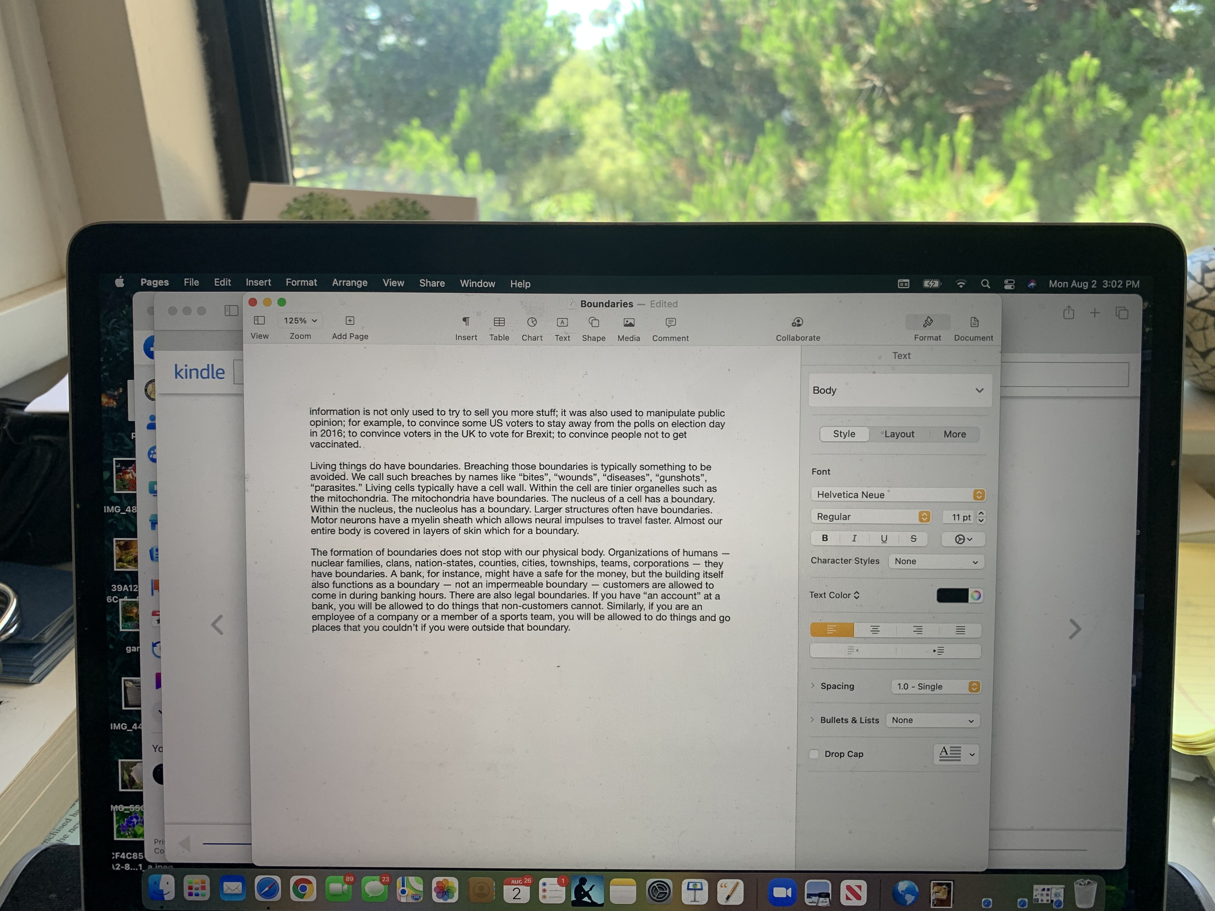
As I type this, I glance at the “Pages” tool bar which includes: Pages, File, Edit, Insert, Format, Arrange, View, Share, Window, and Help. None of these seems like “home” to the task of writing an essay. I know from experience that if I want to write any kind of material, I must go to the “File” menu even though, as best I can recall, my initial impression of this label was that it would be something to do after I was “done” with the tasks of composing and proofreading. The toolbar gives no impression of their being any “center” at all, let alone a “strong center.” 

In my native language (English), I read from top to bottom, left to right. In that sense, the Apple Icon is first and the “Pages” item is next and it is in bold print. That could be considered a subtle clue that it’s the “most important.” In a way, the items on the “Pages” menu are “meta-items.” In that sense, I suppose you could argue that they are “important” — though as a writer, none of the items seem that important. In fact, if we get right down to it, nothing in Pages really seems designed to support the actual writing process. And, I’m not trying to single out Pages because it’s the only one or the worst one. Lack of a “strong center” seems true of nearly all applications. 

Different people use different processes for writing — and I myself use different processes for different types of writing, so perhaps trying to organize the features and functions so that there is a “strong center”reflective of the “strong center” of the task of writing is just not feasible. I am certainly not advocating for resurrecting “Clippy.” 

Ideally, it should be possible for users to “know where the action is” upon entering an application or a web page.

In another interpretation, “strong centers” refers more to underlying architecture and points to the need for a core of functionality that transcends a specific release or even a specific application. A good underlying architecture will communicate this essential center (related to central purpose or style) to the user.

All too often, the processes involved in developing an application or system themselves have no “strong center.” If the development process is itself a hodgepodge political process of accommodating to a portfolio of features and functions that are advocated for by diverse and uncoordinated stakeholders, then, what one has are a long, unorganized list artificially shoved into menus and sub-menus and toolbars. It should not be surprising then, that the user finds it difficult to know where to begin when first encountering an application — even if the user knows exactly what they want to accomplish. 

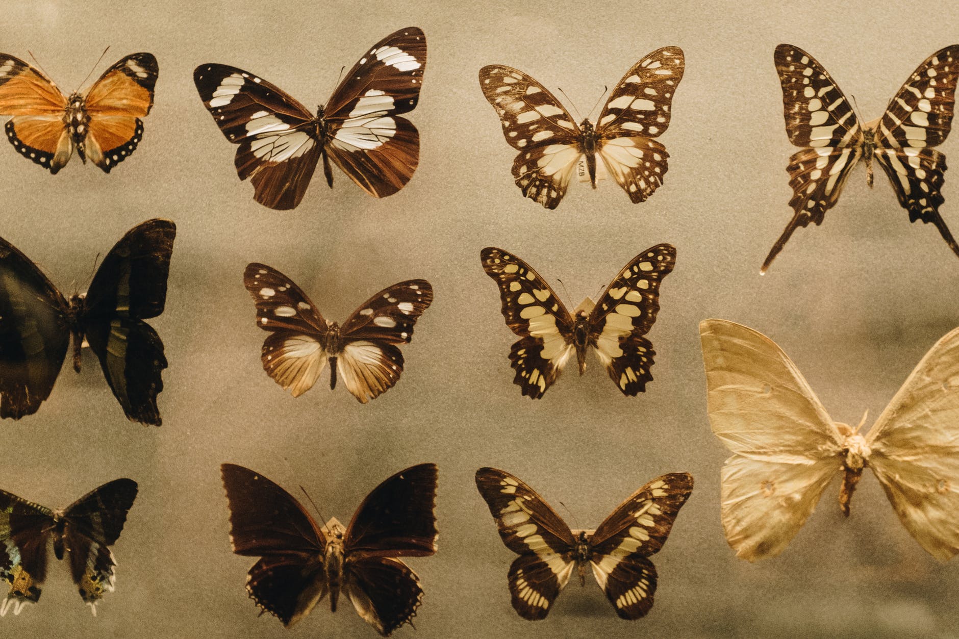
Compare and contrast most menu structures and user interfaces with the “strong centers” that are extremely common in life forms. Here are some examples of butterflies. 

Photo by Cu00e1tia Matos on Pexels.com

The central axis includes the head, the thorax and the abdomen. These are in a line in the strong center. Typically, they are colored differently from the wings. The bilateral symmetry of the wings as well as the overall shape reinforces the strong center. Wing patterns, and even the antennae and legs lead the eye back to the strong center. 

Most people think of butterflies as beautiful — and I agree. When asked, however, most people will say they are “brightly colored.” Some are; some are not. But “bright colors” don’t necessarily give rise to beauty!

Strong Centers doesn’t just apply to butterflies. Look at most birds, fish, mammals, insects and you will see how the symmetries and smaller centers reflect and strengthen the major center. Indeed, Strong Centers are not limited to the animal kingdom. The trunk of a tree provides a strong center. Each branch is itself a center and the connection of the branches to the trunk reinforces the strength of the central trunk. 

Photo by Snapwire on Pexels.com

Even single cells often exhibit strong centers (and many of the other 15 properties, by the way). 

It would love to be able to provide you with a process or checklist or formula so you could design user experiences with “strong centers.” I cannot really do that. Nor can anyone else. If you keep it in mind, even at the back of your mind, you may see opportunities to help make that happen with regard to whatever you’re working on. I’m curious to hear your thoughts about “Strong Centers.” 

One technique that may be of some use was shared at a workshop by someone who worked at a car company. In the design of a specific car, the team decided the car would reflect “a professional soccer player out for a night on the town.” This is obviously not a “formula” or “checklist” but it offers a metaphor that designers of car interiors, exteriors, and the drive train could all relate to. A similar method is sometimes used in film — some specific person is responsible for the artistic integrity of the whole.

There is no one way to produce strong centers. Here are some examples from flowers.

———————

Here we see that each flower has a strong center and the central stem provides a strong center for the entire plant.

Some useful links to more information, discussion, and examples relevant to “strong centers” or to the fifteen properties.

Christopher Alexander – Fundamental Property 2: Strong Centers

https://www.archdaily.com/626429/unified-architectural-theory-chapter-11

Roar, Ocean, Roar!

Imagine All the People

The Dance of Billions

Somewhere a Bird Cries

How the Nightingale Learned to Sing

Piano!

Unite!

Fifteen Properties of Natural Beauty & UX/HCI

09 Wednesday Sep 2026

Posted by petersironwood in creativity, design rationale, HCI, nature, psychology, Uncategorized, user experience

≈ 1 Comment

Tags

architecture, art, books, Design, gratitude, HCI, human factors, mindfulness, photography, Travel, UX

Photo by Dominika Greguu0161ovu00e1 on Pexels.com

This is an introduction to a series of blog posts on the “Nature of Beauty.” 

Christopher Alexander was an architect and city planner. In his MIT dissertation, Alexander took a very mathematical approach to design. In our studies at IBM Research on the “Psychology of Design” I first ran across that work (Notes on the Synthesis of Form). Later in his career, however, he took a quite different approach to design. With an international team, he visited many different parts of the world to see what “worked” in terms of architecture and city planning. The results were documented in the form of a “Pattern Language.” In this sense, a “Pattern” is the named solution to a recurring problem. A “Pattern Language” is a connected lattice of Patterns that together, “cover” a field. 

Others (including me) have emulated his approach for other fields such as pedagogy, organizational change, object-oriented programming, software development processes, and human-computer interaction. A few years ago, I suggested such Patterns for collaboration and teamwork. Here’s a link to the introduction of that effort. Here’s a link to the index of those Patterns. 

Still later in life, Christopher Alexander embarked on a project called The Nature of Order. This work is documented in a series of four books. In the first book, he proposes fifteen properties of good form in nature — and in beautiful artifacts. Explication and example will be needed to appreciate what these properties mean. In this post, I list the fifteen and will attempt to explain the first one with respect to UX and Human Computer Interaction.

OLYMPUS DIGITAL CAMERA

First, you might be wondering what relevance these fifteen properties of nature might have to interface design. After all, can’t the designer just test out their ideas empirically until a UX design is shown to be usable, learnable, and perhaps enjoyable as well? Well, sure. Ideally, every possibility could be explored and tested empirically. 

But how many possibilities are there? Without any guiding principles, there are not only more possibilities than can be tested by you. There are more possibilities than there are atoms in the universe. Imagine a very simple interface on a small mobile device. Let’s say there are only ten screens in your whole application. The iPhone 12, for instance, has nearly 3 million pixels. 24-bit color allows over 16 million colors per pixel. If you literally tested out every possible arrangement, this would mean 16 million to the 3 millionth power for each of the ten screens!! The number of atoms in the universe is estimated to be between 10**78 and 10**82. Obviously, this is far less than 16,000,000**3,000,000 !! 

Of course, I’m not suggesting that anyone would attempt a pixel by pixel test of an interface, but the general point remains: you need some way to limit testing to reasonable alternatives. The notion of using these fifteen properties is not that they dictate a particular design nor that you don’t need to do any empirical testing. Rather, the fifteen properties could be used to help guide design. The properties could be thought of as reducing the search space. 

Here are the fifteen properties: 

  1. Levels of Scale
  2. Strong Centers
  3. Boundaries
  4. Alternating Repetition
  5. Positive Space
  6. Good Shape
  7. Local Symmetries
  8. Deep Interlock and Ambiguity
  9. Contrast
  10. Gradients
  11. Roughness
  12. Echoes
  13. The Void
  14. Simplicity and Inner Calm
  15. Not-separateness

Perhaps the names themselves might resonate with your own sense of aesthetics for design and composition, but let’s review them one by one. 

The first is “Levels of Scale.” 

Photo by Roney John on Pexels.com

When it comes to natural beauty, a few moments reflection may provide you with many examples. Christopher Alexander claims this property is also present in traditional art and architecture across many cultures. As you see something such as, e.g., the Taj Mahal or the Parthenon in the distance, you see a beautiful shape. As you approach it, you will see more and more levels of scale. By contrast, many modern buildings are largely featureless between the overall shape and the texture of the building material. 

If your design has multiple levels of scale, it will be easier for your user to orient themselves; to know “where they are” in the application and therefore easier to take appropriate action. Not only are you making their “task” more doable, you are providing a kind of entertainment. If it works well, they will be thinking of the building and perhaps its significance the entire time they approach the building. By contrast, if I approach a modern no-scales building, I bore quickly and, like most people, there are a whole host of things waiting to be thought about. So, I’ll mainly be thinking of one or my problems and largely ignoring your building and what it stands for. Reflect on your own experiences and see whether you agree. Lincoln Memorial, Winchester Cathedral, Temple in Kyoto: they are completely different from each other and yet in this way, they are all the same: they keep your attention focused on the moment. In other words, they help you be fully alive and awake. In the best circumstance, they also elicit some awe and gratitude not only for the geniuses who designed but also for the many laborers who found and mined the materials, constructed something from it, and even those whose taxes paid those workers.

Levels of Scale is something to keep in mind with respect to your design — whether hardware, software, documentation, story, or a building. 

How could you use or see “Levels of Scale” as a desirable property of what you are doing right now? 

———————————-

Some references to Pattern Languages in HCI. 

Pan, Y., Roedl, D., Blevis, E. and Thomas, J. (2012), Re-conceptualizing Fashion in Sustainable HCI. Designing Interactive Systems conference.  New Castle, UK, June 2012.

Thomas, J. C. (2012).   Patterns for emergent global intelligence.   In Creativity and Rationale: Enhancing Human Experience By Design J. Carroll (Ed.), New York: Springer.

Thomas, J. (2012). Edging Toward Sustainability. CHI Workshop Position Paper for Simple Sustainable Living. CHI 2012, Austin, Texas.

Thomas, J. (2012), Enhancing Collective Intelligence by Enhancing Social Roles and Diversity. CSCW Workshop Position Paper for Collective Intelligence and Community Discourse and Action. CSCW 2012, Bellvue, WA.

Thomas, J. (2011), Toward a pattern language for socializing technology for seniors. Workshop position paper accepted for CSCW 2011 workshop: Socializing technology among seniors in China, Hangzhou, China, March 19-23.

Thomas, J. (2011). Toward a Socio-Technical Pattern Language for Social Systems in China and the World. Workshop position paper accepted for CSCW 2011 workshop: Designing social and collaborative systems for China. Hangzhou, China, March 19-23.

Thomas, J. (2011). Toward a Socio-Technical Pattern Language for Social Media and International Development. Workshop position paper accepted for CSCW 2011 workshop: Social media for development, Hangzhou, China, March 19-23.

Bonanni, L., Busse, D. Thomas, J., Bevis, E., Turpeinen, M. & Jardin, N. (2011). Visible, actionalble, sustainable: Sustainable interactin design in professional domains.  Workshop accepted for CHI 2011. Vancouver, B.C., May 7-12.

Thomas, J. (2011). Focus on Ego as Universe and Everyday Sustainability. Workshop position paper accepted for CHI 2011 workshop: Everyday practice and sustainable HCI: Understanding and learning from cultures of (un)sustainability.  Vancouver, B.C., May 7-12.

https://www.researchgate.net/publication/2242380_A_Pattern_Approach_to_Interaction_Design

Click to access dearden-patterns-hci09.pdf

https://www.mit.edu/~jtidwell/common_ground.html

Thomas, J. C. (2018), Building common ground in a wildly webbed world: a pattern language approach. Journal of Information, Communication and Ethics in Society, 16 (3), 338-350.

——————————-

Some recommended books:

The Winning Weekend Warrior focuses on the mental game for all sports using examples from tennis, golf, baseball, and other sports. It covers self-talk, imagery, mental practice, strategy, tactics, & sportsmanship. http://tinyurl.com/ng2heq3

Turing’s Nightmares explores the implications and ethics of Artificial Intelligence through fictional short stories. http://tinyurl.com/hz6dg2d

Fit in Bits shows many ways to put more fun, variety, & exercise into daily chores and habits to help with strength, flexibility, fitness, and balance. http://tinyurl.com/h6c7fce

Tales from an American Childhood recounts early experiences mainly in the American Midwest in the 1950’s and relates them to contemporary issues and events. https://tinyurl.com/y9ajvz9j

Dream Planet. Where do you run when the whole world is crumbling under the weight of human folly? When the lethal Conformers invade 22nd century Pittsburgh, escape becomes the top priority for lovebird scavengers Alex and Eva.

https://www.barnesandnoble.com/w/dream-planet-david-thomas/1148566558

The Walkabout Diaries are photo-essays inspired by walks in nearby neighborhoods, gardens, and parks.

The Walkabout Diaries

Query By Example

08 Tuesday Sep 2026

Posted by petersironwood in AI, design rationale, HCI, leadership, management, psychology, science, Uncategorized, user experience

≈ Leave a comment

Tags

AI, Artificial Intelligence, expertise, HCI, human factors, IBM, leadership, QBE, research, technology, usability, UX, writing

Photo by RF._.studio on Pexels.com

This is part of a series on experiences in my career in Human Computer Interaction and some lessons learned.

I joined IBM Research on the winter solstice of 1973. I had earned a Ph.D. in Experimental Psychology from the University of Michigan and for the previous few years, I had managed a research project at Harvard Medical School on the “Psychology of Aging.” At the time, I was married and had three small children. I mention this because I was funded by so-called “soft money” which basically meant that my salary depended on a research grant. I helped write a renewal of the grant but the decision was “deferred”; that is, it was neither funded nor unfunded. Then, it was deferred again. This meant that if the grant were not funded, I would only have a few weeks to find a new job. That seemed far too short so I began to look other places for a job. 

Lessons Learned: #1 If you want continuity of personnel in your laboratory, make sure you have overlapping and multiple grants or other sources of income. 

In this case, the grant actually was ultimately approved, but by that time, I had already agreed to join IBM Research. That turned out to be fine, by the way. It was a wonderful place to work.

One of the reasons that I got the job at IBM was that I already knew something about computers. I had taken several computer science courses in grad school along with the needed psych courses. More importantly, our “Psychology of Aging” study was run by a PDP-8 and I had programmed the computer to run our suite of experiments and to do data analyses on the results. I had taken a week-long course at DEC in Maynard, Massachusetts on the assembly language, another week-long course on the machine language, and another week-long course actually tracing the circuitry with a probe and oscilloscope. I felt I “understood” the PDP-8 at a fairly deep level. 

At IBM, I did not have that familiar machine. Instead, I was connected to a mainframe via a dumb terminal. The first day at IBM, I got my userid and tried to log on to APL (A programming language I had not used before). I tried following the manual but I could not seem to get logged on. After hours of trying, I finally gave up and went down to the computer room and found someone willing to help. I showed him the logon instructions I was trying to follow and he immediately said, “Oh, yeah, that doesn’t work any more. We changed that months ago. Here’s how you need to do it now.” The manual I had may have looked new, but it was out of date. 

Lessons Learned: #2 Manuals can be wrong. These days, most are online. But they can still be wrong.

Lessons Learned: #3 Someone who knows how to do something can save you hours with a few minutes of their time. 

Of course, it’s more respectful, efficient, and a better learning experience if you can figure it out on your own. But sometimes you can’t. My stumbling block was not due to an error in logic, or a lack of in-depth knowledge. It was simply that the computer center administrators had changed something arbitrary so that the documentation I was given about how to log on for the first time was no longer accurate. 

In order to teach myself APL, I wrote a very small program to “predict” how long I was going to live “based on” some behaviors that I was interested in controlling. My main goal was to learn APL. My secondary goal was to motivate myself, for instance, to exercise more, lose weight, and not drink too much alcohol. I had no intention or pretensions of making this prediction “accurate.” If I had been doing a consulting gig for an insurance company setting life insurance rates, for example, I would have given far more attention to see precisely what the real data were and incorporated many more variables into the regression model. 

Here’s a link, 

https://www.death-clock.org

by the way, to a more accurate model than the one I used, but it’s still simple to use. Note that my goal was to motivate myself and so I intentionally exaggerated the impact of those behaviors I was trying to change. I had programmed it. I knew how “bogus” the calculation was — nonetheless — here’s the interesting thing though: 

Lessons Learned #4: Even an over-simple model that the user knows is over-simple can still motivate change. 

Photo by Mike on Pexels.com

At last we come to the actual project I worked on — the usability and learnability of Query By Example. One of my colleagues, Moshe Zloof, invented the language for relational data bases. He had designed the language but not yet implemented it. I did not immediately test the design; first, I sought to understand it. In seeking to understand it in depth, prior to testing it, the two of us had some sense-making discussions. Moshe improved the design; in particular, our discussions uncovered some ambiguities and inconsistencies that were not at all obvious when he simply gave talks about the design. This brings me to the next lesson learned which has proven true in nearly every study of early stage designs that I’ve been involved with over the course of six decades.

Lessons Learned #5: Don’t just accept a surface description of something; understand it as deeply as you can before designing a study.  

In this particular case, it was possible for me to understand it in some depth. Relational data bases and second order logic are things I was capable of understanding. If it had been an interface to running a nuclear reactor or using the artificial heart that Moshe had designed earlier in his career, that would have been a much more difficult task for me.

I wanted to understand, not just the “logic” of Query By Example, but also possible contexts of use. For instance, my manager & I visited Burlington, Vermont to talk with IBMer’s who actually used query languages to understand what was happening in chip production lines. At one point, a particular production line that had been producing nearly 100% perfect chips starting having a much higher error rate. Using their query facility, they were quickly able to diagnose the cause of the change which was a supplier of one of the raw materials using a different source. In turn, this meant a slightly different profile of trace impurities in the substrate. Of course, this is only one example, but to me, understanding something in depth means not only understanding its internal logic but also understanding real users, their real tasks, and their context of use. 

Photo by Chokniti Khongchum on Pexels.com

I won’t go into all the details of the pencil & paper study or the results. High School students and then college students were taught the basics of the language and then given a simple relational data base and a set of questions stated in English which they had to translate into Query By Example. Briefly, the bottom line was that Query By Example was easy to learn and easy to use. However, there were still questions that people had difficulty with. In analyzing the data and doing some further experiments, the difficulties that people tended to have, stemmed not so much from Query By Example per se, but from what I much later came to call “labelism” — that is, confusing a label with the thing that label refers to. 

Here’s a simple example of the type of confusion we saw. In Query By Example (and other query languages) there is usually an OR operator and an AND operator. (These operators can be important for doing advanced queries with search engines as well). If you are interested in getting a list of pets you might adopt and you’re willing to adopt dogs or cats, you might ask for “cat OR dog.”  If you only want long-haired cats, you might ask for “cat” AND “long hair.” 

English, however, can be tricky.

If you and I (as opposed to you and a query language) are having a conversation, you might say, “I hear there are many pets that need to be adopted.” 

I say, “Yes, there are all kinds of pets. There are snakes, dogs, turtles, rabbits, cats…” 

You say, “Let me stop you right there. I’m only interested in adopting cats and dogs. Those are the only animals I’d want to adopt.” 

See what you said there? You exact words included: “…cats and dog.” If you put “Cats AND dogs” into a query against the data base of available pets, however, you will get the null set (that is, nothing) back. There are no animals who are both cats and dogs! (Though my part Main Coon cats, Luna and Charles Wallace, can play fetch like dogs). 

When people were presented with an English statement that included the English word “and” — regardless of the actual syntax and context, some of them had difficulty using the OR operator. If instead, the query in English had set up like this: “Oh, I don’t want reptiles. I’d be happy with adopting a cat or a dog, however” then, they’d have no problem translating it into the OR operator in the query language. 

Lessons Learned: #6 Sometimes the difficulty people have in using a product, a service, or a prototype is not due to the interface details but with the structure of the task, their background, and their training.  

By analogy, you will not allow me to beat Carlos Alcaraz or Jannik Sinner at tennis by giving me a better tennis racquet! (Although if you gave one of them a toothpick for a tennis racquet, I might have a shot).

Photo by Isabella Mendes on Pexels.com


That sounds obvious and even absurd, but I promise you, some companies get so greedy that they want you to design a system that allows people who do not understand the task and have minimal background and training to nonetheless be able to perform that task. And, to be fair, it isn’t just the companies who are greedy. They are steered into thinking that they can get away with this absurdity because some outsourcing companies (and more recently, AI companies) tell them they can do it.

One example you may have encountered is having “help desk” personnel who have no understanding of a product go through a script to help you “solve your problem.” Sometimes, it works. But many times it doesn’t. When it does not work, you might not be able to “fix” the system by making the interface to the scripts easier to use for the help desk folks. The problem is much deeper (in some cases). Yes, a really bad interface can make it difficult even for a really knowledgeable and capable person to do the job. But often, even a really great interface cannot always substitute for actual expertise.

——————————————————-

Essays on America: Labelism 

Other posts on problem formulation: 

The Doorbell’s Ringing

Reframing the Problem

I Say Hello

I Went in Seeking Clarity

Who Knows What?

Measure for Measure

Labelism

Destroying Natural Intelligence

Some relevant Books I recommend:

Turing’s Nightmares explores the implications and ethics of Artificial Intelligence through fictional short stories. http://tinyurl.com/hz6dg2d

https://us.macmillan.com/books/9780374619336/enshittification

https://us.macmillan.com/books/9780374621575/thereversecentaursguidetolifeafterai

Seed, Ground, Water, Light, Love

09 Sunday Aug 2026

Posted by petersironwood in creativity, design rationale, fantasy, fiction, leadership, love, management, politics, psychology, Uncategorized, Veritas

≈ Leave a comment

Tags

books, cooperation, council, Democracy, fiction, legend, life, myth, peace, politics, story, Veritas, war, writing

——————

After some delicate and delicious love-making with Shadow Walker, Many Paths decided to check on She Who Saved Many Lives. If she seemed well enough, it might also be good to see whether her mentor had any further wisdom to share about Many Path’s plan to gather all the tribes. Her goal was to bring about peace but she realized that in trying to accomplish that, she might trigger the evil things she hoped to avoid. Her tentative plan was therefore to gather as much wisdom as she might from many sources — but not to wait overlong. As the story goes, she thought to herself, if you waste the entire warm season deciding where to plant, you will starve in the season of great ice and snow.

Many Paths called out to her friend and mentor and received a surprisingly strong and cheery response. “Come in, Many Paths. Come in! I’ve been meaning to ask your advice about something. Do sit down. I will get you a cup of tea this time.” 

Not for the first time, Many Paths wondered whether it was actually possible for She Who Saved Many Lives to see into her heart and mind. After serving them both a cup of spicebush tea, ever so slightly flavored with mint, She Who Saved Many Lives went to her work area and brought over two patches of weaving. She placed one on each knee of Many Paths. The older woman smiled and said, “It never fails to amaze me how strong a weave of reeds is! It’s so wonderful. Just as I hope our community is.”

“I have had that exact same though,” Many Paths replied. Then, she laughed and added, “Likely because you pointed that out to me before I was even old enough to remember.”

The Elder Shaman tilted her head and nodded ever so slightly. “Perhaps. But you have made so many wonderful discoveries. And, not only you but our entire tribe. That’s because you have been open to learning and seeing what is there. But enough of that. I did have a question for you. Which of these two do you think is better?”

Many Paths frowned. “Better for what? What are you making?”

She Who Saved Many Lives considered, “A basket to carry things.” 

Many Paths nodded, “What things and how many? This weave has these stiffer switches to help support the weight. If you’re making a small bag to collect mint, for example, you wouldn’t have any need. If you’re making a large bag to collect apples, however, you would want the extra structuring support.”

Photo by Pierpaolo Riondato on Pexels.com

She Who Saved Many Lives nodded. “Yes, yes. It sounds obvious when you say it. I guess the fever must have addled my brain a bit. Anyway, thank you for reminding me. Soon, I will have to decide on what I want to use the bag for; then I will know which one is likely correct. Now, what did you want to ask my advice on?”

Many Paths took in a deep breath and slowly let it out. “I am quite sure I didn’t say anything about asking your advice.” 

She Who Saved Many Lives nodded. “I think you’re right. Sometimes I confuse us.” She laughed. “I know it sounds crazy but any way, I will get back to my weaving — or at least deciding why I’m weaving and let you go about your business — unless, of course, there was something else you wanted to talk about.” 

Many Paths chuckled. “As it turns out, I did want to ask your advice about something. You know I want to convene a  — Let me ask you another question first. Are you going to teach me how to see into another person’s mind?”

She Who Saved Many Lives laughed surprisingly long. At last, she caught her breath and said, “Many Paths! You won all seven rings of empathy! Of course, you can see into others. Of course, you can never be perfect at it. But you already do it. I knew you were busy. Yet you came to see me. You probably wanted to see whether I was dead or not, but even your footsteps and the way you called out told me you had something else on your mind. In fact, whether you knew it or not, you assumed I was alive. There was no edge of anxious worry in your voice. It was friendly — but also a bit — plaintive. I knew you wanted something from me. Now, you can see I have very few possessions. I find that having too many things about is intolerably distracting and makes cleaning and finding much more difficult. I am not going to help you with any arduous physical task. What is left? You want to offer me the opportunity to share my experiences; that is a great gift. For once we die, what else is left? So, naturally, I am more than willing to try to see what grows from our discussion.” 

Many Paths looked down and slowly shook her head. She realized that she could read people. She simply forgot sometimes to do it. If you really take the time to put yourself in their sandals, of course, you can make a good guess at what they’re thinking, she thought. Aloud, she said, “Yes. You’re right. So, I want to convene the tribes and I am wondering how, exactly, to go about it. How can I make sure it helps bring greater peace and doesn’t somehow spark off violence. Maybe it’s better not to try?” 

She Who Saved Many Lives replied, “I can say that no-one has attempted to bring all the tribes we know about together — not in my lifetime or the lifetime of my mother or the lifetime of my mother’s mother. During that time, there have been many wars and other atrocities. People stealing other people’s children? Even in our own tribe, we had some who forgot they were not the Tree of Life but a small and temporary part of the Tree of Life. I judge it’s worth the attempt.”

Many Paths. “As to how…?” 

She Who Saved Many Lives said, “What comes to mind for what you are trying to do is more akin to growing things than it is to making things. I am making a basket, and I will use it for a time. I don’t ever imagine that it will live forever any more than that I will or you, my dear. But if I know your heart correctly, you don’t want to make a thing, which will at some time break or dissolve. You want to make something grow for a hundred years, like a giant oak. Ideally, it would be an oak that would seed still more oaks when old mother oak also died.” 

Many Paths nodded. She realized that her mentor had described her desires precisely even though she herself could not have articulated them so succinctly. “Yes, that’s exactly right.”

She Who Saved Many Lives nodded. “Let’s suppose then that you want to plant something so that it’s likely to grow. What do you need?” 

“A seed. Fertile ground. Water. Sun. That’s it. Is there more? Love! It’s all more likely to grow with love.” 

She Who Saved Many Lives nodded. “Yes. That’s it. I would start with the love. You already have that. Then, you need to know what seed. The seed determines what will grow though not exactly how. But you will need the ground, water, and sun so it can grow at all.” 

Many Paths continued the thought stream. “If you know what the seed is, then, you know what kind of place to look for. You know whether you need to plant it in bright sunlight or in shade. You know whether it needs very fertile ground or if it can grow in dirt and rocks. And, you know whether it needs to be in very wet ground or if arid ground will do.”

“Yes,” Many Paths, “and it occurs to me, that you might choose a place with enough light first, because, you can make the ground more fertile and bring more water, if need be. But brining light is more difficult.” She Who Saved Many Paths sighed. “Once, apparently, we knew how to bring light as those which lit the tunnel that leads to the Veritas on the … on the other side of the mountain.” 

“I do wonder, Old Mother, whether such light is strong enough to grow plants. And then, Shadow Walker used reflections of the sun, along with other captives, to escape from the City of the Z-Lotz. It seems too contrived and elaborate for growing plants, but … perhaps writing is a little like that when it comes to providing enough truth so that peace can grow. It allows you to bring the light of wisdom to places that are many days walk from where they started. More importantly, you can place the light in a different time as well. We have all learned so much from the books uncovered in the great library. But, as usual, you are right. We must determine what type of thing we want to grow. That decision will determine the type of seed. The type of seed will determine the proper material, sunshine, and water.”


Many Paths arose and began pacing around in the Old Leader’s shelter. “Of course, since the outcome could impact everyone, I need to know how everyone believes it should be. Or, at least, find out as much as they know about how they want it to be.”

She Who Saved Many Lives considered for a moment before answering. “Yes. I suspect some will have many ideas about that while others may not care that much. Nearly everyone wants peace. On other matters, there may be great differences.” 

Many Paths sat back down. The two sat in a comfortable silence for a time. Many Paths rose at last and said, “Thank you for sharing your wisdom. I will look for some to walk with me a bit and contemplate the plants and their nature and try to see among them what it is that the people may be seeking. I’m glad you seem so much better.” 

“As am I, Many Paths. You know, you give me much to live for.” She Who Saved Many Lives smiled and added, “But I do think I will lie down for a nap now. Though some time in the near future, I might accompany you on such a walk.”

Many Paths left and saw Shadow Walker coming toward her. From the look on his face, Many Paths judged he had some news. His smile broadened as he approached and he said, “Hello my love! Can we go for a bit of a walk?” 

———————

Author Page on Amazon

Myths of the Veritas: The Orange Man

Myths of the Veritas: The Forgotten Field

Myths of the Veritas: The First Ring of Empathy

We won the war! We won the war!

Who won the war?

Somewhere a Bird Cries

How the Nightingale Learned to Sing

The Broken Times

The Silent Screams of Dead Mens Dreams

After All

When Greed is the Only Creed

A Pattern Language for Collaboration & Cooperation

Imagine All the People…

Roar, Ocean, Roar!

The Dance of Billions

Small Steps

“The Psychology of Design”

22 Wednesday Jul 2026

Posted by petersironwood in creativity, design rationale, HCI, management, politics, psychology, science, Uncategorized, user experience

≈ Leave a comment

Tags

AI, creativity, Design, education, HCI, human factors, IBM, leadership, research, technology, UX

“The Psychology of Design” 

I worked at IBM, all told, about 28 years. During that time, management put increasing pressure on us to make our work “relevant” to the business. In fact, the pressure was always there, even from the beginning. Over the years, however, we were “encouraged” to shorten evermore the time gap between doing the research and having the results of that research impact the bottom line. This was not an IBM-only phenomenon. 

I was a researcher, not a politician, but it seemed to me that at the same time researchers in industrial labs were put under pressure to produce results that could be seen in terms of share price (and therefore payouts to executives in terms of stock options), academia was also experiencing more and more pressure to publish more studies more quickly — and to make sure “intellectual property” was protected to make sure the university could monetize your work. This was about the same time that, at least in America, increasing productivity and the wealth that sprung from that increased productivity stopped being shared between the workers and the owners.

Photo by Dmitry Demidov on Pexels.com

In the late 1970’s, the “Behavioral Sciences” group at IBM Research began to study the “psychology of design.” For the first few months, this was an extremely pleasurable & productive group, due mainly to  my colleagues. Over the next few blogs, I’ll focus on some specific techniques and methods that you may find useful in your own work. 

In this short recounting though, I want to focus instead on some broader issues relevant to “technology transfer”, “leadership” and “management.” Even if you are or aspire to be an expert in UX or HCI or design, I assure you that these broader issues will impact you, your work and your career. I wouldn’t suggest becoming obsessed with them, but being aware of their potential impact could help you in your own work and career. 

It is telling that, almost invariably, whenever I told someone inside IBM (or, for that matter, outside IBM) that I was studying the “psychology of design,” people responded by asking, “the design of what?” So, I would explain that we were interested in the generic processes of design and how to improve them. I would explain that we were interested in understanding, predicting, and controlling these processes to enable them to be more effective. I would explain that we could apply these findings to any kind of design: software design, hardware design, organizational design, and (see last post about IBM) communication design. I would explain that design was a quintessentially human activity. I would also explain that design was an incredibly leveraged activity to improve. 

Looking back on it, I still think all these things are true. I also see that I missed the “signal” people were giving me that, while I thought of design as something that could be studied as a process, that most people did not think of it that way. To them, it was never the “psychology of design,” but only the design of something. 

Don’t get me wrong. I agree that somewhat different skills are involved in designing a great advertising campaign, a great building, and a great application. I agree that different communities of practice treat various common issues differently. I still think it’s worth studying commonalities across domains. For one thing, we may find an excellent way of generating ideas, say, that the advertising community of practice uses that neither architects nor applications developers had ever tried. Or, vice versa.

My own academic background was in “Experimental Psychology.” We were forever doing experiments that we believed were about psychological processes that were thought to be invariant regardless of the domain. It was an axiom of our whole enterprise that studying memory for any one thing also shed light on how we remember every other thing. Similar studies looked at decision making or problem solving or multi-tasking. We came to understand that there were some interesting exceptions to being able to separate content from process. For instance, it is much easier to multi-task a spatial task and a verbal task than it is to multi-task two independent spatial tasks or two independent verbal tasks. 

In our Behavioral Sciences lab, we used a spectrum of techniques to study “design” ranging from laboratory studies of toy problems, to observing people doing real-world design problems while thinking aloud. After about 3-4 months of very productive work, we were told that we had to make our work relevant to software development. That one domain should be the focus of our work. We were told that this command came from higher-ups in IBM. That might have been true, or perhaps partly true. 

It might also be relevant that someone in our management chain might have been the recipient of a grant from ONR which was specifically focused on software development. So far as I can tell, nothing had been done on that grant. So, our past, present, and future work could have been co-opted to be “results” done under the auspices of the ONR grant. 

In any case, regardless of the “reasons,” the group began to focus specifically on software design. In one study, we used IBM software experts as subjects. Each person was given information that was geared toward a specific transformation that occurred in software development. One person was presented with the description of a “situation” that included a number of “issues” and they were asked to write a requirements document. In real life, I would hope that this would be done in a dialogue (and, indeed, in other studies, we recorded such dialogues). Absent such dialogues, what we found was that different software experts — all from IBM research — and all given the same documentation about a set of problems generated vastly different problem statements and overall approaches. 

Photo by ELEVATE on Pexels.com

In other parts of the study, other experts were variously given requirements documents and asked to do an overall, high level system design, or given a high level design and asked to design an algorithm, or given an algorithm and asked to code a section. There was always diversity but the initial phases showed the greatest diversity of behavior. The initial stage is also the one that can cause the most expensive errors. If you begin with a faulty set of requirements — a misreading about how to even go about the problem — then, the overall project is almost certain to incur schedule slip, cost overruns, or outright failure. 

While the vital importance of the initial stages of design is true in software development, I would argue that it is likely also true for advertising campaigns, building designs — and even true for the design of research programs. We designed our research agenda under the assumption that we had a long time; that we were studying design processes independently of specific communities of practice or the nature of the problems people were attempting to address. We assumed that there was no “hidden agenda.” Although we believed we would eventually need to show some relevance to IBM business, we had no idea, when we began, that only relevance to software design would be “counted.”


—————-

Some of our studies on the “Psychology of Design.” 

Carroll, J. and Thomas, J.C. (1982). Metaphor and the cognitive representation of computer systems. IEEE Transactions on Man, Systems, and Cybernetics., SMC-12 (2), pp. 107-116.

Thomas, J.C. and Carroll, J. (1981). Human factors in communication. IBM Systems Journal, 20 (2), pp. 237-263.

Thomas, J.C. (1980). The computer as an active communication medium. Invited paper, Association for Computational Linguistics, Philadelphia, June 1980. Proceedings of the 18th Annual Meeting of the Association for Computational Linguistics., pp. 83-86.

Malhotra, A., Thomas, J.C. and Miller, L. (1980). Cognitive processes in design. International Journal of Man-Machine Studies, 12, pp. 119-140.

Carroll, J., Thomas, J.C. and Malhotra, A. (1980). Presentation and representation in design problem solving. British Journal of Psychology/,71 (1), pp. 143-155.

Carroll, J., Thomas, J.C. and Malhotra, A. (1979). A clinical-experimental analysis of design problem solving. Design Studies, 1 (2), pp. 84-92.

Thomas, J.C. (1978). A design-interpretation analysis of natural English. International Journal of Man-Machine Studies, 10, pp. 651-668.

Thomas, J.C. and Carroll, J. (1978). The psychological study of design. Design Studies, 1 (1), pp. 5-11.

Miller, L.A. and Thomas, J.C. (1977). Behavioral issues in the use of interactive systems: Part I. General issues. International Journal of Man-Machine Studies, 9 (5), pp. 509-536.

——————————

Blog posts about the importance of solving the “right” problem. 

The Doorbell’s Ringing. Can you get it?

https://petersironwood.com/2021/01/13/reframing-the-problem-paperwork-working-paper/

Problem Framing. Good Point. 

https://petersironwood.com/2021/01/16/i-say-hello-you-say-what-city-please/

Problem formulation: Who knows what. 

How to frame your own hamster wheel.

The slow seeming snapping turtle. 

Author Page on Amazon. 

Walston & Felix Multiple Regression Study

17 Friday Jul 2026

Posted by petersironwood in creativity, design rationale, leadership, management, psychology, Uncategorized

≈ 1 Comment

Tags

art, books, development, HCI, IT, productivity, programming, regression, software, technology, UX, writing

As I mentioned recently, when I first arrived at IBM Research in the early 1970’s I began to work on Query By Example and other schemes to make it easier for non-programmers to interact productively but flexibly with computers. Some of the lessons learned have to do, not with my own work, but with the work of others. 

At that time, some researchers labelled their work as “The Psychology of Programming.” There were many debates — and some studies — about structures, syntax, which language was better than others, etc. There were also lengthy discussions about the process that one should use for software development. Doing any kind of “controlled” experiment on large scale code development is prohibitively expensive. It is rare that a company is willing to have two independent teams build the same piece of software in order to learn which of two methods is “better.” 

Of course, one such comparison would likely not prove much. It may be that one of the two teams had a “super-programmer” or an extremely good manager. Perhaps, flu broke out in one of the two teams. You would really need to study many more than two teams to properly and empirically study the impact of language, or syntax, or process. Doing reasonable-sized experiments would be far too costly and impractical. Our lab and others did do laboratory tasks in order to test one syntax variant against another and so on. The problems were generally quite small in order for the study to be practical. So, the applicability to real-world development projects was questionable.

Photo by Christina Morillo on Pexels.com

Walston & Felix (See below), on the other hand, were able to find data on a fair number of real-world projects and rather than try to control for languages, processes, etc., they did a multiple regression analysis based on what languages, methods, etc. real projects used and what the important predictors were of actual productivity. 

Personally, I learned two lessons from their study. 

Lessons Learned: #1 — Sometimes, when it comes to what matters in the real world, controlled laboratory experiments have to give way to other methods such as studying “natural experiments.” Despite the many issues with trying to interpret such findings, no-one will pay for massive controlled experiments that parametrically vary programming methods, programming languages, etc. while controlling for quality of management, experience, complexity of task, etc. Multiple regression studies and in-depth case studies; ethnographic studies; interviews: all of these can provide useful input. 

OLYMPUS DIGITAL CAMERA

Lessons Learned: #2 — The impact of the variables that our community of people were looking at in terms of syntax, structure, etc. were dwarfed by the impact of organizational variables. For example, Walston & Felix found that the complexity of the interface between the developers and the customers was extremely important.

DeMarco & Lister (See below) claim that, based on their decades of experience as consultants to the software development process, projects almost never fail for technical reasons; when they do fail, it’s almost always for organizational and management reasons.  

That conclusion dovetails with my own experience. Many decades later, working for IBM in “knowledge management,” it was amazing how many companies wanted us to “solve” their knowledge management issues by building them a “system” for knowledge sharing.

But…

Management at the company would not provide:

Incentives to share knowledge

Space to share knowledge

Time to share knowledge 

Or, commit any personnel to gathering, vetting, organizing, and promoting the knowledge repository. 

So — knowledge sharing was something their workers were simply supposed to “do” knowledge sharing on top of everything else they were doing. 

They did not want a computer system, IMHO; they wanted a magic system. 

Photo by David Cassolato on Pexels.com

These experiences were part of my motivation for attempting to catalog “best practices” in collaboration and teamwork in the form of a Pattern Language. Christopher Alexander and his colleagues looked at “what worked” in various parts of the world when it came to architecture and city planning. What they did for architecture and city planning, I want to do for collaboration. 

Naturally, merely creating a catalog is not sufficient. I need to have people who will read it, understand it, modify and improve it, and then promulgate it via actual use. For now, it’s free. Comments and critiques are always welcome.

—————-

C. E. Walston and C. P. Felix, “A method of Programming Measurement and Estimation,” IBM Systems Journal, vol. 16, no. 1, pp. 54–73, 1977.

https://en.wikipedia.org/wiki/Peopleware:_Productive_Projects_and_Teams

Thomas, J.(2008).  Fun at work: Managing HCI from a Peopleware perspective. HCI Remixed. D. McDonald & T. Erickson (Eds.), Cambridge, MA: MIT Press.

——————-

Introduction to a Pattern Language for Collaboration and Teamwork 

Index to a Pattern Language for Collaboration and Teamwork

Chain Saws Make the Best Hair Clippers 

Author Page on Amazon

← Older posts
Newer posts →

Subscribe

  • Entries (RSS)
  • Comments (RSS)

Archives

  • October 2026
  • September 2026
  • August 2026
  • July 2026
  • June 2026
  • May 2026
  • April 2026
  • March 2026
  • February 2026
  • January 2026
  • December 2025
  • November 2025
  • October 2025
  • September 2025
  • August 2025
  • July 2025
  • June 2025
  • May 2025
  • April 2025
  • March 2025
  • February 2025
  • January 2025
  • December 2024
  • November 2024
  • October 2024
  • September 2024
  • July 2024
  • April 2024
  • March 2024
  • February 2024
  • January 2024
  • December 2023
  • August 2023
  • July 2023
  • May 2023
  • April 2023
  • March 2023
  • February 2023
  • January 2023
  • December 2022
  • November 2022
  • October 2022
  • September 2022
  • August 2022
  • July 2022
  • June 2022
  • May 2022
  • April 2022
  • March 2022
  • February 2022
  • January 2022
  • December 2021
  • November 2021
  • October 2021
  • September 2021
  • August 2021
  • July 2021
  • June 2021
  • May 2021
  • April 2021
  • March 2021
  • February 2021
  • January 2021
  • December 2020
  • November 2020
  • October 2020
  • September 2020
  • August 2020
  • July 2020
  • June 2020
  • May 2020
  • April 2020
  • March 2020
  • February 2020
  • January 2020
  • December 2019
  • November 2019
  • October 2019
  • September 2019
  • August 2019
  • July 2019
  • June 2019
  • May 2019
  • April 2019
  • March 2019
  • February 2019
  • January 2019
  • December 2018
  • November 2018
  • October 2018
  • September 2018
  • August 2018
  • July 2018
  • June 2018
  • May 2018
  • April 2018
  • March 2018
  • February 2018
  • January 2018
  • December 2017
  • November 2017
  • October 2017
  • September 2017
  • August 2017
  • July 2017
  • June 2017
  • May 2017
  • April 2017
  • March 2017
  • February 2017
  • January 2017
  • December 2016
  • November 2016
  • October 2016
  • September 2016
  • August 2016
  • July 2016
  • June 2016
  • May 2016
  • April 2016
  • March 2016
  • February 2016
  • January 2016
  • December 2015
  • November 2015
  • October 2015
  • September 2015
  • August 2015
  • May 2015
  • January 2015
  • July 2014
  • January 2014
  • December 2013
  • November 2013

Categories

  • AI
  • America
  • apocalypse
  • cats
  • COVID-19
  • creativity
  • design rationale
  • dogs
  • driverless cars
  • essay
    • guns
  • family
  • fantasy
  • fiction
  • HCI
  • health
  • leadership
  • love
  • management
  • nature
  • pets
  • poetry
  • politics
  • psychology
  • Sadie
  • satire
  • science
  • sports
  • story
  • The Singularity
  • Travel
  • Uncategorized
  • user experience
  • Veritas
  • Walkabout Diaries

Meta

  • Create account
  • Log in

Blog at WordPress.com.

  • Subscribe Subscribed
    petersironwood
    Join 653 other subscribers

    Have a WordPress.com account? Log in now.

  • petersironwood
    View site in Reader
    Manage subscriptionsSign upLog in
    Report this content
    Collapse this bar
Loading Comments...