Tags
beauty, Business, Design, HCI, human factors, Human-Computer Interaction, poetry, politics, problem_solving, symmetry, truth, UX, Web design, writing
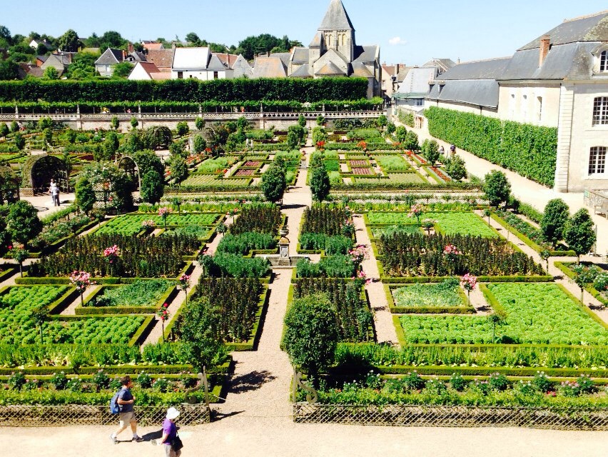
Symmetry

(Original, free-hand drawing by Zoe Colier).
There are many varieties of symmetry. Symmetry exists rampantly in nature and symmetry is also incorporated into many human designs. In this short essay, I want to remind people of several varieties of symmetry and then show how symmetry may also be used as a tool of thought to help solve problems by simplifying the space of possibilities that must be considered.
Symmetry is a concept with far broader application than cutting out paper snowflakes or choosing a nice looking Christmas Tree, Menorah or other Holiday decoration. It is fundamental in logic, mathematics, physics, chemistry, biology, and even in social science.
Symmetry exists at many different scales as well. Planets are generally roughly spherical and their orbits are roughly circular.
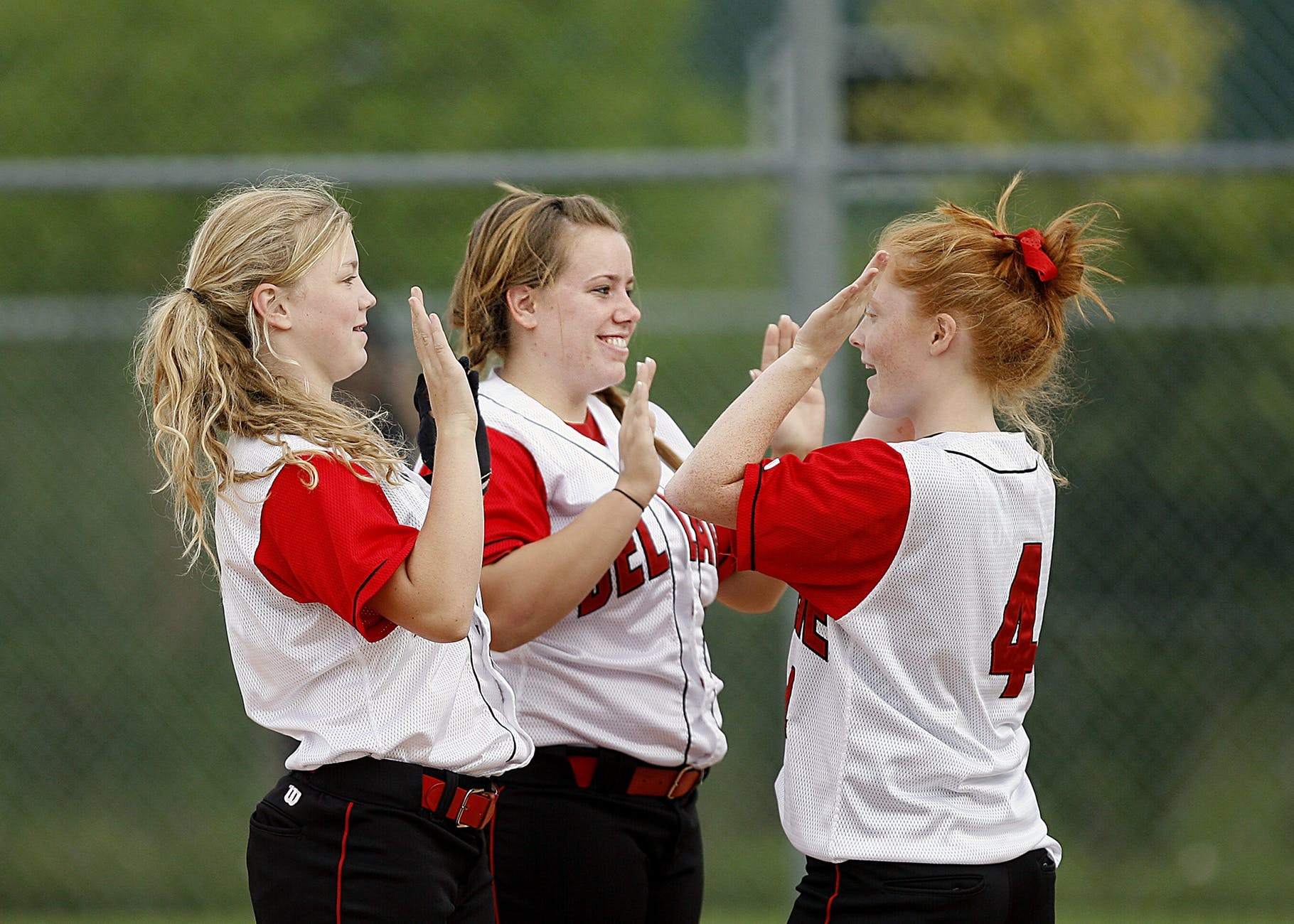
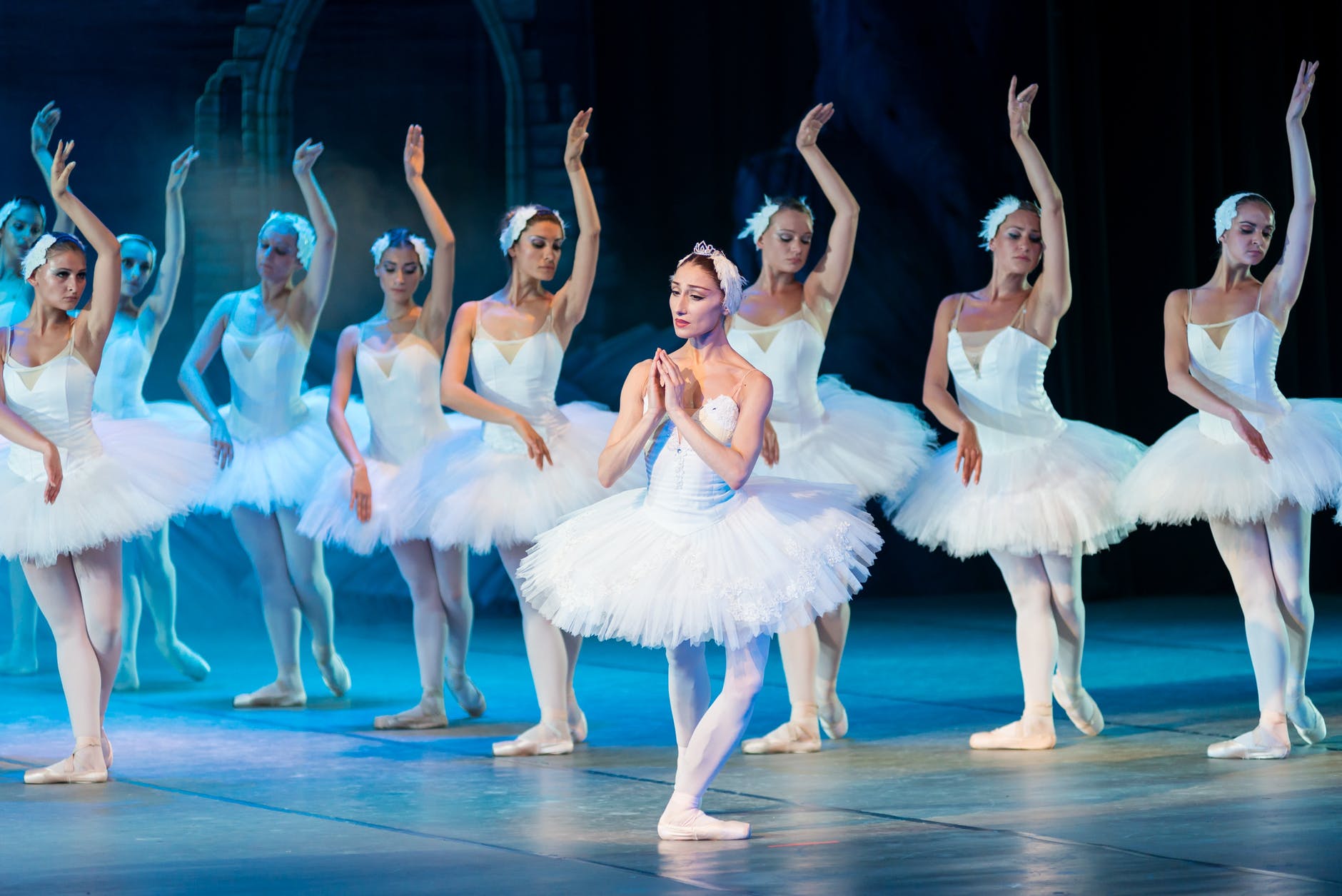
The human body, along with most other animals, exhibits rough bilateral symmetry in external appearance. If you examine your own fingerprints or the pattern of your moles, for instance, you will see that one side of your body looks slightly different from a mirror image. If, like me, you are a righty who play tennis, you will find the forearm muscles on your right arm are slightly larger than those on the left. What is remarkable to me is not that there are slight variations between left and right but just how slight those variations are. And, we are not alone. Fish, insects, flatworms, roundworms, snakes, turtles, lizards, horses, dogs, cats, apes, and humans are all roughly bilaterally symmetrical in appearance. I say “in appearance” because our internal arrangement of organs is not at all symmetrical.
External Appearance and Internal Organs
In general, it seems to me that most animals possess more complete or “perfect” bilateral symmetry than do most plants. I suspect that this is because animals generally move through a physical environment. Since we can move around, the environmental forces are generally symmetrical and so our ability to react to those environmental forces is also symmetrical. A tree, on the other hand, may have a genetic “blueprint” to be bilaterally or (more likely) radially symmetrical, but it may be subject to strong asymmetrical forces such as wind, a water source, or sunlight versus shade.
Our designed objects are also most often (at least) bilaterally symmetrical, and particularly for those objects which must interact and move through the physical world. Cars, boats, motorcycles, busses, trains, trucks, bikes, skis, surfboards, roller skates, ice skates, snowshoes and tennis shoes all tend to be bilaterally symmetrical. On the inside, however, again just like us, there are often some irregularities. The arrangement of controls of the car, for instance, are asymmetrical. (Each control in itself often does show symmetry. In some cases, this makes it easier to use, especially without looking. I suspect that the symmetry may often be for aesthetic reasons, for ease of manufacturing, for ease of maintenance or replacement or some combination.) The asymmetry of arrangement “works” because the arrangement of displays and controls does not interact with the natural world the way that the car body and wheels do. The controls are designed to interact with a human being. There are also rough conventions for where controls are laid out, how they operate, and what each type looks like. Asymmetry of arrangement is also evident under the hood. However, some of the components such as the engine, the battery, the radiator have symmetry within them. The radiator, which arguably has the most interaction with the outside world, is symmetrically placed though its plumbing is not.

Photo by Pixabay on Pexels.com
In the design of User Interaction and Experience, an argument can be made for certain kinds of symmetry. For example, in the Mac editor Pages, which I am using to write this, if the B for bold button background turns blue when bolding is turned on, I expect the background will turn back the way it was (white) when bolding is turned back off. I also expect that italics and underlining will behave the same way, especially because all three are in the same toolbar.
Where possible, it also generally makes sense, I believe, to design so that the functionality of a system is symmetrical. This isn’t always possible. Some actions are necessarily irreversible. If you don’t believe me, ask anyone who has toddlers or who has pets. In the real world, if you shoot someone dead, you cannot “unshoot” them. Unlike a computer system who asks, “Do you really want to delete all your files?” before doing so, guns do not ask that. If you are designing what can be done with a toy robot however, if you can make it go forward, you want to make it so it can go back as well. If it can turn right 90 degrees, you would like to enable it to turn left 90 degrees. Saying, “Oh, yes, but don’t you see, you can, in effect, make it turn left 90 degrees by making it turn right 90 degrees three times?!” does not cut it, IMHO.
Typically, you not only want the functionality to be symmetrical, you also want the control functions and appearances to mirror the symmetry of the functionality. For example, if you can issue the command: “MOVE ROBOT FORWARD THREE PACES” you want the symmetrical function to be evoked this way: “MOVE ROBOT BACKWARD THREE PACES” and not, “THREE PACES BACKWARD FOR ROBOT MOVE.” If you decide to give auditory feedback for the first command that says, “ROBOT MOVING FORWARD THREE PACES” you do not want the reverse command to provide feedback that says, “ROBOT THREE PACES BACKWARD MOVING.” (Oh, by the way, if you cannot provide symmetrical functionality, please do not pretend to do so with a facade of symmetrical looking commands that actually behave asymmetrically!)
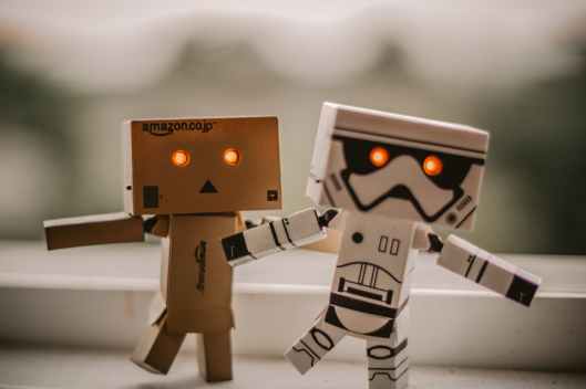
Photo by Matan Segev on Pexels.com
A lack of symmetry (or consistency) in the functionality, command structure, or visual appearance often arises because of a lack of communication within the development team. If different functions of the robot are to be implemented by different people, then it’s important that those various people use an agreed upon style guide or Pattern Language or that they communicate frequently. Of course, this is not the only cause of asymmetry. Even if your team communicates really well, they can’t design an effective gun with an “unkill” function.
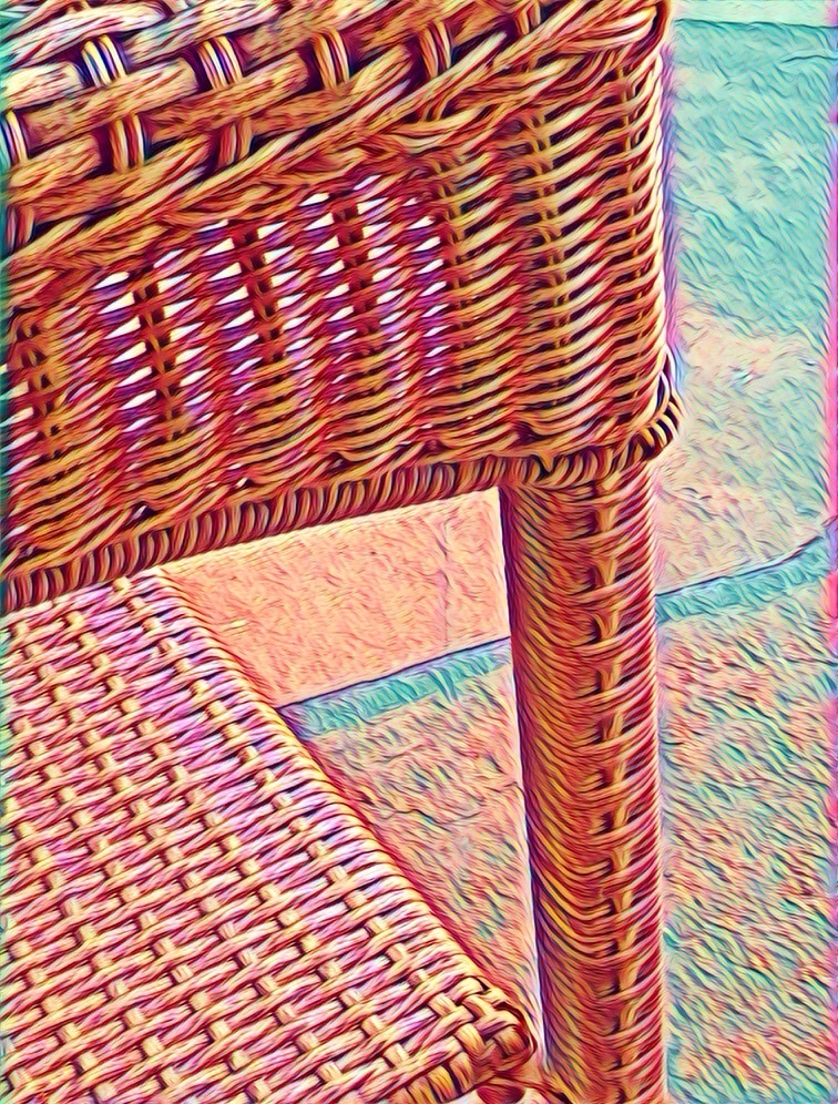
There are, of course, various types of symmetry. Bilateral (mirror) symmetry is what the external appearance of our bodies has. There is also translational symmetry, where the same shape is repeated along a line. The string ABCCBA shows bilateral symmetry while ABCABC exhibits translational symmetry. Most human factors people now agree that hot water faucets (usually on the left) and cold water faucets (usually on the right) should both be turned off by turning to the right and turned on by turning to the left (translational symmetry) as opposed to having the faucet on the right turn off to the right and the left faucet turn off to the left. But you will definitely experience both types.
In both music and poetry, at least in the culture I am most familiar with, translational symmetry is more common than mirror symmetry. It does sometimes happen that musical composers experiment with playing a tune backwards or even with the staff turned upside down. But this is far less common than repeating a theme or melody. Similarly, a rhyme scheme like ABCABC is much more common than is ABCCBA. {In this notation, ABCABC means that the first line rhymes with the fourth line, the second line rhymes with the fifth line and the third line rhymes with the sixth line.}

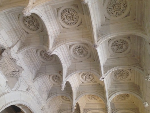
Photo by Pixabay on Pexels.com
In biology, we also find translational symmetry or something close to it. The segments of a tape worm, the segments of the body of a millipede or centipede, the small legs of a lobster, and even our own vertebrae and ribs show translational symmetry. In social structures as well, we find both mirror symmetry and translational symmetry. For instance, the Golden Rule says to do unto others as you would have them do unto you. In addition, as it happens, if we are nicer to other people, then, generally speaking, they are also nicer to us. This is not always true, however. Some people simply take advantage and view all of life as a zero sum game. Whatever you gain, they lose and vice versa. This is a very limited, inaccurate, and self-defeating attitude in most social situations. Most social situations, are, of course, much more complicated. Generally speaking, there are a great many situations that both you and your “opponent” or even your “enemy” would agree are good and a great many others that both of you would agree are bad. If you are playing tennis or golf outdoors, for instance, you may be fiercely competitive but both of you would probably find a game that brings out the best play is better for both of you. Both of you would probably also agree that being rained out is a bad outcome.
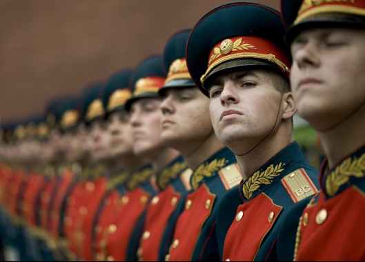
Photo by Pixabay on Pexels.com
In the military and in many industrial settings, there is a great deal of translational symmetry. The “ideal” set-up is to have many groups at each of many levels and each group is meant to be as similar as possible to all the other groups at that level. The marching that military groups learn is both symbolic of this translational symmetry and practice in behaving as a unit composed of identical parts. Whether or not this is the best way to run a military is debatable. To me, it’s undeniable that this management style has been imported into a huge number of organizations where it is definitely not the best way to organize.
The last thing to note is that symmetry also pops up in design. There is often a whole series of information exchanges from people who have quite different areas of expertise. These exchanges can result in mutual learning, solutions that work, and often patents, and occasionally, some really cool, transcendent, game-changing designs. In my experience, it is much better to have a design process based on symmetrical relationships founded in mutual respect than to have a design process based on having someone in a hierarchical power relationship make decisions that are to be implemented by an identical set of “underlings.”

Photo by Egor Kamelev on Pexels.com
The Takeaway
Symmetry is everywhere. There are many forms. If you start looking for symmetry, you will find examples in nature, in mathematics, poetry, art, music, machine design, the military and even in design problems and design processes. Thinking quite consciously about the types of symmetry that exist in a problem space and what could or should exist in that problem space, can lead to novel solutions.

——————————————-
Donnie Takes a Blue Ribbon for Spelling
A Suddenly Springing Something