• About PeterSIronwood

petersironwood

~ Finding, formulating and solving life's frustrations.

petersironwood

Tag Archives: Design

4. Alternating Repetition

03 Tuesday Aug 2021

Posted by petersironwood in Uncategorized

≈ 2 Comments

Tags

beauty, Design, diversity, HCI, human factors, order, repetition, UX

(This is the fourth post in a series of 15 which aim to examine the fifteen properties of natural order postulated by Christopher Alexander. I wonder whether the property of “Alternating Repetition” could be more frequently incorporated into User Experience and what the pros and cons might be).

4. Alternating Repetition

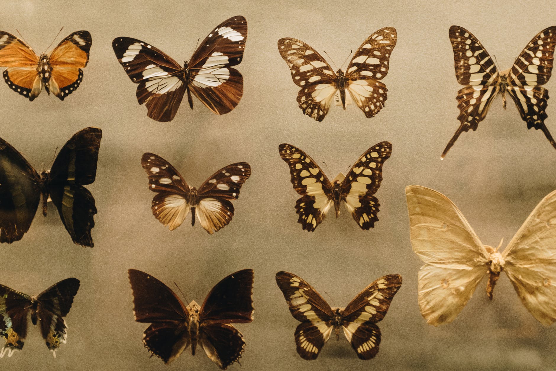
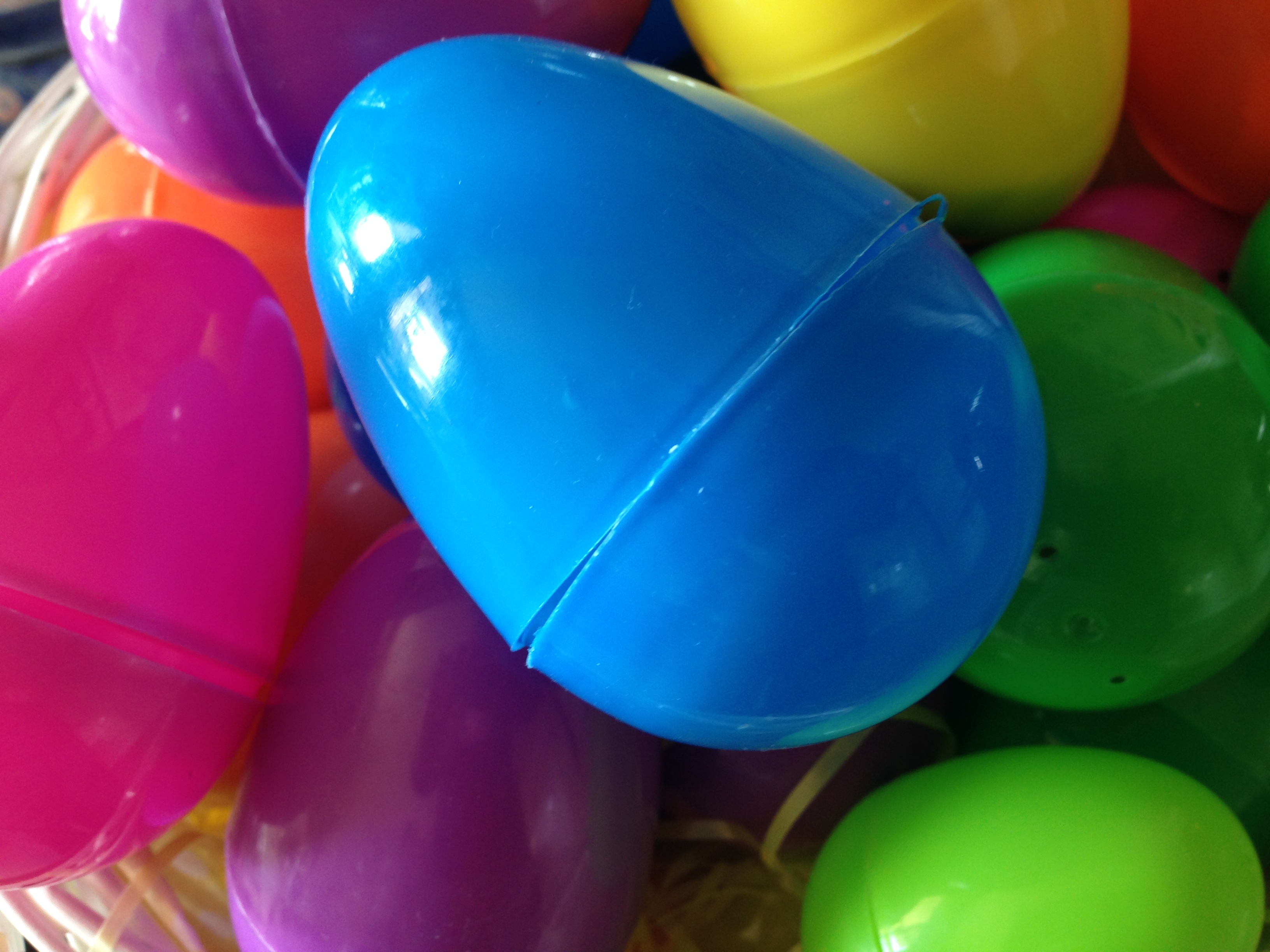
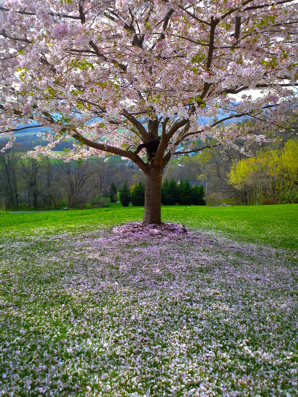
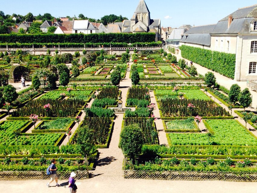
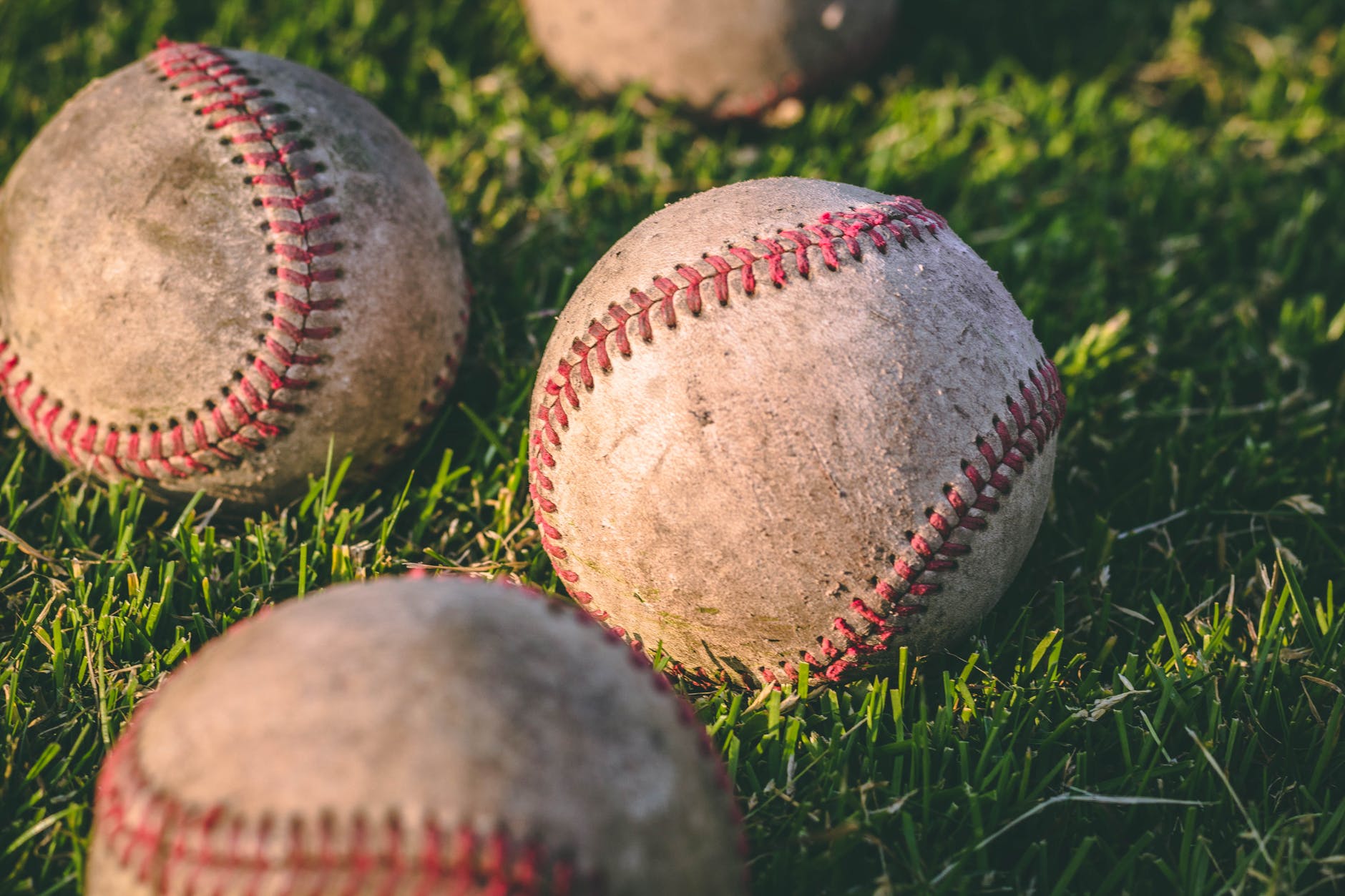
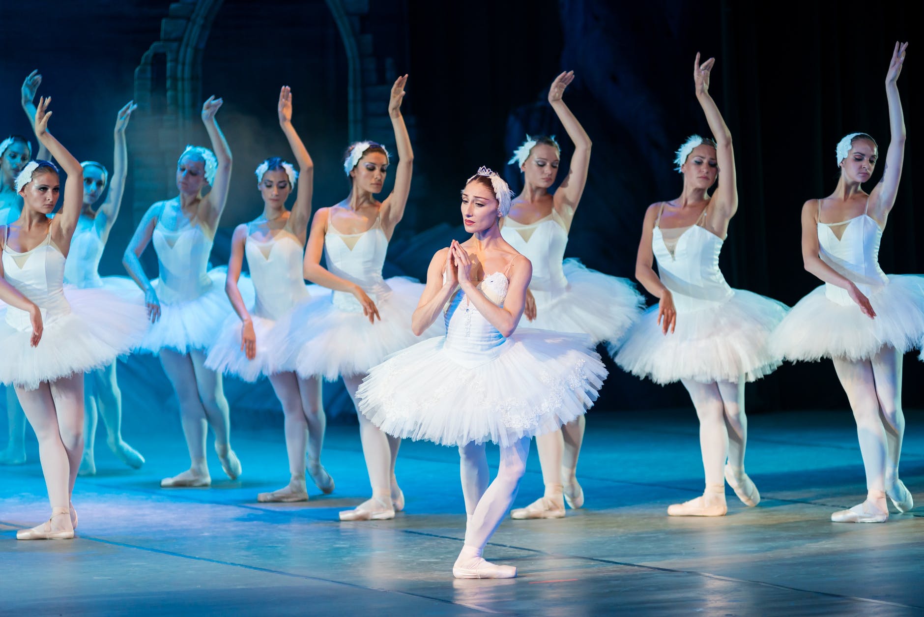
In nature, whether we look at clouds, waves, mountain ranges, forests, plants, the leaves of plants, or almost any animal, we see alternating repetition. Such natural repetition is almost never precise and complete replication. Just as every reproductive act of life introduces an element of recombination as well as the possibility of mutation, so too the repetitions we see in life are not mathematical. We indeed see patterns repeated in a line or in a circle, but the instances in living things show variation. Similarly, human artifacts made with the hands; e.g., weaving or poetry or rock walls or tennis strokes show repetition but with slight and subtle variations. 

If you look at modern industrial society, you see many examples of exact repetition. It’s true that if you looked at 10,000 examples of the same brand and model pen, or notebook, or scissors, or streak knives under a microscope, you could likely find small differences. To the naked eye, however, they would appear identical. Seeing 10,000 pebbles, leaves, or waves you would always see slight to moderate differences. To me, it makes a difference in terms of beauty. Handmade items and human actions naturally show more variation than things produced by machines. 

Photo by Pixabay on Pexels.com

The various “elements” of a User Interface generally have the feel of something made by machine. The size of all the application icons on the tool bar for instance are the same. They are all almost the same exact shape and size. On my tool bar the icons for Finder, Launchpad, Mail, Safari, Chrome, FaceTime, Messenger, Maps, Photos, Contacts, Calendar, Reminders, Notes, System Preferences, Keynote, Pages, Preview, and News are the same. However, the Kindle icon is slightly larger and more square. The Zoom icon is very slightly rounder and the icon for Facebook is circular. In other words, there is some slight variation, but mainly the icons are the same in outline, but different inside. But the set of icons on the tool bar has no sense of “harmony.” 

Note that the tool bar is both abnormally homogeneous in terms of positioning and size but completely disconnected in terms of the images which differ in a random disharmony seldom exhibited in nature.

Instead, each icon seems to scream out its individuality without regard to its neighbors. (Which reminds me of things like masking, vaccinations, telling the truth, etc.). Anyway, the layout of the toolbar, to me, it’s reminiscent of driving down the highway and seeing a sequence of billboards, each advertising some random product or service in no particular order. Often, each billboard is the same size but they are independent of each other. The one exception I can think of were the “Burma Shave” signs along the highway. Each sign was a small rectangle with several words on it. About a quarter mile down the road, another sign would appear. They were meant to be seen in a specific order and together, they made a kind of “story” which usually rhymed. Typically, the signs touted the joys of the product — “Burma Shave” — or, provided public service announcements about safe driving. 

In the early days of computing, putting in “variation” would have been insanely wasteful of space and processing time. This is no longer true. Yet, the “look and feel” of User Interfaces remains, for the most part, quite “mechanical” or “mechanistic” rather than “natural.” Sometimes modern computer games include naturalistic looking variations in how repeated plants, rocks, clouds, etc. are represented. Look at the palm trees and you will see variations among the trees that are reminiscent of the real palm trees I see every day. In addition, each tree contains a number of fronds that repeat a generic theme; yet, each front is somewhat different. The fronds themselves each contain alternating repetition, just as do real palm tree fronds. 

We might consider whether it would make sense to put more natural looking alternating repetition into the more utilitarian aspects of user experience. For example, could it be both more beautiful and more useful to allow more variation in the way files are represented visually?  Will Hill, James Hollan, Dave Wrobleski, & Tim McCandless suggested (in a CHI ’92 paper) that physical documents such as manuals naturally show wear in places where they are most used. They suggested that the visual representation of computer documents might be altered slightly to show which documents have been used or edited more and also that such cues within a document might also be useful. 

Hill, William; Hollan, James; Wrobleski, Dave; McCandless, Tim; “Edit Wear and Read Wear,” Human factors in computing systems: Striking a balance. Proceedings of the 9th annual conference. SIGCHI ’92 Proceedings (Monterey, CA), Addison-Wesley, 1992, pp. 3-9.

One of the few cookbooks I use with some regularity is entitled, Fat Free and Flavor Full. The recipe I’ve used many times is the black bean salad. If I open the physical book, it naturally falls open to that particular recipe. “Open Recent” I find a very useful features of the Pages application, but I don’t see a way to look at files based on overall frequency of use. It could be the case that there are some applications for which you would want specific files to be easily found depending on the season or the date. The authors of “Edit Wear and Read Wear” were mainly talking about the utility of encoding information about a file into its visual representation. There might well be aesthetic reasons to do so as well. 

The wooden blinds shown below exhibit alternating repetition in several ways. First, there is the matter of perspective. Some variation almost always presents itself simply by virtue of the fact that I typically view the blinds at an angle and some are closer to me than others. This means that the size, and the retinal shape are slightly different. Second, there is variation caused by slight changes in the angle of the slats relative to vertical. Third, each slat is made of wood. The wood itself shows rings (or more commonly a planar projection of the concentric cylinders. 

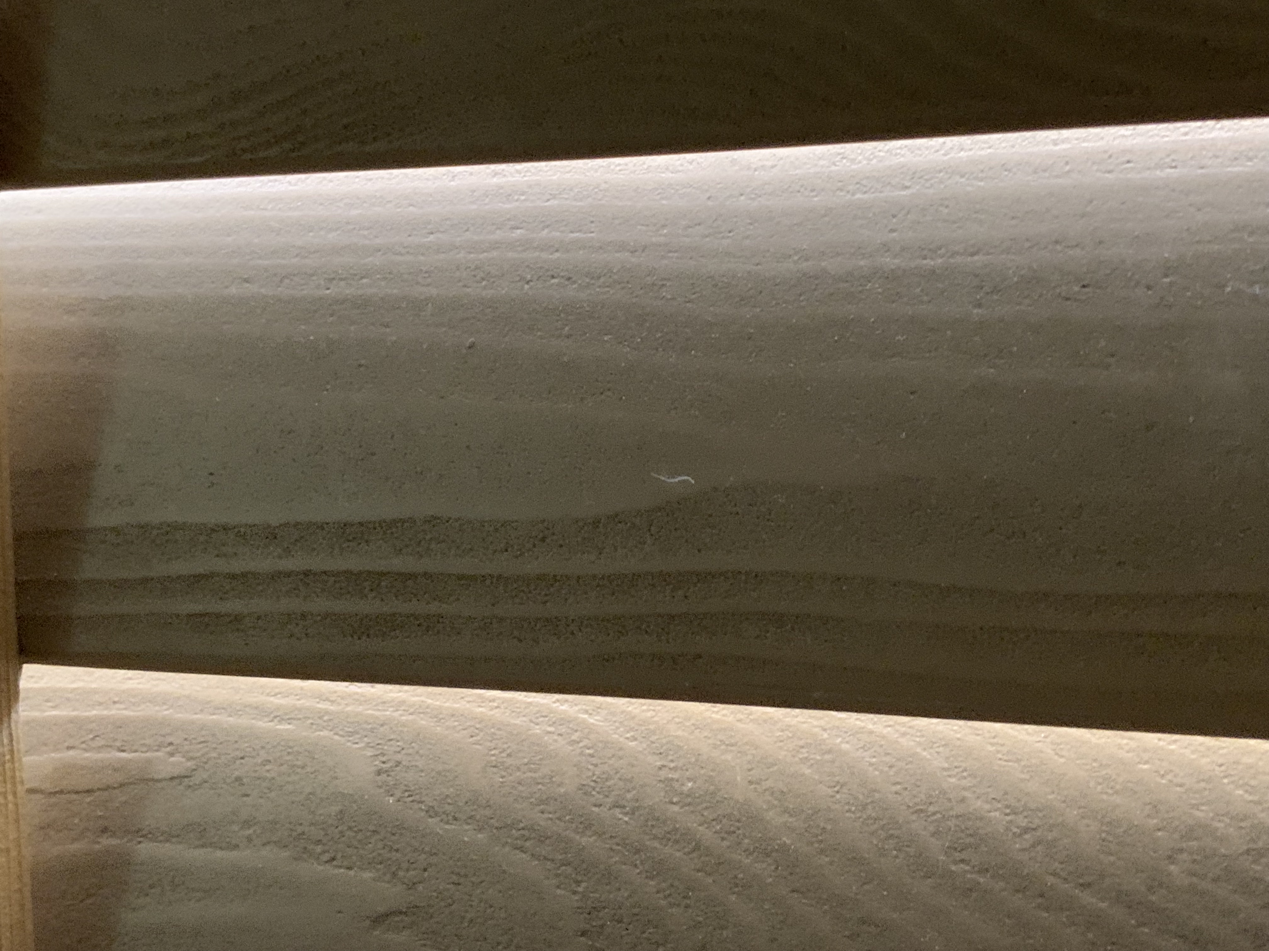
The wooden blinds, because they are illuminated from the outside by tree-filtered sunlight also show further variation; however I don’t think that is typically “alternating repetition.” Perhaps not coincidentally, although I find it a little interesting, I can’t say I find that source of variation to be beautiful to me. The other three all add to the aesthetics, at least to me. 

Is it feasible to introduce alternating repetition with slight variation into User Interfaces? Would it be desirable? What negative side-effects might arise? Do you even agree with Christopher Alexander that Alternating Repetition is an aspect of natural beauty and beautiful design? One thing that occurs to me is that if some element of the UI is more variable in outline etc., it may mean that the actions upon that object must deal with that variability. If designed greenfield, that might not be too difficult. But if, for example, the code for dragging and dropping was written under a presumption of zero variability, that might be problematic. What do you think?

——————-

Discussion of Alternating Repetition with additional visual examples can be found here: 

The Fifteen Fundamental Properties of Living Structure. 4. Alternating Repetition

Use Diversity as a Resource

The Tree of Life

Life is a Dance

Take a Glance; Join the Dance

3. Boundaries

02 Monday Aug 2021

Posted by petersironwood in Uncategorized

≈ 1 Comment

Tags

boundary, Design, ethics, limit, privacy, truth, UX

3. Boundaries

Here are a few thoughts about “Boundaries” and how they apply in User Experience. 

I decided to gift a copy of of Volume One on The Nature of Order to my daughter earlier today. I logged on to Amazon and looked at my address book. I am aware that she moved fairly recently. So, I was scrolling through my earlier text conversations with her to see whether she had told me of her new address. I couldn’t find a text about her new address so I texted her to get the new address. 

Suddenly, a popup window appeared from SIRI. It had her new address. I hadn’t said anything aloud. I thought of SIRI as a voice-activated service on my iPhone. It was disconcerting to have it “notice” my text message and then suggest an answer (which turned out to be correct). 

Last week, after physical therapy, my therapist & I began to discuss the time for my next appointment. I pulled up the calendar application on my iPhone and went to a particular day and began to type in her name. After the first two characters were typed in, the “type-ahead” function suggested three possible “completions” the first of which was the time we had been orally discussing (which was not a common time nor the time of any of my recent appointments with her). It also filled in her complete name and the purpose of the appointment, but that was more understandable. 

Photo by Nikolay Ivanov on Pexels.com

One sense of “Boundaries” in User Experience connects with a notion of “boundaries” that is much discussed in contemporary mental health. We are advised to “establish boundaries” with co-workers, family, friends, and strangers. We don’t necessarily want to share personal information with everyone or let everyone touch us in any way they choose to. If intimate details are shared in a recovery group or group therapy, it is generally agreed that such details will not be shared with others. 

We sometimes extend the idea of informational boundaries to written materials as well. If, for instance, we keep a personal diary, we do not expect other people to “search for it” or to read it. In this story, I relied on the expectation that someone would read a paper I “accidentally” dropped on the sidewalk. But she was so protective of my privacy that she wouldn’t even glance at my paper. 

On the other hand, if we write and publish an autobiography, then we can expect that other people will feel justified in discussing the contents. To me, it would seem odd for an author to feel “violated” if people start talking about the contents of their autobiography (or their blog).

When it comes to modern interactions with computer software however, the boundaries are invisible — and sometimes non-existent. It can feel as though I write a private diary on paper; lock it up in a safe immediately; and then — without any sign that the safe has been broken into, I suddenly find details of my personal life revealed! 

There appear to be boundaries between applications, and certainly between devices but these boundaries may be illusory. I find that troubling and confusing. I think the first application of “Boundaries” as a property of UX is that apparent boundaries should be real. There may be exceptions for exceptional circumstances; e.g., the police may get a search warrant to search your house if there is reasonable suspicion that you have committed a crime. 

When a social media site analyzes your reactions, relationships, and word usage to determine what to try to sell you and what type of approach is most likely to succeed, that does not strike me as a reasonable response to an “emergency.” As most readers know by now, such information is not only used to try to sell you more stuff; it was also used to manipulate public opinion; for example, to convince some US voters to stay away from the polls on election day in 2016; to convince voters in the UK to vote for Brexit; to convince people not to get vaccinated. 

Living things do have boundaries. Breaching those boundaries is typically something to be avoided. We call such breaches by names like “bites”, “wounds”, “diseases”, “gunshots”, “parasites.” Living cells typically have a cell wall. Within the cell are tinier organelles such as the mitochondria. The mitochondria have boundaries. The nucleus of a cell has a boundary. Within the nucleus, the nucleolus has a boundary. Larger structures often have boundaries. Motor neurons have a myelin sheath which allows neural impulses to travel faster. Almost our entire body is covered in layers of skin which for a boundary.


The formation of boundaries does not stop with our physical body. Organizations of humans — nuclear families, clans, nation-states, counties, cities, townships, teams, corporations — they have boundaries. A bank, for instance, might have a safe for the money, but the building itself also functions as a boundary — not an impermeable boundary — customers are allowed to come in during banking hours. There are also legal boundaries. If you have “an account” at a bank, you will be allowed to do things that non-customers cannot. Similarly, if you are an employee of a company or a member of a sports team, you will be allowed to do things and go places that you couldn’t if you were outside that boundary. 

All boundaries are semi-permeable. Boundaries change over time. A thorn tears your skin. Your boundary is broken. If you’re not careful, bacteria can get in and cause an infection. Your white blood cells destroy the invading bacteria. Your body heals. If the cut was bad enough, you may get a scar and the scar is now part of your “boundary.” It isn’t only at the level of the body that changes occur. Your social boundaries change too.

You get married. You get divorced. You are born. You join a team. You quit the team. You sell your house and other people buy it. Now, you are no longer allowed to come into the house without an invitation. Meanwhile, you buy another house. You have acquired new boundaries. Or, perhaps, you have no home. You are homeless and your boundaries are not so secure. 

Most of our possessions have clearly defined boundaries. Your hammer is separate from your saw which is separate from your drill. They come from an earlier time and the “boundary” of such objects are determined by their shape. More recently, such tools (and nearly everything else!) Is packaged in bubble wrap which forms an additional boundary. This makes it harder for people to hide one under their clothes and walk out without paying. Such packaging has the added advantage that it will require time and energy on your part before you can actually start using the tool for its intended purpose. Not only that — such packaging helps pollute our world beyond the pollution required by “old style” tools.

Photo by cottonbro on Pexels.com


Once you have separated your new tool purchase from its packaging, if you have any energy left, you can saw a board, or drill a hole, or hammer a nail. But you do not expect (not yet, at least), the saw to “communicate” behind the scenes with your drill. Or with you. You’d be surprised if it piped up and said, “Gee, Gene, you just sawed a board. Now, you have taken up the drill. Would you like suggestions on how to build a dog house?” (That’s what Clippy would do). 

(Link to Wikipedia article on “Clippy” and how it was parodied). https://en.wikipedia.org/wiki/Office_Assistant

Clippy tried to be helpful. But it didn’t really have enough information about my tasks, goals, and context to actually be helpful. But today’s behind-the-scenes information sharing with dark forces is not trying to be helpful. It’s trying to get you to change your behavior for someone else’s benefit — and you don’t even know who those someones are. 

Notice that if you buy a house (which typically comes with doors and keys), you can lock the house and the default is that it keeps everyone else out — except those you’ve given a key to or those who have rung your doorbell or otherwise asked for permission to come in. Typically, if a rare visitor comes to your house, you make arrangements for a time and a place. The piano tuner comes to tune your piano. You might let them use your bathroom or even offer them something to drink. But you don’t expect the piano tuner to redecorate your study or to spend the night uninvited. 

Photo by Mike on Pexels.com

That’s kind of what does happen in the electronic world though. In many cases, you cannot visit a website or use an application unless you give permission for the “guest” to rifle through the choices you make. Just to be clear, these “choices” are not only explicit choices; your “choices” can include how long you linger over a particular message or video clip. In many cases, you have not just given a key to a specific vendor, application, or website — in many cases, you have also given them rights, essentially, to make as many copies of your front door key as they care to make and hand them out to whomever they like. 

These are missing boundaries, not so much in the user interface design, but in the socio-technical context in which we use our technology. 

In the physical world in which we evolved, invasion of privacy typically involved symmetry. If I can see your eyes, you can see mine. Conversely, if I can’t see anyone, chances are that they can’t see me. Of course, this isn’t literally true. A tiger’s camouflaging stripes may mean that they can see the gazelles even though the gazelles cannot see them. The astounding eyesight of the eagle allows them to see a mouse on the ground and start their deadly dive before the mouse can see the eagle. 

In the electronic world, it isn’t genetically coded asymmetries of information that allows other people to invade your boundaries — in many cases without your permission or even knowledge. It is an asymmetry that comes from money and time. You don’t have anything like the fortune that rich companies have. They can hire experts at subverting your boundaries. They can hire an entirely different set of experts to convince you that it’s all okay. They can afford to hire still other experts to defend themselves in a court of law should you seek redress for any particularly unethical behavior. They can afford to hire politicians as well in order to make laws to protect their unfettered access to your data. You typically cannot afford to hire politicians to protect your right to privacy. 

You probably don’t have 10,000 to 100,000 people working for you. Companies not only have the money to spy on you. They also have to time to collect and analyze your behavior & make sense of it. You don’t. Perhaps, every once in a while, you take the time to wade through a “privacy policy.” In most cases, since experts were hired to make the text as incomprehensible as possible, you likely didn’t see much value in reading the document. 

The Nature of Order is about aesthetics, not ethics. And, this post was meant to be about aesthetics, not ethics. 

The poem by Keats, Ode on a Grecian Urn, 

https://www.poetryfoundation.org/poems/44477/ode-on-a-grecian-urn

ends thusly: 

“Beauty is truth, truth beauty,—that is all

                Ye know on earth, and all ye need to know.”

Life includes differences in sensory capability. And life includes camouflage. Generally, however, when you get to the end a cliff and step off, you have a pretty good idea what’s going to happen. The boundary is visible to you, to a bison, to a mouse, to a lemming, to an eagle. 

Photo by Pixabay on Pexels.com

When we walk through the woods in northeastern USA where I lived for many years, we run the risk of being attacked by a deer tick. The dear tick makes a hole in you and starts sucking your blood (oh, while they’re at it, they may inject a large does of Lyme disease bacteria into your blood stream). You don’t notice it, because the deer tick is “kind enough” to administer a local anesthetic so you don’t feel any pain from this invasion of your person; this breaking of boundaries. It’s a one-sided breach. The deer tick is well aware of the invasion. It’s the whole point! But you do not perceive the breach. At least, I didn’t. Twice. Thankfully, I don’t seem to have any long-lasting effects though I have several friends who do. 

A one-sided boundary breach, doesn’t seem “aesthetic” to me. Nor does it seem “truthful.” The little orange deer tick, is, in a very real sense, lying to me. It uses its narcotic to tell me, “No worries! There’s no wound here! There’s no deer tick sucking your blood. There’s no deer tick injecting a serious disease into your blood. No, no. All is well!” It seems the opposite of beauty and the opposite of truth.

I suppose if I had been born a deer tick, I might view things differently. 

———————-

Myths of the Veritas: The Orange Man

Pattern Language for Collaboration and Teamwork

Strong Centers

29 Thursday Jul 2021

Posted by petersironwood in Uncategorized

≈ 2 Comments

Tags

beauty, Christopher Alexander, Design, HCI, UX

This is the second posting in a series of fifteen which examine Christopher Alexander’s “Fifteen Properties” of natural beauty and suggests how these properties might apply to user experience design. 

Photo by Dominika Greguu0161ovu00e1 on Pexels.com

2. “Strong centers” is probably one of the most overlooked properties of design in UX/HCI. Often, what exists for the user, from their perspective, is a “sprawl” of functions, tool bars, and icons with no obvious overall or subsidiary organization. A better design would allow the user to quickly find a “home base” from which, it would be obvious where to find subsidiary home bases. There is some sense in which hyperbolic trees, fisheye lenses, and home pages partly begin to address this issue. 

Instead of “strong centers”, the impression I often get in looking at applications for word processing, organizing photos, searching, or dealing with settings is that the designers are given or generate a long list of functions to be supported. Which ones are related to which though? Which ones are central? In many cases, UX practitioners give users (or, more often, potential users), a set of cards with one function each and ask the users to sort these into piles. I am not against such studies, but they are unlikely to lead to a coherent design with a strong center. The users are not, in most cases, professional designers. In many cases, an application is supposed to support many different specific actions. For example, I use word processors to write essays, poems, and fiction. I also use a word processor to proofread something, to re-organize ideas, to “jot down” a bunch of ideas, or to write an outline. These are very different tasks, at least to me. If asked sort cards, I would do it differently depending on which type of task and which type of material I’m thinking about. 

As I type this, I glance at the “Pages” tool bar which includes: Pages, File, Edit, Insert, Format, Arrange, View, Share, Window, and Help. None of these seems like “home” to the task of writing an essay. I know from experience that if I want to write any kind of material, I must go to the “File” menu even though, as best I can recall, my initial impression of this label was that it would be something to do after I was “done” with the tasks of composing and proofreading. The toolbar gives no impression of their being any “center” at all, let alone a “strong center.” 

In my native language (English), I read from top to bottom, left to right. In that sense, the Apple Icon is first and the “Pages” item is next and it is in bold print. That could be considered a subtle clue that it’s the “most important.” In a way, the items on the “Pages” menu are “meta-items.” In that sense, I suppose you could argue that they are “important” — though as a writer, none of the items seem that important. In fact, if we get right down to it, nothing in Pages really seems designed to support the actual writing process. And, I’m not trying to single out Pages because it’s the only one or the worst one. Lack of a “strong center” seems true of nearly all applications. 

Different people use different processes for writing — and I myself use different processes for different types of writing, so perhaps trying to organize the features and functions so that there is a “strong center”reflective of the “strong center” of the task of writing is just not feasible. I am certainly not advocating for resurrecting “Clippy.” 

Ideally, it should be possible for users to “know where the action is” upon entering an application or a web page.

In another interpretation, “strong centers” refers more to underlying architecture and points to the need for a core of functionality that transcends a specific release or even a specific application. A good underlying architecture will communicate this essential center (related to central purpose or style) to the user.

All too often, the processes involved in developing an application or system themselves have no “strong center.” If the development process is itself a hodgepodge political process of accommodating to a portfolio of features and functions that are advocated for by diverse and uncoordinated stakeholders, then, what one has are a long, unorganized list artificially shoved into menus and sub-menus and toolbars. It should not be surprising then, that the user finds it difficult to know where to begin when first encountering an application — even if the user knows exactly what they want to accomplish. 

Compare and contrast most menu structures and user interfaces with the “strong centers” that are extremely common in life forms. Here are some examples of butterflies. 

Photo by Cu00e1tia Matos on Pexels.com

The central axis includes the head, the thorax and the abdomen. These are in a line in the strong center. Typically, they are colored differently from the wings. The bilateral symmetry of the wings as well as the overall shape reinforces the strong center. Wing patterns, and even the antennae and legs lead the eye back to the strong center. 

Most people think of butterflies as beautiful — and I agree. When asked, however, most people will say they are “brightly colored.” Some are; some are not. But “bright colors” don’t necessarily give rise to beauty!

Strong Centers doesn’t just apply to butterflies. Look at most birds, fish, mammals, insects and you will see how the symmetries and smaller centers reflect and strengthen the major center. Indeed, Strong Centers are not limited to the animal kingdom. The trunk of a tree provides a strong center. Each branch is itself a center and the connection of the branches to the trunk reinforces the strength of the central trunk. 

Photo by Snapwire on Pexels.com

Even single cells often exhibit strong centers (and many of the other 15 properties, by the way). 

It would love to be able to provide you with a process or checklist or formula so you could design user experiences with “strong centers.” I cannot really do that. Nor can anyone else. If you keep it in mind, even at the back of your mind, you may see opportunities to help make that happen with regard to whatever you’re working on. I’m curious to hear your thoughts about “Strong Centers.” 

———————

Some useful links to more information, discussion, and examples relevant to “strong centers” or to the fifteen properties.

Christopher Alexander – Fundamental Property 2: Strong Centers

https://www.archdaily.com/626429/unified-architectural-theory-chapter-11

Fifteen Properties of Natural Beauty & UX/HCI

22 Thursday Jul 2021

Posted by petersironwood in Uncategorized

≈ 15 Comments

Tags

Design, HCI, human factors, UX

Photo by Dominika Greguu0161ovu00e1 on Pexels.com

This is an introduction to a series of blog posts on the “Nature of Beauty.” 

Christopher Alexander was an architect and city planner. In his MIT dissertation, Alexander took a very mathematical approach to design. In our studies at IBM Research on the “Psychology of Design” I first ran across that work (Notes on the Synthesis of Form). Later in his career, however, he took a quite different approach to design. With an international team, he visited many different parts of the world to see what “worked” in terms of architecture and city planning. The results were documented in the form of a “Pattern Language.” In this sense, a “Pattern” is the named solution to a recurring problem. A “Pattern Language” is a connected lattice of Patterns that together, “cover” a field. 

Others (including me) have emulated his approach for other fields such as pedagogy, organizational change, object-oriented programming, software development processes, and human-computer interaction. A few years ago, I suggested such Patterns for collaboration and teamwork. Here’s a link to the introduction of that effort. Here’s a link to the index of those Patterns. 

Still later in life, Christopher Alexander embarked on a project called The Nature of Order. This work is documented in a series of four books. In the first book, he proposes fifteen properties of good form in nature — and in beautiful artifacts. Explication and example will be needed to appreciate what these properties mean. In this post, I list the fifteen and will attempt to explain the first one with respect to UX and Human Computer Interaction.

OLYMPUS DIGITAL CAMERA

First, you might be wondering what relevance these fifteen properties of nature might have to interface design. After all, can’t the designer just test out their ideas empirically until a UX design is shown to be usable, learnable, and perhaps enjoyable as well? Well, sure. Ideally, every possibility could be explored and tested empirically. 

But how many possibilities are there? Without any guiding principles, there are not only more possibilities than can be tested by you. There are more possibilities than there are atoms in the universe. Imagine a very simple interface on a small mobile device. Let’s say there are only ten screens in your whole application. The iPhone 12, for instance, has nearly 3 million pixels. 24-bit color allows over 16 million colors per pixel. If you literally tested out every possible arrangement, this would mean 16 million to the 3 millionth power for each of the ten screens!! The number of atoms in the universe is estimated to be between 10**78 and 10**82. Obviously, this is far less than 16,000,000**3,000,000 !! 

Of course, I’m not suggesting that anyone would attempt a pixel by pixel test of an interface, but the general point remains: you need some way to limit testing to reasonable alternatives. The notion of using these fifteen properties is not that they dictate a particular design nor that you don’t need to do any empirical testing. Rather, the fifteen properties could be used to help guide design. The properties could be thought of as reducing the search space. 

Here are the fifteen properties: 

  1. Levels of Scale
  2. Strong Centers
  3. Boundaries
  4. Alternating Repetition
  5. Positive Space
  6. Good Shape
  7. Local Symmetries
  8. Deep Interlock and Ambiguity
  9. Contrast
  10. Gradients
  11. Roughness
  12. Echoes
  13. The Void
  14. Simplicity and Inner Calm
  15. Not-separateness

Perhaps the names themselves might resonate with your own sense of aesthetics for design and composition, but let’s review them one by one. 

The first is “Levels of Scale.” 

Photo by Roney John on Pexels.com

When it comes to natural beauty, a few moments reflection may provide you with many examples. Christopher Alexander claims this property is also present in traditional art and architecture across many cultures. As you see something such as, e.g., the Taj Mahal or the Parthenon in the distance, you see a beautiful shape. As you approach it, you will see more and more levels of scale. By contrast, many modern buildings are largely featureless between the overall shape and the texture of the building material. 

If your design has multiple levels of scale, it will be easier for your user to orient themselves; to know “where they are” in the application and therefore easier to take appropriate action. It’s something to keep in mind with respect to your design — whether hardware, software, documentation, or a building. 

How could you use or see “Levels of Scale” as a desirable property of what you are doing right now? 

———————————-

Some references to Pattern Languages in HCI. 

Pan, Y., Roedl, D., Blevis, E. and Thomas, J. (2012), Re-conceptualizing Fashion in Sustainable HCI. Designing Interactive Systems conference.  New Castle, UK, June 2012.

Thomas, J. C. (2012).   Patterns for emergent global intelligence.   In Creativity and Rationale: Enhancing Human Experience By Design J. Carroll (Ed.), New York: Springer.

Thomas, J. (2012). Edging Toward Sustainability. CHI Workshop Position Paper for Simple Sustainable Living. CHI 2012, Austin, Texas.

Thomas, J. (2012), Enhancing Collective Intelligence by Enhancing Social Roles and Diversity. CSCW Workshop Position Paper for Collective Intelligence and Community Discourse and Action. CSCW 2012, Bellvue, WA.

Thomas, J. (2011), Toward a pattern language for socializing technology for seniors. Workshop position paper accepted for CSCW 2011 workshop: Socializing technology among seniors in China, Hangzhou, China, March 19-23.

Thomas, J. (2011). Toward a Socio-Technical Pattern Language for Social Systems in China and the World. Workshop position paper accepted for CSCW 2011 workshop: Designing social and collaborative systems for China. Hangzhou, China, March 19-23.

Thomas, J. (2011). Toward a Socio-Technical Pattern Language for Social Media and International Development. Workshop position paper accepted for CSCW 2011 workshop: Social media for development, Hangzhou, China, March 19-23.

Bonanni, L., Busse, D. Thomas, J., Bevis, E., Turpeinen, M. & Jardin, N. (2011). Visible, actionalble, sustainable: Sustainable interactin design in professional domains.  Workshop accepted for CHI 2011. Vancouver, B.C., May 7-12.

Thomas, J. (2011). Focus on Ego as Universe and Everyday Sustainability. Workshop position paper accepted for CHI 2011 workshop: Everyday practice and sustainable HCI: Understanding and learning from cultures of (un)sustainability.  Vancouver, B.C., May 7-12.

https://www.researchgate.net/publication/2242380_A_Pattern_Approach_to_Interaction_Design

Click to access dearden-patterns-hci09.pdf

https://www.mit.edu/~jtidwell/common_ground.html

Thomas, J. C. (2018), Building common ground in a wildly webbed world: a pattern language approach. Journal of Information, Communication and Ethics in Society, 16 (3), 338-350.

——————————-

“The Psychology of Design”

08 Thursday Jul 2021

Posted by petersironwood in Uncategorized

≈ Leave a comment

Tags

creativity, Design, HCI, human factors, IBM, leadership, research, UX

“The Psychology of Design” 

I worked at IBM, all told, about 28 years. During that time, management put more and more pressure on us to make our work “relevant” to the business. In fact, the pressure was always there, even from the beginning. Over the years, however, we were “encouraged” to shorten evermore the time gap between doing the research and having the results of that research impact the bottom line. This was not an IBM-only phenomenon. 

I was a researcher, not a politician, but it seemed to me that at the same time researchers in industrial labs were put under pressure to produce results that could be seen in terms of share price (and therefore payouts to executives in terms of stock options), academia was also experiencing more and more pressure to publish more studies more quickly — and to make sure “intellectual property” was protected to make sure the university could monetize your work. This was about the same time that, at least in America, increasing productivity and the wealth that sprung from that increased productivity stopped being shared with the workers.

Photo by Dmitry Demidov on Pexels.com

In the late 1970’s, the “Behavioral Sciences” group began to study the “psychology of design.” For the first few months, this was an extremely pleasurable & productive group, due mainly to  my colleagues. Over the next few blogs, I’ll focus on some specific techniques and methods that you may find useful in your own work. 

In this short story though, I want to focus instead on some broader issues relevant to “technology transfer”, “leadership” and “management.” Even if you are or aspire to be an expert in UX or HCI or design, I assure you that these broader issues will impact you, your work and your career. I wouldn’t suggest becoming obsessed with them, but being aware of their potential impact could help you in your own work and career. 

It is telling that, almost invariably, whenever I told someone inside IBM (or, for that matter, outside IBM) that I was studying the “psychology of design,” people responded by asking, “the design of what?” So, I would explain that we were interested in the generic processes of design and how to improve them. I would explain that we were interested in understanding, predicting, and controlling these processes to enable them to be more effective. I would explain that we could apply these findings to any kind of design: software design, hardware design, organizational design, and (see last post about IBM) communication design. I would explain that design was a quintessentially human activity. I would also explain that design was an incredibly leveraged activity to improve. 

Looking back on it, I still think all these things are true. I also see that I missed the “signal” people were giving me that, while I thought of design as something that could be studied as a process, that most people did not think of it that way. To them, it was never the “psychology of design,” but only the design of something. 

Don’t get me wrong. I agree that somewhat different skills are involved in designing a great advertising campaign, a great building, and a great application. I agree that different communities of practice treat various common issues differently. I still think it’s worth studying commonalities across domains. For one thing, we may find an excellent way of generating ideas, say, that the advertising community of practice uses that neither architects nor applications developers had ever tried. Or, vice versa.

My own academic background was in “Experimental Psychology.” We were forever doing experiments that we believed were about psychological processes that were thought to be invariant regardless of the domain. It was an axiom of our whole enterprise that studying memory for any one thing shed light on how we remember every other thing. Similar studies looked at decision making or problem solving or multi-tasking. We came to understand that there were some interesting exceptions to being able to separate content from process. For instance, it is much easier to multi-task a spatial task and a verbal task than it is to multi-task two independent spatial tasks or two independent verbal tasks. 

We used a spectrum of techniques to study “design” from laboratory studies of toy problems, to observing people doing real-world design problems while thinking aloud. After about 3-4 months of very productive work, we were told that we had to make our work relevant to software development. That should be the focus of our work. We were told that this command came from higher-ups in IBM. That might have been true, or perhaps partly true. 

It might also be relevant that someone in our management chain might have been the recipient of a grant from ONR which was specifically focused on software development. So far as I can tell, nothing had been done on that grant. So, our past, present, and future work could have been co-opted to be “results” done under the auspices of the ONR grant. 

In any case, regardless of the “reasons,” the group began to focus specifically on software design. In one study, we used IBM software experts as subjects. Each person was given information that was geared toward a specific transformation that occurred in software development. One person was presented with the description of a “situation” that included a number of “issues” and they were asked to write a requirements document. In real life, I would hope that this would be done in a dialogue (and, indeed, in other studies, we recorded such dialogues). Absent such dialogues, what we found was that different software experts — all from IBM research — and all given the same documentation about a set of problems generated vastly different problem statements and overall approaches. 

Photo by ELEVATE on Pexels.com

In other parts of the study, other experts were variously given requirements documents and asked to do an overall, high level system design, or given a high level design and asked to design an algorithm, or given an algorithm and asked to code a section. There was always diversity but the initial showed the greatest diversity. The initial stage is also the one that can cause the most expensive errors. If you begin with a faulty set of requirements — a misreading about how to even go about the problem — then, the overall project is almost certain to incur schedule slip, cost overruns, or outright failure. 

While the vital importance of the initial stages of design is true in software development, I would argue that it is likely also true for advertising campaigns, building designs — and even true for the design of research programs. We designed our research agenda under the assumption that we had a long time; that we were studying design processes independently of specific communities of practice or the nature of the problems people were attempting to address. We assumed that there was no “hidden agenda.” Although we believed we would eventually need to show some relevance to IBM business, we had no idea, when we began, that only relevance to software design would be “counted.”


—————-

Some of our studies on the “Psychology of Design.” 

Carroll, J. and Thomas, J.C. (1982). Metaphor and the cognitive representation of computer systems. IEEE Transactions on Man, Systems, and Cybernetics., SMC-12 (2), pp. 107-116.

Thomas, J.C. and Carroll, J. (1981). Human factors in communication. IBM Systems Journal, 20 (2), pp. 237-263.

Thomas, J.C. (1980). The computer as an active communication medium. Invited paper, Association for Computational Linguistics, Philadelphia, June 1980. Proceedings of the 18th Annual Meeting of the Association for Computational Linguistics., pp. 83-86.

Malhotra, A., Thomas, J.C. and Miller, L. (1980). Cognitive processes in design. International Journal of Man-Machine Studies, 12, pp. 119-140.

Carroll, J., Thomas, J.C. and Malhotra, A. (1980). Presentation and representation in design problem solving. British Journal of Psychology/,71 (1), pp. 143-155.

Carroll, J., Thomas, J.C. and Malhotra, A. (1979). A clinical-experimental analysis of design problem solving. Design Studies, 1 (2), pp. 84-92.

Thomas, J.C. (1978). A design-interpretation analysis of natural English. International Journal of Man-Machine Studies, 10, pp. 651-668.

Thomas, J.C. and Carroll, J. (1978). The psychological study of design. Design Studies, 1 (1), pp. 5-11.

Miller, L.A. and Thomas, J.C. (1977). Behavioral issues in the use of interactive systems: Part I. General issues. International Journal of Man-Machine Studies, 9 (5), pp. 509-536.

——————————

Blog posts about the importance of solving the “right” problem. 

The Doorbell’s Ringing. Can you get it?

https://petersironwood.com/2021/01/13/reframing-the-problem-paperwork-working-paper/

Problem Framing. Good Point. 

https://petersironwood.com/2021/01/16/i-say-hello-you-say-what-city-please/

Problem formulation: Who knows what. 

How to frame your own hamster wheel.

The slow seeming snapping turtle. 

Author Page on Amazon. 

Tag! You’re it!

08 Monday Feb 2021

Posted by petersironwood in Uncategorized

≈ 1 Comment

Tags

BLM, Design, empathy, HCI, problem formulation, problem solving, UX

As I mentioned before, one of my part-time jobs during my Senior year in college was as a teaching assistant at the Supplementary Educational Center (SEC) in Cleveland. In addition to actual teaching, I did a variety of other chores as well including erecting and painting walls, setting up lighting, putting up NASA exhibits, etc. One of the worst tasks I was assigned was putting a straight pin into each one of a billion variously colored squares of construction paper. 

No, there weren’t really a billion. It just seemed that way. I sat at a desk with a very large pile of these 3” x 4” pieces of paper on my left and a large supply of straight pins straight ahead. I picked up a rectangle of paper, picked up a pin and poked it through in two places so that friction held the pin in place. Then I placed it in a pile on my right. I picked up another piece of paper and did the same thing. Again. And again. After awhile, I looked down and noticed that there was a large pile of these pinned pieces of paper on my right — and none left undone on the right. But I only “noticed” doing the first several. After that, my brain took a vacation. 

It’s not the only time my brain has taken a vacation when faced with a boring task. If I had a heavy industry job on an assembly line, I have no doubt that I’d be mangled or dead within a week. I just “tune out” of the task at hand. Perhaps you have experienced something similar while driving a well-known route. You get in your car to drive home from work — and then — you find yourself at home — and you have no conscious recollection of driving home! It’s an interesting phenomenon but not the one I’m going to explore in this post. 

Hopefully, you are also curious about why I had been assigned the task of putting these pins in all the various pieces of colored paper. 

Here’s the deal. The school system of Cleveland, like many others at the time, was very racially divided. There were many neighborhoods in the Cleveland area that were nearly 100% black and others which were nearly 100% white. One of the goals of the SEC was to bring kids from various neighborhood schools together so that they could have at least some experience interacting with kids of different races and ethnic backgrounds. Sadly, the situation is pretty much the same today as the map below from 2018 shows. (Red are majority black areas; orange are Hispanic; Green is Asian; Blue codes for white).

https://www.clevescene.com/scene-and-heard/archives/2018/05/10/new-data-map-reminds-us-cleveland-is-hyper-segregated
 
  So, cast your mind back to your time in the sixth grade (about 10-11 years old, typically). One day, you get in a bus and ride to downtown Cleveland and go into the Supplementary Educational Center and there are kids there from two other neighborhoods — kids you’ve never seen before and will likely never see again. Are you going to hang out with your friends? Or, are you going to walk up to some total stranger — of a different race — and introduce yourself and hang out with them for the day while you learn about American history or space science? I don’t have any conscious recollection of ever being a racist, but I have no doubt whatever that I would spend time with my own classmates; in fact, I would hang out with a subset of my classmates who were my friends. 

Guess what?


That’s exactly what the kids did as well. They hung out with their friends. The administrators of the SEC eventually noticed this and constructed a social engineering “solution.” They gave every kid who entered a tag of green, blue, yellow, or red. For the day, at least, the “greens” would be with each other. The “blues” would hang out together with other “blues.” And so on. 

Thus my assigned task of putting pins so that the kids would have a tag that they could pin on their clothes. This way, so the thinking went, people from diverse neighborhoods would end up in the “green” group. Sounds reasonable in theory.

If you’ve never actually been a kid. 

Or, if you’ve been a kid but have nonetheless convinced yourself that you weren’t. 

Or, if you’ve been a kid but you never think back on your actual experience in order to inform your design decisions when you’re designing for kids. 

Cast your mind back to when you were ten or eleven years old. You get on a bus and ride to downtown Cleveland and as you walk in the door of the Supplemental Educational Center, you’re handed a red tag and the two friends you typically hang out with are handed a green tag and a yellow tag. You discover that these tags will determine who you get to hang out with for the day. 

What would you do? 

I can tell you what the kids at the SEC did.  They immediately traded tags with other kids so they could still hang out with their own friends! Mostly, they could do this with kids in their own school. On rare occasions, they also went to kids from other schools in order to get the “right” tags so they could hang out with their friends. At least for a few moments, some of them did actually interact transactionally with kids of other races long enough to trade tags. 

Please understand. The administrators and teachers at the school weren’t dummies. But … ? Did they really think this ploy would work? 

I’m not saying that empathy is an infallible guide in design. Things change. It’s possible that your experience as a child would be quite different from what children today would do. Technology changes; culture changes; nutrition changes. 

Nonetheless, thinking back to your own experience as a child should at least be consulted when you’re designing for kids. Your experiences are vast. You can not only think back about your experience as a kid. You can think back about your own experiences of being thirsty or hungry or afraid or angry. If you’re designing for users who might be experiencing these states, that can be useful information. 

I’ll say it again. Your own experience is not an infallible guide. User testing is still necessary. Just because you might have liked something doesn’t mean others will. On the other hand, when it comes to any real world problem, the design space is huge. You can use your own experience as an inspiration to design and you can also use it as a first level check on design ideas. 

————————————————

Myths of the Veritas: The First Ring of Empathy

Author Page on Amazon

Race, Place, Space, Face

Don’t they realize how much better off they are now?

The Most Serious Work

Blood-Red Blood

Answers to Your Many Questions

Who are the Speakers for the Dead?

How the Nightingale Learned to Sing

The Pie of Life

The only “Them” that Counts is all of “US”

The Touch of One Hand Clasping

Cars that Lock too Much

The Lost Sapphire

Jennifer’s Invitation

How did I get here?

That Cold Walk Home

That First Time is So Special

The Itsy Bitsy Spider & the Waterspout

Getting Into (the “right”) Shape

07 Monday Sep 2020

Posted by petersironwood in Uncategorized

≈ 1 Comment

Tags

cats, consumer products, Design, form, function, HCI, human factors, kittens, usability, UX


A truism we have all heard is that “form should follow function.”  I tend to agree with this as a good general principle, but only if the designer has given more than 30 milliseconds of thought about what the actual function is. Even better is to observe function being used in practice.  Below, I give examples of how form may look like function but not actually follow (actual) function.

The first comes from the complex and technical domain of nail clippers.  My nails are tough and I actually need to use toenail clippers to cut my fingernails.  But the same principle applies to both fingernail clippers and toenail clippers.  I see many many examples where the designer has attempted to curve the surface of the nail clipper to “match” the curve of nails.  This is a brilliant idea, but only if every nail on every human being on the planet has the same curvature.  A priori, I would tent to think this is not the case, but being empirically oriented I decided to test it out by actually looking at real nails.  I looked at my thumbnail and the fingernail on my little finger.  Sure enough, my hypothesis was borne out.  They are NOT the same.  What this means is that a nail clipper that is curved so that it fits my pinkie will wreak havoc when applied to my thumbnail.  I am probably going out on a limb here, but I suspect that if one were to include fingernails from other people in this sample, one might find an even wider variation in curvature.  What are people thinking when they make curved nail clippers? I can only speculate that they have never looked at the fingernails of more than one person and that, indeed, they never looked at more than one fingernail on that one person.

Image

Image

If only there were a solution.  Sigh.  Oh, wait!  There is a solution. Make the cutting surface of the nail clippers flat.  This enables the person to clip nails of any curvature.  It does, of course, require multiple cuts.  It has the added advantage, that if you so wish, you can sharpen your nails so they resemble cat claws.

Image

Cats bring me to my second example.  When we moved to California amid a large garden, we wanted to let our cats to spend most of their time outdoors, partly so litter box cleaning would be at a minimum.  Unfortunately, we soon discovered that while the outdoors here offers many opportunities for cats to be hunters of lizards and mice, it also offers even more opportunities for them to be prey for bobcats, cougars, eagles, and especially coyotes.

Now, here is a beautifully shaped litter box (a gift).  It even has a place for the cats to clean their paws before they track litter back into the living room.  Nice.  Unfortunately, this is a beautiful shape by someone who has never cleaned a litter box, at least not by litter box shovel.  Perhaps they clean litter boxes with their bare hands?  Anyway, this curved shape does not jibe well with the typical litter box shovel.  Of course, the cats could choose to do their business along the gently curving side of the litter box.  And, of course, they never do.  They choose instead the places along the edge of the litter box where there is maximum curvature.

Image

Image

The idea that there is a place for the cats to clean their feet before venturing back out into the living room or pouncing up on the kitchen counter is a sweet idea.  It is an idea that would never occur to the owner of an actual cat, however.  Here are two cats we obtained from a shelter (Tally on the left, Molly on the right).

Image

They are cute, but defective in that they do not speak English, nor so far as I have been able to discover, any other language.  So, despite my explanations that they are supposed to wipe their feet on the way out of the litter box, they do not.  Instead, they do their business on the foot-wiping section of the litter box.  So, apart from the annoying high curvature, if you are unlucky enough to get a cat who either does not understand complex sentences or just doesn’t care, this is probably not the litter box for them either.  It might work for cats who: 1) speak your language fluently and 2) are cooperative. (Recent estimates indicate the total number of such cats is zero).

The third example comes from health care and is a bit more abstract.  On my insurance ID card is a field which is labeled: “Identification number.”  In order to use this, I have to go to their website and “register.”  In order to register, the website says I need to enter my “identification number.” But in actuality, that does not work!  No.  Instead, I am supposed to leave off the first three characters in what is labeled my identification number.  The website doesn’t say this.  But the help desk is quite familiar with the issue and will happily explain it to you after you listen to musak for three or four hours.  This is not so much shape not matching real function, but label not matching function.

The fourth example comes from some of our “bookcases.”  Why, I hear you ask, are there scare quotes around bookcases.  I will tell you why.  I put scare quotes because although the shelves are flat and just the right size for books, and although this piece of “furniture” is sold as a bookcase, in fact, it is a nick-knack shelf.  My wife and I foolishly tried filling it with books and it collapsed.  So, in this case, the label and the shape lead one to believe it serves a particular function but the underlying functionality is insufficient to fulfill that dream of ours (that the “bookshelf” would actually hold books).


grey metal hammer

Photo by Pixabay on Pexels.com


The fifth example comes from my experience with companies who want to simplify things for their customers.  That sounds worthwhile.  So, they launch major efforts to make their products “consistent.” But they soon learn that making products behave consistently years after they were independently developed is way too expensive.  So instead, they focus on making them look the same and using consistent terms across products, while leaving the underlying functionality behave quite differently.  To me, this is quite akin to the bookshelf case. Making things look the same while continuing to have them act differently is actually worse for the user than having things that act differently also look different! 


Photo by Pixabay on Pexels.com


The moral of the story? It’s fine to have form follow (and signal) function, but you need to understand how users actually behave. They won’t necessarily behave as you imagine they are supposed to any more than a cat will read your mind in order to please you. Of course, if you see yourself, not as a partner of your users, but rather out to deceive them into thinking they are buying and using something different from what they really are… 

—————————————

Introduction to Pattern Language for Collaboration and Cooperation.

Index for Collaboration Patterns  

Author Page on Amazon

Using Stories and Storytelling 

What do you do when the client insists you solve the “wrong” problem? 

Essays on America: OOPS!

29 Wednesday Apr 2020

Posted by petersironwood in America, apocalypse, COVID-19, family, health, management, politics, psychology, Uncategorized

≈ 3 Comments

Tags

coronavirus, COVID19, Design, Feedback, pandemic, politics, systems thinking, testing, truth


sunset skyline boston dusk

Photo by Kristin Vogt on Pexels.com

OOPS!  

The basement in the rented Woburn house was not particularly pleasant. Cold, damp, and dark, there were only four small basement windows and even these were cluttered with spider webs. One day, in order to try to make the place marginally more usable for my three small kids, I removed all the spider webs. The next day, the basement was swarming with hornets! 

OOPS! 

We had an oil burning furnace in that basement. The landlord cautioned me before we even rented it, that a pair of knobs should be used to make sure that the water level in glass vial be kept between two marks. This gauge looked like the gauge in a level.

I glanced at the gauge every so often. Initially, I checked it every day or so. But the level never moved. So, I began checking it every week. But it still never moved. It never seemed to move for two years. One day, I glanced at it, and to my horror, the gauge was almost completely empty. 

OOPS! 

Now, I was faced with a dilemma. Which of these two knobs was I supposed to turn? There were no labels. There hadn’t been any when I rented the property. Of course, I should have asked the owner more questions during the walk-through. And, then I should have immediately made my own labels. But I hadn’t. 

OOPS! 

I could not recall which knob would cause the fluid level to rise. I decided to try it. I just opened it a little bit. Nothing. I watched closely. I waited. Nothing. As in the illustration above, there were no marks either on the knobs or on metal behind them. So, I wanted to return the first knob to its initial position. But in my hurry to “fix” the problem, it hadn’t occurred to me to put a little mark on the knob and the background so that I would at least be able to return it to the original position. 

OOPS! 

Well, okay but it was too late for that now. I waited. Nothing. I turned the first knob back to where I thought it was. The glass was still nearly empty. Was it slightly less empty than it had been? Or was it slightly more empty? I wasn’t really sure. I should have also marked the level very carefully. I didn’t. 

OOPS! 

So, the glass tube was nearly empty. I did definitely remember that I had been told this was a very dangerous situation! I had tried one knob and it hadn’t seem to do anything. I decided to try the other knob. I turned it a little. Nothing. I waited. Nothing. At this point, the sweat was pouring down the inside of my undershirt. I wasn’t really clear what might happen if I failed. Could the boiler actually blow up? Could it cause a fire? Or would I be lucky and it would just ruin the furnace? 

I opened the second knob a bit farther. Nothing. I waited. I opened it a bit farther. Nothing. I opened it a bit farther. Nothing. 

Then, suddenly, the vial began to fill. Rapidly! Too rapidly! I quickly turned the second knob back to what I hoped had been its original position. The vial was still filling. Try as I might, I could not get the vial to stop filling! 


Bang!! 

OOPS!

The glass vial had broken. Luckily I had not been hit by the flying glass. I turned off the furnace and called the owner. Eventually, it was fixed. In a few months, we moved to Westchester, New York. 

Perhaps few people have had the exact experience I had with an oil burner, but I suspect almost everyone has travelled to a new place on vacation or a business trip or visiting a friend and decided to take a shower at some point. (Think back to the pre-pandemic days). 

If you are in most bathrooms for the first time, you really have no idea how to arrange the knobs for a reasonable shower temperature. If you move the knob(s) and feel the change almost immediately, you can quickly arrange things so that you have a comfortable shower. In some houses or hotels, however, if you move the knob, there is a significant delay before you feel any change in the water temperature. You might arrange it so the water is perfect. You get in the shower, and you get your self soapy and …

OOPS! 

You are suddenly being boiled alive! So, you step out of the scalding water, and drip water all over the floor and go back round to the controls and turn the knobs until it feels comfortable again. You’ve learned your lesson. So you wait. Still comfy. Good. In you go. Ah, feels nice…

OOPS! 

Suddenly you are being sprayed with ice water! 

Think back and you’ve quite likely experienced something like this. If the feedback is delayed a bit, it makes it harder to adjust things. And, if the feedback for your actions is delayed a lot, it makes the adjustment very difficult indeed. Of course, if you have experience with that particular system or you have a decent model of how the system works, then, you can do a much more reasonable job of adjustment. 

Guess what? This is one of the factors that makes “opening the economy back up” extremely hard to do safely. I didn’t say “impossible” but very difficult. If you decrease social distancing regulations and people respond to those regulations by doing precisely as you’ve directed, it will be at least a week before you have reliable feedback about whether your actions have been too little lifting of restrictions, just right, too much or way too much. (It’s quite possible the “Goldilocks Zone” between surging cases way beyond hospital capacity and destroying the economy is very narrow).  

And, now let’s imagine that you are one of those politicians who looks at the data and immediately realizes and admits that you opened things up way too much. You retrench. You close things down. Once again, there will be a delay before the rate of new infections, new hospitalizations, and deaths starts to decline again. Meanwhile, even if you, the mayor or governor is wise enough to savvy to the delayed feedback, many of your constituents will not be. 

“What do you mean, you’re closing back down!!? You just opened up two weeks ago! I brought everybody back, assured my customers it was fine, bought all this inventory — and you shut me down!? Now, I’ve been shut down a week and so what? The cases keep going up anyway. Your order is bullshit and has no impact!” 

If you bow to that pressure, it will be a disaster. 

OOPS! 

If you are a mayor governor, you also need to realize that your orders themselves have zero impact on the pandemic. What does matter, but which is influenced by your orders, is actual behavior. It may seem an obvious point, but it seems to be overlooked. If for example, you have been honest and open with the public, other things being equal, you will get greater compliance and faster compliance. If you have not been honest, on the other hand, you will get  (other things being equal) less complete compliance and slower compliance. As leader, the feedback between what you do and what you see in terms of cases will take a least a week just based on the nature of the disease. But there may also be additional time lag because of the fact that people will not all comply. It would be really good to have measures in place of aggregate compliance in order to understand what is really happening. 

Sadly, COVID19 is worse — much worse — in this regard than the shower example. I don’t just mean that the outcome is potentially worse than an uncomfortable shower. It is, obviously. What I mean is that the other examples, though they had delay, were (at least till I got in the loop) basically linear systems.

Spread of contagious diseases is nothing like that! 

It is exponential growth. Exponential growth can be explosive growth. 

You may recall from your high school days, that rabbits were introduced to Australia and for a time bred for food. At some point, they began to undergo a population explosion and became serious pests for Australia. 

https://en.wikipedia.org/wiki/Rabbits_in_Australia

You might find this paragraph of particular interest: 

“The population explosion was ascribed to the disappearance of native predators, but the emergence of a hardier breed by natural selection has subsequently been attributed to their spread.” — op. cit. (4/28/2020)


Awkwardly worded, but I take it to mean that one of the effects of exponential growth is that it can result in hardier breeds. I suppose that the hardier breeds also help foster that exponential growth. A resurgent pandemic also means an explosion — not just in the number of humans who are affected — it also means an explosion in the number of COVID19 viruses on the planet. Therefore, there is a much greater population from which adaptive mutations of various kinds can arise.

There is already evidence that COVID19 has evolved and now exists in different strains. Some strains may be more virulent than others. The degree of cross-strain immunity is as yet unknown. (Update?)

OOPS!

Imagine you live in a straw house. It’s actually pretty comfortable most of the time. But one night it gets really cold, so you decide to start a fire for warmth. Of course, you realize that your house is straw so you aim to be very very careful. And you are. And, then two sparks from your fire spew out in two different directions and set your entire house on fire. Of course, you do your best to put it out. But you don’t. It got away from you. 

OOPS!

——————————————-

Myths of the Veritas: The Orange Man

Trumpism is a New Religion

You Bet Your Life!

Citizen Soldiers. 

Parametric Recipes and American Democracy

Essays on America: The Game

Author Page on Amazon

Process Re-engineering Moves to Baseball 

25 Saturday Apr 2020

Posted by petersironwood in America, apocalypse, COVID-19, family, health, management, politics, sports, Uncategorized

≈ 9 Comments

Tags

baseball, Business, Consulting, Design, efficiency, process, Process Re-engineering, sports, Trumpism, truth, work

[I wrote this satire when I was Executive Director of the AI lab at NYNEX back in the 1990’s. At that time, “Business Process Re-engineering” was a huge management fad. Here’s how it worked, in short. Consultants would ask top executives how their part of the organization worked. Then, the consultants would make a map of one of the processes of the organization. This was called the “As Is” map. Then, the consultants would simplify that to produce the map of the ideal (and supposedly more efficient) process. Then, the executives would pay the consultants a bunch of money and insist that their organizations stop using the “As Is” map and instead do things according to the “Should Be” map. In a few cases, there were some inefficient processes that were replaced with better ones. But in many cases, the “As Is” map was made based on a fantasy of what was going on in the organization. Unless the executive had “worked their way up the ranks” by actually doing the jobs, these “As Is” maps were almost certain to be ridiculous over-simplifications. Even if the executives had worked their way up, they could still be way off because markets change, technology changes, and workers change. Despite the fact that I wrote this about 25 years ago, to me, it seems much like the kind of ignorant and egomaniacal over-simplified mis-thinking that is rampant in the Trumputin Misadministration. So, I thought it appropriate to publish. (And, I miss baseball).] 


person holding baseball bat

Photo by Mandie Inman on Pexels.com


In a surprise move today, the take-over executive known affectionately as B. S. announced a take-over of the New York Yankees. 

INTERVIEW ONE 

B.S.: “The Yankees are facing new competitive pressures, and we will be bringing our management skills to the team to help them deal with those pressures and increase shareholder value while maintaining player morale and improving customer service.” 

Reporter: “So, what exactly will you be doing?” 

B.S.: “First, we brought in an outside Management Consulting Firm. Just between you and me, we paid them big bucks! But it was worth it.” 

Reporter:”Worth it how? What will you be doing?” 

B.S.:”Well, for starters, we’re downsizing the on-the-field team from nine to six players.” 

Reporter:”Uh….did these management consultants actually know how to play baseball?” 

B.S.”Probably. Maybe. I don’t really know. But that’s not the point. They are top-notch accountants. We plan to increase our operating efficiency 33%.” 

Reporter:”Fascinating. Any other plans.” 

DCA8FC9A-F229-4538-9EA2-D9E13D4796EB_1_105_c

B.S.:”We have to be willing to change, you know, flow with the times. Once, spring training made sense. But in today’s highly competitive economy, we won’t be able to afford frills like that.” 

Reporter: “Cool. No training. That should save some bucks!” 

B.S.:”You said it! We have to pay for our big executive bonuses somehow. After all, we deserve to make more money for … well … for being rich.” 

Reporter: “Any other productivity measures?” 

B.S.: “Well, this inventory of bats, balls, mitts — I mean that has just gotten completely out of hand. Sure, I suppose we should keep a bat for the team, but having all those individual bats? Nonsense. And, don’t get me started on mitts!” 

Reporter:”No mitts? Won’t that decrease your fielding effectiveness?” 

B.S.:”No, we have a Quality Process to improve our fielding effectiveness. Besides our management consultants pointed out that cricket fielders don’t use mitts.” 

baseball glove and ball

Photo by Alexandro David on Pexels.com

Reporter: “Well, Mr. B.S., I think the Yankee fans are in for a real — a really different experience this season.” 

B.S.: “Thanks! And, believe me, Wall Street has already taken notice. The Market to Book value is up 10% already. Just wait till we move into the football market.” 

Reporter: “Football?” 

B.S.:”Sure. There’s no reason at all these ball-players can’t make themselves useful in the off-season by playing football.” 

Reporter:”Well, with a few exceptions, it takes a different set of skills — and a different body type even to —“ 

B.S.:”B*** S***! That’s what those nambly-pambly unions would like you to believe. Didn’t you play football and baseball when you were a kid? Huh?” 

Reporter: “Well, yes, but not at a professional level. I mean….” 

B.S.”Well, we’re going to increase shareholder value. Period. End of discussion.” 

football game

Photo by football wife on Pexels.com


INTERVIEW TWO 

Reporter: “So, B.S., how is your plan going?” 

B.S.: “Great! Fantastic!” 

Reporter: “So, you’re winning ball games then?” 

B.S. “We are meeting all our financial targets for cost-containment. In fact, our top-notch accounting team has uncovered another big cost savings.” 

Reporter: “Really? What?” 

B.S.:”We’re going to outsource our pitching. No more high-paid prima donnas! Nope. We’ve found a vendor who can provide pitching for 1/10 of our current costs!” 

Reporter: “Hmmm. I don’t know. They say, pitching is 80% of baseball.” 

B.S.: “Exactly, my point, boy!” 

Reporter: “Well, are you actually winning games?” 

B. S. “I already told you, our costs are down significantly!” 

Reporter: “Yes, but when you actually get out on the field, do you score more points than your opponents?” 

B.S. “There are some temporary performance anomalies — mostly due to bad weather — and the lack of cooperation on the part of the Umpire’s Union.” 

Reporter: “Lack of cooperation?” 

B.S. “Yes, the Umpire’s haven’t quite adjusted to the new realities of competition. Once they make the proper adjustments to the strike zone, I have every confidence that we will be fully compatible run-wise with others in our segment of the league.” 

tilt shift photography of a baseball referee

Photo by Pixabay on Pexels.com

Reporter: “I see….” 

B.S.:”Meanwhile, we’re also improving and upgrading our capital infrastructure.” 

Reporter: “You mean…the stadium?” 

B.S.”Exactly. We’re replacing the concrete with much newer high-tech polypropylene glycol embedded styrene.” 

Reporter: “Oh. Will you be replacing those hard seats?” 

B.S. “Seats? Don’t be ridiculous. That would be way too expensive.” 

Reporter: “Well, how will the stadium be different — from the fan’s perspective?” 

B.S.: “Fans? Oh, fans. It will be a much more modern, more high-tech stadium.” 

Reporter: “So, how will the actual experience of the fans be different?” 

B.S. “Did I mention that our stock price has risen 5%? Wall Street knows what’s best for baseball!” 

Reporter: “Perhaps, but according to our wire service, you lost last night to Cleveland, 26-0. That’s….” 

arena athletes audience ball

Photo by Pixabay on Pexels.com

B.S.:”That’s a temporary aberration! I told you! The Umpires have got to get on board here. We’re only asking a proportional shrinkage in the strike zone to match our cost-containment figures. Our new policies are a success. We don’t need to be questioned by nay-sayers spouting statistics. This interview is over!” 


INTERVIEW THREE 

Reporter: “So, BS, I hear your team has surpassed the opening losing streak record of the Pittsburg….” 

BS:”Bah! Our expenses are down! Our stock price is UP!” 

Reporter: “How about the fans? How’s the attendance?” 

BS: “Attendance? It takes time for our end users to adjust to the interface changes, but they will. After all, what are they going to do, take a ride to Seattle just to watch a live ballgame?” 

Reporter: “Well — or, maybe across town.” 

BS: “Get serious. It takes less time to get to Seattle. Anyway, we have taken some of the surplus and hired some systems analysts to help us out. We should be on a winning streak in no time!” 

Reporter: “Wouldn’t it maybe make more sense to hire some — you know, outfielders, say?” 

BS: “You obviously don’t know anything about business. That’s why they hired me. Ever hear of the expression ‘a level playing field’?” 

Reporter: “Yes, but what … ?” 

BS: “Well, we are not going to have one! Not much longer! Our system analysts have designed a system to tilt the entire stadium on command. So — in short, our ball-players will be hitting DOWNSLOPE while the opposition will be hitting UPHILL! Come on. Tell me I’m brilliant! And, we are moving the stadium to a place where the tax rate is less and the real estate is cheaper! Go ahead! Tell me I’m brilliant!”

scenic view of mountains

Photo by Elina Sazonova on Pexels.com

Reporter: “Uh, you’re brilliant, but — ah — won’t your opponents object?” 

BS: “Who cares? Our lawyers have combed the rule book and the UCC and NOWHERE does it mention anything about not tilting the earth!” 

Reporter: “Well, maybe not specifically, but surely on the basic principles of fair play….” 

BS: “Ha hah hahahahhh! Oh, you really crack me up! ‘Basic Principles of Fair Play!’ Oh, that’s rich. That’s realllllly rich. Yes. Good one. Listen, sucker, if you can get away with it, it’s what you do! Have you been asleep? Ever hear of tobacco companies? How about the Ford Pinto? Billionaire Milliken? Get real!” 

Reporter: “Still….somehow, I always thought of baseball as a sport.” 

BS: “Oh, right. And, I always thought of Howard Stern as Marilyn Monroe. Geez. Our profits will soar! Our profits will soar! Oh, so many plans. Fewer squares! Fewer innings! Fines for foul balls! Fines for run homes! Fines….” 

Reporter: “Excuse me, did you say ‘run homes’?” 

BS: “Yeah, those things — don’t you call them run homes — where the guy loses the baseball? Talk about waste!” 

Reporter: “Those are Home Runs. That’s one good way to win ball games.” 

close up photography of four baseballs on green lawn grasses

Photo by Steshka Willems on Pexels.com

BS: “Yeah, whatever. Maybe to you. To me, they are an unnecessary waste. Just like second square.” 

Reporter: “Second square? You mean, ‘second base’?” 

BS: “Whatever. That little square bag out there in the middle of the sandyfield.” 

Reporter: “Have you ever actually played baseball?” 

BS: “Me? I was too busy for frills, my friend. Too busy making my first million. And I did it through hard work and ingenuity. I did it in high school. It wasn’t easy either. Do you know how many of those little first grade brats you have to shake down for lunch money just to get a thousand bucks?” 

toddler with red adidas sweat shirt

Photo by mohamed Abdelgaffar on Pexels.com


Author Page on Amazon

Donnie Plays Bull-Dazzle Man

Donnie Learns Golf! 

Donnie Plays Doctor Man!

Donnie Plays Soldier!

Donnie Visits Granny!

Donnie Gets a Hamster!

Myths of the Veritas: The Orange Man

The Truth Train

Winning by Cheating is Losing

Trumpism is a New Religion


Serious Fun and Games

25 Tuesday Feb 2020

Posted by petersironwood in America, apocalypse, psychology, Uncategorized, Veritas

≈ 1 Comment

Tags

codes, Design, games, greed, legend, life, love, myth, relationships, Veritas

woman holding white plumeria flower

Photo by The Lazy Artist Gallery on Pexels.com

Tu-Swift watched the small party leave and chewed the inside of his lips. Though he understood the “rationale” that Many Paths had given for the composition of the search party, he suspected that her real reason for leaving him out was more personal. She wanted to keep Tu-Swift close at hand. True enough, his knee still didn’t act quite right. He would walk along just fine for a time and then, he would just slightly misjudge the ground and a rock might slide a little to one side or the other and his knee would suddenly “give out.” Riding wasn’t much better. Although he was now second only to Jaccim in skill, he couldn’t ride for long. Tu-Swift wanted to be among those who first encountered the Veritas beyond the twin peaks. He had dreamed of being there when she was reunited. What, he wondered, if she never returned here? He stared at the long and beautiful ebony hair of Cat Eyes and remembered how it had pleasurably whipped his face on that wild flume ride. She turned back and grinned at him; waved; he could see the sunlight making a kind of dark rainbow in her hair. He waved back. Tu-Swift hadn’t noticed Sooz walk up behind him so that when she spoke it startled him. 

“You like her, don’t you?” 

“What?! Oh, Sooz, sorry. I … well, yes. I mean, don’t you?” 

Sooz smiled with her mouth but her eyes remained tight. “Oh, yes, she’s quite smart. It’s been fun working with her — and you — to better understand that game she brought with her from the ROI. Want to play?”

IMG_0673

Indeed, many of the Veritas had made some contribution to understanding the game, but Cat Eyes had been crucial in understanding. True enough, thought Tu-Swift, she was smart, but mainly, she had helped the most because she had seen the game played. Although, as a slave, they had never asked her to participate in the giant settlement of the Z-Lotz, she had in the last few weeks, under the direction of Many Paths, been able to calm her mind, shut her eyes, and systematically “revisit” memories of watching the game played. She had not only seen in her mind’s eye what the throws and moves were; she could also recall what had been said and note the reactions on people’s faces. Playing the game proved to be fun for those Veritas patient enough to learn it including Tu-Swift and Sooz. And playing the game improved the speed with which they could decode the characters written on the many leaves that Eagle Eyes and Lion Tamer had returned with. 

“I would like to play with you, Sssooz. How about another game instead?” 

Sooz blushed. Tu-Swift and Sooz had been working on a secret code for communicating between the two of them. They said the same word, but in different ways. They would change how long they held on to one of the sounds that nature had long ago given the Veritas and that variation would change the meaning. The also said the words with a slightly different tone structure. They had worked together for several weeks on a kind of magic trick and were about to perform it in front of Many Paths and She Who Saves Many Lives. Tu-Swift and Sooz had made a pact not to let anyone else in on the secret quite yet. If they could pull off the trick in front of those two — and Eagle Eyes — then, they would reveal it to everyone. 

A7A8D582-4B4A-4A7C-99CD-F4B9ADB9E82A

Tu-Swift believed this could prove useful as one of the new weapons of the Veritas. Many Paths had asked Tu-Swift to lead an effort to develop weapons that could be used without anyone noticing, including, if it came to that, the Z-Lotz who might try to kill or capture all of the Veritas. Tu-Swift had not wanted to contemplate being captured again, and the idea that all of the Veritas might be enslaved was horrendous. And yet, he could see the wisdom of preparation for such an eventuality. He reckoned that if he and Sooz could fool Eagle Eyes, Many Paths and She Who Saves Many Lives, they would be able to communicate secretly even if the worst came to be. 

Tu-Swift pulled a piece of birchbark from inside his tunic, walked over to a nearby charred log and broke off a small piece of charcoal. He carefully wrote a few strokes on the birch bark and handed it to Sooz. She read aloud, “Kiss me.”  

close up photo of woman s face

Photo by Charry Jin on Pexels.com

Tu-Swift leaned over and whispered, “If you insist.” He kissed her lightly on the lips. It felt good. He wanted to write her some more when a small and very familiar voice called his name. 

“Hi Tu-Swift! Are you two playing a game? Can I join?” 

It was Day-Nah. Day-Nah was gradually becoming more friendly with all of the Veritas but  still felt most comfortable when he was with Tu-Swift. Usually, Tu-Swift enjoyed his company but he scrunched his face up at the current interruption. I will have other opportunities, I suppose, thought Tu-Swift. He glanced at Sooz who noted the chagrin on the visage of Tu-Swift and chuckled. She smiled at Dah-Nah and said aloud, “Ssssure, Day-Nah, we wouldddd love to have you join in our reading game.” She winked at Tu-Swift with an eye that was hidden from Day-Nah. 

Despite the momentary disappointment, Tu-Swift had to smile at her hidden message which promised much more later. He looked at Day-Nah and smiled at him as well. “We’re practicing making marks and saying them. Here. You put some marks down. Let’s see whether we can say what you meant.” Tu-Swift gently took the birchbark from Sooz, stroking her hand as he did so and surreptitiously smudging what he had just written. He handed the birchbark and piece of charcoal to Day-Nah. He had expected Day-Nah to put down one word. Instead, Day-Nah was making a whole forest of marks. At last he handed the birch bark back to Tu-Swift. 

Tu-Swift shifted position so that he now saw shoulder to shoulder with Sooz. Together they looked and read aloud. “?We go? ?See the whole collection? ?Again?” Tu-Swift sighed and glanced at Sooz. She made the slightest nod. They stood and walked across the cleaning and over to one of the many storerooms of the Veritas. Many Paths had asked for the table acorn-smashing table to be cleared. Several stumps already provide sitting. In the early spring, this table was used for mashing acorns that had been softened and de-bittered over-winter in the swamp. For now, people of the Veritas at various times came in and practiced decoding the marks. Everyone had been instructed to be very careful not to harm the delicate leaves of bark.  

It took a moment for the trio to become adjusted to the dim light. Day-Nah, the youngest, had adjusted the most quickly. He took the first leaf and stared at it. It seemed laid out differently from all the others. This first leaf of thin bark had many large spaces in it while all the other leaves were largely filled from top to bottom. Only a few spaces popped up here and there. Day-Nah began to turn his head this way and that. 

Tu-Swift’s inner eye suddenly showed him that flash of the long dark rainbow hair of Cat Eyes and he sighed. He said aloud, “I hope our searchers are able to find our cousins — there is no map. Jaccim says he knows the way, but I think his horse may know the way better. You know, horses are pretty amazing Sooz. I hope you someday get to ride one. They are big, but there’s no need to be scared.” 

horse near trees

Photo by KML on Pexels.com

Day-Nah muttered, “Map?”  

Tu-Swift shook his head. “What map? They don’t have any map. We’re taking about horses now.” 

Day-Nah, who generally seemed quite attuned to Tu-Swift’s every move, ignored Tu-Swift. He furrowed his brow and said again, “Map?” 

Sooz said kindly, “What map are you talking about, Day-Nah?” 

Day-Nah lifted up the first leaf and said, “This map.” 

Tu-Swift’s brows furrowed and he shook his head. “That’s not a map Day-Nah. It’s just the first leaf.” 

Day-Nah ignored them and put the first page up against a nearby pot so that it was nearly vertical at one end of the table. Then, he began arranging the leaves on the table. After about half of them were arranged on the table, Tu-Swift said, “Come Day-Nah, what is this nonsense. I thought we were going to practice. What are you doing?”

Day-Nah said again, “It’s a map.” He continued arranging the leaves carefully. “Now, go over to the door and tell me what you see.”

Tu-Swift sighed. “I won’t be able to see the marks from there. I mean, I will be able to see them but I won’t be able to tell which mark is which.” 

Day-Nah, said with some insistence in his voice, “Try it.” 

Tu-Swift sighed. He tried to be lenient with Day-Nah. As traumatic as it had been for he himself to have been stolen from his tribe, he imagined it had to be even more traumatic for Day-Nah. But now the kid was being annoying. He shook his head and walked over to the door. He stared at the leaves carefully laid out on the table. 

FE330504-4067-401B-9EAA-E0B393F875CE

“Are you happy now, Day-Nah, just as I suspected, I cannot decode a single one of those marks from here. I almost have them memorized but I cannot actually discern them. They are just … just … Turtle in the sky!!” 

Sooz looked at the wide-eyed expression on Tu-Swift’s face. “What are you talking about? Have you both gone crazy?”

Tu-Swift gestured frantically. “Come over here! Come over here, Sooz! Look!” 

Sooz dutifully stood though she shook her head and slowly walked over. “My eyesight’s not any better than yours, Tu-Swift. I don’t even think Eagle Eyes could…” 

And then Sooz saw it too. The small markings could not be discriminated from each other but when the leaves were arranged thus, larger characters stood out. Those characters could be made out. She said them aloud: 

“Life must balance. Freedom and discipline. Work for self and work for tribe. Work for self alone ended the world for Orange Man and then greed ended the world. Now, we rebuild.” 

Tu-Swift swallowed hard. That was the essence of the story contained in the pages. The Orange Man had destroyed a tribe — and himself. But — the world? Everyone knew that too much greed was very strong and very bad medicine. How did Day-Nah know this was a map? With a sudden inspiration, Tu-Swift opened the shutters of one of the storehouse windows and walked outside. He peered in at the leaves arranged on the table. Now, he could see yet another pattern of characters that stunned him into a long silence. 

“Love/Unity makes Life. Greed/Division makes Death.”

shirtless man sitting on a rock

Photo by Darren Lawrence on Pexels.com

—————————————————-

Author Page on Amazon

Start of the First Book of The Myths of the Veritas

Start of the Second Book of the Myths of the Veritas

Table of Contents for the Second Book of the Veritas

Table of Contents for Essays on America 

Index for a Pattern Language for Teamwork and Collaboration  

← Older posts
Newer posts →

Subscribe

  • Entries (RSS)
  • Comments (RSS)

Archives

  • April 2026
  • March 2026
  • February 2026
  • January 2026
  • December 2025
  • November 2025
  • October 2025
  • September 2025
  • August 2025
  • July 2025
  • June 2025
  • May 2025
  • April 2025
  • March 2025
  • February 2025
  • January 2025
  • December 2024
  • November 2024
  • October 2024
  • September 2024
  • July 2024
  • April 2024
  • March 2024
  • February 2024
  • January 2024
  • December 2023
  • August 2023
  • July 2023
  • May 2023
  • April 2023
  • March 2023
  • February 2023
  • January 2023
  • December 2022
  • November 2022
  • October 2022
  • September 2022
  • August 2022
  • July 2022
  • June 2022
  • May 2022
  • April 2022
  • March 2022
  • February 2022
  • January 2022
  • December 2021
  • November 2021
  • October 2021
  • September 2021
  • August 2021
  • July 2021
  • June 2021
  • May 2021
  • April 2021
  • March 2021
  • February 2021
  • January 2021
  • December 2020
  • November 2020
  • October 2020
  • September 2020
  • August 2020
  • July 2020
  • June 2020
  • May 2020
  • April 2020
  • March 2020
  • February 2020
  • January 2020
  • December 2019
  • November 2019
  • October 2019
  • September 2019
  • August 2019
  • July 2019
  • June 2019
  • May 2019
  • April 2019
  • March 2019
  • February 2019
  • January 2019
  • December 2018
  • November 2018
  • October 2018
  • September 2018
  • August 2018
  • July 2018
  • June 2018
  • May 2018
  • April 2018
  • March 2018
  • February 2018
  • January 2018
  • December 2017
  • November 2017
  • October 2017
  • September 2017
  • August 2017
  • July 2017
  • June 2017
  • May 2017
  • April 2017
  • March 2017
  • February 2017
  • January 2017
  • December 2016
  • November 2016
  • October 2016
  • September 2016
  • August 2016
  • July 2016
  • June 2016
  • May 2016
  • April 2016
  • March 2016
  • February 2016
  • January 2016
  • December 2015
  • November 2015
  • October 2015
  • September 2015
  • August 2015
  • May 2015
  • January 2015
  • July 2014
  • January 2014
  • December 2013
  • November 2013

Categories

  • AI
  • America
  • apocalypse
  • cats
  • COVID-19
  • creativity
  • design rationale
  • dogs
  • driverless cars
  • essay
  • family
  • fantasy
  • fiction
  • HCI
  • health
  • management
  • nature
  • pets
  • poetry
  • politics
  • psychology
  • Sadie
  • satire
  • science
  • sports
  • story
  • The Singularity
  • Travel
  • Uncategorized
  • user experience
  • Veritas
  • Walkabout Diaries

Meta

  • Create account
  • Log in

Blog at WordPress.com.

  • Subscribe Subscribed
    • petersironwood
    • Join 662 other subscribers
    • Already have a WordPress.com account? Log in now.
    • petersironwood
    • Subscribe Subscribed
    • Sign up
    • Log in
    • Report this content
    • View site in Reader
    • Manage subscriptions
    • Collapse this bar
 

Loading Comments...