Tags

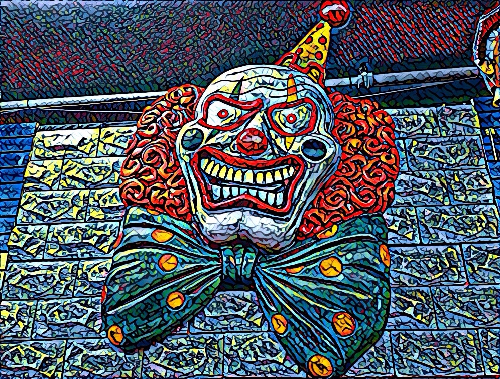
8. Deep Interlock & Ambiguity
In many cases, the various 15 properties that Christopher Alexander poses as characteristic of natural beauty seem to contradict each other. They don’t contradict each other. They are forces that sometimes oppose each other or work at angles to each other. This should not surprise us because the same is true of life in general. Of course, I want my bones to be bigger because that will make them stronger. But bigger bones will make me weigh more and demand more nutrition. I want the biggest brain I can have, but a big head makes childbirth almost impossible. One way out of the conundrum is to risk having human babies born way earlier in their development than for most animals.
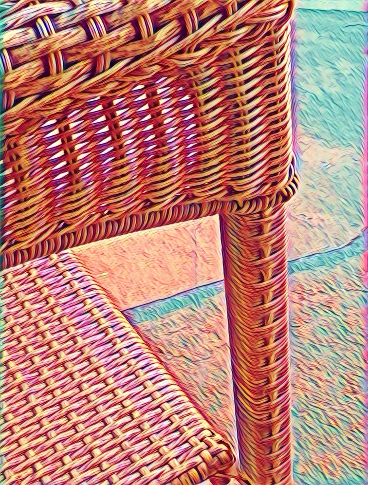
So, Good Shape plays off against Deep Interlock & Ambiguity. Partly, it solves this problem by asking a third character in this morality play to step onto the stage — Levels of Scale. If one focuses attention on a single leaf or flower or petal of a flower, one typically finds “Good Shape.” In clusters of well-shaped leaves, or well-shaped flowers, one often sees the flowers or leaves interleaving with the space of other well-shaped leaves or flowers. Thus, at one level of scale, there is Good Shape. But at a higher level, all of these Good Shapes interact with each other so as to interlock.


Typically, when we design User Experiences, we try to make things clear, not provide “Deep Interlock and Ambiguity” — that sounds like something to be avoided. Perhaps we can see how some decorative elements might exhibit Deep Interlock & Ambiguity, but surely anything that is functional should be clear.
I think there is a place for Deep Interlock & Ambiguity in design — even functional design. First, we need to distinguish two sorts of reasons for having Deep Interlock & Ambiguity. On the one hand, the application itself may require deep interlock and ambiguity. Insisting that the user make absolute or irrevocable decisions when inappropriate is not good design. The importance of pliant design I’ve mentioned before. Here’s the paper that first introduced me to the term.
https://dl.acm.org/doi/10.1145/302979.303003
Harris, Jed & Henderson, Austin. (1999). A Better Mythology for System Design.. 88-95. 10.1145/302979.303003.
Consider the relationship between a father and son, or between spouses. Do you think such intimate relationships could be reduced to a black and white set of clear, consistent, precise rules? I doubt it. It’s a “natural relationship” and, as such, will be ill-suited to predefining everything. That doesn’t mean that there need be no rules or that each person themselves should not have a “Good Shape.” Multiple “Good Shapes” with the right spacing will include both “Boundaries” and “Deep Interlock and Ambiguity” and as a result help produce “Positive Space.”

On the other hand … (did you forget the first hand? It was quite a diversion. Well, the first hand was about revealing to the user the Deep Interlock and Ambiguity inherent in their particular context, task, and the field they are working in. That is much better than hiding that truth.

On the other hand, are you adding ambiguity because you’re not really clear about how a function is supposed to work? Or, are you pushing decorative elements so hard that it is obscuring the relationship of functional elements? A decorative example of mis-using “Deep Interlock & Ambiguity” (which I doubt anyone would actually do) would be to interlace two different menus like interlocking fingers of the two hands. It might indeed look more interesting visually. Perhaps someone out there could even make a good argument for having interleaved menus in certain situations. One example that might make some sense would be interlocking food and wine menus.
Deep Interlock & Ambiguity is not only a property of visual beauty. Good drama, poetry, and music exhibit them as well. In various ways, so also do most sports. Almost every sport allows and requires the athlete to make decisions that have tradeoffs. Should they attempt the riskier move or the safer one? Should they attempt a higher bar, the heavier weight, the faster start? In addition, many sports (soccer, basketball, baseball, American football, hockey, rugby, etc.) have the two teams interacting directly. In tennis and volleyball, the players stay on their own side of the net, but the players need to shift constantly depending on the positions & motions of everyone else and the position & trajectory of the ball and the capabilities of the various players. I think this qualifies as a sort of Deep Interlock and Ambiguity. Such sports seem not that different from a simplification and stylization of the kinds of interactions that take place in natural ecosystem interactions.
Many simplified childhood games seem quite close to re-enactments of life and death struggles: Hide and Seek, Tag, Hare and Hounds, Cops and Robbers. In my neighborhood, when a new movie came out, the kids would typically go see it and then “play out” variations on the theme of the music. We would play in the setting of the movie (in our imaginations) and adopt characters from the movie. Movies aimed at children typically don’t exhibit quite as much Deep Interlock & Ambiguity as those aimed at older audiences when it comes to Character development. But the plot swings back and forth between apparent victory & defeat, loss & gain, life & death, honor & dishonor, etc. In that sense, the “experiencer” — whether adult or child — doesn’t know (or let themselves know) how things will turn out.

My childhood friends and I moved far beyond re-enacting the actual movie. We improvised entirely new plot lines, we created new lines of deep interlock and ambiguity. Were we taking actions we “really wanted to do” or merely taking actions we thought the characters in the movie would do if they were in the new situation? If we, as an actor, acted too “angry” with one of our friends, would it carry over into real life? If we, as ourselves, acted a certain way and liked it better than our ordinary way, could we “keep” the new behavior (or name, or hairdo, or way of dressing, or favorite expression, etc.?).
Something like that continues throughout adulthood as well, both within our careers and in our personal lives. Or, at least it may. As you take on different “roles”, you begin to notice that you are better than most people at some things; worse at other things; and roughly average at still other things. You may also notice that doing certain kinds of things is very enjoyable while other activities leave you cold. Your preferences about what you want to do might stay fairly constant through your whole career. Or, your preferences might change quite a bit. If you allow yourself to really “get into a role,” you’ll have a better time deciding if it is a role you really relish. You might find yourself falling in love with your work, which of course is quite different from falling in love with the rewards or the trappings of work. If your life is like most, you’ll spend a lot more time working than enjoying the rewards or trappings of work.

——————-
How the Nightingale Learned to Sing
Who are the Speakers for the Dead
————-