
Tags
beauty, Design, Good shape, HCI, UX

6. Good Shape.
Good Shape. Positive Space. These seem to be highly related concepts. Most of the pictures I used as illustrations of Positive Space could equally well illustrate Good Shape. A Positive Space is often composed of multiple good shapes arranged in a “balanced way.”

In order to illustrate “Good Shape,” I decided to take some pictures to illustrate “Bad Shape.” Since I have surrounded myself mainly with nature or with artifacts that were intentionally designed to be aesthetically pleasing, it turned out to be more difficult than I imagined at first. The other issue is that when I take photographs, I (like most people) “frame” the picture so that “Good Shape” is clear. I began to intentionally brake that habitual way of framing with pictures of flowers that overlap. The natural beauty of flowers is so rich that, to me, even a quasi-random framing still results in a beautiful picture.


This turns out not to be the case with artifacts however.
Although some of the elements of this seem to have “Good Shape,” the overall composition lacks a coherent center. It seems to me to be an artificial “kludge” of colors, textures, and shapes and there is no overall “Good Shape.”

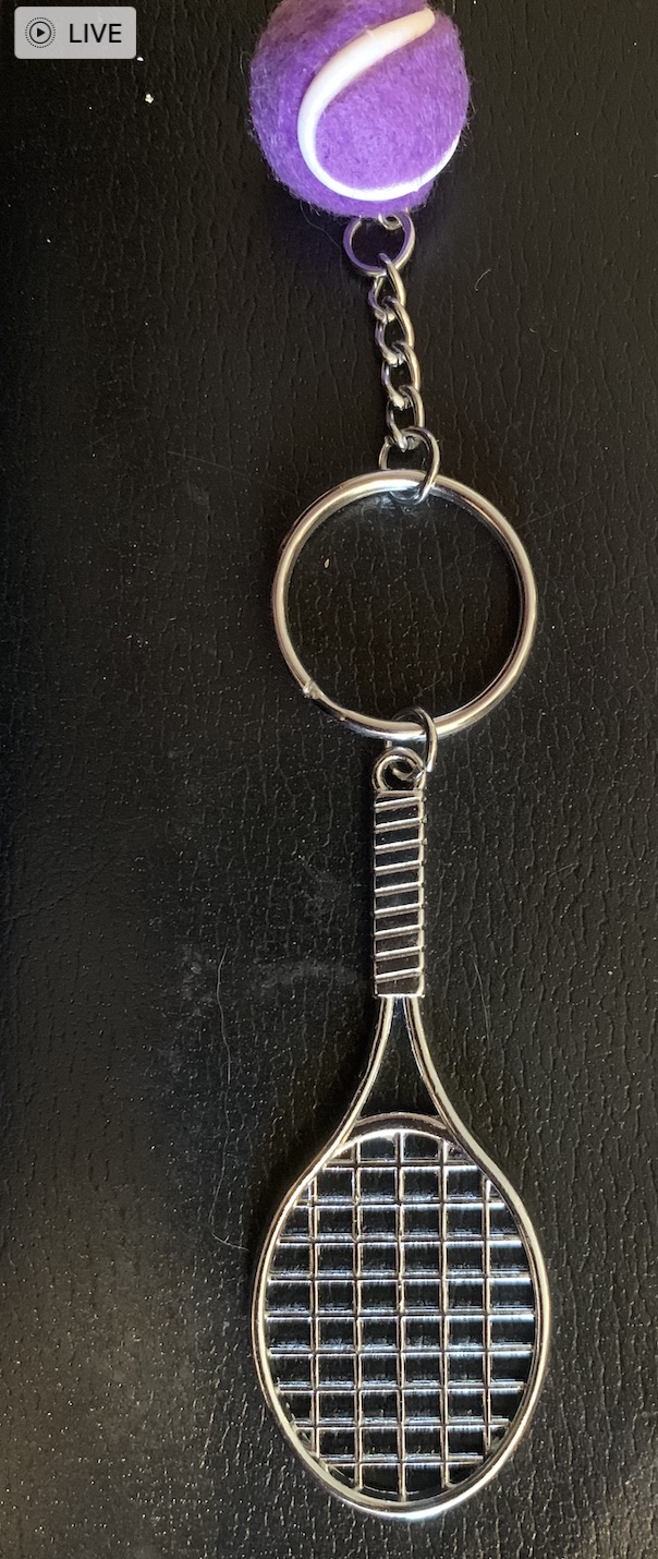
By re-arranging the elements into this form (above), to me, it seems to get closer to “Good Shape” but the purple “tennis ball” seems ill-proportioned and out of place. In “real tennis” there is a physical reason for the ball to be fuzzy but here, the fuzziness of the ball seems added on and arbitrary.

Here too (above), the overall composition lacks “Good Shape.” The large semi-random dark blob in the middle has no real “Center.” The elements around the edges do not cohere or reflect off of each other. None of the elements around the edges are complete enough to have “Good Shape” except possibly the links of the small chain.

Here is another example of quasi-random elements brought together into a single picture. Though to me, both the wood and the stone are in and of themselves beautiful, there is nothing about the composition that integrates into a whole. There is no center, no echoes, no alternating repetition, no levels of scale, and despite the nice texture of the stone and wood, the overall effect, to me, is lacking in “Natural Order” and in beauty.

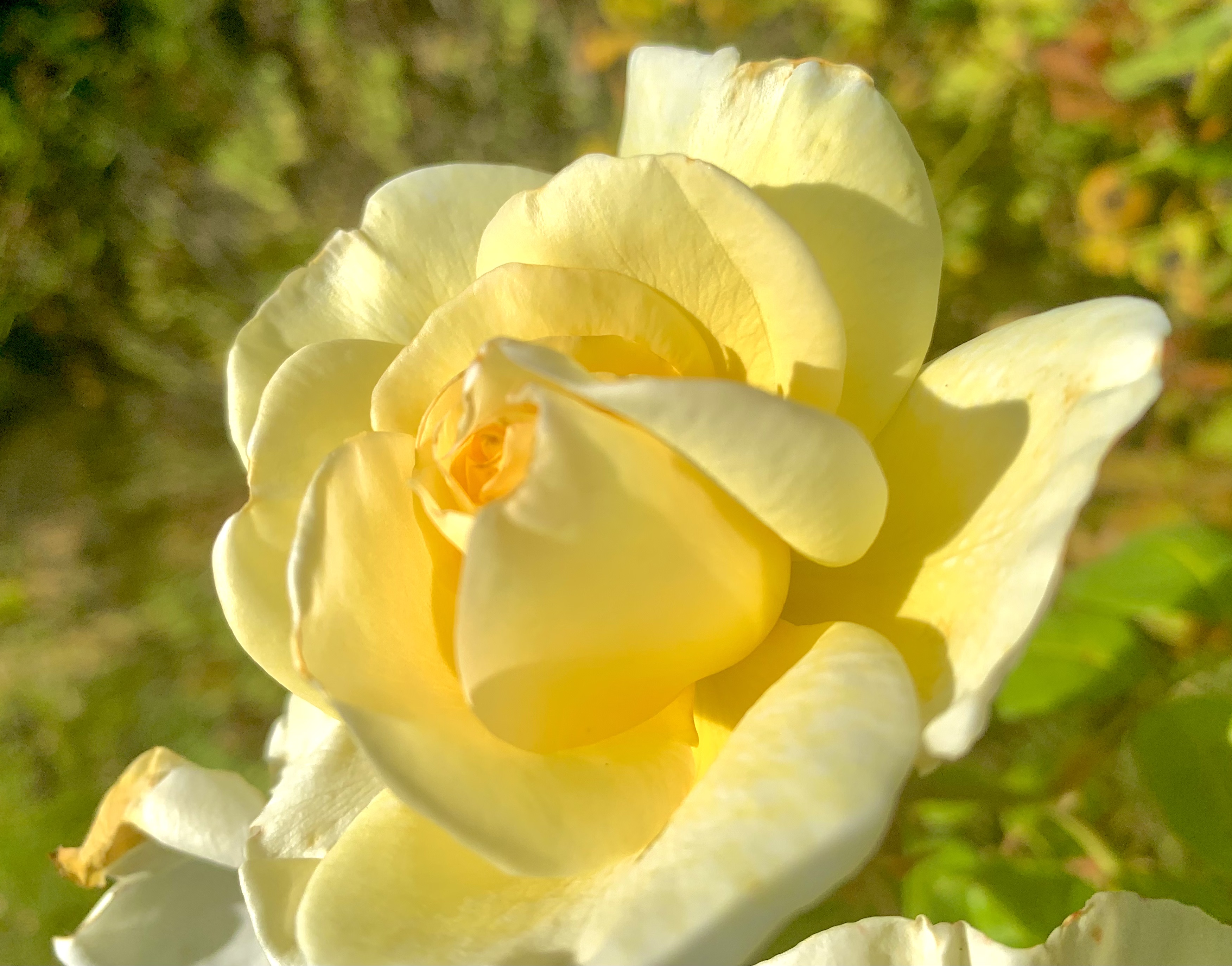
By way of contrast, the flower here seems to have a good overall shape reinforced by a Strong Center, Alternating Repetition, and each of the petals themselves has Good Shape. Around the flower, to me, is a “Positive Space.” Note that one of the petals seems slightly out of place. To me, however, this does not spoil the “Good Shape.”


The same can be said of these flowers.
It isn’t necessary to have overall “simplicity” in order to have “Good Shape.” These flowers are not “simple” in shape, but they still have “Good Shape.”

The bird on a branch shown above seems to me to have “Good Shape” even though it is (in outline) lacking symmetry. Though lacking symmetry in profile, the shape strikes me as “balanced.” I don’t perceive the bird as having to exert a lot of energy to keep from “falling off the branch.” The bird’s shape, like the shapes of most animals and plants is the result of 4.5 billion years of evolutionary history.
Many people view some creatures as “enemies” and therefore “creepy” or “yucky” or perhaps even as dangerous. If you can set that aside and simply look though, I think you can see that “Good Shape” characterizes all sorts of animals (as well as plants).


At a more abstract level, it even seems that natural animal behavior often shows beauty. That also seems characteristic of skilled human behavior. The Olympics show plenty of examples. It is hard to imagine an “ugly” baseball swing resulting in a home run. The runners, jumpers, throwers, gymnasts, tennis players, and so on produce “Good Shape” in three spatial dimensions and one temporal dimension.

I play tennis several times a week. I’m not averse to winning a point even if the ball hits my frame, skids off to the net cord and drops over for a winner. But — I never feel as pleased by such outsized luck as when I hit a good shot that results from proper choice, preparation, and execution (and a history of practice and reflection). I never think of a lucky mis-hit as “beautiful.”
The concept of “Good Shape” even applies to more complex human organizations and endeavors. Racism, for instance, to me is truly ugly. It is not based on truth, but on a kludge of lies masquerading as truth. White Supremacy for instance, basically says, “We’re white! That makes us superior! In fact, we’re so superior, that we insist every aspect of our society be tilted so we can be guaranteed a win!”
Huh?
Bad logic is never beautiful.
The “Good Shape” exhibited by most plants and animals reflects both a long evolutionary balance of forces (phylogeny) and the development of a particular organism (ontogeny). When biology goes awry, as in cancer, the result is not beauty. The “logic” of cancer is that billions of years of evolution that allows our bodies to work harmoniously is put aside for short-sighted egotism. A random cell says, in effect, “I’m no longer going to do my part for the body as a whole. Instead, I’m going to grab all I can for myself and grow in an unrestricted way!”
Such a cell, by making that decision, signs its own death warrant. Either the body destroys the cancer and therefore the cancer dies — or, the cancer prevails and in that case it destroys the life of the organism it was supposed to be a part of — and then it dies anyway! It’s an “ugly” decision both because it is disproportionate and because it is illogical. It aims to be self-serving, but it is not even self-serving. It guarantees its own death and kills more life along the way.
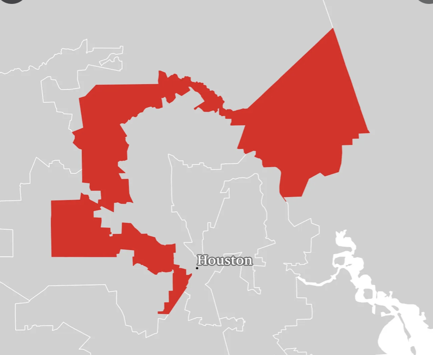
It’s the same, to me, with any dysfunctional human organization. If democracy is perverted by some people demanding that decisions be made so that they can have their way regardless of how it impacts the overall tree of life and the overall health of a city, state, or nation, it lacks “Good Shape” and instead becomes a distorted kludge lacking symmetry, lacking balance, lacking life. It is no accident that “Gerrymandered” districts do not have “Good Shape.”
In extreme cases, not surprisingly, dictatorships have resulted in a war on truth, beauty, and life itself. It’s no “accident” that Hitler, Stalin, and Mao were each responsible for millions of human deaths. Their activities also show utter disregard for the beauty of the natural environment and the plants and animals of the planet.
When it comes to User Experience, the most obvious way to apply “Good Shape” is to the visual elements of the interface — icons, windows, menus, tool bars etc. However, I think it also applies to the design process. Are the needs of all stakeholders taken into consideration?
Do the various disciplines involved in design respect each other? Do people tell the truth and show trust? Does the company treat its users with respect and tell the truth in its various communications?
If a company provides “free games” or “free services” that are purportedly for entertainment or education but the real purpose is to gather data to sell to advertisers or foreign powers trying to use the data to destroy democracy, it would seem to me that business model itself — the raison d’êtrefor the entire project is an “ugly shape” regardless of how pretty the icons are.
What do you think? Do the concepts of natural beauty apply to the design of organizations and even governments?
—————————————
Cancer always loses in the end
Voter Suppression is Life Suppression

