My first conscious memory of thinking about “gradients” was in college biology. Gradients of chemicals make a difference in terms of cell differentiation, our professor explained.
For the past few days, I’ve been walking the garden on the lookout for “gradients.” As an experiment, I’m going to break up the discussion of gradients into sub-categories.
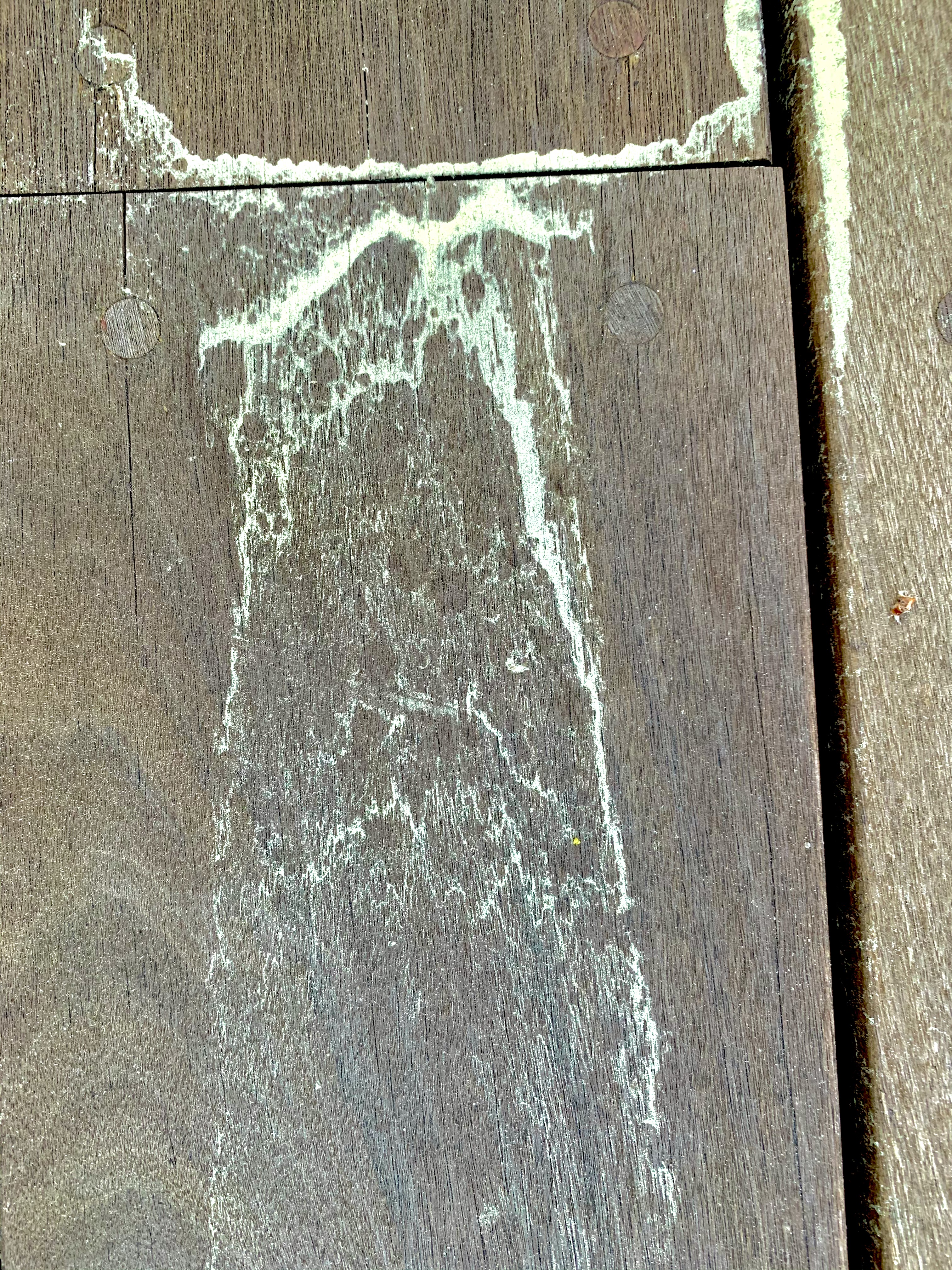
Visually, all the various gradients look similar. I am categorizing them by the cause of the gradient.
So, first, we have “Perspective Gradient” … as we look at identical or nearly identical items at different distances, they will obviously appear to have different sizes and different distances between those items.
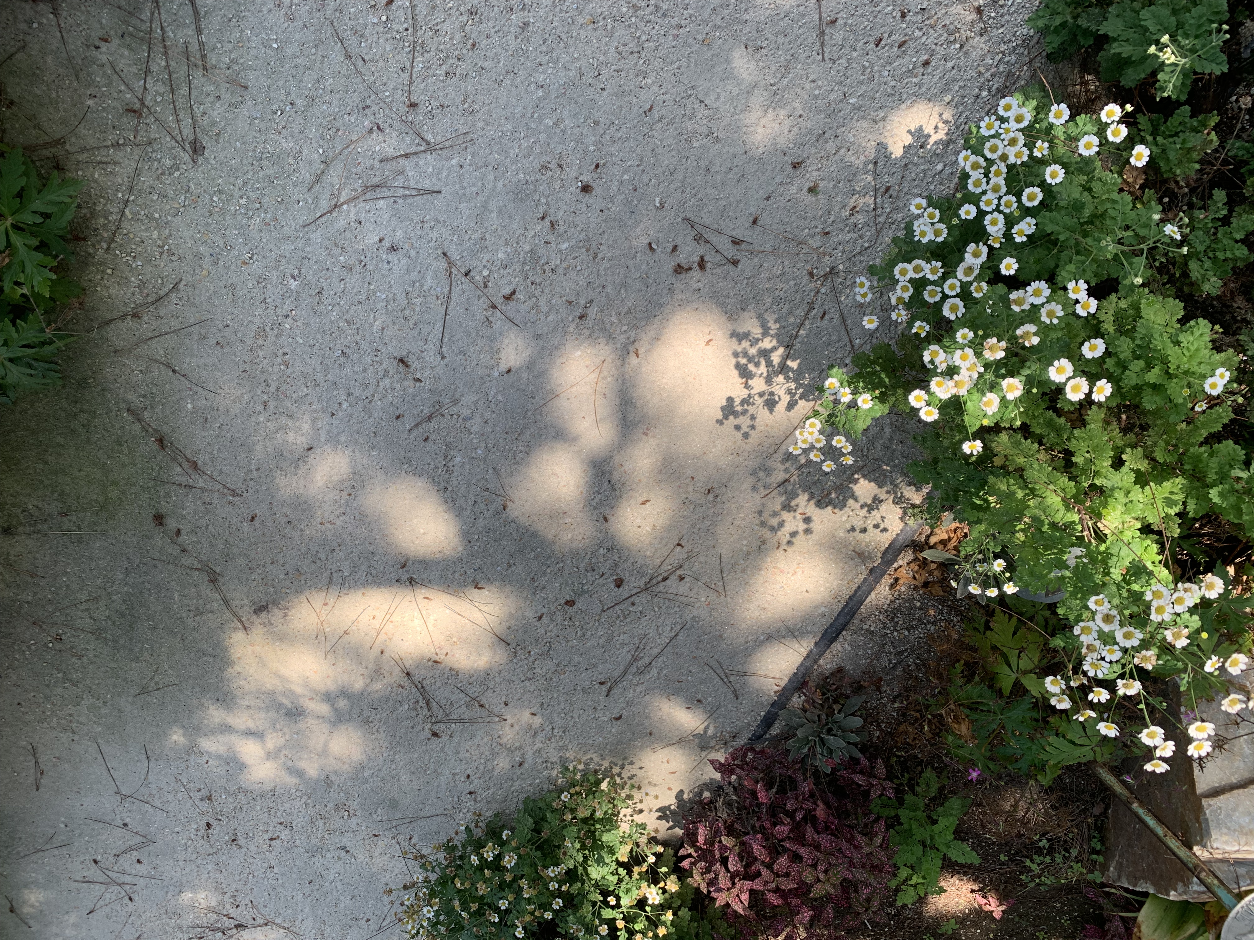
Second, we have “Light Gradient.” For example, a series of spheres or cylinders lit by a single source, the three-dimensional shape will result in a gradient of light and dark from most angles.
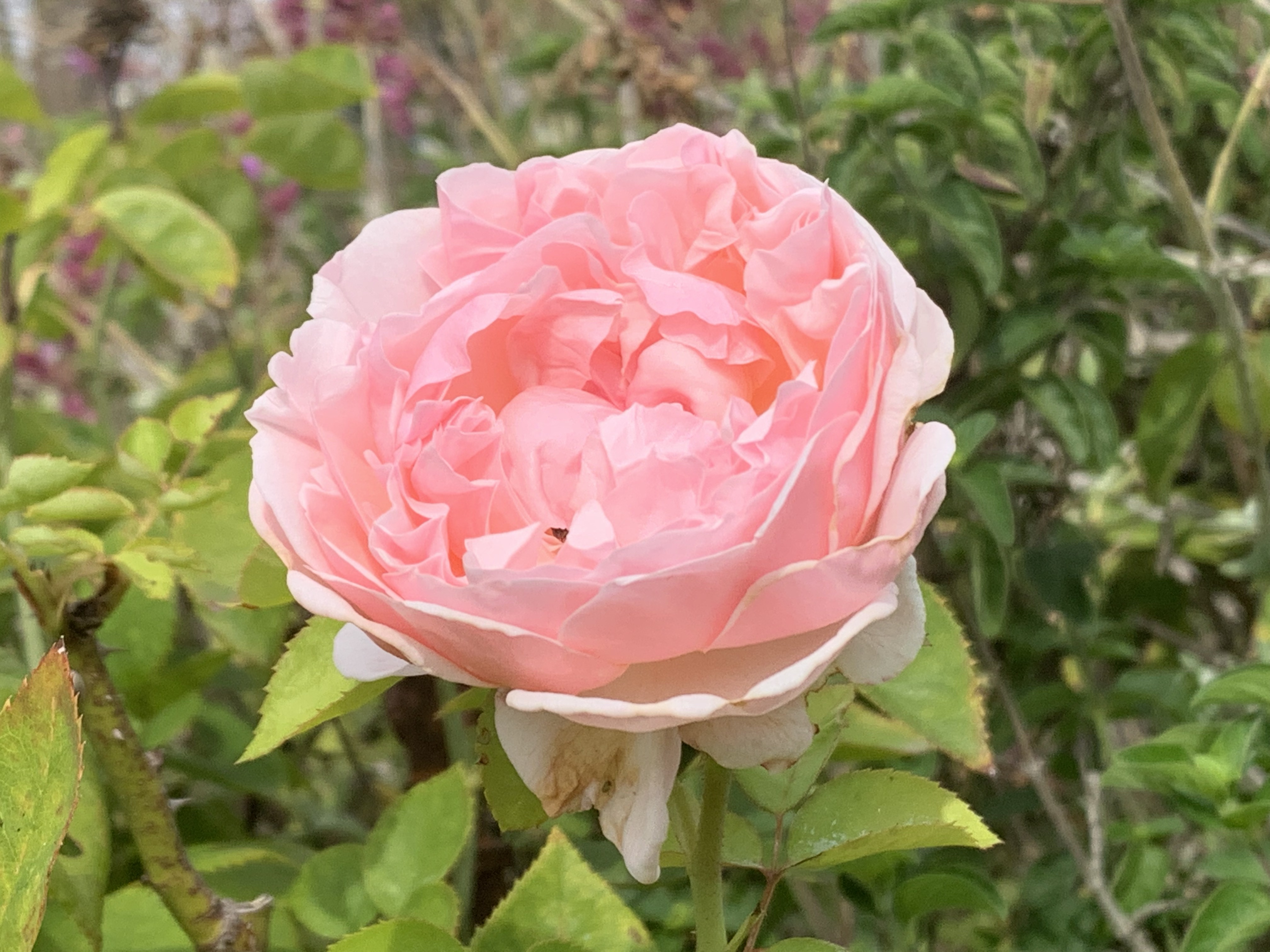
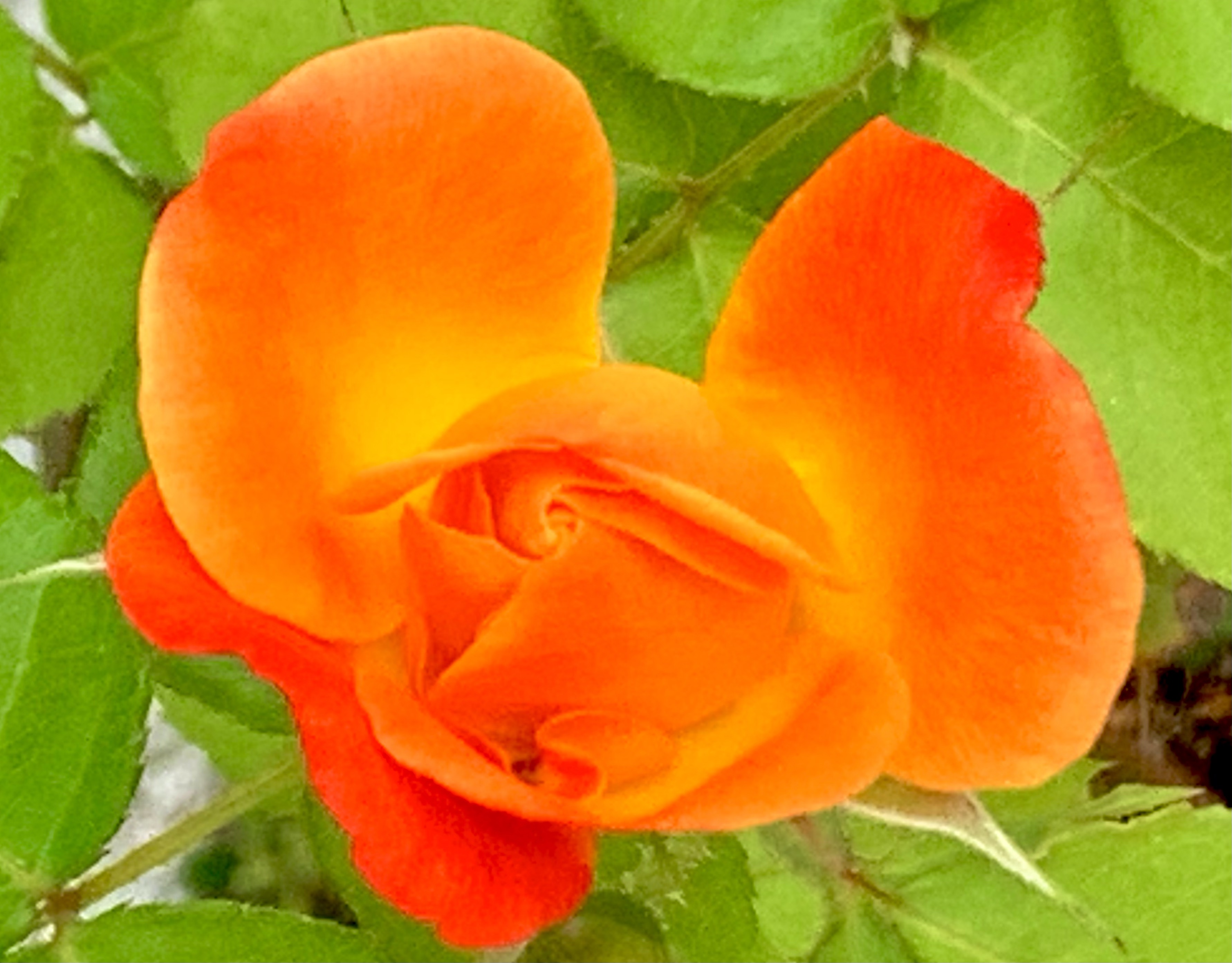
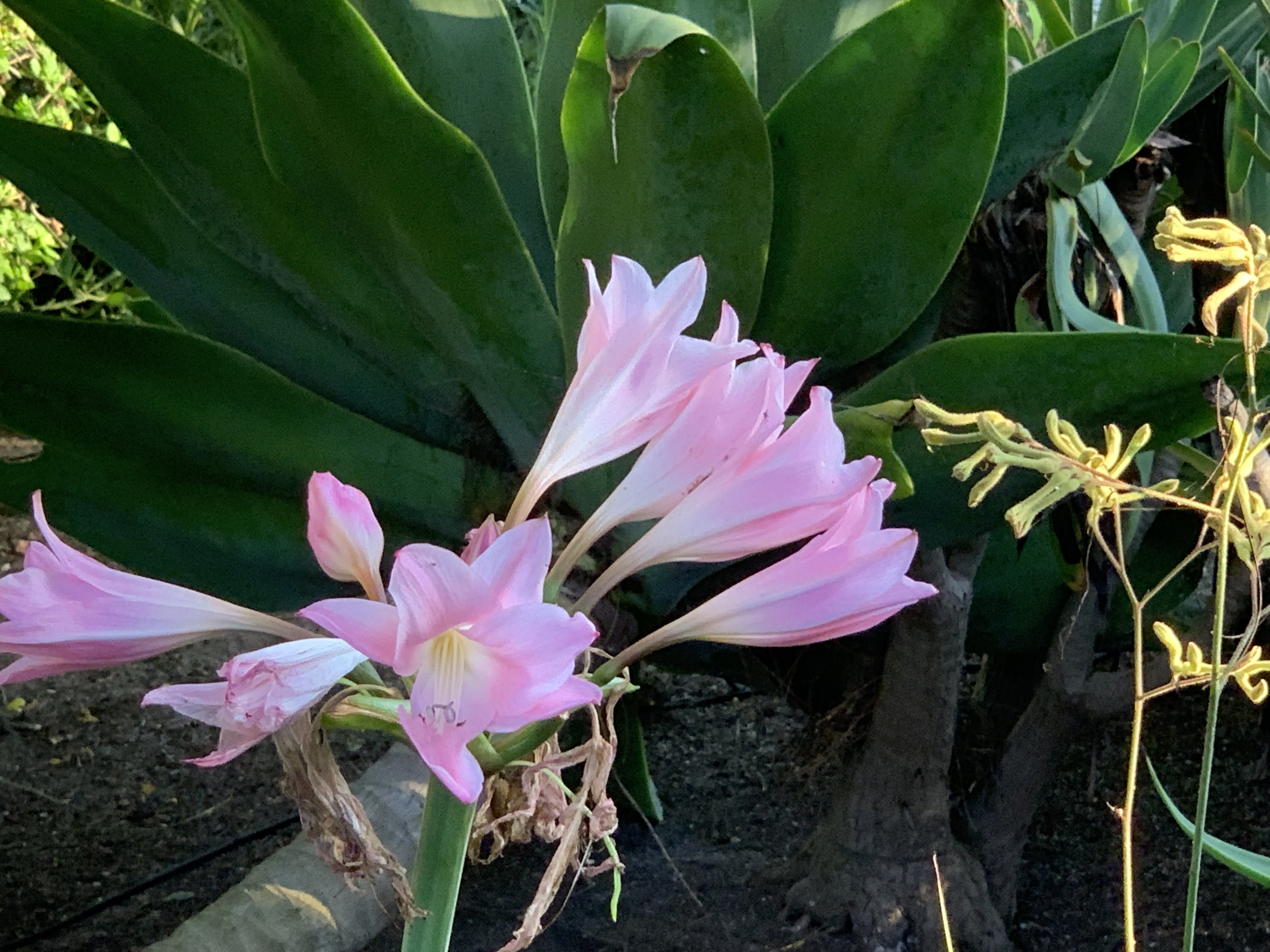
Third, there are often “Color Gradients” for both animals and plants.
Fourth, there are “Growth Gradients.” Color Gradients, are often a specific example of Growth Gradients. However, there are other types of Growth Gradients. For example, in many plants new growth is at the distal end and is smaller. Old growth is more central or more toward the roots; it is older, and is larger.
Growth Gradients not apply to many plants and animals. They often apply to organizations as well. Imagine a multi-national distributor with field offices in half the countries in the world. If they move into a new country, at first, there will only be a few
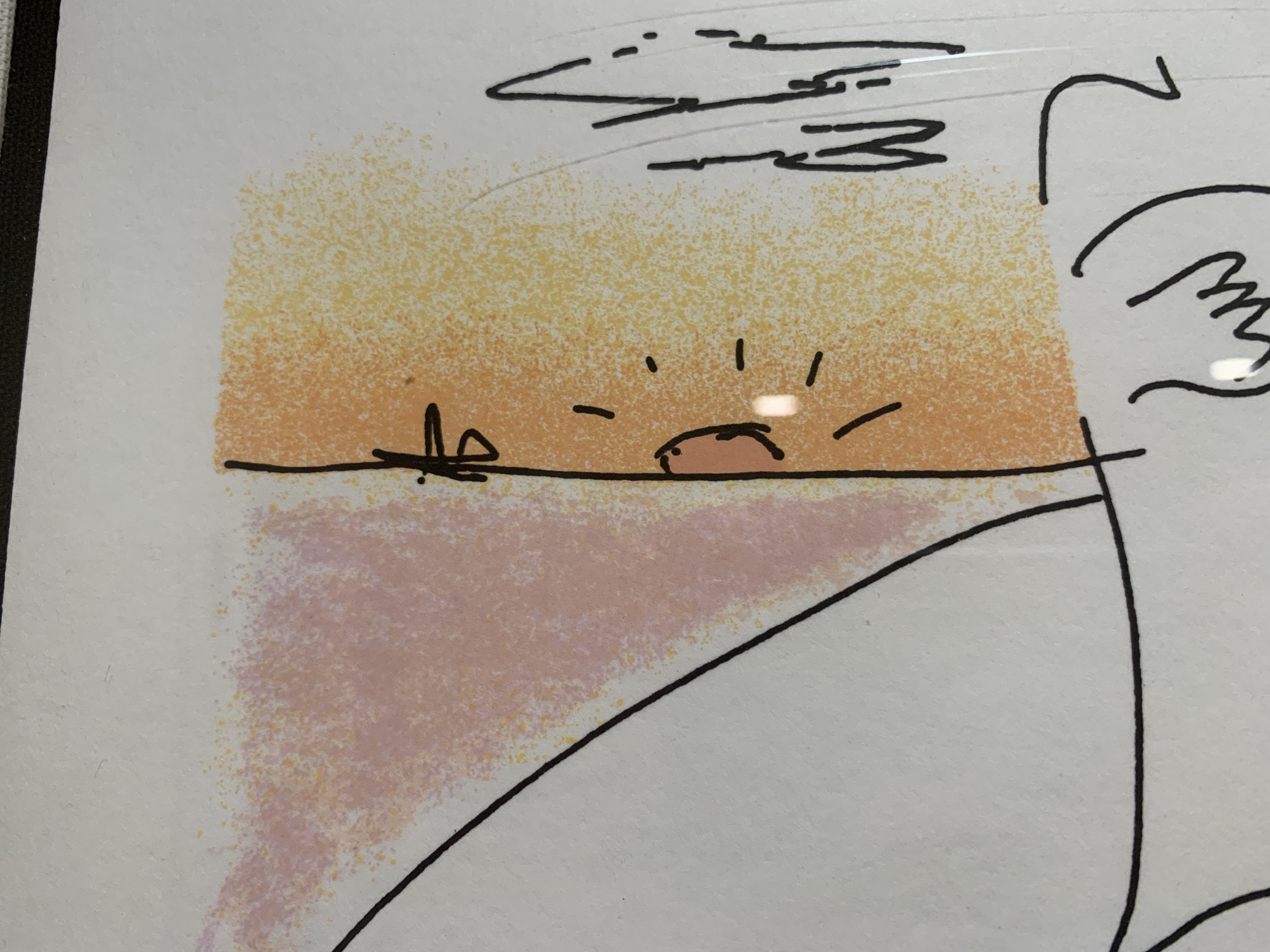
Conversely, Color Gradients can be quite intentionally added by the artist! Here’s a detail from a John Lennon lithograph. Note that “Boundaries” and “Gradients” reinforce each other. The Gradient makes the Boundary Stronger and vice versa.
There are also “Force Gradients” that appear in response to water, wind, gravity, magnetism, etc. One could argue that “Growth Gradients” are due to forces as well. Historically, gradients can arise from evolutionary pressures. These, in turn, are instantiated, in many cases, by chemical gradients of hormones that control growth. However, there are also many non-living cases of gradients.
Finally, there are “Intentional Gradients” that are put in by artists, architects, landscape gardeners, designers, and UX designers.
Although the examples above are visual, there are also gradients in music. There are gradients in activity.
Gradients are also present in narrative. Think of the rising passion between two lovers or the increasing tension and suspense in a mystery or horror film scene.
Are there gradients in User Interfaces? One example that springs to mind was in the “Audio Distribution System” and “Olympic Message System.” These were audio messaging systems from IBM that allowed subscribers to the service to leave an audio message to a person or distribution list “on a person’s phone.” (Of course, the message was really on a server and played upon demand.) The UI’s only visual elements were an ordinary touch tone key pad circa 1980 and possibly a small booklet or template with the various command options. Primarily, the user was meant to hear Prompts for actions.
The gradient part came in the fact that the user could speed up the audio more and more as they became more and more familiar with it. That variable speed applied to prompts and also to messages. A typical user would experience slow messages, then faster messages, then, still faster messages, and so on.
In another IBM project, we built a “Personalized Education System” that would allow IT personnel to build a “Custom Course” for on-line learning that could vary continuously in length and difficulty. However, while each individual user could choose length and difficulty, they typically did not experience a gradient in that regard. By analogy, some insects may prefer to chew on new growth while others may like more mature leaves. An individual insect only experiences one “size & tenderness” yet the plant taken as a whole provides a gradient. Similarly, if your fellow citizens ever get there act together enough for you to have a barbecue party again, you might offer up a range of options on how done you cook the burgers. In this case, we might say the BBQ service offers gradations though an individual burger is not a gradient. This isn’t strictly true. A well-done burger is fairly consistent throughout but a rare burger may be much more rare in the middle and charred on the edges. So, for that choice, there is a gradient of experience.
Compared to the natural environment around me, which is positively thick with gradients, I don’t see (or feel) many gradients in any of the UI’s I interact with (games aside). The fisheye lens provides one way of introducing gradient into the UI. It produces, a kind of “Perspective Gradient.”
It would be possible to put gradients into many of the visual elements of a UI. Would it make the interface look more like nature? Would it be more beautiful? Would it be distracting?
——————-
Here’s a poem that illustrates a gradient of love.
With zero contrast, nothing can be seen at all! Beyond that however, it is interesting how many plants and animals as well as good designs show the property of Contrast. Plants “use” contrast, if I may speak in teleological terms, to attract pollinators such as butterflies and bees to their flowers. Plants also use contrast to “announce” to animals who spread seeds that their fruit is ripe and ready to be eaten. If the fruit part of a plant did not make such an obvious “announcement,” a forager might damage a plant by eating all of it rather than just the sugar-rich fruit.
By contrast, fall leaves show high contrast which adds to their beauty, but this is probably just a “side-effect” of the leaves “saving” their water & chlorophyl and leaving other colorful compounds in the leaf. I suppose there could be an evolutionary advantage to a tree that is beautiful in the fall. I could imagine that bright colors attract animals and birds to “hang out” nearby and this means that the soil will be enriched by animal excretions and sometimes deaths. In some cases, the color might “signal” animals that fall is coming and if the animals take more appropriate actions, this makes for a healthy ecosystem for the trees. I know of no such evidence however. It seems likely the bright colors are a beautiful side-effect of the tree breaking down the no-longer-useful chlorophyl to components that are stored in the roots. The more we learn about trees though, the more “clever” they seem so I wouldn’t put it past them to have “reason.”
Some animals, such as zebras and tigers, use contrast as a kind of camouflage. If you see a picture of a zebra or tiger out of context, you may think, “What? How is that camouflage?” But in the bright sun, grazing in tall grass (or lurking there, hoping for dinner), it actually does serve such a purpose.
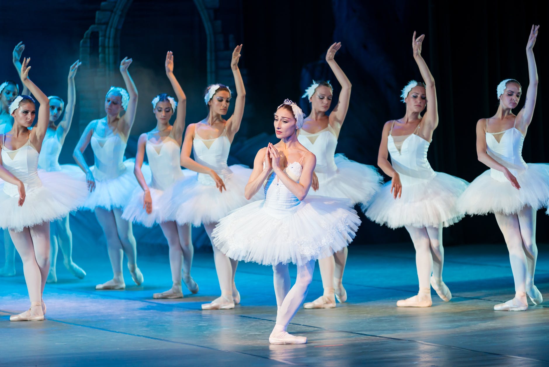
There is also a more subtle kind of camouflage that some animals employ. High contrast can make it difficult for a potential predator or prey to “parse” the visual image. I believe some of the professional tennis outfits, for instance, make it harder for an opponent to “read” the actual body positions from across the court, especially with non-foveal vision. Is that what’s going on in the picture below?
Considered separately, the shadow of the fence in the photo below strikes me as more beautiful than the fence itself. This is largely due to the higher Contrast in the shadow. I think another property “Roughness” also plays a part. The fence is machine milled and regular. The shadow falls on uneven ground. Rather than obscuring the Contrast, the Roughness actually enhances it. In addition, the fence appears quite separate and distinct from the greenery behind it. However, the shadow is partly determined by the fence and partly determined by the uneven ground. This means the shadow exhibits more “Deep Interlock and Ambiguity.”
I do think the combination of fence and shadow is more beautiful than either taken alone. Taken together, there is an additional layer of Contrast between the “mechanical” regularity of the fence and the rougher feel of the shadow.
One of the things that trees do is add contrast by virtue of the branches and leaves casting irregular shadows in many places but letting bright light through in other places. Here is a simple case.
In the photo below, the landscape architect has likely intentionally designed this arbor partly with contrasts in mind. Dark vs. Light; Horizontal vs. Vertical; Straight vs. Bent; Built vs. Growing. What other contrasts do you see?
Contrast is often desirable not just in terms of vision, but also for other senses. A good salad, for instance, shows contrast in color, but also in terms of textures and tastes. Orchestral music shows contrast in terms of loudness, timbre, harmony, melody, etc.
Living things also exhibit contrast, not only in their visual appearance, but also in terms of the rhythms of life. Many plants and animals exhibit both daily cycles such as sleep and wakefulness, but also yearly cycles (hibernation, aestivation, migration, mating season, losing fall leaves, blooming & fruiting, etc.). In fact, many animals & plants only live one year.
Stories typically exhibit contrasts of various sorts. A story (whether play, movie, novel, or short story) is often more interesting when set in both wartime and peacetime, in both country and city, in two different times, etc. In addition, a good story often has contrasting characters such as hero and villain, or two less extreme characters, one of whom is a “foil” for the other. The plot itself is constructed of contrasts in value. The hero loses an athletic contest. Then, the hero wins! Then, the judges unfairly strip the hero of the medals. Then, an investigation reveals that the hero was framed and the hero prevails after all. Love may conquer all — but never without a struggle!
This succulent pictured below seems beautiful to me partly because of Contrast. Is there an aesthetic “purpose” to the contrast shown? Or, is the real “point” to provide the sharp spikes on the edge of the plant and in order to make those spikes effective, the plant needs to be drier near the edges or have a yellow pigment that somehow facilitates the growth of spikes? Perhaps the plant’s growth is limited (in the Southwestern US) by the available water and not at all by sunshine (which is plentiful). Therefore, there is no “point” to having the entire plant green.
If it seems too far-fetched to imagine a plant exhibiting contrast because it’s more beautiful, it is not to far-fetched to imagine animals exhibiting contrast to attract other animals; most notably, a mate. Insects, birds, mammals, fish, sometimes exhibit “displays” of high contrast color in order to attract mates. Typically, such displays are only used during actual mating season.
In addition to seasonal and daily “contrasts” in behavior and appearance, animals often exhibit contrast at a finer temporal granularity. As humans, we breathe several times a minute and our heart beats about once a second. Some aspects of our anatomy and physiology have evolved to provide antagonistic forces and processes. We have, for instance, our sympathetic nervous system that prepares us for “Fight or Flight” reactions. The para-sympathetic nervous system turns on a “rest and digest” mode also called “feed and breed.” Our sensory and motor systems use both excitatory and inhibitory processes to “sharpen” what we perceive and the actions we take. Our musculature often has muscles that produce “opposite” results. Our biceps bends our arm and our triceps straightens our arm. The adductors in our legs move our legs inward toward our trunk and the abductors move our legs apart.
Contrast is so prevalent in the natural order of things “out there” and in the structure and function of our own bodies that it is hardly surprising that our conceptual structures often exaggerate contrasts. We often think, for instance, in terms like these: “Up or Down? Liberal or Conservative? Good or Evil? Strong or Weak? Black or White? Growth or Decay? Orderly or Disorderly?”
If we return to the photo of the fence and its shadow, for example, we are tempted to describe the darkest parts of the shadow as being places without light while the spaces between have light. Of course, there is light, even in those shadows. Light is reflecting off the nearby trees, houses, grape vines, sand, cars, etc. There is nothing shown in this photo that has no light.
As Amanda Gorman pointed out in the recent Presidential Inauguration —
“For there is always light,
if only we’re brave enough to see it
If only we’re brave enough to be it.”
When it comes to User Interface design, contrast has many uses. For example, contrast is often used to signal whether an item is chosen or not, or whether an action is available or not. Interfaces often include text and the text is easier to read if the contrast is higher. In the early days of human computer interaction, text was composed of a relatively small number of bits that were either on or off. High contrast came with the technological limitations of the devices. More recently, text often appears as dark gray on light gray rather than as black on white. Why? I have no idea. People sometimes claim that low contrast is “easier on the eye.” So far, no-one has been able to point to empirical evidence. However, text is harder to read when the contrast is low. If the user is old, or trying to read in glare, or has limited vision, or the reader or device is moving or vibrating, low contrast text can become illegible. The “worst” cases I’ve seen are on devices such as CD players or smoke alarms. To simplify (and therefore cheapen) manufacture, the letters are not painted at all but simply embossed as white on white or (even worse) black on black. From my personal experience, few things in modern life are as pleasant as being awoken around 3 am by a screaming smoke alarm which has cryptic and unreadable directions in white on white.
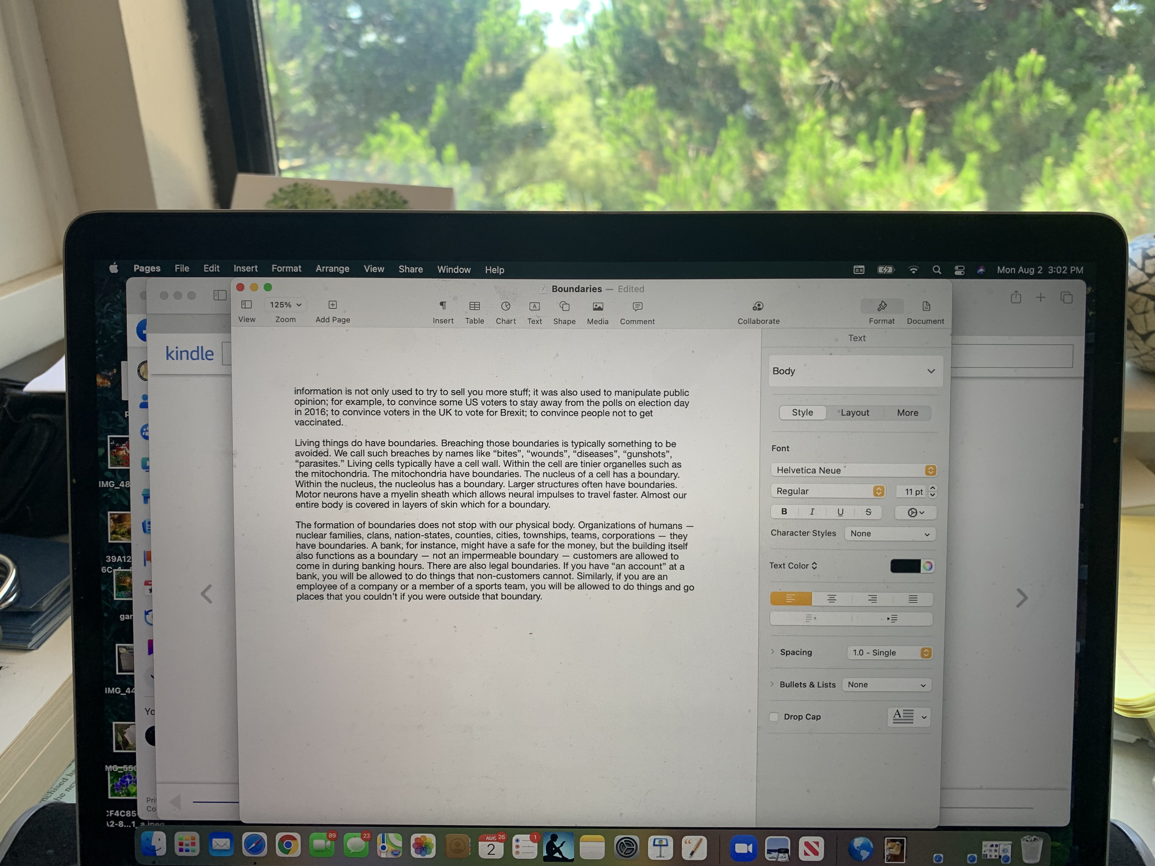
At a more abstract level, a high level of conceptual contrast can often make the user experience less frustrating, more enjoyable, and more productive. What do I mean by “conceptual contrast.” In this context, I mean that two related actions or situations that are clearly differentiated in the commands, the explanations, the terms etc. are less prone to confusion. Let’s pick on what I see right before me: the high level “Pages” tool bar. “File Edit Insert Format Arrange View Share Window Help” At a visual level, these are nearly white on a black background; i.e., easy to read. But what is the conceptual contrast between “Format” and “Arrange”? How about “View” and “Window”? Are there other terms that would be better cues as to what these groups of functions do?
The same for menus within the document. I see above the material I am actually typing another use of the words “Insert” and “Text” appears right next to it. But how is this different from “Text” on the right? It’s not that any of these items are so confusing that they cannot be learned. “Style” when you are writing (as opposed to “word processing”) generally refers to something much more abstract that the type of font and the size or color of the text or the spacing between lines.
I think a more fundamental issue is that typical text editors, after the “Clippy” fiasco, have steered away from explicitly supporting the process of actual writing. That would be much more difficult. I’m not going to try to design such a system here. To give a hint of the kind of thing I mean though, suppose that a text editor explicitly supported writing a short story. Embarking on writing a short story, the user might be presented with a choice for guidance. Perhaps this hypothetical writer wants to try writing a “locked room” mystery. And, maybe they want lots of guidance. So, the software leads them through an idea generation phase. In that phase, perhaps it is more productive to turn off various kinds of “autocorrect.” Perhaps the author is encouraged to “solve” the basic problem (how was the murder committed) before actually beginning the writing. Maybe there is a high level of visual Contrast which serves as a constant reminder to the author that they are, at this point, generating ideas.
Von Oech suggests that problem solving involves four stages that he illustrates with four “hats” — an explorer’s pith helmet for the Exploration phase; an artists beret for the Creation Phase; a judge’s wig for the Editing or testing phase; and a Viking warrior’s horned helmet for the marketing and sales phase. If such a model were supported by the software, you might expect a strongly contrasted visual interface to reinforce the phase of writing that the user was in. The Exploration phase might consist visually of cards that various fields that would support research. The artistic phase might be a mind-mapping tool. And, so on. The user would know at every glance which phase of the overall writing process they were “in.”
It may be that any such process involves too much overhead or is too rigid. But what is the alternative? At present, the author must either keep almost all the information about their goals, ideas, and processes in their head or in a separate document or spreadsheet. As I look at the screen in writing there is almost no clue about “where I am” in the process of writing. Whether or not you buy into the specific four-stage model of Von Oech, I do believe that various phases of writing do offer contrasts in terms of how that phase should be supported. I only chose writing as one example.
Nearly any task that the user is engaged in has some structure to it. Scientific research, learning a foreign language, organizing a tennis tournament, planning a trip, finding a house, buying a book on-line, etc. All of these have different sub-tasks. In some cases, the user wants more flexibility; in some cases, less flexibility is actually helpful. But most “application programs” seem to me to be deficient in terms of guiding the user through a process; giving any visual indication of where the user is in the overall process, or of tailoring actions to which subtask the user is engaged in. If a user is generating ideas, for example, pointing out grammatical errors, typos, and spelling errors is distracting and not that helpful. On the other hand, if the user is finished writing and is proofreading, then such suggestions may be helpful and appreciated.
What do you see as the uses of Contrast in User Experience? Is it best thought of as a visual property which may be nice to have but is not crucial? Or, does Contrast also apply to different subtasks or phases which need to be reflected in both the appearance of the UI and in the way the functionality works?
In many cases, the various 15 properties that Christopher Alexander poses as characteristic of natural beauty seem to contradict each other. They don’t contradict each other. They are forces that sometimes oppose each other or work at angles to each other. This should not surprise us because the same is true of life in general. Of course, I want my bones to be bigger because that will make them stronger. But bigger bones will make me weigh more and demand more nutrition. I want the biggest brain I can have, but a big head makes childbirth almost impossible. One way out of the conundrum is to risk having human babies born way earlier in their development than for most animals.
So, Good Shape plays off against Deep Interlock & Ambiguity. Partly, it solves this problem by asking a third character in this morality play to step onto the stage — Levels of Scale. If one focuses attention on a single leaf or flower or petal of a flower, one typically finds “Good Shape.” In clusters of well-shaped leaves, or well-shaped flowers, one often sees the flowers or leaves interleaving with the space of other well-shaped leaves or flowers. Thus, at one level of scale, there is Good Shape. But at a higher level, all of these Good Shapes interact with each other so as to interlock.
Typically, when we design User Experiences, we try to make things clear, not provide “Deep Interlock and Ambiguity” — that sounds like something to be avoided. Perhaps we can see how some decorative elements might exhibit Deep Interlock & Ambiguity, but surely anything that is functional should be clear.
I think there is a place for Deep Interlock & Ambiguity in design — even functional design. First, we need to distinguish two sorts of reasons for having Deep Interlock & Ambiguity. On the one hand, the application itself may require deep interlock and ambiguity. Insisting that the user make absolute or irrevocable decisions when inappropriate is not good design. The importance of pliant design I’ve mentioned before. Here’s the paper that first introduced me to the term.
Harris, Jed & Henderson, Austin. (1999). A Better Mythology for System Design.. 88-95. 10.1145/302979.303003.
Consider the relationship between a father and son, or between spouses. Do you think such intimate relationships could be reduced to a black and white set of clear, consistent, precise rules? I doubt it. It’s a “natural relationship” and, as such, will be ill-suited to predefining everything. That doesn’t mean that there need be no rules or that each person themselves should not have a “Good Shape.” Multiple “Good Shapes” with the right spacing will include both “Boundaries” and “Deep Interlock and Ambiguity” and as a result help produce “Positive Space.”
Who’s pulling whom?
On the other hand … (did you forget the first hand? It was quite a diversion. Well, the first hand was about revealing to the user the Deep Interlock and Ambiguity inherent in their particular context, task, and the field they are working in. That is much better than hiding that truth.
On the other hand, are you adding ambiguity because you’re not really clear about how a function is supposed to work? Or, are you pushing decorative elements so hard that it is obscuring the relationship of functional elements? A decorative example of mis-using “Deep Interlock & Ambiguity” (which I doubt anyone would actually do) would be to interlace two different menus like interlocking fingers of the two hands. It might indeed look more interesting visually. Perhaps someone out there could even make a good argument for having interleaved menus in certain situations. One example that might make some sense would be interlocking food and wine menus.
Deep Interlock & Ambiguity is not only a property of visual beauty. Good drama, poetry, and music exhibit them as well. In various ways, so also do most sports. Almost every sport allows and requires the athlete to make decisions that have tradeoffs. Should they attempt the riskier move or the safer one? Should they attempt a higher bar, the heavier weight, the faster start? In addition, many sports (soccer, basketball, baseball, American football, hockey, rugby, etc.) have the two teams interacting directly. In tennis and volleyball, the players stay on their own side of the net, but the players need to shift constantly depending on the positions & motions of everyone else and the position & trajectory of the ball and the capabilities of the various players. I think this qualifies as a sort of Deep Interlock and Ambiguity. Such sports seem not that different from a simplification and stylization of the kinds of interactions that take place in natural ecosystem interactions.
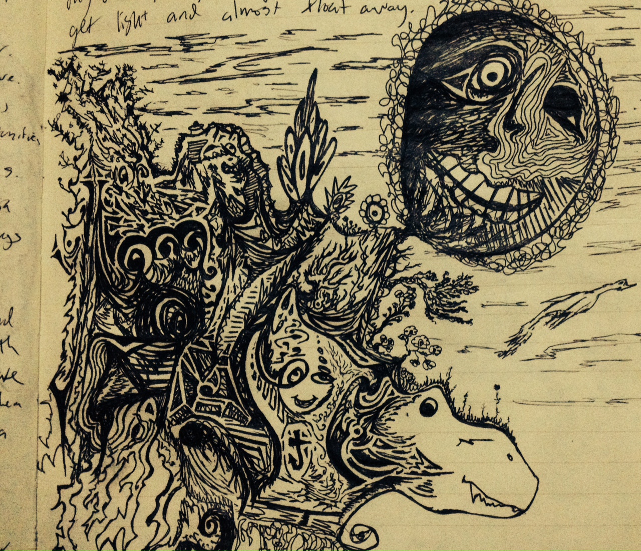
Original drawing by Pierce Morgan
Many simplified childhood games seem quite close to re-enactments of life and death struggles: Hide and Seek, Tag, Hare and Hounds, Cops and Robbers. In my neighborhood, when a new movie came out, the kids would typically go see it and then “play out” variations on the theme of the music. We would play in the setting of the movie (in our imaginations) and adopt characters from the movie. Movies aimed at children typically don’t exhibit quite as much Deep Interlock & Ambiguity as those aimed at older audiences when it comes to Character development. But the plot swings back and forth between apparent victory & defeat, loss & gain, life & death, honor & dishonor, etc. In that sense, the “experiencer” — whether adult or child — doesn’t know (or let themselves know) how things will turn out.
My childhood friends and I moved far beyond re-enacting the actual movie. We improvised entirely new plot lines, we created new lines of deep interlock and ambiguity. Were we taking actions we “really wanted to do” or merely taking actions we thought the characters in the movie would do if they were in the new situation? If we, as an actor, acted too “angry” with one of our friends, would it carry over into real life? If we, as ourselves, acted a certain way and liked it better than our ordinary way, could we “keep” the new behavior (or name, or hairdo, or way of dressing, or favorite expression, etc.?).
Something like that continues throughout adulthood as well, both within our careers and in our personal lives. Or, at least it may. As you take on different “roles”, you begin to notice that you are better than most people at some things; worse at other things; and roughly average at still other things. You may also notice that doing certain kinds of things is very enjoyable while other activities leave you cold. Your preferences about what you want to do might stay fairly constant through your whole career. Or, your preferences might change quite a bit. If you allow yourself to really “get into a role,” you’ll have a better time deciding if it is a role you really relish. You might find yourself falling in love with your work, which of course is quite different from falling in love with the rewards or the trappings of work. If your life is like most, you’ll spend a lot more time working than enjoying the rewards or trappings of work.
Good Shape. Positive Space. These seem to be highly related concepts. Most of the pictures I used as illustrations of Positive Space could equally well illustrate Good Shape. A Positive Space is often composed of multiple good shapes arranged in a “balanced way.”
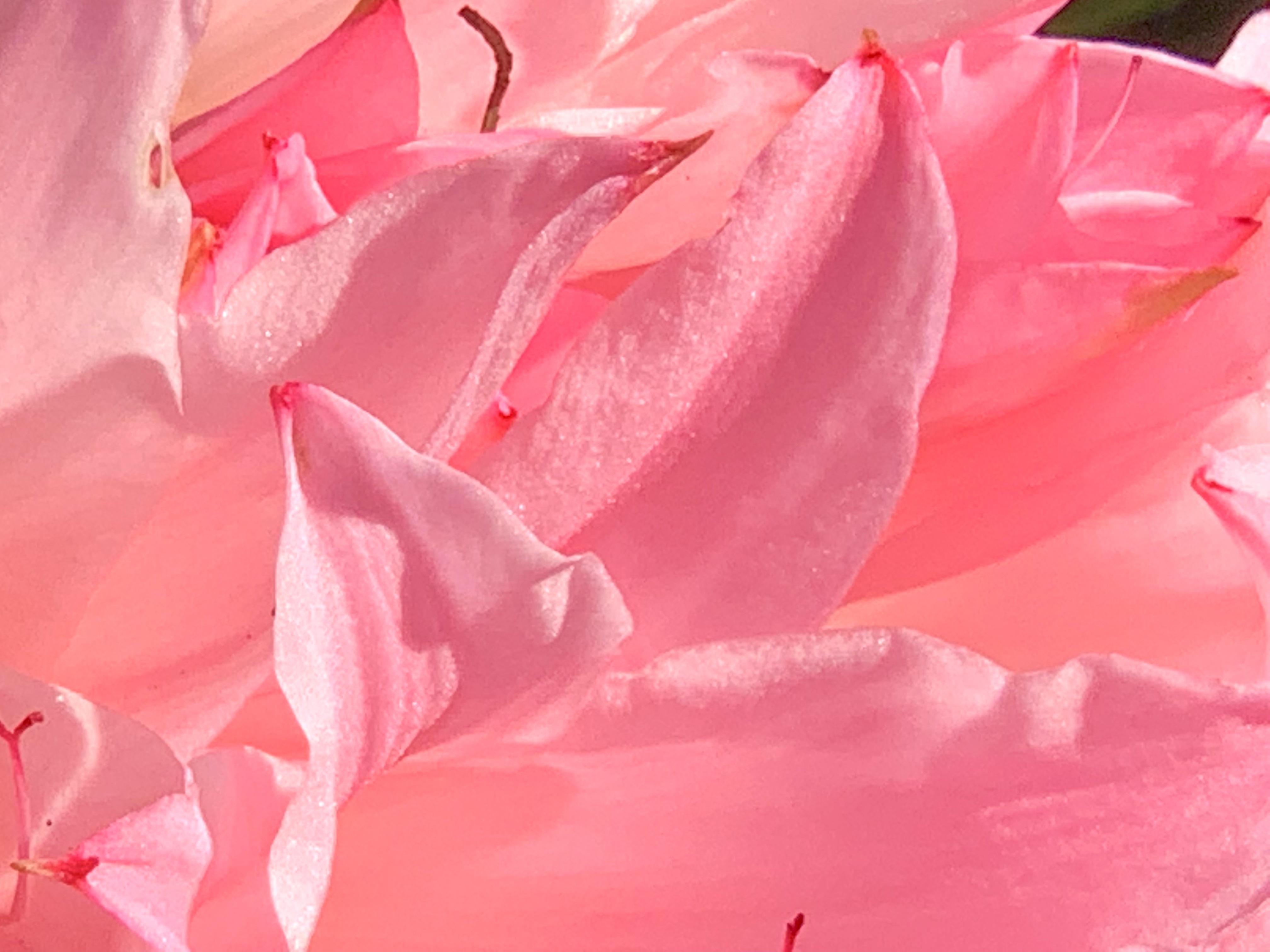
In order to illustrate “Good Shape,” I decided to take some pictures to illustrate “Bad Shape.” Since I have surrounded myself mainly with nature or with artifacts that were intentionally designed to be aesthetically pleasing, it turned out to be more difficult than I imagined at first. The other issue is that when I take photographs, I (like most people) “frame” the picture so that “Good Shape” is clear. I began to intentionally brake that habitual way of framing with pictures of flowers that overlap. The natural beauty of flowers is so rich that, to me, even a quasi-random framing still results in a beautiful picture.
This turns out not to be the case with artifacts however.
Although some of the elements of this seem to have “Good Shape,” the overall composition lacks a coherent center. It seems to me to be an artificial “kludge” of colors, textures, and shapes and there is no overall “Good Shape.”
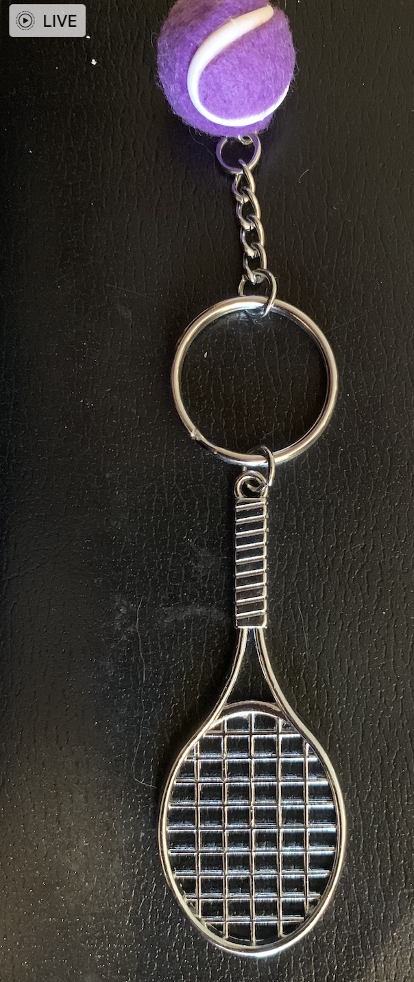
By re-arranging the elements into this form (above), to me, it seems to get closer to “Good Shape” but the purple “tennis ball” seems ill-proportioned and out of place. In “real tennis” there is a physical reason for the ball to be fuzzy but here, the fuzziness of the ball seems added on and arbitrary.
Here too (above), the overall composition lacks “Good Shape.” The large semi-random dark blob in the middle has no real “Center.” The elements around the edges do not cohere or reflect off of each other. None of the elements around the edges are complete enough to have “Good Shape” except possibly the links of the small chain.
Here is another example of quasi-random elements brought together into a single picture. Though to me, both the wood and the stone are in and of themselves beautiful, there is nothing about the composition that integrates into a whole. There is no center, no echoes, no alternating repetition, no levels of scale, and despite the nice texture of the stone and wood, the overall effect, to me, is lacking in “Natural Order” and in beauty.
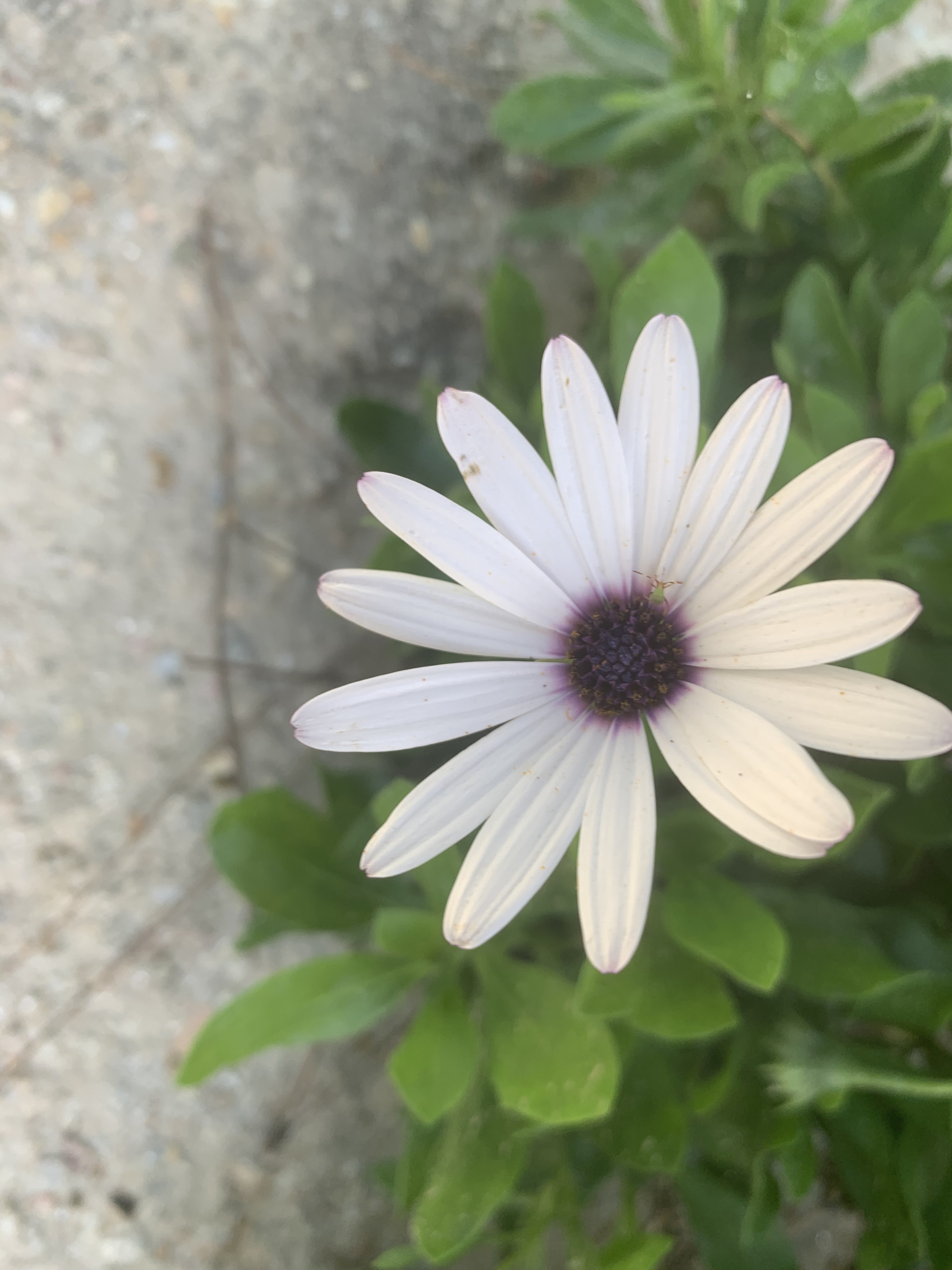
By way of contrast, the flower here seems to have a good overall shape reinforced by a Strong Center, Alternating Repetition, and each of the petals themselves has Good Shape. Around the flower, to me, is a “Positive Space.” Note that one of the petals seems slightly out of place. To me, however, this does not spoil the “Good Shape.”
The same can be said of these flowers.
It isn’t necessary to have overall “simplicity” in order to have “Good Shape.” These flowers are not “simple” in shape, but they still have “Good Shape.”
The bird on a branch shown above seems to me to have “Good Shape” even though it is (in outline) lacking symmetry. Though lacking symmetry in profile, the shape strikes me as “balanced.” I don’t perceive the bird as having to exert a lot of energy to keep from “falling off the branch.” The bird’s shape, like the shapes of most animals and plants is the result of 4.5 billion years of evolutionary history.
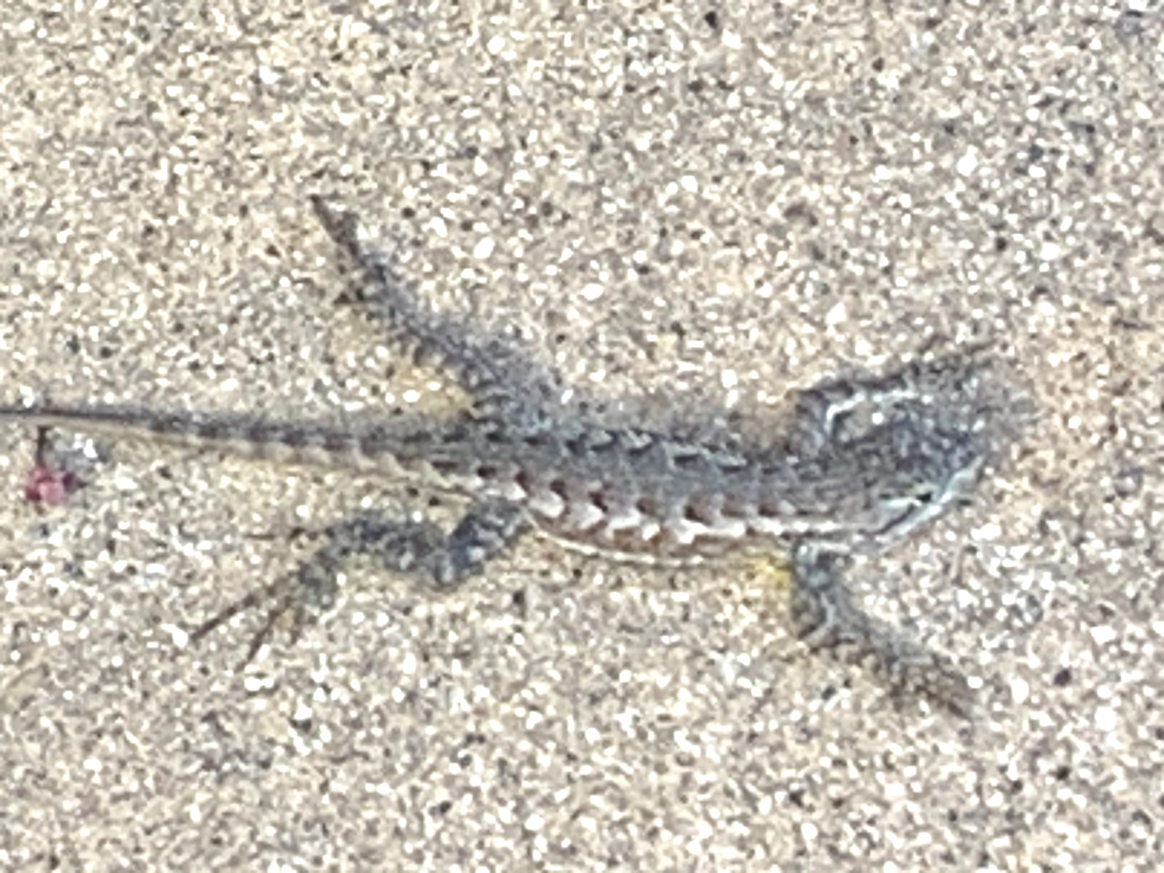
Many people view some creatures as “enemies” and therefore “creepy” or “yucky” or perhaps even as dangerous. If you can set that aside and simply look though, I think you can see that “Good Shape” characterizes all sorts of animals (as well as plants).
At a more abstract level, it even seems that natural animal behavior often shows beauty. That also seems characteristic of skilled human behavior. The Olympics show plenty of examples. It is hard to imagine an “ugly” baseball swing resulting in a home run. The runners, jumpers, throwers, gymnasts, tennis players, and so on produce “Good Shape” in three spatial dimensions and one temporal dimension.
I play tennis several times a week. I’m not averse to winning a point even if the ball hits my frame, skids off to the net cord and drops over for a winner. But — I never feel as pleased by such outsized luck as when I hit a good shot that results from proper choice, preparation, and execution (and a history of practice and reflection). I never think of a lucky mis-hit as “beautiful.”
The concept of “Good Shape” even applies to more complex human organizations and endeavors. Racism, for instance, to me is truly ugly. It is not based on truth, but on a kludge of lies masquerading as truth. White Supremacy for instance, basically says, “We’re white! That makes us superior! In fact, we’re so superior, that we insist every aspect of our society be tilted so we can be guaranteed a win!”
Huh?
Bad logic is never beautiful.
The “Good Shape” exhibited by most plants and animals reflects both a long evolutionary balance of forces (phylogeny) and the development of a particular organism (ontogeny). When biology goes awry, as in cancer, the result is not beauty. The “logic” of cancer is that billions of years of evolution that allows our bodies to work harmoniously is put aside for short-sighted egotism. A random cell says, in effect, “I’m no longer going to do my part for the body as a whole. Instead, I’m going to grab all I can for myself and grow in an unrestricted way!”
Such a cell, by making that decision, signs its own death warrant. Either the body destroys the cancer and therefore the cancer dies — or, the cancer prevails and in that case it destroys the life of the organism it was supposed to be a part of — and then it dies anyway! It’s an “ugly” decision both because it is disproportionate and because it is illogical. It aims to be self-serving, but it is not even self-serving. It guarantees its own death and kills more life along the way.
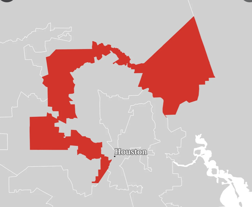
It’s the same, to me, with any dysfunctional human organization. If democracy is perverted by some people demanding that decisions be made so that they can have their way regardless of how it impacts the overall tree of life and the overall health of a city, state, or nation, it lacks “Good Shape” and instead becomes a distorted kludge lacking symmetry, lacking balance, lacking life. It is no accident that “Gerrymandered” districts do not have “Good Shape.”
In extreme cases, not surprisingly, dictatorships have resulted in a war on truth, beauty, and life itself. It’s no “accident” that Hitler, Stalin, and Mao were each responsible for millions of human deaths. Their activities also show utter disregard for the beauty of the natural environment and the plants and animals of the planet.
When it comes to User Experience, the most obvious way to apply “Good Shape” is to the visual elements of the interface — icons, windows, menus, tool bars etc. However, I think it also applies to the design process. Are the needs of all stakeholders taken into consideration?
Do the various disciplines involved in design respect each other? Do people tell the truth and show trust? Does the company treat its users with respect and tell the truth in its various communications?
If a company provides “free games” or “free services” that are purportedly for entertainment or education but the real purpose is to gather data to sell to advertisers or foreign powers trying to use the data to destroy democracy, it would seem to me that business model itself — the raison d’êtrefor the entire project is an “ugly shape” regardless of how pretty the icons are.
What do you think? Do the concepts of natural beauty apply to the design of organizations and even governments?
(This is the fifth in a series of 15 blogs that explore Christopher Alexander’s “Fifteen Properties” of good design, natural beauty, living spaces, etc.).
Life is a dance on the edge between chaos, on the one hand, and sameness & repetition on the other hand. Repetition without variation or change is not life. On the other hand, endless random variation without any pattern or principle is also not life. Planet Earth is sometimes said to be a “Goldilocks Planet” — not too hot and not too cold — to support life. Most of the life forms on planet earth themselves exhibit a “positive shape” — a shape that wants to expand and fill out — and yet, there are limits because of circulation, gravity, communication etc. so that growth is typically not unrestricted. The tension between trying to grow and having to stick close enough to form creates positive space.
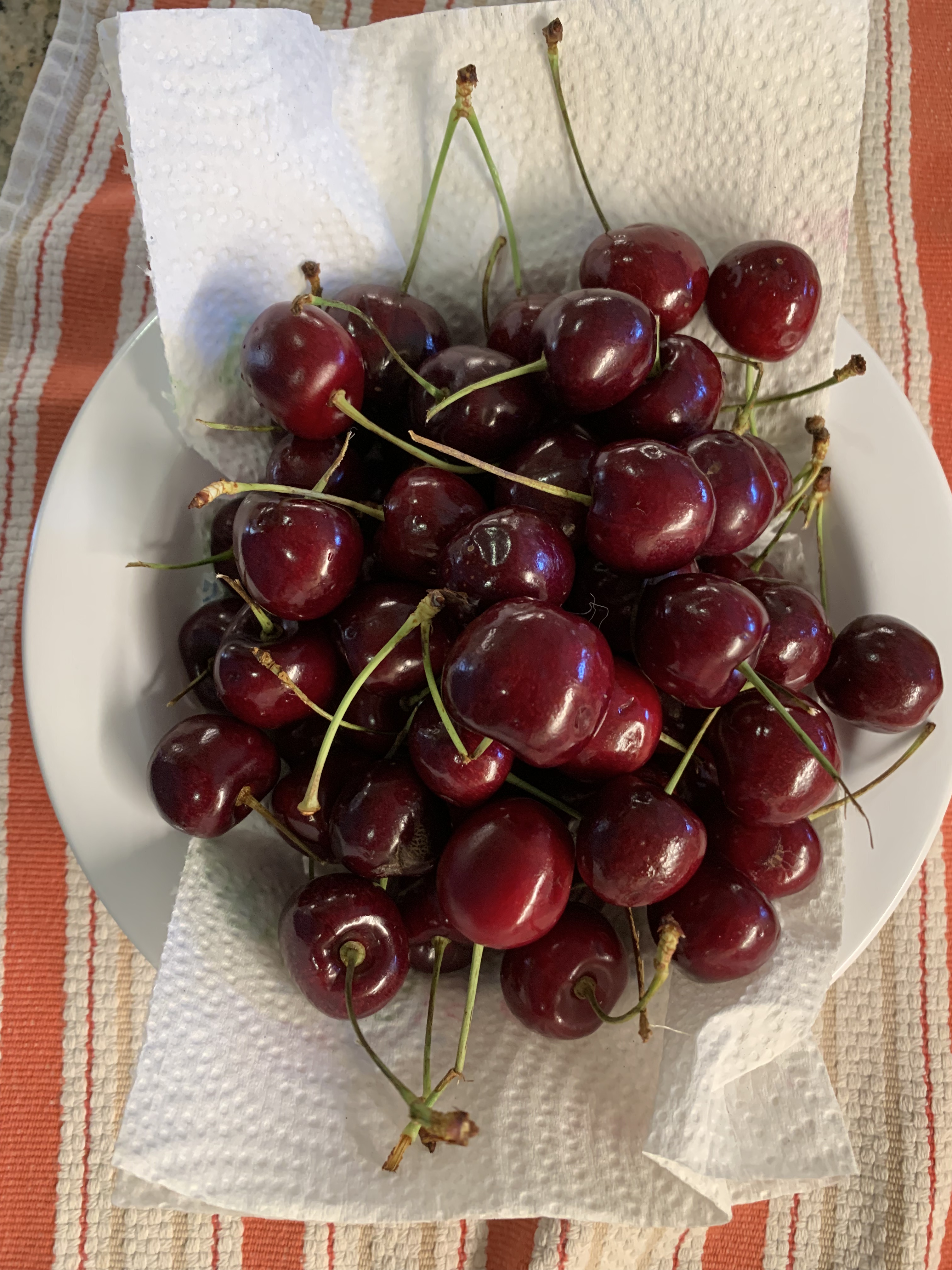
Life may not always be “a bowl of cherries” but nonetheless, a bowl of cherries does illustrate the property of “positive space.” The bowl connotes living things trying to expand right up to the boundaries possible. A bowl that is filled with cherries and even slightly over-filled but without inducing a fear of spillage, to me, connotes life being vigorous and healthy. To me, a single cherry sitting all alone in a large bowl seems to exhibit positive space much less — at least at the scale of the bowl.
When I look at an individual cherry, I also see positive space. The cherry is not a perfect sphere, featureless and smooth. If it were, to me, it would be a much less positive space. The fact that there is a stem and a noticeable indentation where the stem goes provides a kind of center. So too does the slight asymmetry of the cherry. It appears as though it might have developed as two halves that tried to circle a space at the same time from two different directions – clockwise and counterclockwise. They met and merged to form the almost spherical cherry.
The cherry is not the only natural food that has this kind of positive space. Think of corn on the cob. Each kernel seems to have tried to grow as large as it can. It pushes up against and into other kernels. Each kernel seems therefore to be “bursting with life.”
Consider a cucumber. It’s roughly cylindrical. But “roughly” is important here. To me, it would seem much less an example of “Positive Space” if it were literally a cylinder. It tapers at the ends and it bulges at the middle. That seems more “positive.”
A person who doesn’t understand that life is primarily a cooperative endeavor among all the parts of the vast tree of life, but instead sees the world only as a zero-sum game, it must seem as though the positive living space of a cucumber makes the space around the cucumber less positive and less living. But this is not true! The space around the cucumber’s slightly rotund shape is much more positive and living than the space around a perfect cylinder.
Think of a tree trunk compared with a telephone pole. They are both made of wood and they are both approximately cylindrical. But a tree trunk feels much more alive to us than a telephone pole. I don’t think this is simply because we “know” a tree is alive. It looks more alive and if you allow yourself to “tune in” to it, it feels more alive. And, importantly, not only does the space that the tree inhabits seem more living. So too does the space around it! A long line of telephone poles may exhibit “Levels of Scale” and “Alternating Repetition” and such a picture may make us feel some life to it.
But a single telephone pole does nothing to stir life in me. In that sense, it’s nothing like a tree. It’s flat and it kills the space on either side as well. The columns in the Parthenon are roughly cylindrical and obviously not literally alive. But they, unlike a telephone pole, have positive space and create positive space around them. Life is not fundamentally a zero-sum game. The bee does not “steal” the flowers pollen and thus damage the flower. The bee helps the flower. The flower helps the bee. Positive space in an object does not steal from or detract from the space around the object. It enhances it!
Similarly, the “competition” for space among the kernels of corn on a cob of corn shows that competition can be a beautiful thing. I like to see the kernels pushing against each other. All of them seem living and positive. Imagine instead a cob of corn in which one kernel had grown like a giant spider of orange cancer and took up 98% of the cob. Aside from this one ultra-greedy cell, there were only a few widely spaced and shriveled up kernels. Would you pick that from the pile of corn? Would want to slather it with butter and bite into it? I sure wouldn’t! And to me, that is exactly what cruelty, unfairness, and greed look like. It might seem positive — after all, the dictator is trying to “grow.” That is true but he’s rigged the game. Competition is no longer beautiful when the game is rigged. Competition is no longer beautiful when your tennis opponent slices off your leg before the match starts or pays off the chair umpire to call everything you hit out.
I don’t think there’s anything particularly special about cucumbers or cherries or corn. I just happened to have been washing vegetables before writing this. These radishes also exhibit positive space. And, although their shape is not the same as a cherry or a cucumber, the radishes also enhance the space around them. And, so does the avocado. An avocado that is just past ideal ripeness begins to flatten irregularly and the “pebbles” of the skin also flatten making a less positive space. The pebbles of a perfectly ripe avocado are themselves tiny positive spaces that add to the overall impression of vigor.
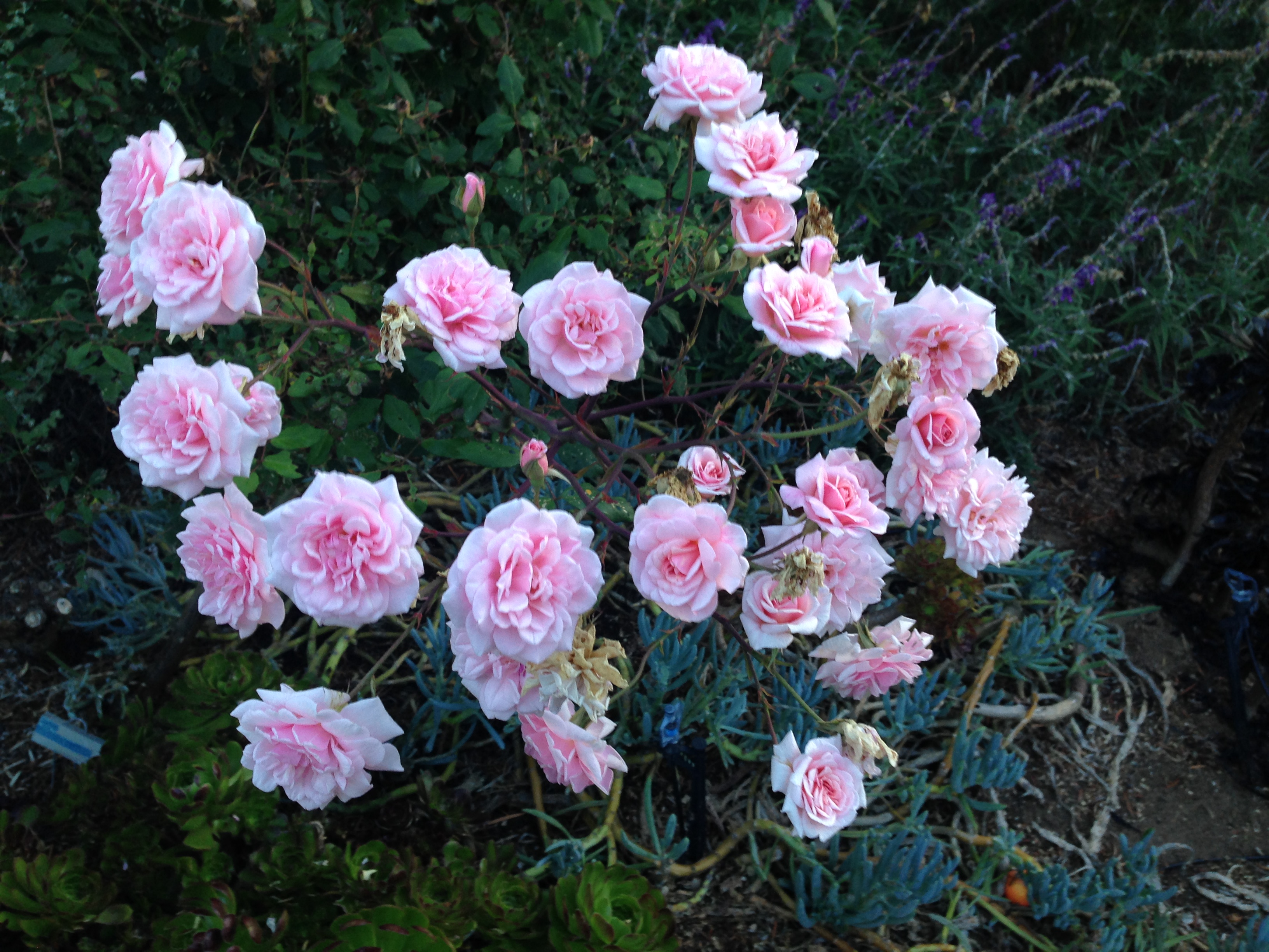
Flowers provide numerous examples of positive space. And, so far as I can tell, the positive space of flowers invariably also enhances the positivity of the space around them.
Animals also generally exhibit positive space. Their shapes, after all, come about through a struggle among different tradeoffs that have been “learned” by each species over four and a half billion years. But whether you look at the leg of a turtle, the leg of a turkey, or the leg of a polar bear, you will see positive space. The shapes are quite different because their histories are quite different. But in every case, the shape is determined by the history and each of those histories is the same length — 4.5 billion years. The fact that each of these shapes comes about through the dance of trying to survive and thrive in all their various habitats makes every one of them beautiful in its own right — even those whom most of us don’t particularly like to interact with such as rattlesnakes or lions. Even if we don’t wish to come face to face with a lion or grizzly bear we do recognize their beauty. And, I would claim that as those animals walk through any landscape, they will not only exhibit their own positive shape; they will also enhance the positivity of the shape around where they are walking. Think how many times photographers and painters have put an animal in the foreground of a landscape! Of course, doing so makes the scene immediately more living, more interesting, and more beautiful.
What does this have to do with the user’s experience on a computing device? I would have to say that most interfaces on most devices do not do a lot to bring the interface “alive” including having positive space. The tool bar icons on this version of my Mac are very slightly “bulging” like a living cell (or kernel of corn). Even more subtly, the windows have slightly rounded corners.
It’s an entirely different story with many games though. It seems to me that some of the game artists are among the best artists in the world. They have created many very beautiful games. Could they be more beautiful still if game designers consciously thought about using Christopher Alexander’s “Properties” in general, and “Positive Space” in particular? I think so, but for many games, such as Horizon Zero Dawn, many of the elements are copied so closely from nature that aspects such as “Positive Space” are mostly already taken care of by evolutionary bias toward the beautiful. (Yes, I do think there is such a bias, but it will have to be the subject of a different post.)
What about other applications and systems? Do you think you’ve seen good examples of “Positive Space” in such systems? How could you see incorporating “Positive Space” in UX?
(This is the fourth post in a series of 15 which aim to examine the fifteen properties of natural order postulated by Christopher Alexander. I wonder whether the property of “Alternating Repetition” could be more frequently incorporated into User Experience and what the pros and cons might be).
4. Alternating Repetition
In nature, whether we look at clouds, waves, mountain ranges, forests, plants, the leaves of plants, or almost any animal, we see alternating repetition. Such natural repetition is almost never precise and complete replication. Just as every reproductive act of life introduces an element of recombination as well as the possibility of mutation, so too the repetitions we see in life are not mathematical. We indeed see patterns repeated in a line or in a circle, but the instances in living things show variation. Similarly, human artifacts made with the hands; e.g., weaving or poetry or rock walls or tennis strokes show repetition but with slight and subtle variations.
If you look at modern industrial society, you see many examples of exact repetition. It’s true that if you looked at 10,000 examples of the same brand and model pen, or notebook, or scissors, or streak knives under a microscope, you could likely find small differences. To the naked eye, however, they would appear identical. Seeing 10,000 pebbles, leaves, or waves you would always see slight to moderate differences. To me, it makes a difference in terms of beauty. Handmade items and human actions naturally show more variation than things produced by machines.
The various “elements” of a User Interface generally have the feel of something made by machine. The size of all the application icons on the tool bar for instance are the same. They are all almost the same exact shape and size. On my tool bar the icons for Finder, Launchpad, Mail, Safari, Chrome, FaceTime, Messenger, Maps, Photos, Contacts, Calendar, Reminders, Notes, System Preferences, Keynote, Pages, Preview, and News are the same. However, the Kindle icon is slightly larger and more square. The Zoom icon is very slightly rounder and the icon for Facebook is circular. In other words, there is some slight variation, but mainly the icons are the same in outline, but different inside. But the set of icons on the tool bar has no sense of “harmony.”
Note that the tool bar is both abnormally homogeneous in terms of positioning and size but completely disconnected in terms of the images which differ in a random disharmony seldom exhibited in nature.
Instead, each icon seems to scream out its individuality without regard to its neighbors. (Which reminds me of things like masking, vaccinations, telling the truth, etc.). Anyway, the layout of the toolbar, to me, it’s reminiscent of driving down the highway and seeing a sequence of billboards, each advertising some random product or service in no particular order. Often, each billboard is the same size but they are independent of each other. The one exception I can think of were the “Burma Shave” signs along the highway. Each sign was a small rectangle with several words on it. About a quarter mile down the road, another sign would appear. They were meant to be seen in a specific order and together, they made a kind of “story” which usually rhymed. Typically, the signs touted the joys of the product — “Burma Shave” — or, provided public service announcements about safe driving.
In the early days of computing, putting in “variation” would have been insanely wasteful of space and processing time. This is no longer true. Yet, the “look and feel” of User Interfaces remains, for the most part, quite “mechanical” or “mechanistic” rather than “natural.” Sometimes modern computer games include naturalistic looking variations in how repeated plants, rocks, clouds, etc. are represented. Look at the palm trees and you will see variations among the trees that are reminiscent of the real palm trees I see every day. In addition, each tree contains a number of fronds that repeat a generic theme; yet, each front is somewhat different. The fronds themselves each contain alternating repetition, just as do real palm tree fronds.
We might consider whether it would make sense to put more natural looking alternating repetition into the more utilitarian aspects of user experience. For example, could it be both more beautiful and more useful to allow more variation in the way files are represented visually? Will Hill, James Hollan, Dave Wrobleski, & Tim McCandless suggested (in a CHI ’92 paper) that physical documents such as manuals naturally show wear in places where they are most used. They suggested that the visual representation of computer documents might be altered slightly to show which documents have been used or edited more and also that such cues within a document might also be useful.
Hill, William; Hollan, James; Wrobleski, Dave; McCandless, Tim; “Edit Wear and Read Wear,” Human factors in computing systems: Striking a balance. Proceedings of the 9th annual conference. SIGCHI ’92 Proceedings (Monterey, CA), Addison-Wesley, 1992, pp. 3-9.
One of the few cookbooks I use with some regularity is entitled, Fat Free and Flavor Full. The recipe I’ve used many times is the black bean salad. If I open the physical book, it naturally falls open to that particular recipe. “Open Recent” I find a very useful features of the Pages application, but I don’t see a way to look at files based on overall frequency of use. It could be the case that there are some applications for which you would want specific files to be easily found depending on the season or the date. The authors of “Edit Wear and Read Wear” were mainly talking about the utility of encoding information about a file into its visual representation. There might well be aesthetic reasons to do so as well.
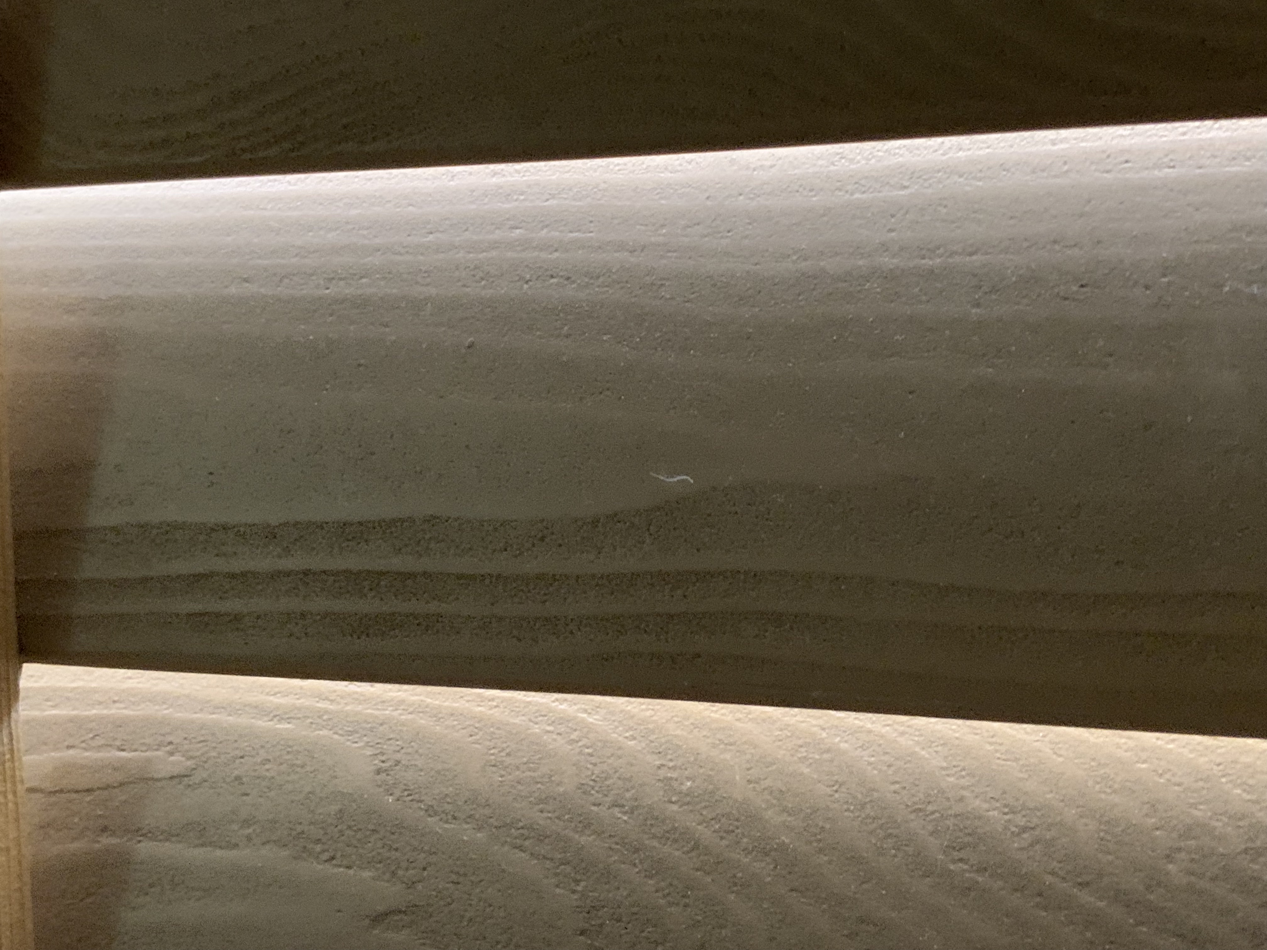
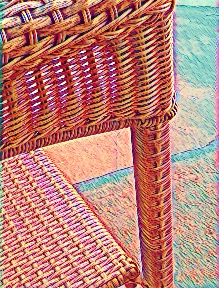
The wooden blinds shown below exhibit alternating repetition in several ways. First, there is the matter of perspective. Some variation almost always presents itself simply by virtue of the fact that I typically view the blinds at an angle and some are closer to me than others. This means that the size, and the retinal shape are slightly different. Second, there is variation caused by slight changes in the angle of the slats relative to vertical. Third, each slat is made of wood. The wood itself shows rings (or more commonly a planar projection of the concentric cylinders.
The wooden blinds, because they are illuminated from the outside by tree-filtered sunlight also show further variation; however I don’t think that is typically “alternating repetition.” Perhaps not coincidentally, although I find it a little interesting, I can’t say I find that source of variation to be beautiful to me. The other three all add to the aesthetics, at least to me.
Is it feasible to introduce alternating repetition with slight variation into User Interfaces? Would it be desirable? What negative side-effects might arise? Do you even agree with Christopher Alexander that Alternating Repetition is an aspect of natural beauty and beautiful design? One thing that occurs to me is that if some element of the UI is more variable in outline etc., it may mean that the actions upon that object must deal with that variability. If designed greenfield, that might not be too difficult. But if, for example, the code for dragging and dropping was written under a presumption of zero variability, that might be problematic. What do you think?
——————-
Discussion of Alternating Repetition with additional visual examples can be found here:
This is the second posting in a series of fifteen which examine Christopher Alexander’s “Fifteen Properties” of natural beauty and suggests how these properties might apply to user experience design.
2. “Strong centers” is probably one of the most overlooked properties of design in UX/HCI. Often, what exists for the user, from their perspective, is a “sprawl” of functions, tool bars, and icons with no obvious overall or subsidiary organization. A better design would allow the user to quickly find a “home base” from which, it would be obvious where to find subsidiary home bases. There is some sense in which hyperbolic trees, fisheye lenses, and home pages partly begin to address this issue.
Instead of “strong centers”, the impression I often get in looking at applications for word processing, organizing photos, searching, or dealing with settings is that the designers are given or generate a long list of functions to be supported. Which ones are related to which though? Which ones are central? In many cases, UX practitioners give users (or, more often, potential users), a set of cards with one function each and ask the users to sort these into piles. I am not against such studies, but they are unlikely to lead to a coherent design with a strong center. The users are not, in most cases, professional designers. In many cases, an application is supposed to support many different specific actions. For example, I use word processors to write essays, poems, and fiction. I also use a word processor to proofread something, to re-organize ideas, to “jot down” a bunch of ideas, or to write an outline. These are very different tasks, at least to me. If asked sort cards, I would do it differently depending on which type of task and which type of material I’m thinking about.
As I type this, I glance at the “Pages” tool bar which includes: Pages, File, Edit, Insert, Format, Arrange, View, Share, Window, and Help. None of these seems like “home” to the task of writing an essay. I know from experience that if I want to write any kind of material, I must go to the “File” menu even though, as best I can recall, my initial impression of this label was that it would be something to do after I was “done” with the tasks of composing and proofreading. The toolbar gives no impression of their being any “center” at all, let alone a “strong center.”
In my native language (English), I read from top to bottom, left to right. In that sense, the Apple Icon is first and the “Pages” item is next and it is in bold print. That could be considered a subtle clue that it’s the “most important.” In a way, the items on the “Pages” menu are “meta-items.” In that sense, I suppose you could argue that they are “important” — though as a writer, none of the items seem that important. In fact, if we get right down to it, nothing in Pages really seems designed to support the actual writing process. And, I’m not trying to single out Pages because it’s the only one or the worst one. Lack of a “strong center” seems true of nearly all applications.
Different people use different processes for writing — and I myself use different processes for different types of writing, so perhaps trying to organize the features and functions so that there is a “strong center”reflective of the “strong center” of the task of writing is just not feasible. I am certainly not advocating for resurrecting “Clippy.”
Ideally, it should be possible for users to “know where the action is” upon entering an application or a web page.
In another interpretation, “strong centers” refers more to underlying architecture and points to the need for a core of functionality that transcends a specific release or even a specific application. A good underlying architecture will communicate this essential center (related to central purpose or style) to the user.
All too often, the processes involved in developing an application or system themselves have no “strong center.” If the development process is itself a hodgepodge political process of accommodating to a portfolio of features and functions that are advocated for by diverse and uncoordinated stakeholders, then, what one has are a long, unorganized list artificially shoved into menus and sub-menus and toolbars. It should not be surprising then, that the user finds it difficult to know where to begin when first encountering an application — even if the user knows exactly what they want to accomplish.
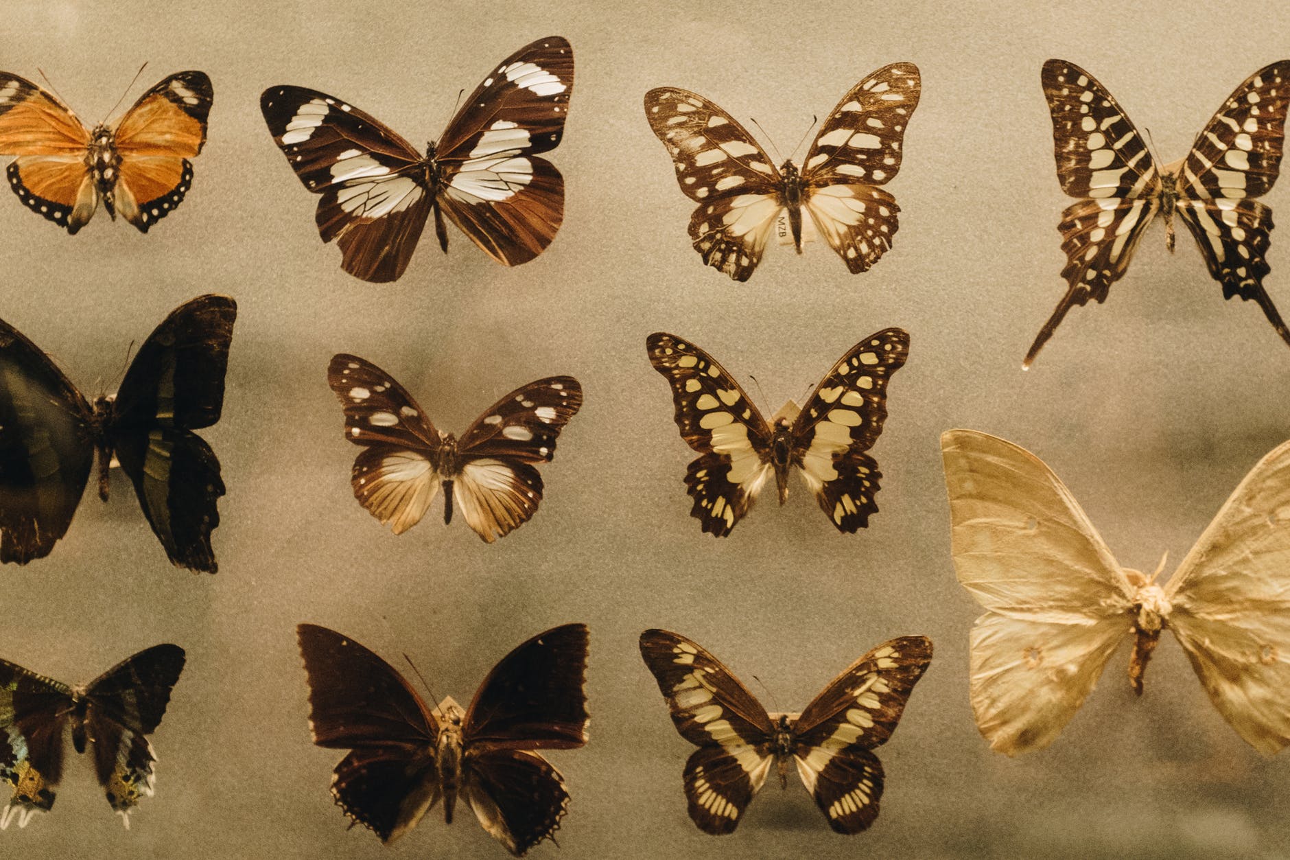
Compare and contrast most menu structures and user interfaces with the “strong centers” that are extremely common in life forms. Here are some examples of butterflies.
The central axis includes the head, the thorax and the abdomen. These are in a line in the strong center. Typically, they are colored differently from the wings. The bilateral symmetry of the wings as well as the overall shape reinforces the strong center. Wing patterns, and even the antennae and legs lead the eye back to the strong center.
Most people think of butterflies as beautiful — and I agree. When asked, however, most people will say they are “brightly colored.” Some are; some are not. But “bright colors” don’t necessarily give rise to beauty!
Strong Centers doesn’t just apply to butterflies. Look at most birds, fish, mammals, insects and you will see how the symmetries and smaller centers reflect and strengthen the major center. Indeed, Strong Centers are not limited to the animal kingdom. The trunk of a tree provides a strong center. Each branch is itself a center and the connection of the branches to the trunk reinforces the strength of the central trunk.
Even single cells often exhibit strong centers (and many of the other 15 properties, by the way).
It would love to be able to provide you with a process or checklist or formula so you could design user experiences with “strong centers.” I cannot really do that. Nor can anyone else. If you keep it in mind, even at the back of your mind, you may see opportunities to help make that happen with regard to whatever you’re working on. I’m curious to hear your thoughts about “Strong Centers.”
———————
Some useful links to more information, discussion, and examples relevant to “strong centers” or to the fifteen properties.
{I wrote this poem in 1997 when it won third prize in the Chatfield National Poetry contest. It seems oddly apropos today.}
Winter ripped into our neighborhood last night
Gale and pail of rain turned flake by morning
Gutters filled to overflowing; my basement flooded.
And the riot of yesterday’s autumn light
Gone as though it never burned its magic riots of red and gold.
All the tallest tulip trees and oaks stand naked now,
Black, bucking wet twigs against the steel gray sky.
Bundled in my leather hat, jacket and gloves,
I walk out to survey the carnage of fallen leaf and broken branch.
The wind still gusts to make my eyes smart and my cheeks burn
Low black clouds swim and swirl.
Somewhere a flag cord bangs against an empty pole.
So off I go through deserted streets of a condo Sunday morning
Into the drear of pale November.
The wind sings a shriller note when the leaves are gone,
The hush is replaced by a whistle.
And, walking down the hill toward the main road
I see beneath the broken canopy the first Jewels of November —
Coral leaves laid in relief against the wet black woods
The amber leaves, the carmine leaves of shrubs
Protected by the barren trunks of their taller cousins.
Beside the road, a head of goldenrod casts against green grass.
A few lonely wood asters, white and an occasional blue.
Hanging from the dead vines, clusters of gold and red.
Before me, the sky breaks for a moment only
And a hawk wheels through a single shaft of sunlight
Rejoicing, so it seems, in the thick cold air,
His outstretched white wing fingers glowing white for a moment.
And so I find, here in this gray and lifeless world
Treasures of color and texture and form — and music too
For the overflowing brooks are singing quiet giggles
Just as ten black crows careen and crackle through the trees.
I look down and see a broken piece of branch
Bedecked with lichens, the palest possible shade of blue-green.
I bend to pick it up and out of my jacket pocket coins tumble
Tinkling on the black macadam roadway, they splay themselves:
A shiny copper penny, dime, quarter, nickel and a dark penny.
How fine when I was a child to find a few coins like this! How rich!
I knew the different smell and taste of every coin,
My parents’ dire warnings not to put them in my mouth
Making the taste so much more exotic and exciting.
Now my money comes to me as a blue paper note
Claiming the check was deposited directly in my account.
How efficient, I note.
Another shaft of sunlight strikes me from the briefly parting clouds
As I retrieve my coins one by one
And remember that today is the New York City marathon.
Phillipides, so the story goes, died after bringing the news
Of a Greek victory back, from exhaustion, so we suppose.
But I wonder: was it simply that his life¹s best work was done?
Or could it even be the sheer clear joy of the news delivered?
Or, the ecstasy of the swinging legs and arms, the hot heart,
The heaving chest — feeling so alive that pain itself is joy.
The wind is at my back and I wonder what it would feel like
To run today that long race through the windy streets of New York.
But a walk through the woods is enough for me, enough today,
Stopping to watch the hundred precious scenes laid out before me.
I wonder where all these treasures were last week-end
When I walked this same path.
The answer is, of course, that they were drowned in a sea of color
The neon chaos of autumnal carnival showing off.
I turn back toward home now.
Lonely snowflakes hit and actually bounce once off the black road
Before settling down to melt their brief beauty on still warm tar.
The wind is fully furious in my face.
I dream what lunch I might fix once out of this blowing cold
A steaming chicken broth thick with onions, carrots, and peppers.
And I recall a time when I was a senior in college and had the flu;
The medicine the doctor gave me made me worse
And I ended up not eating for three days
But the at-last, ah-ah, taste of the clear broth I savored oh so slowly!
A feast from a magic bullion cube!
And I wonder as I begin the ascent up the long hill toward home,
Whether winter might not be the whirling earth’s greatest gift.
What would autumn, full summer, or the tender spring be
Without the deadly in-between, the waiting, the wail, the white.
In a land of endless plenty and eternal life, would we ever see
The Jewels of November?